|
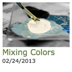
My suggestion of, "Your paint is too bright, try adding some white," met with confused looks too many times in a row, and I realized that the difference between "light vs. dark" and "bright vs. dark" was not well understood by the students. Adding white paint will make something lighter, but it will also make it duller, especially in combination with black paint. Our mural is very dull compared to the colors of paint that come out of the bottles. Almost all of the colors need to be mixed with both black and white to reduce the saturation—to make it "greyer."
Reference sheets below illustrate the differences:
 Comments are closed.
|
Topics
All

Archives
May 2021
|


 RSS Feed
HOME |
PHOTOGRAPHY COLLECTIONS
|
© COPYRIGHT 2020. ALL RIGHTS RESERVED.
|