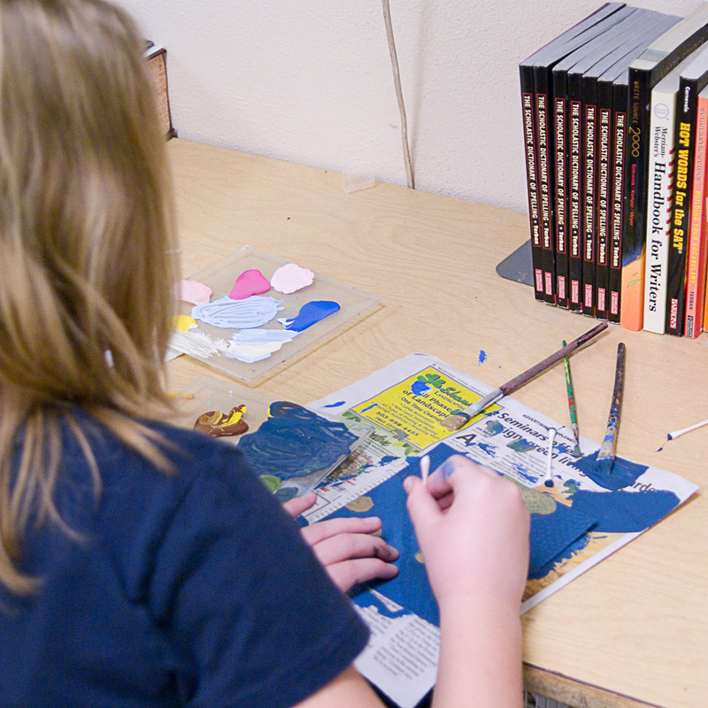
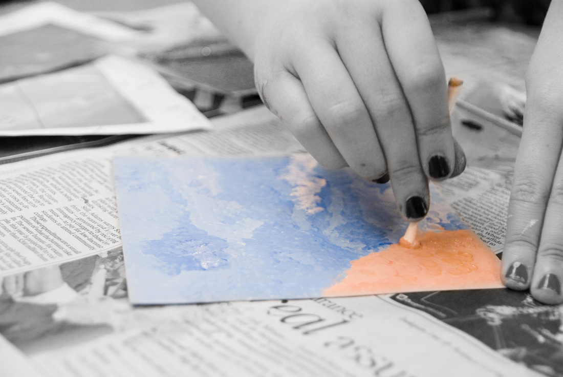
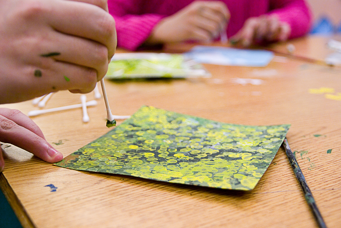
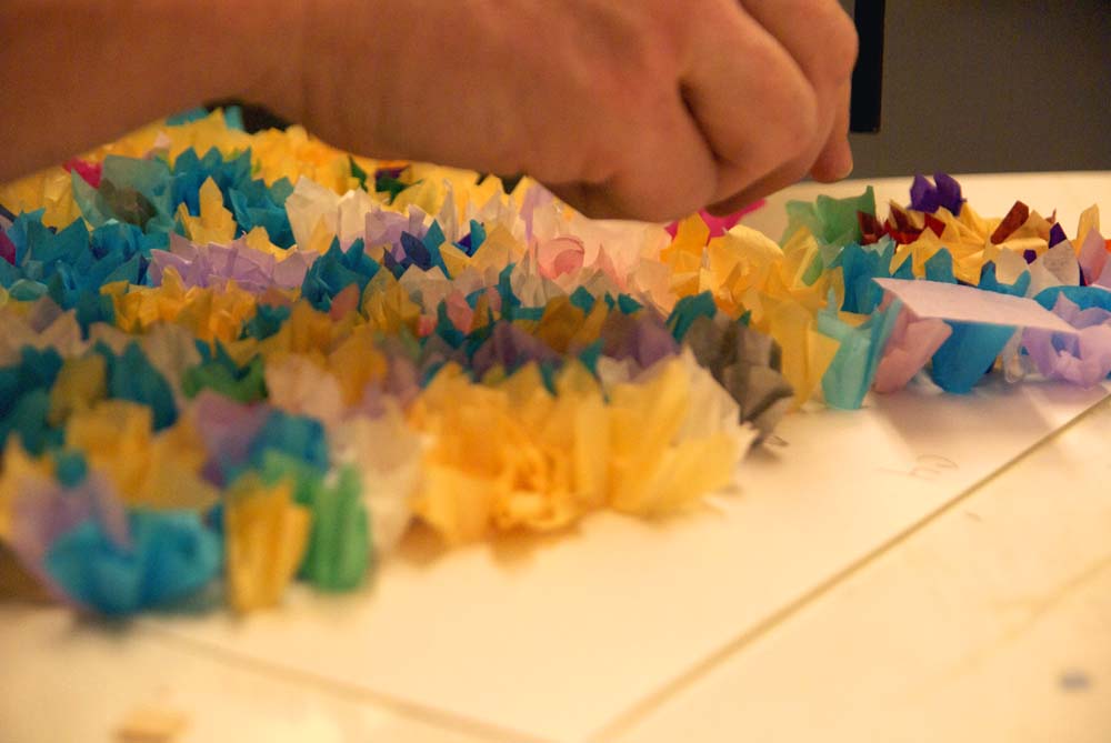
Once the proper paint colors are mixed, the process of adding dots with a Q-tip begins. It is a long and monotonous process. Some students are methodical and slow, and others have opted for speed in lieu of accuracy.
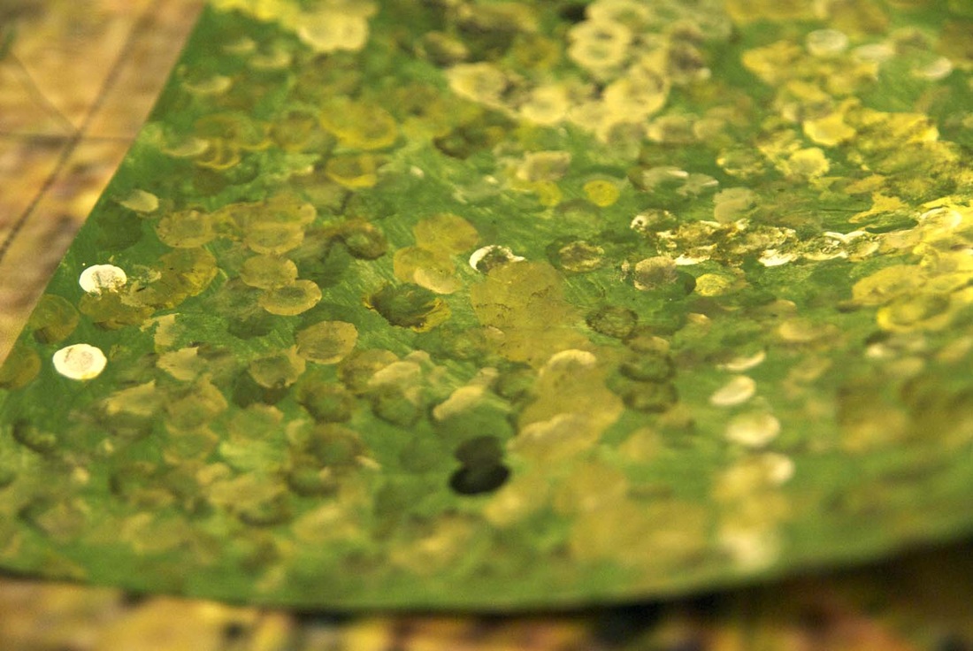
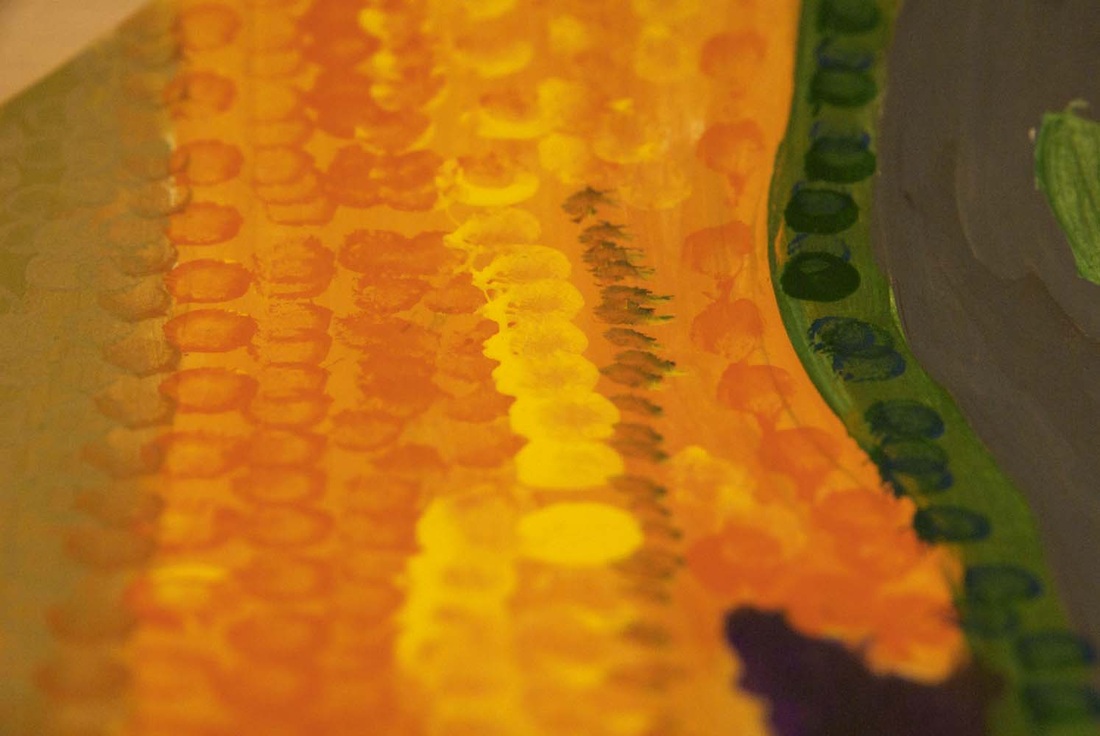
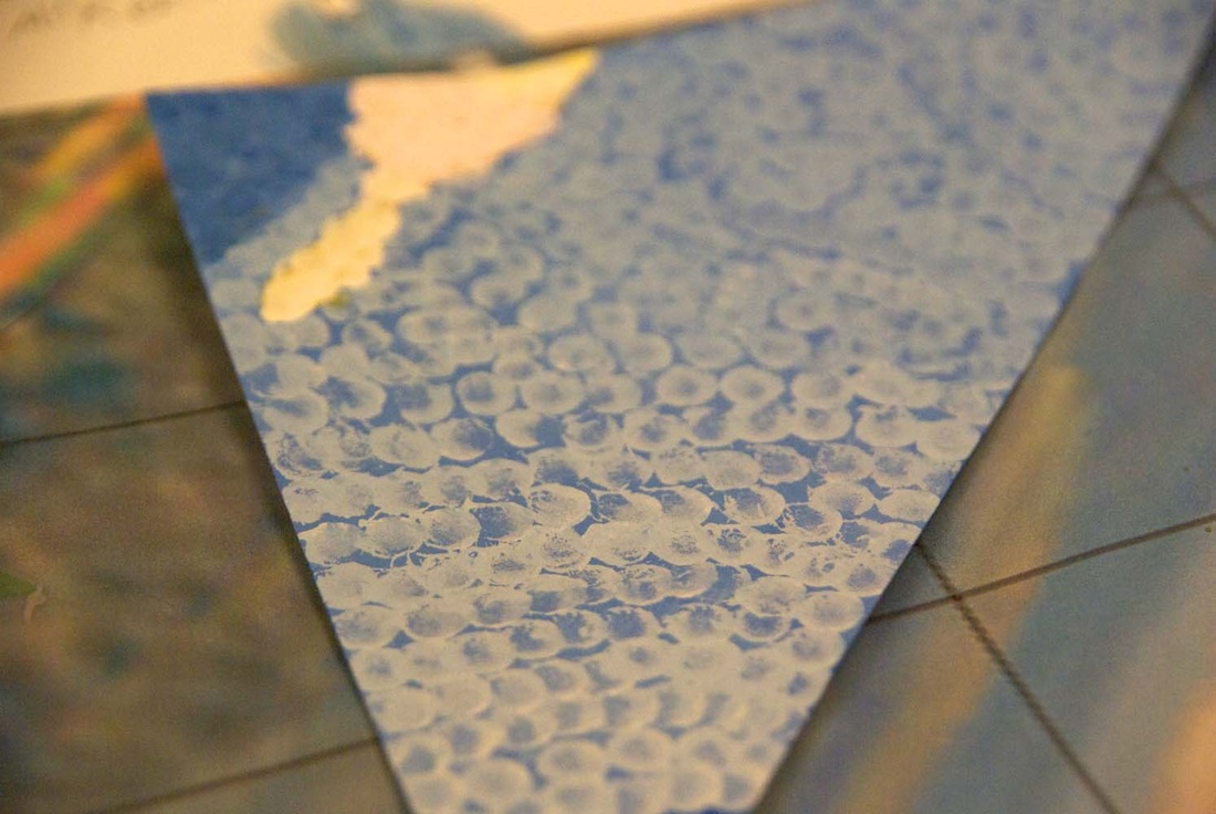
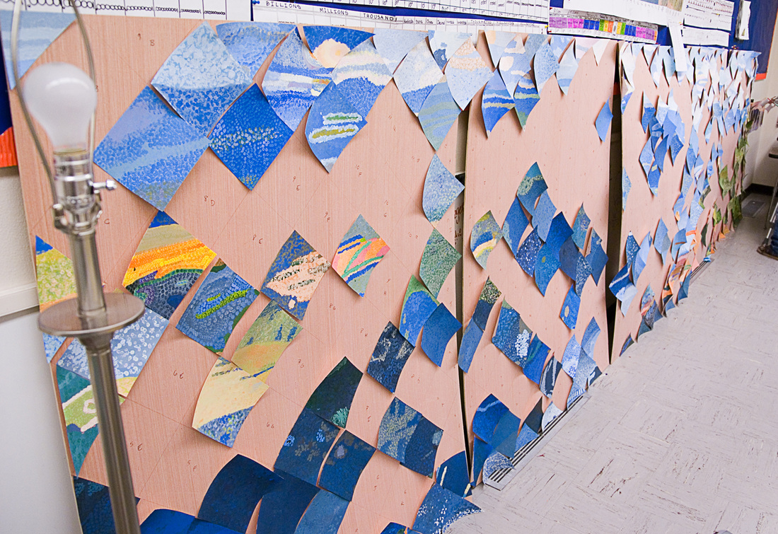
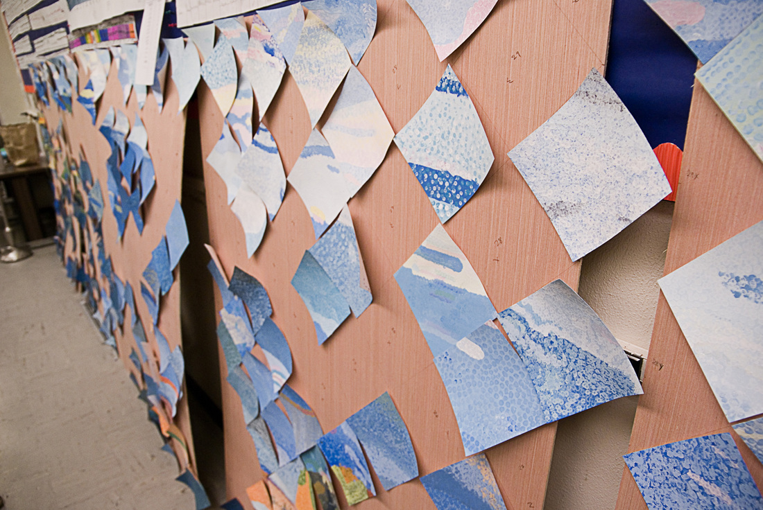
There is an amazing depth of color present in the layers of dots that the students painstakingly apply to the squares (and triangles), and more dots usually makes for a better looking square.
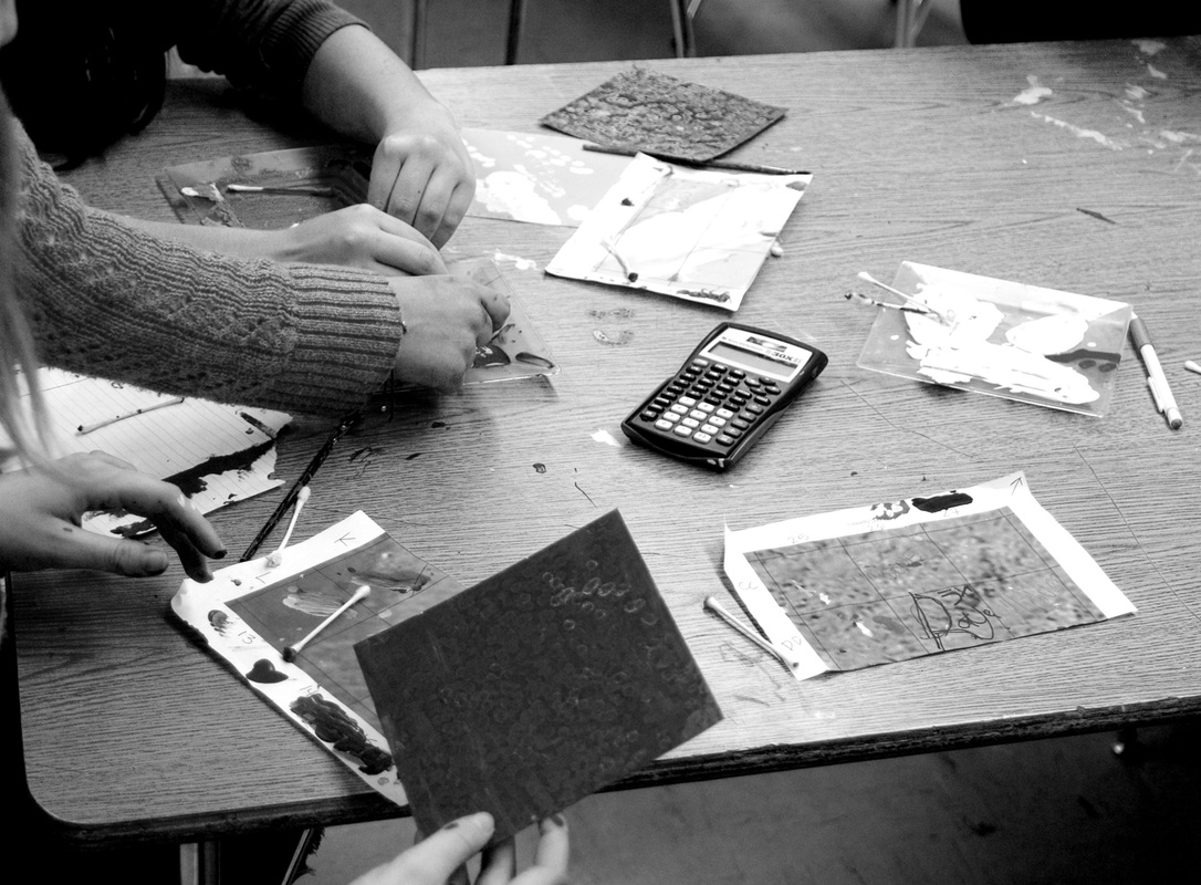
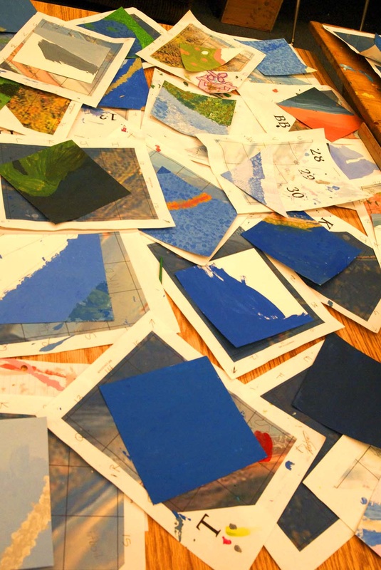
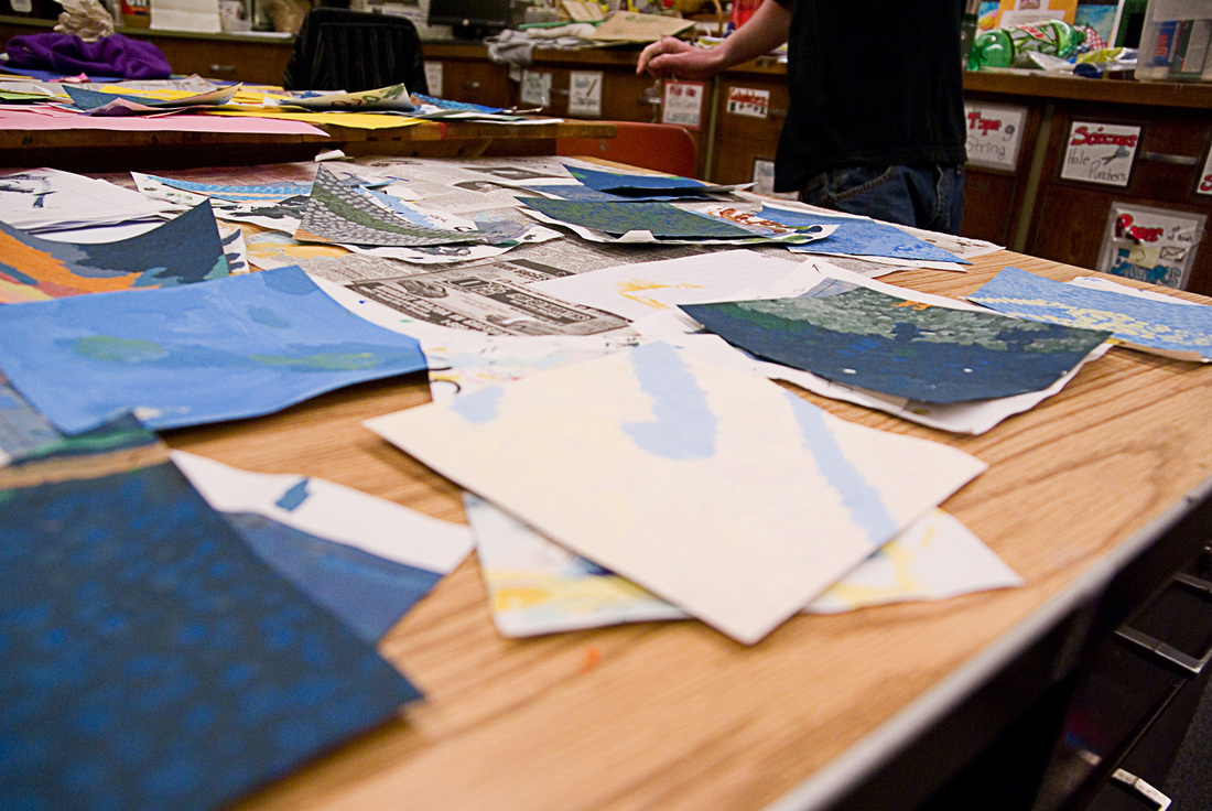
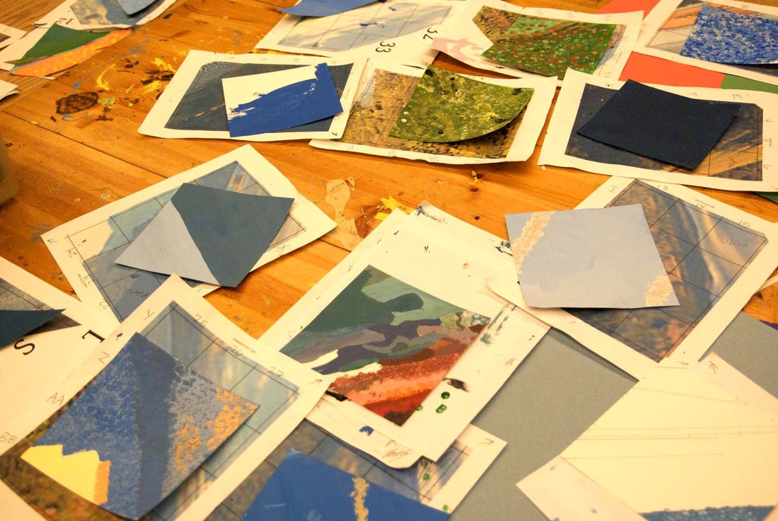
Squares that are in progress or finished get turned in to a central location to be approved by me. I check for color and line accuracy. Some get returned to the original artist to fix, some get passed on to different students to amend as necessary, and some I fix myself. Squares that are just a few dots away from being completed I often finish as well.
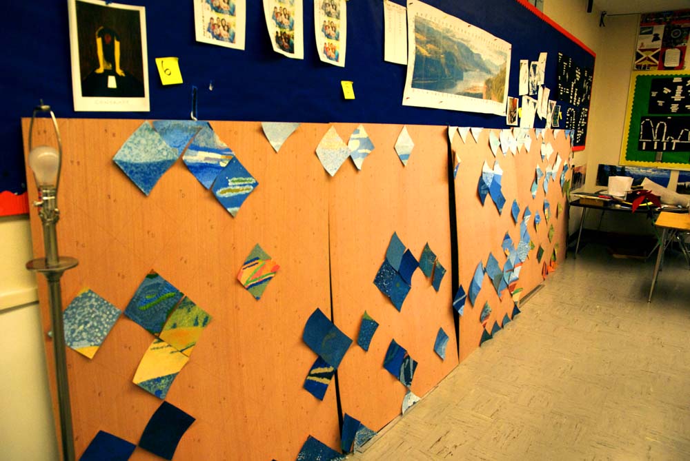
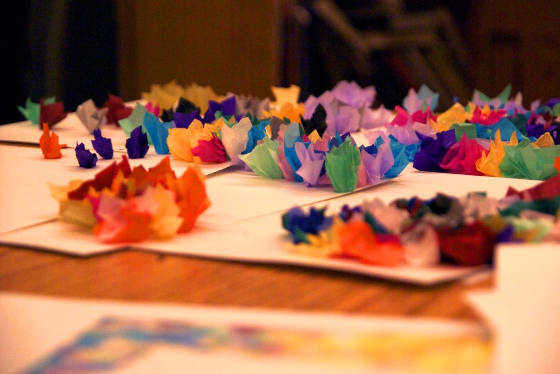
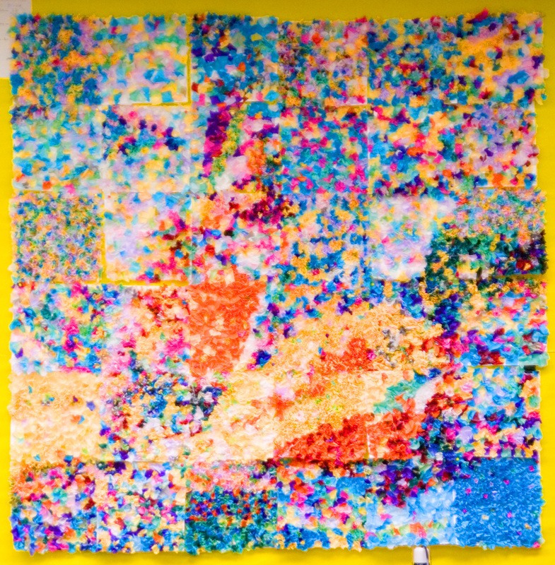
As squares are finished and approved, they are temporarily taped to the plywood in their final locations, so we can begin to see the picture come together. Only a few more squares to go before we can start gluing them down permanently.
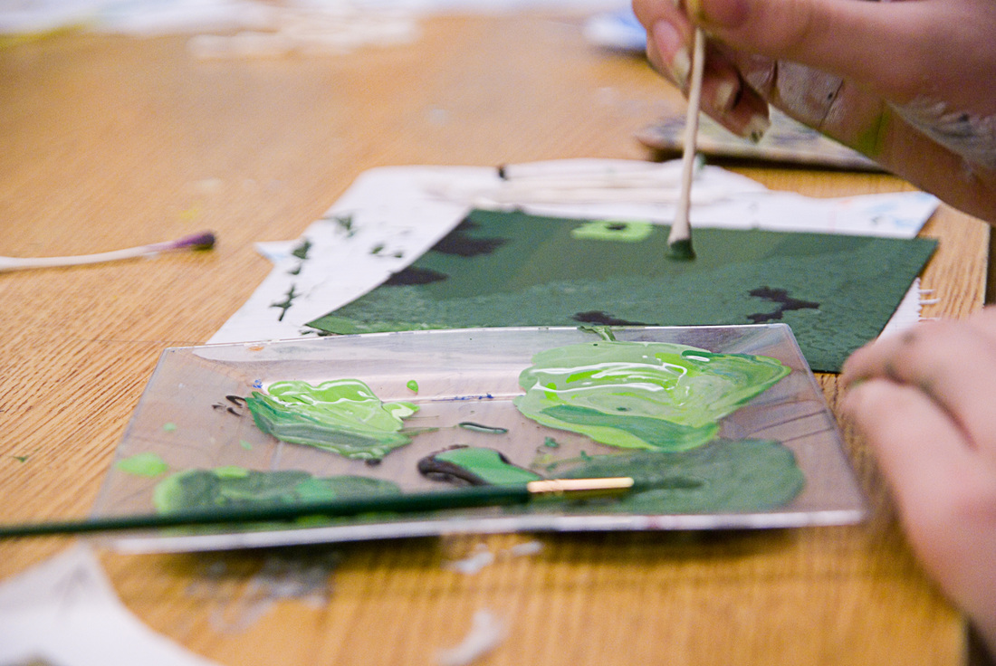
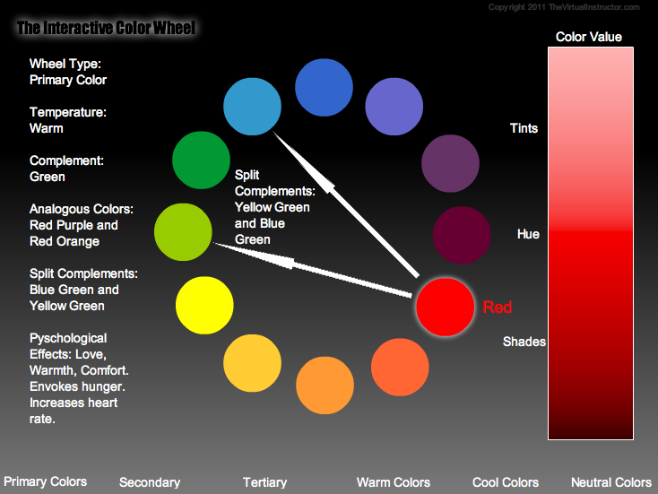
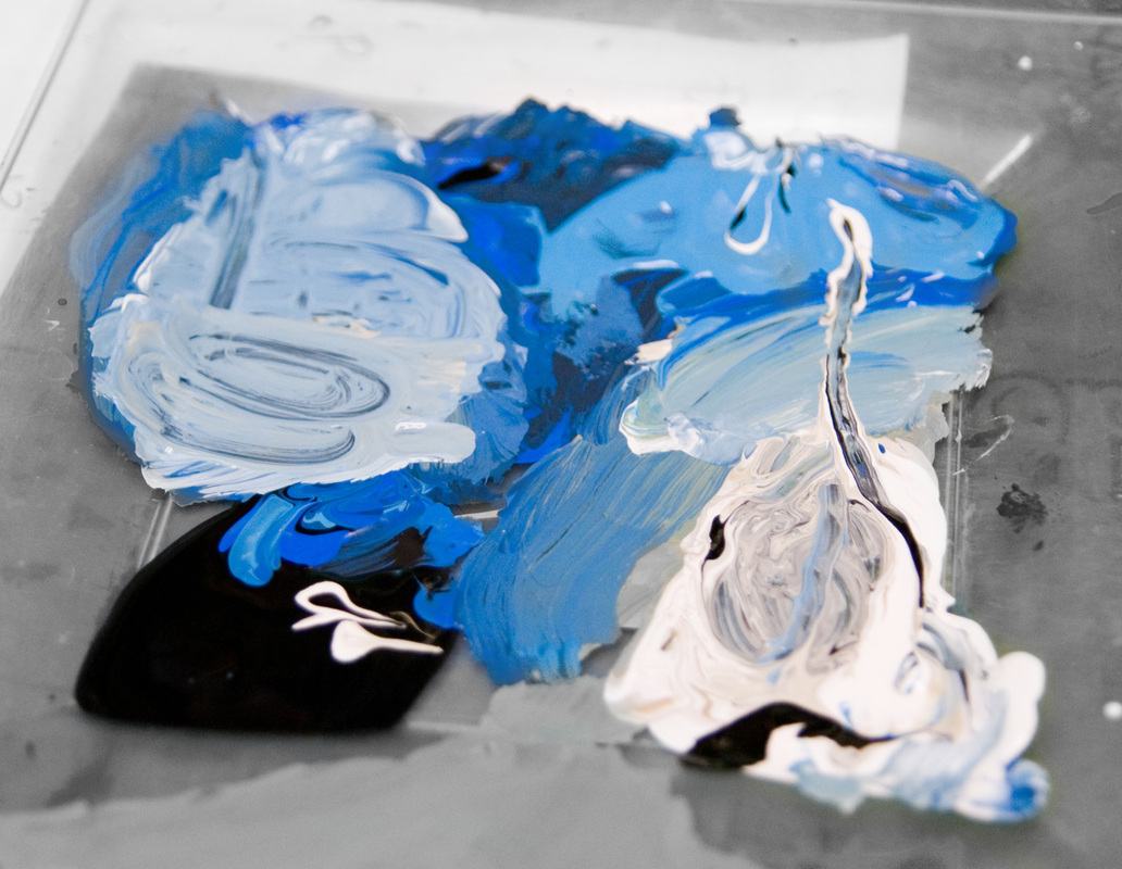
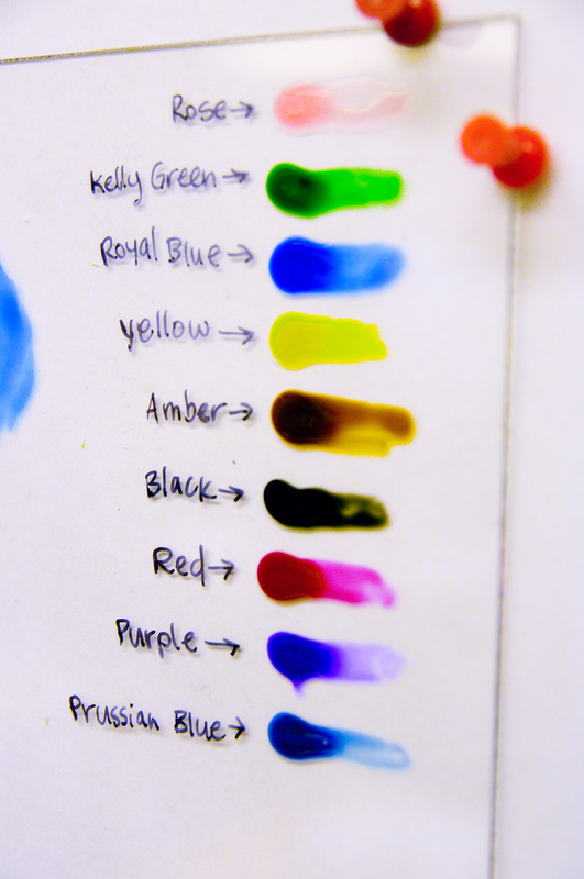
 My suggestion of, "Your paint is too bright, try adding some white," met with confused looks too many times in a row, and I realized that the difference between "light vs. dark" and "bright vs. dark" was not well understood by the students. Adding white paint will make something lighter, but it will also make it duller, especially in combination with black paint. Our mural is very dull compared to the colors of paint that come out of the bottles. Almost all of the colors need to be mixed with both black and white to reduce the saturation—to make it "greyer."
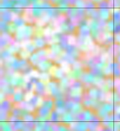
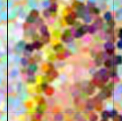
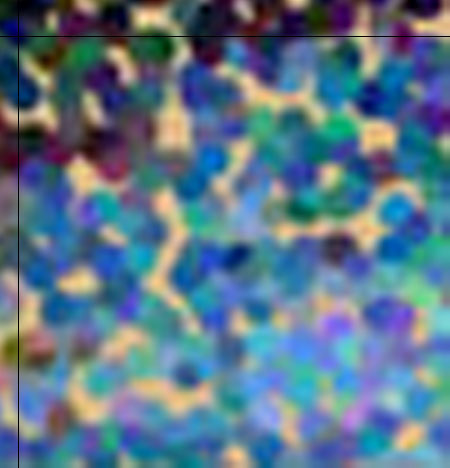
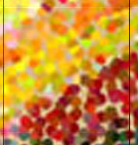
Reference sheets below illustrate the differences:
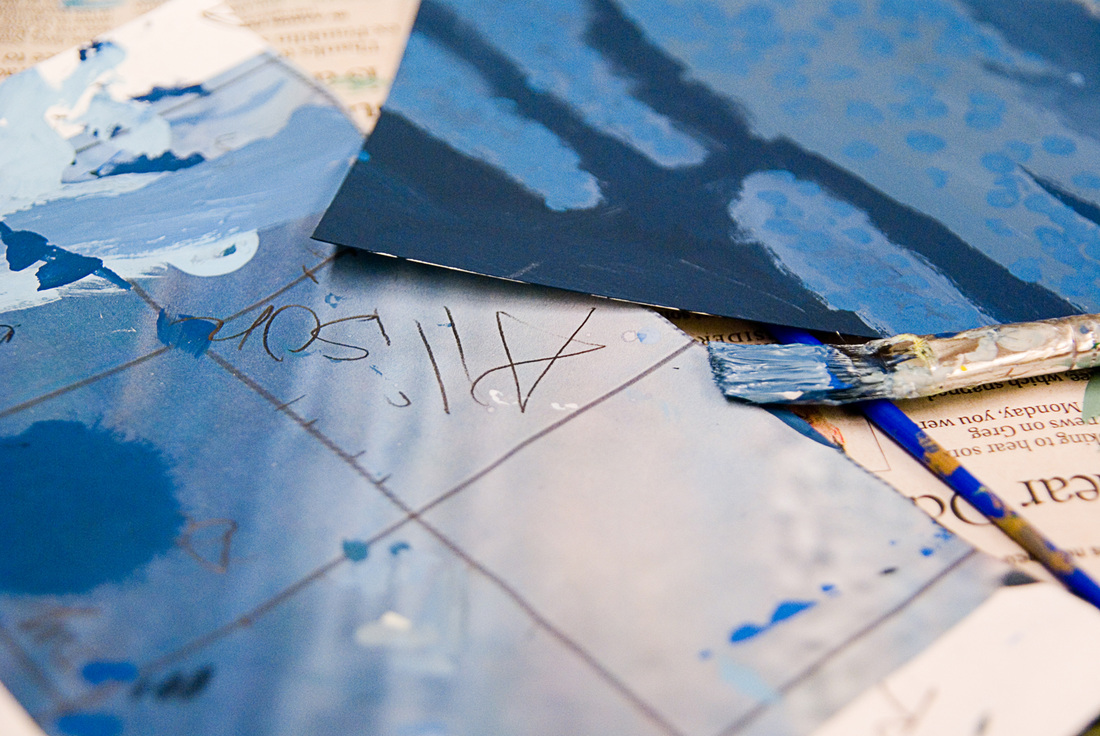
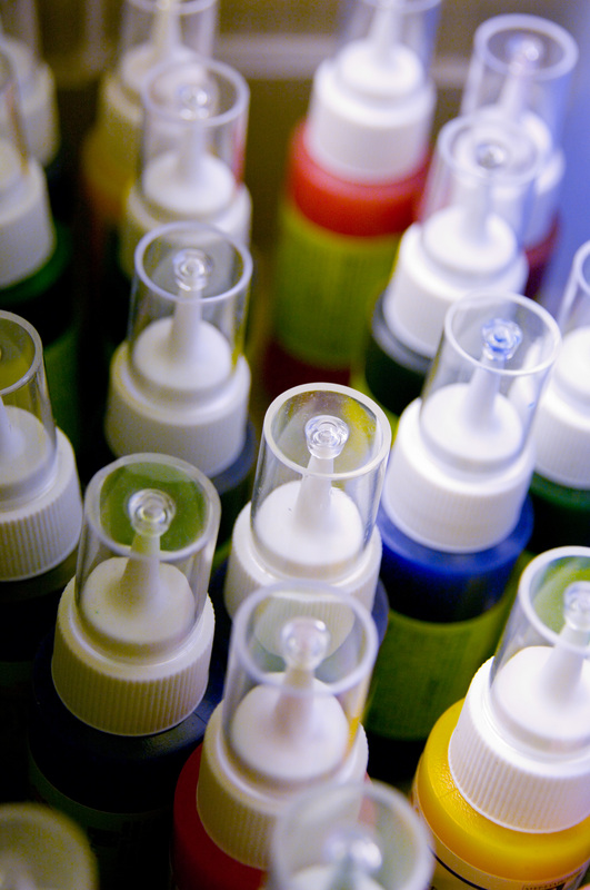
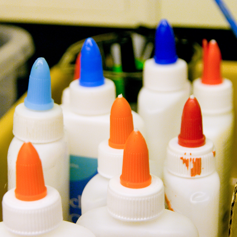
 The hardest part of this project is mixing paint colors accurately. One of the largest obstacles is that not everyone can see the same range of color. Some people are color blind in the classically understood sense, but some just have a limited range of color visibility. Throughout our time working on this project, many students have been able to identify specifically their own limitations when it comes to colors they can or can't see. I will suggest a square for them to complete next and they'll tell me, "I probably shouldn't do that one because I can't see green very well." Luckily, seeing color accurately is only one part of the painting process, and students who can't see various colors very well can still create pieces that are beautiful and useful. These two resources are both useful and fun for learning about color and testing color abilities: The students are also getting better at estimating paint volumes. Mixing paint colors can sometimes cause the puddle to get away from you. As you add a little of this and a little of that, the puddle of paint becomes an unwieldy quantity, and still isn't quite right.
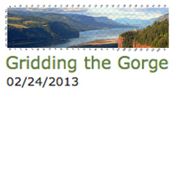
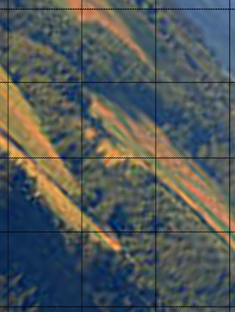
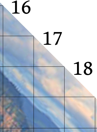
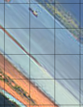
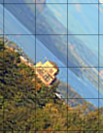
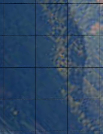
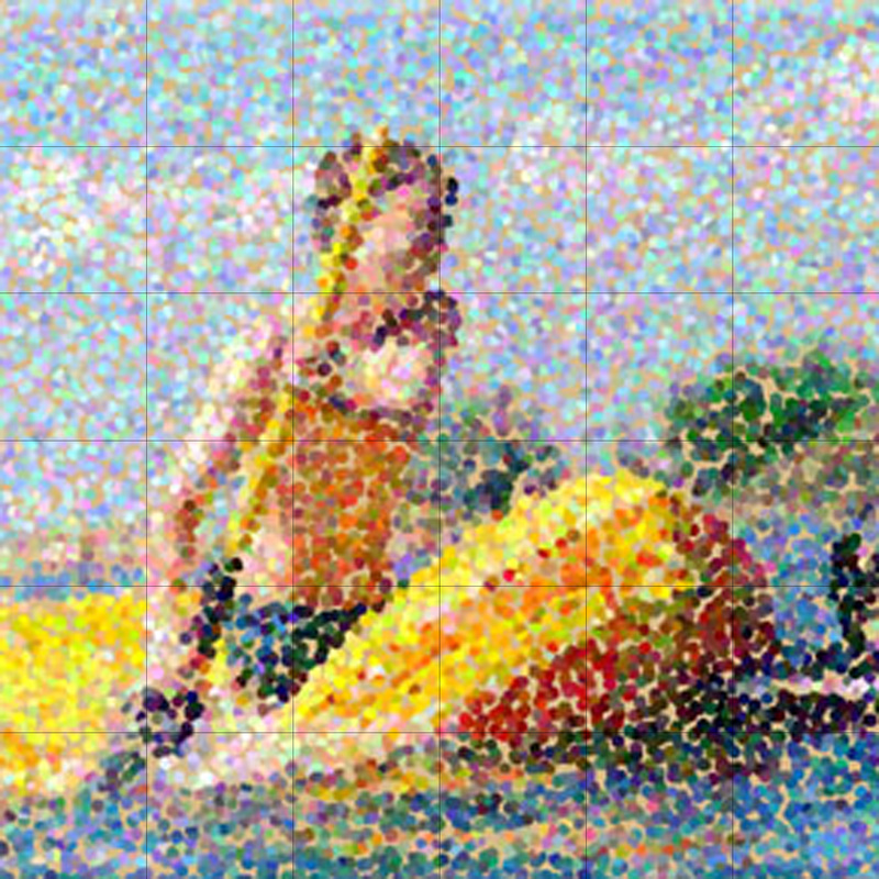
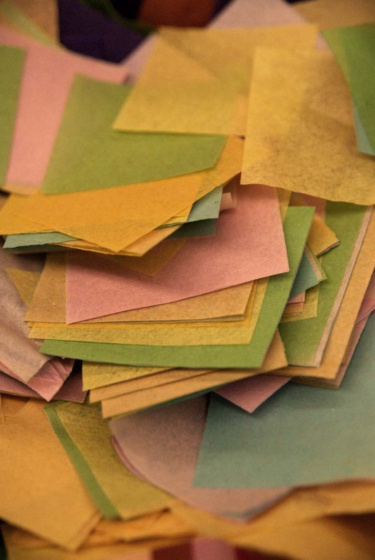
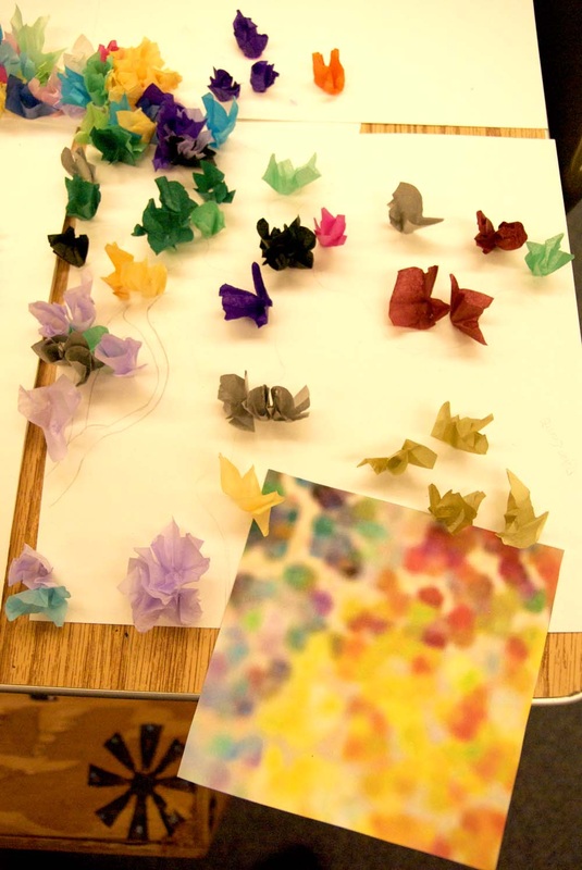
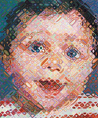
 The "real" mural will be done with paint in the pointillist style rather than tissue paper, and will be installed permanently in the school library. We decided to make the grid angled 45° in homage to the Big Emma piece by Chuck Close. Our reference photo is of a biome (naturally), and one that all of the students have experienced in person.  The mural was originally divided into individual sheets of twelve squares. Students chose one square to copy with painted dots. No one was allowed to do more than one square per sheet. Further into the project, we began to run out of sheets, and the remaining sheets were cut in half to accommodate more students.
Though labeling the squares correctly with number, letter, and directional arrow is essential for accurate placement, it still eludes many students. Squares are now turned in along with the original reference grid so the accuracy of both paint colors and labeling can be checked before the source is removed from the art. 
No students were allowed to see the final image until all of the squares were finished.
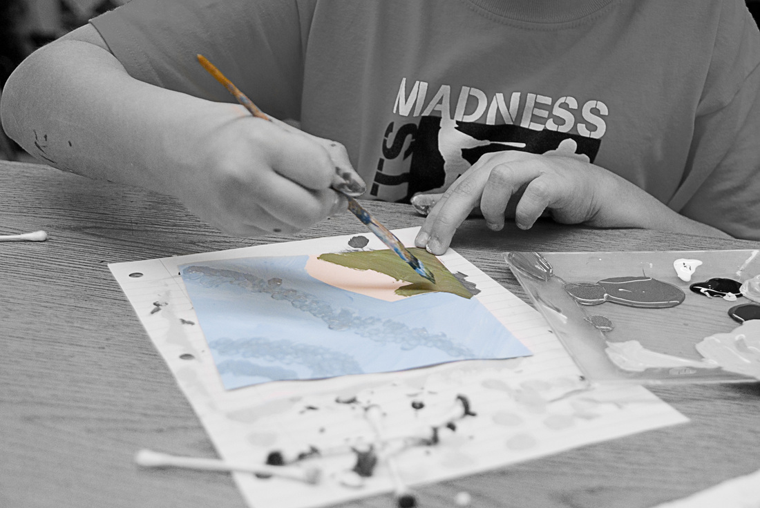
Though we started with a fairly good variety of color in our available tissue paper supply, many students had a hard time noticing the subtlety of colors present in a particular square. They would notice, for example, that their square had purple spots, but not that those purple spots were a very pale shade of lavender. Adding dark purple tissue paper where light lavender should be causes some problems in the final piece.
Throughout the process, the students tried to guess what the final piece could possibly be. Some of them tried to guess famous pieces of art or famous artists. I told one student, "It's not something you've seen before, it's just a pointillist piece of art."
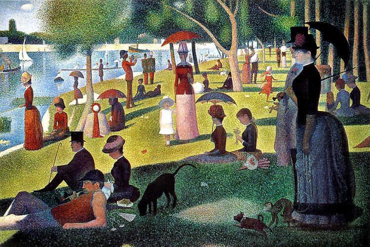
 Well, pointillism, that's what. One of this year's projects focuses on the complexity and detail of a biome (yup, back to biomes and 6th graders again) through studying the whole-is-greater-than-the-parts aspect of pointillist art. One of the most well-known employers of the technique was Georges Seurat, artist of The Sunday Afternoon on the Island of La Grande Jatte.


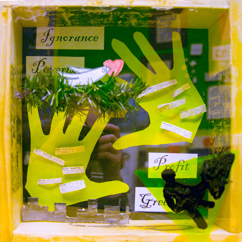
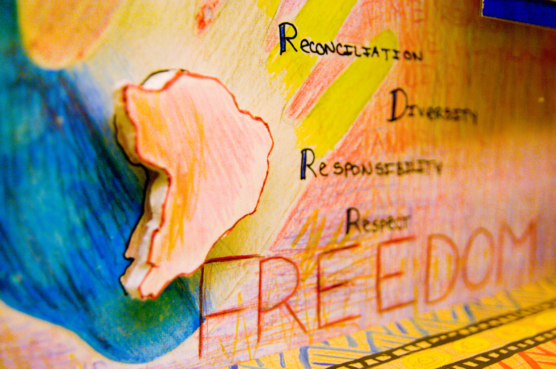
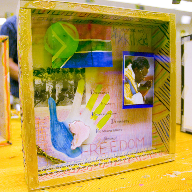
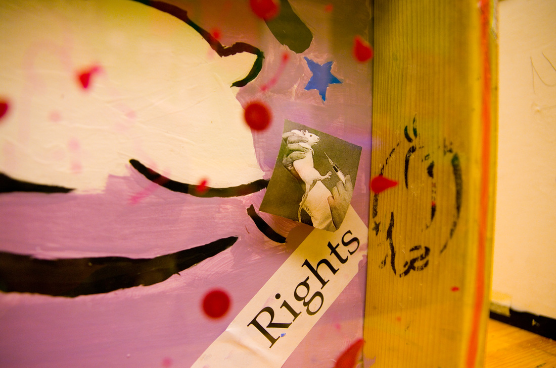
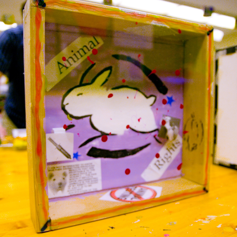
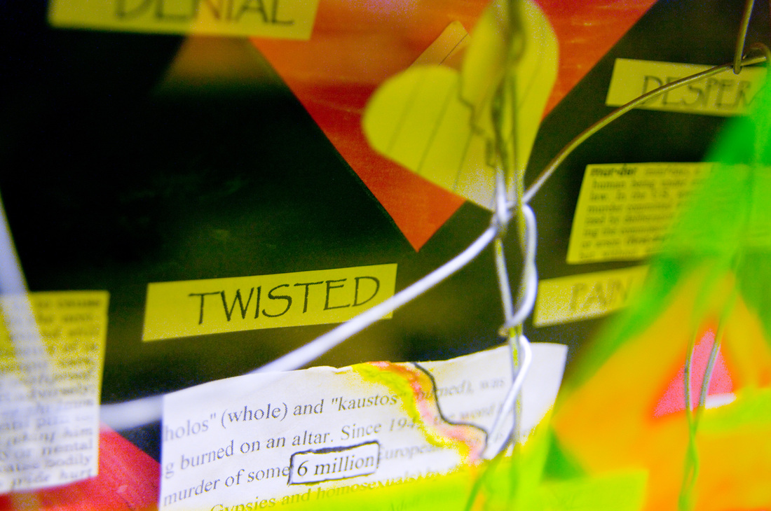
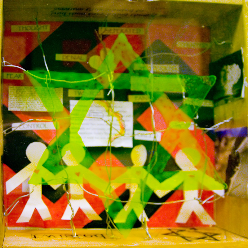
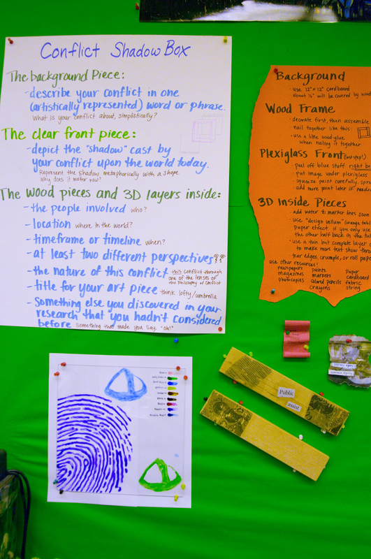
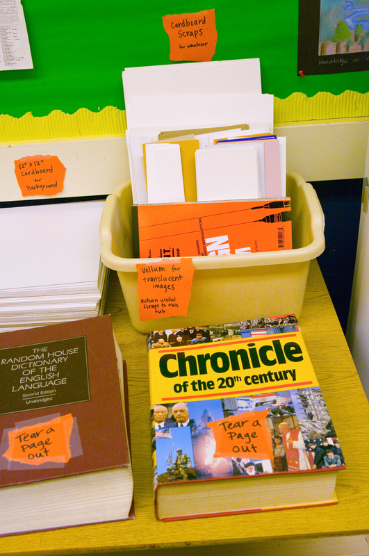
The Background Piece: Describe your conflict in one (artistically represented) word or phrase. What is your conflict about, simplistically?
3D Inside Pieces:
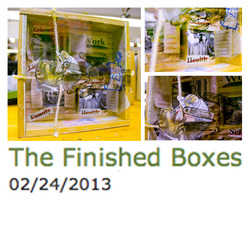
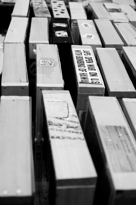
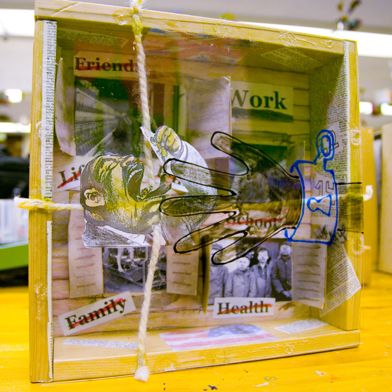
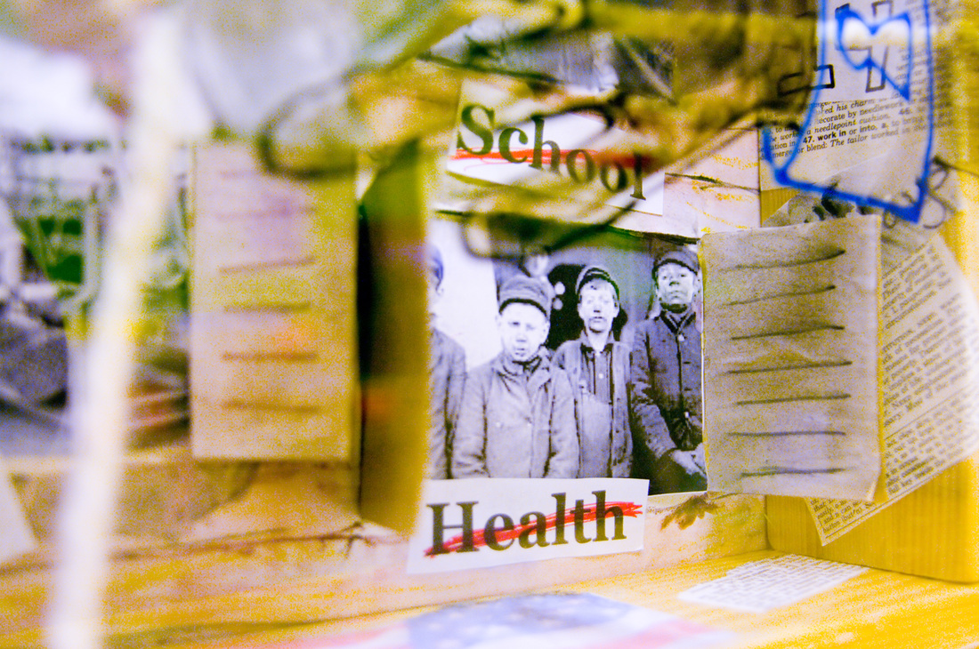
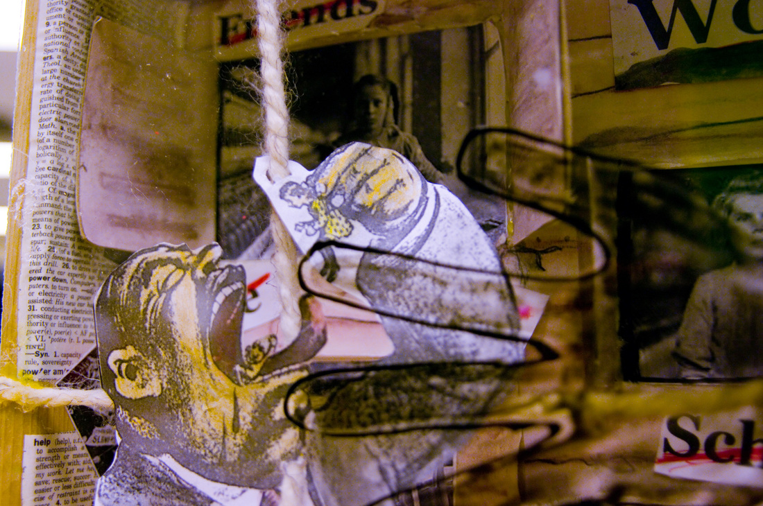
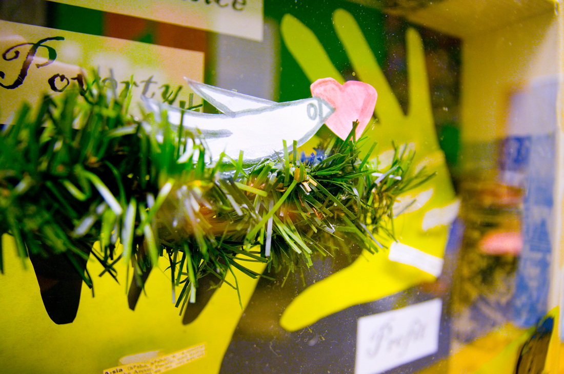
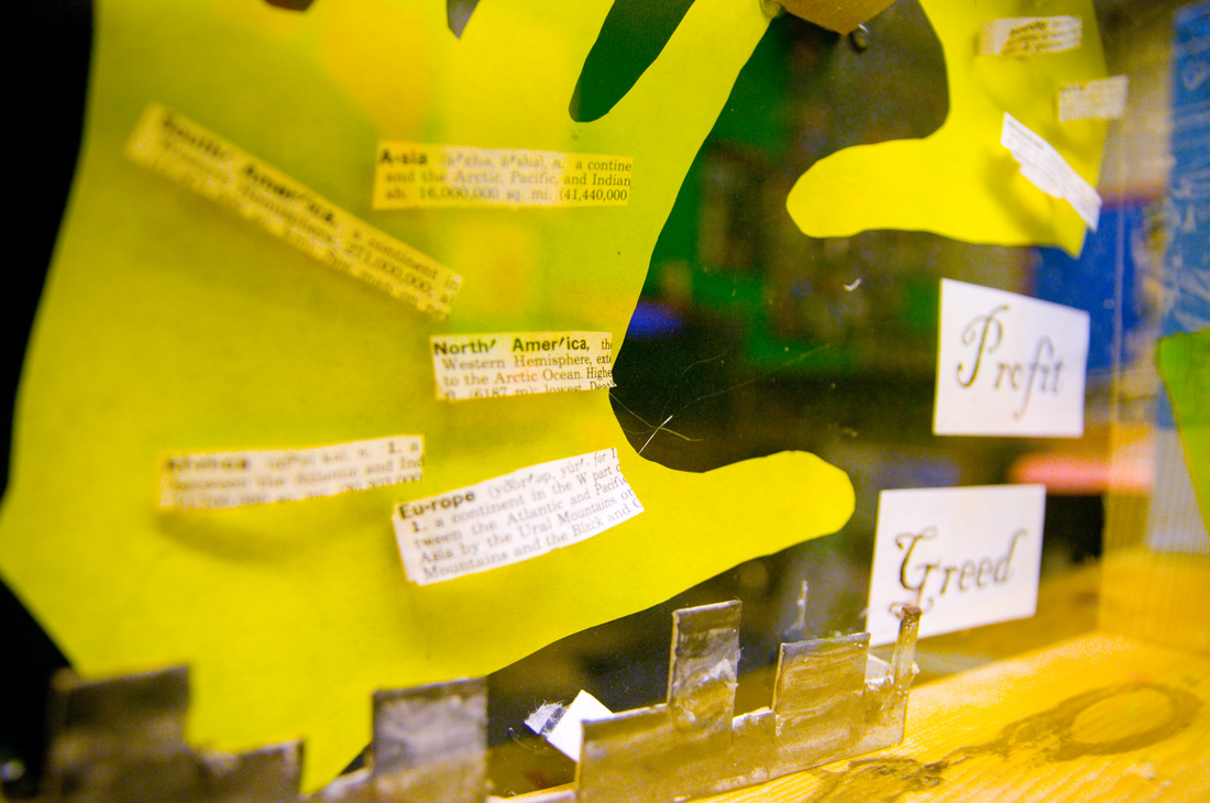
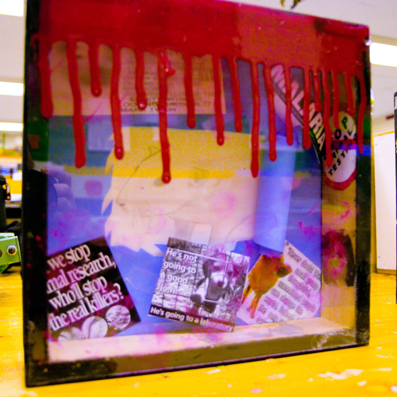
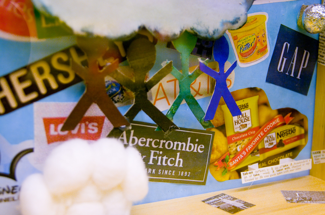
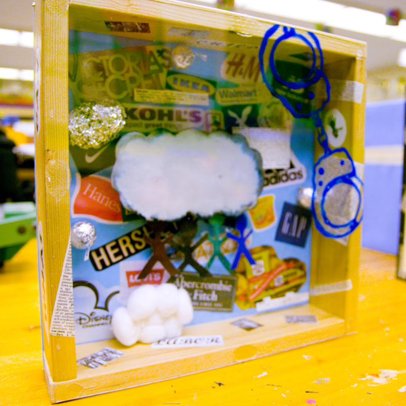
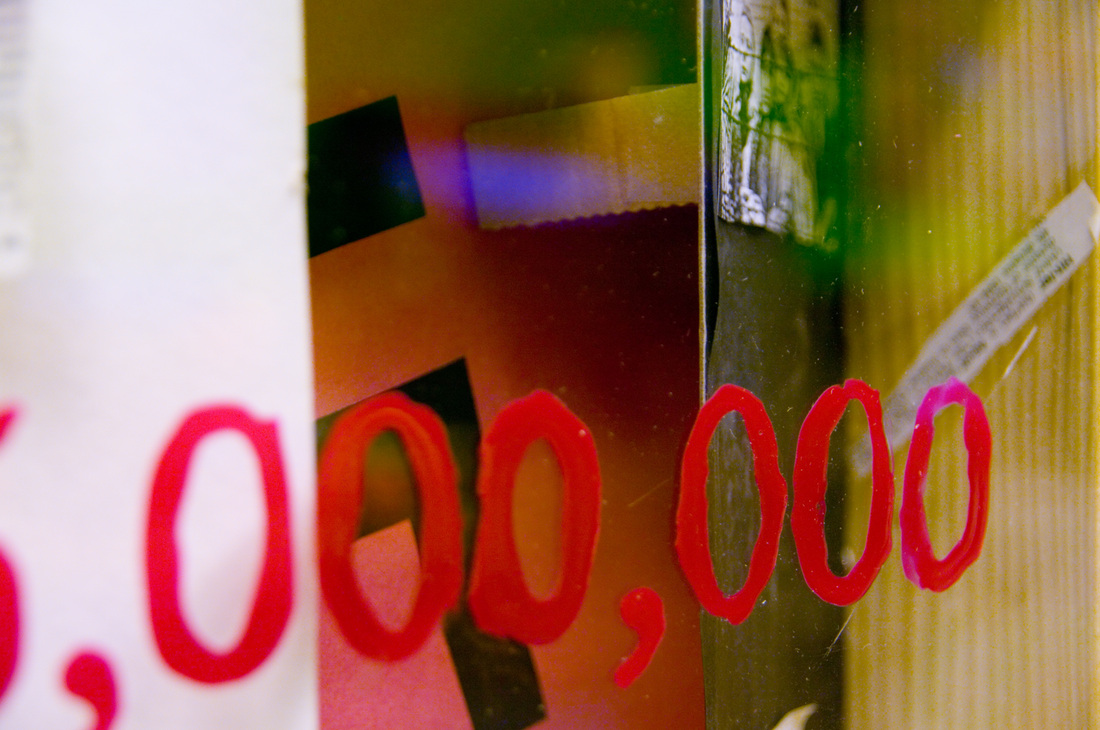
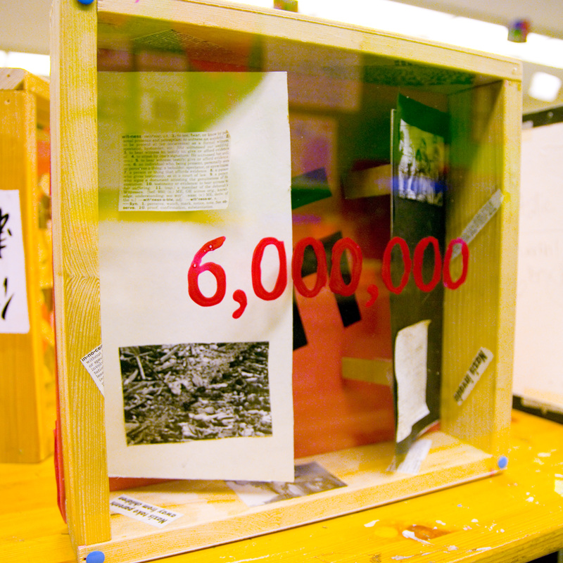
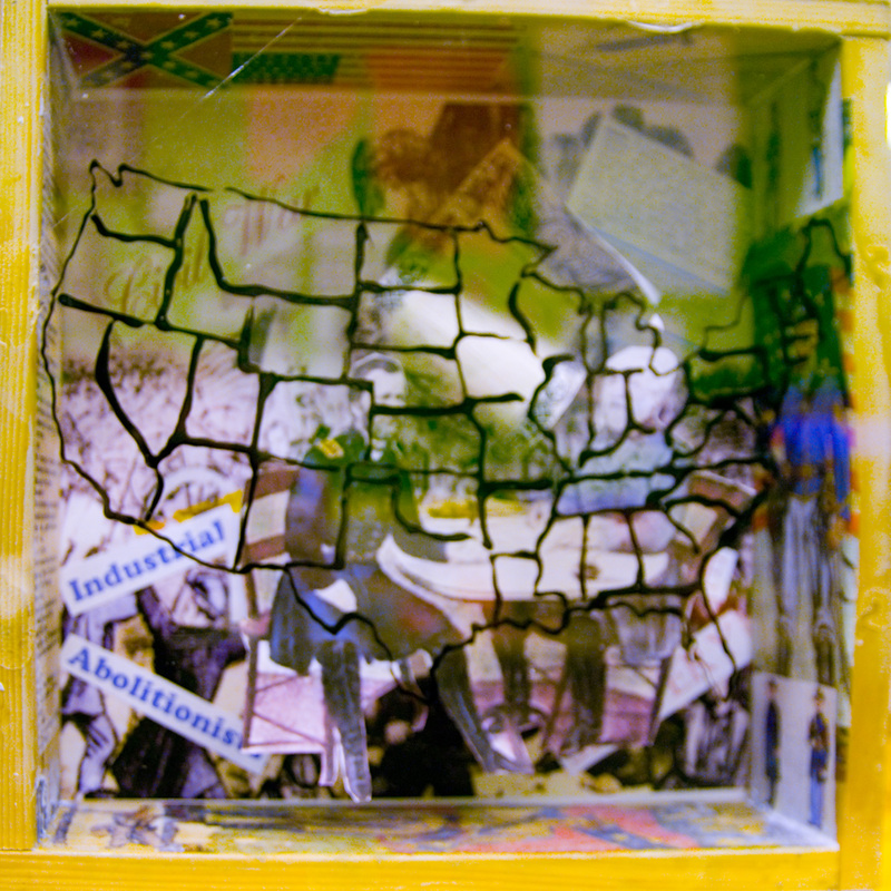
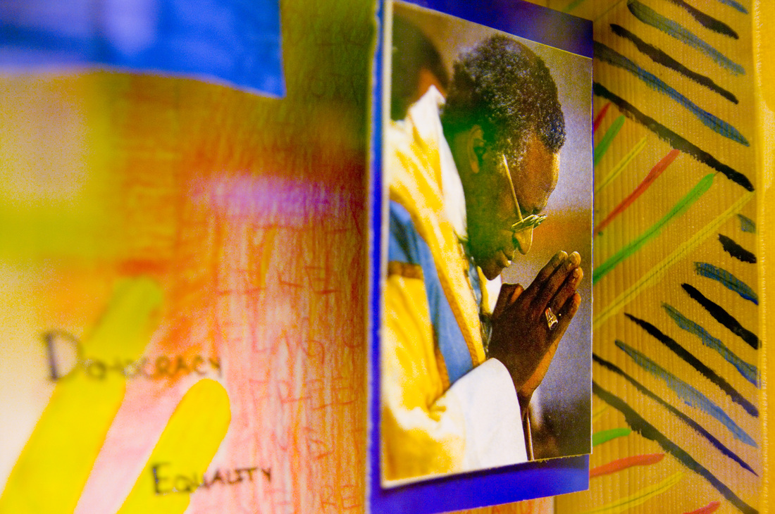
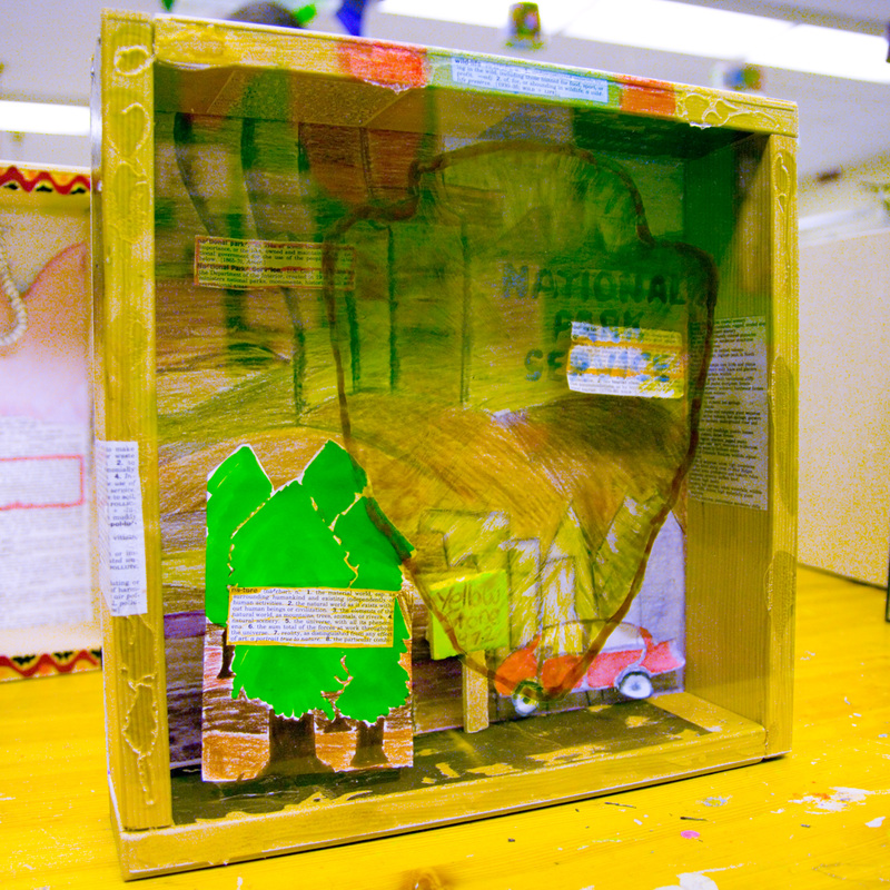
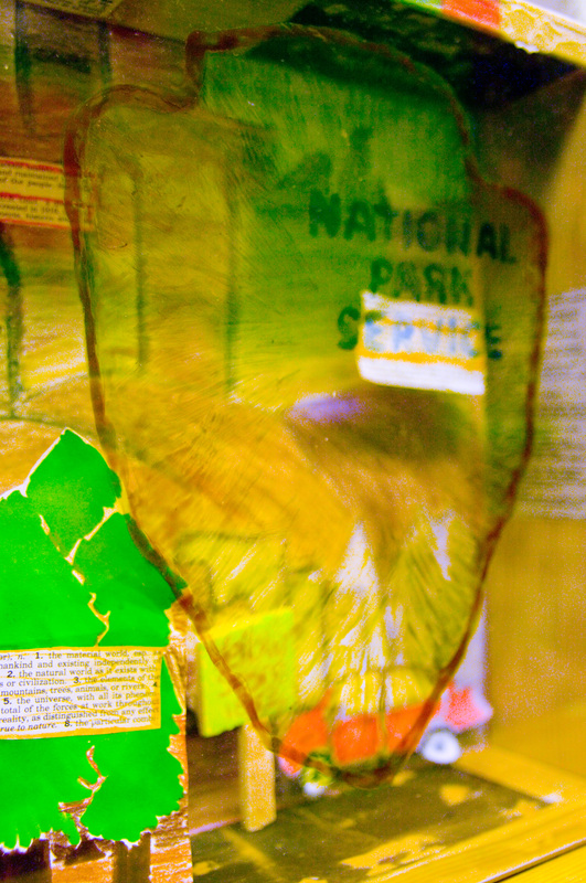
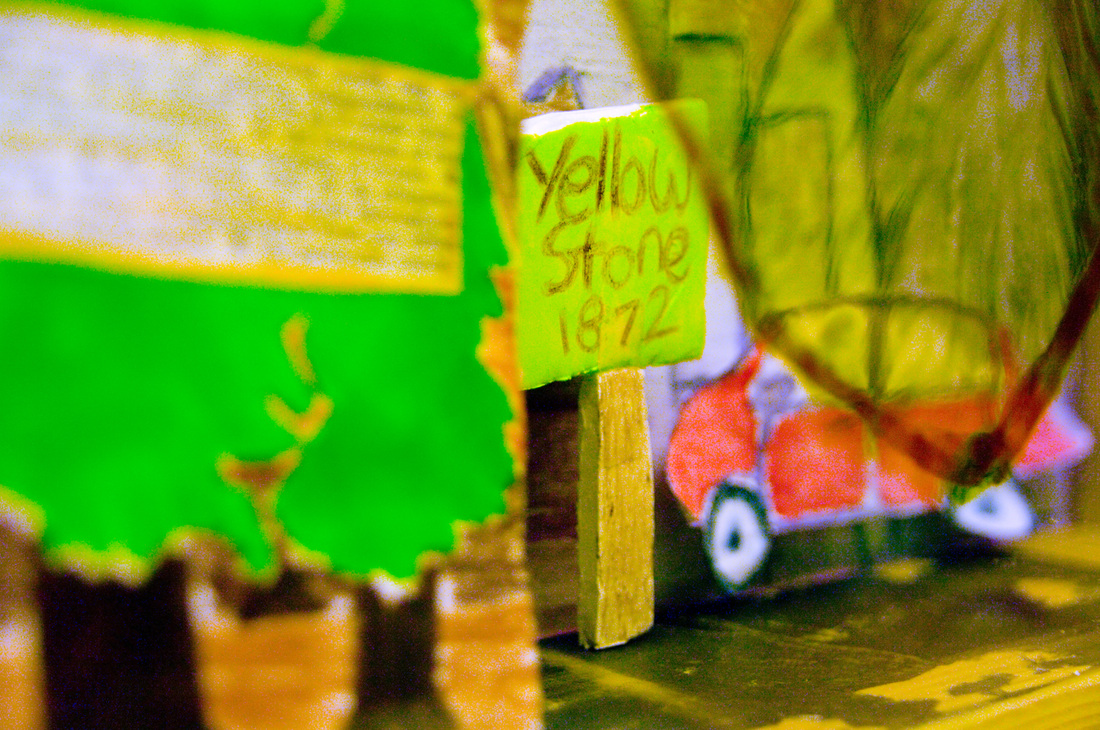
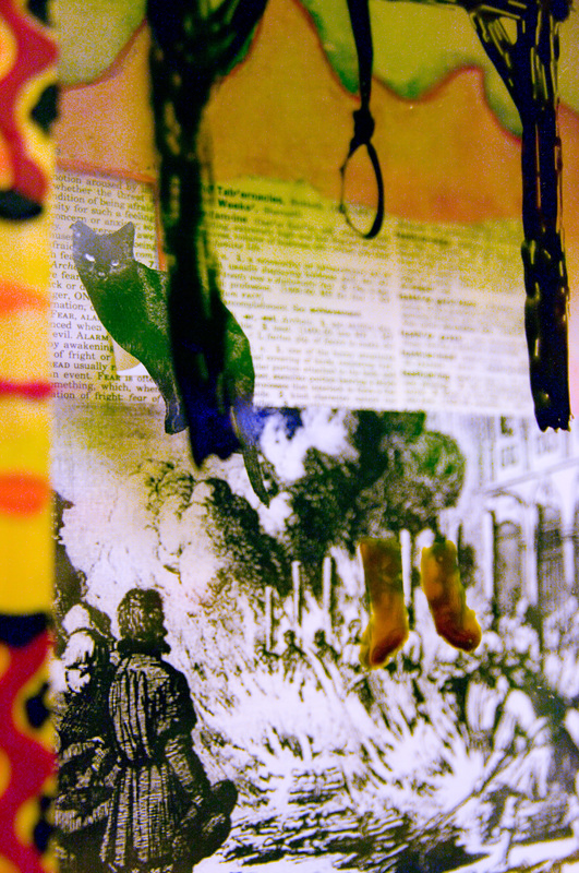
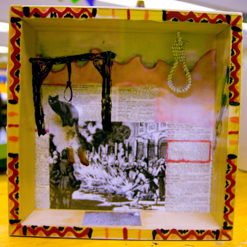
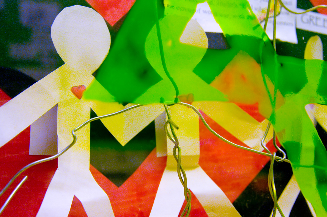
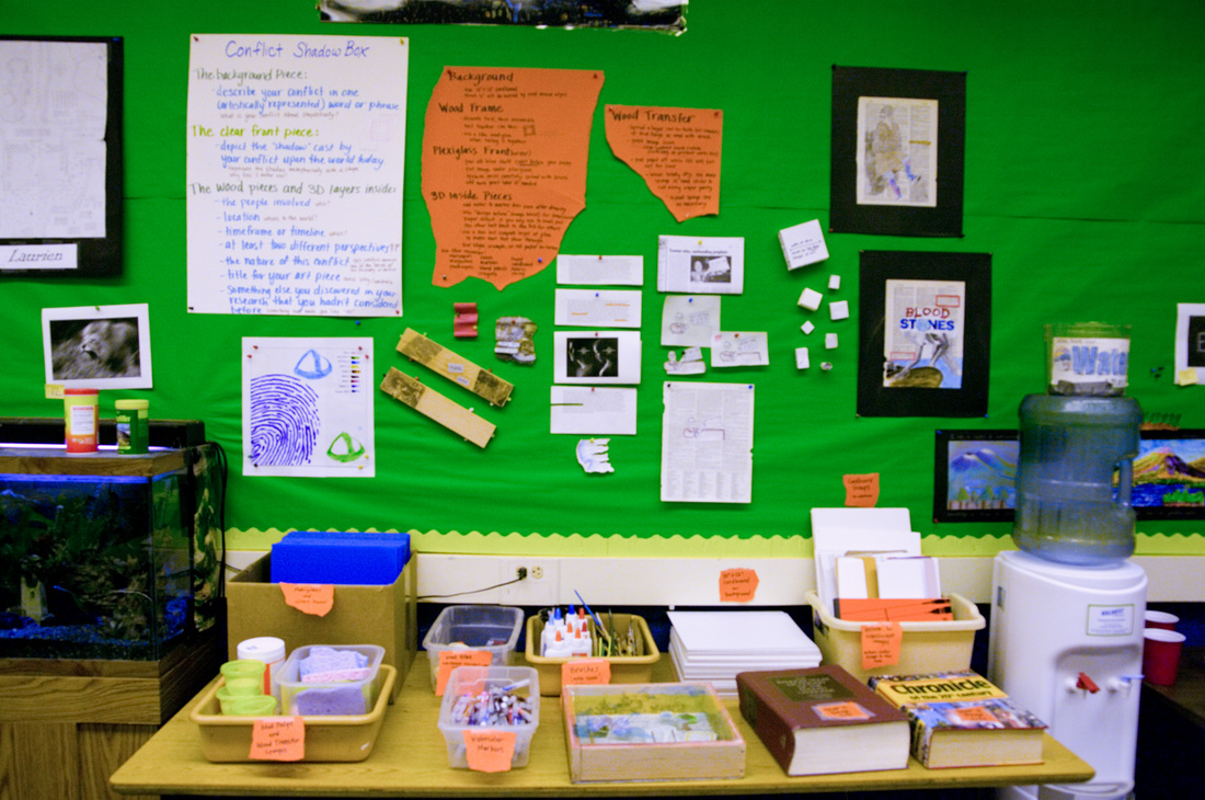
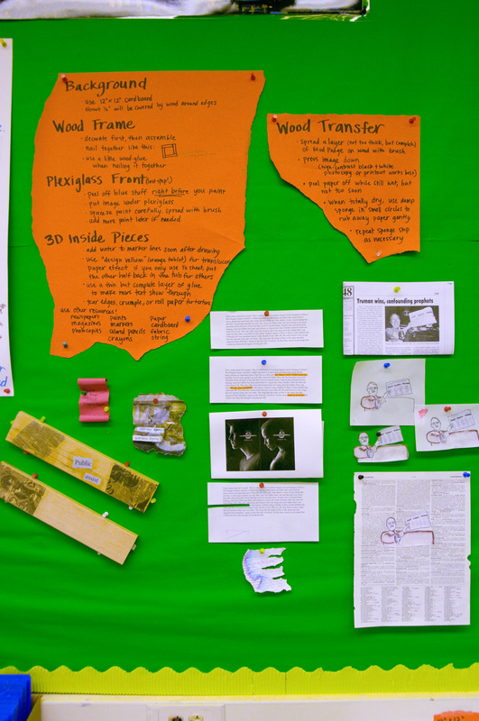
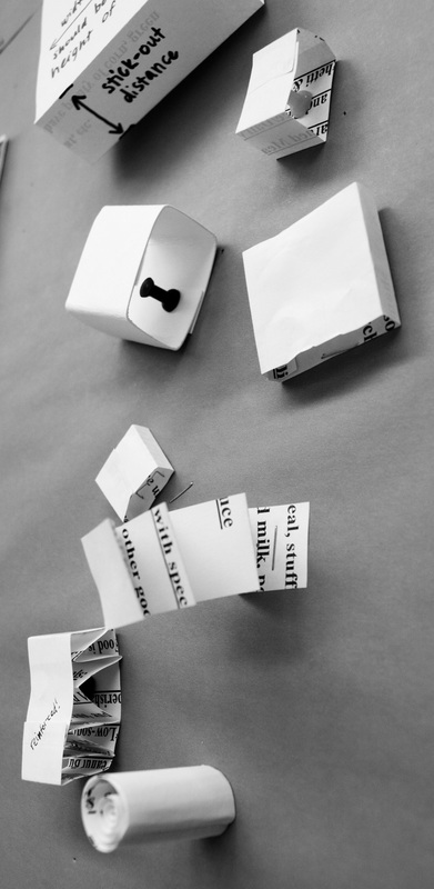
 Time to start creating the shadow boxes! And by "time to start" I of course mean that I'm just now posting this, 11 months later, so the shadow boxes have long been completed and those students aren't even in 7th grade anymore, but anyway... Each student will be creating a shadow box to showcase elements of their chosen conflict. The boxes will be made of wood, about 3 inches deep, with a plexi-glass front. All parts of the box (ideally) will be decorated with important people, places, dates, and ideas that relate to their conflict. While I was available, I was able to give the students techniques that would help them create dynamic, layered, 3-dimensional pieces to go inside their boxes.
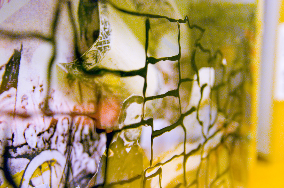
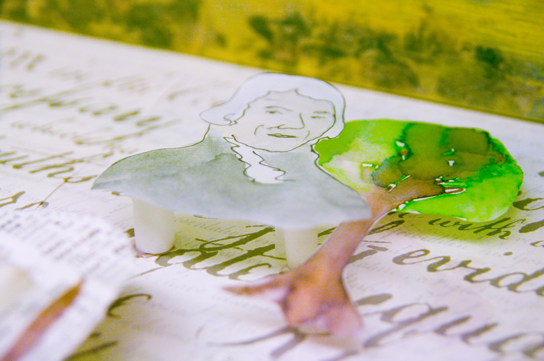
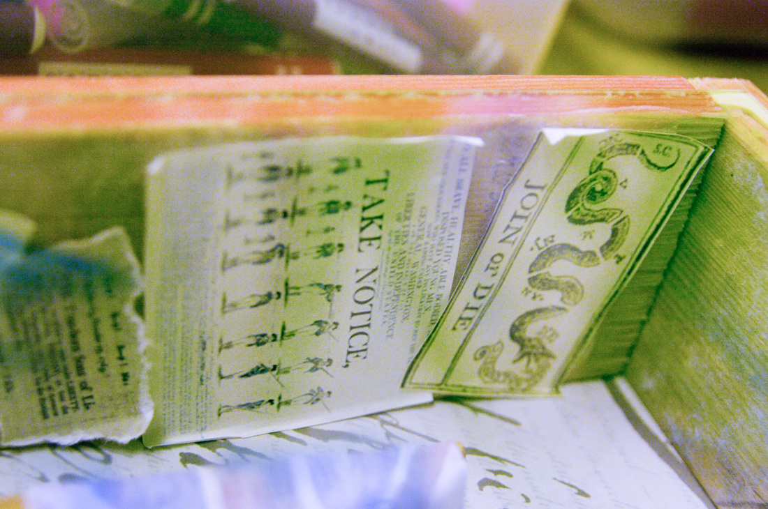
My shadow box was on the American Revolution (below). I created several paper examples of how to make 3-dimensional elements and left them on the project wall for students to inspect at their leisure. I used several of these techniques in my shadow box.
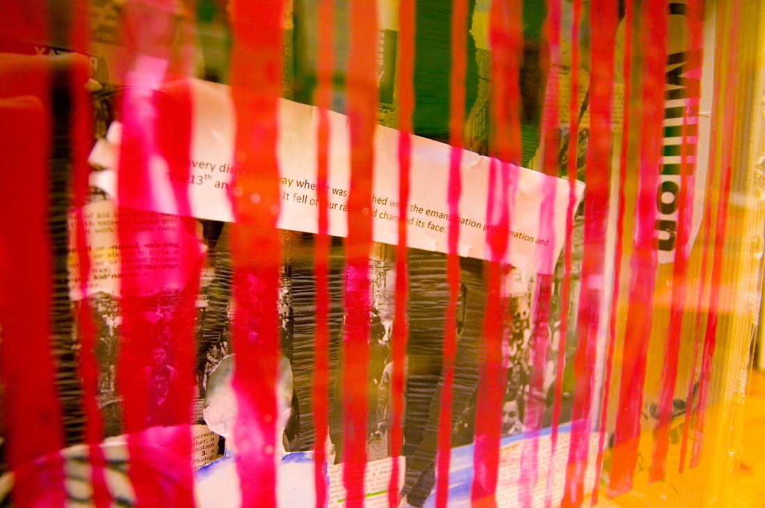
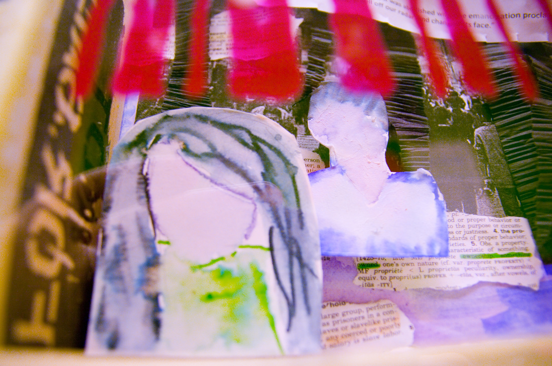
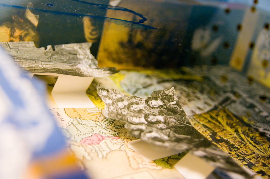
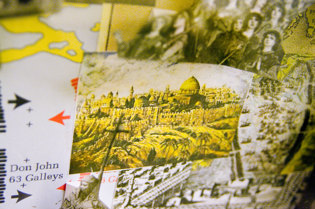
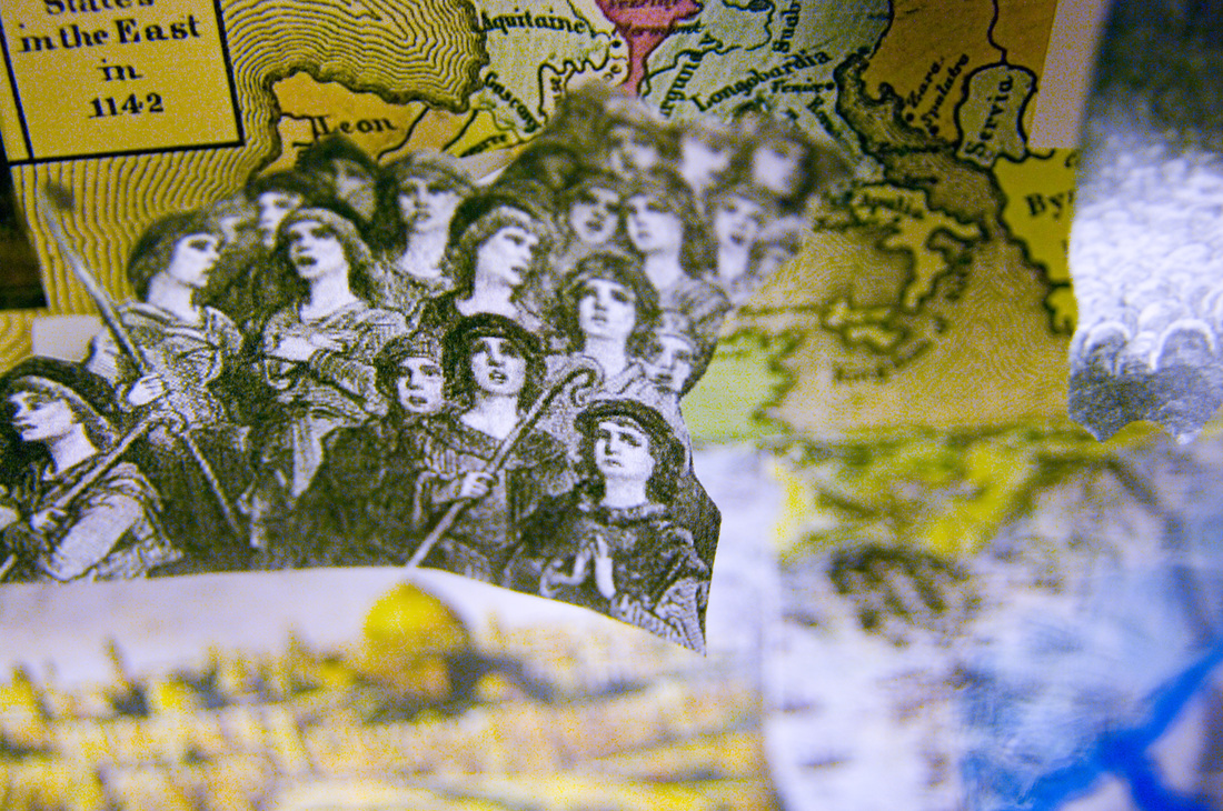
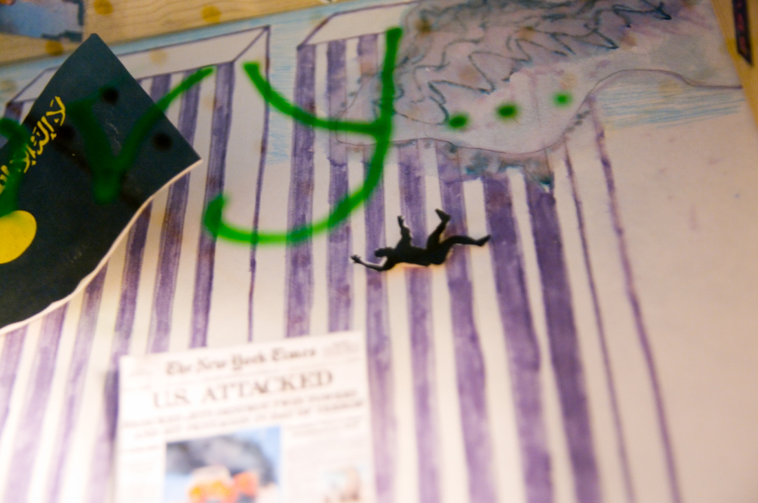
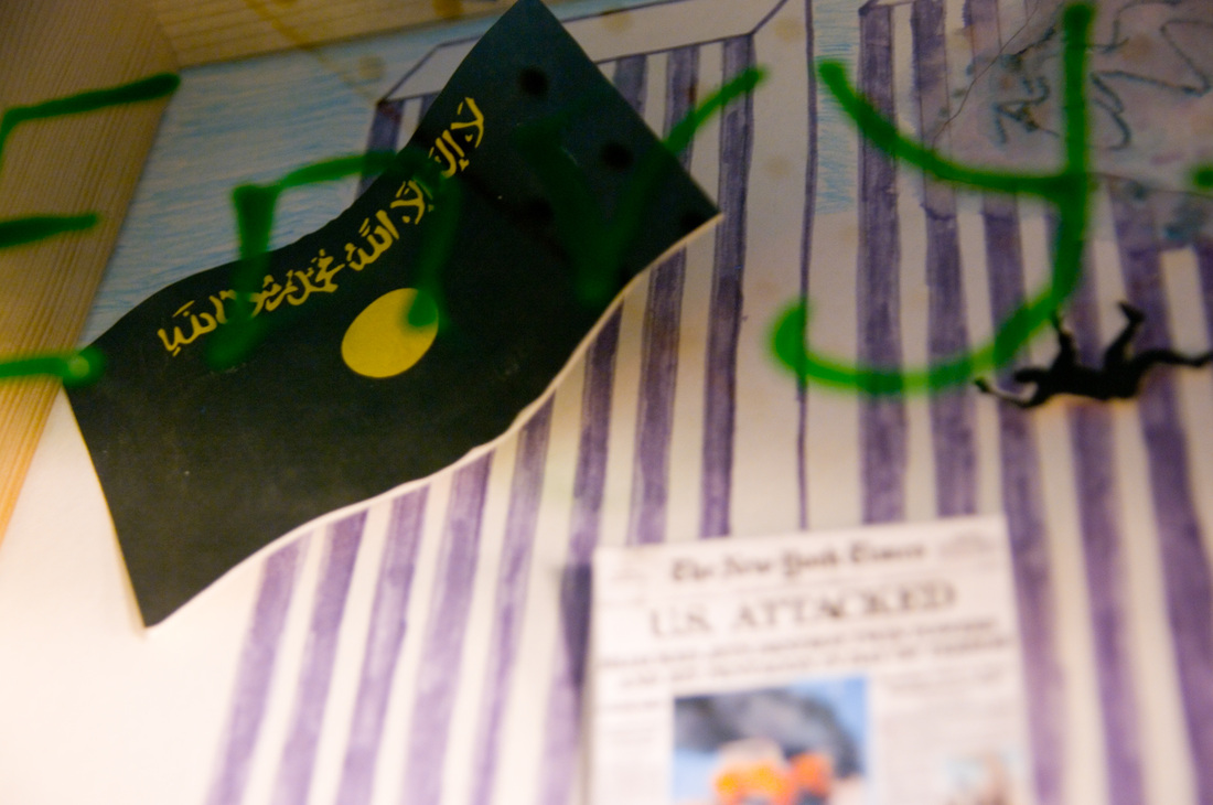
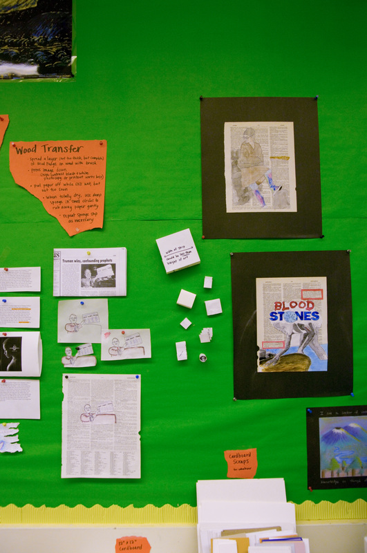
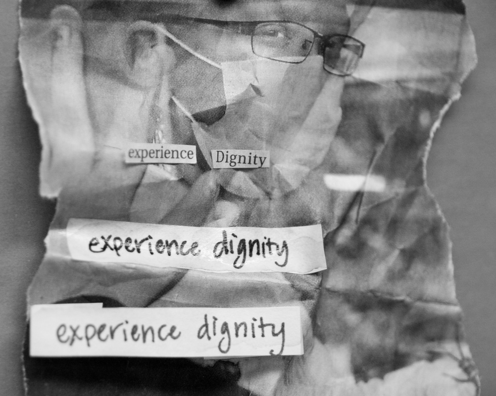
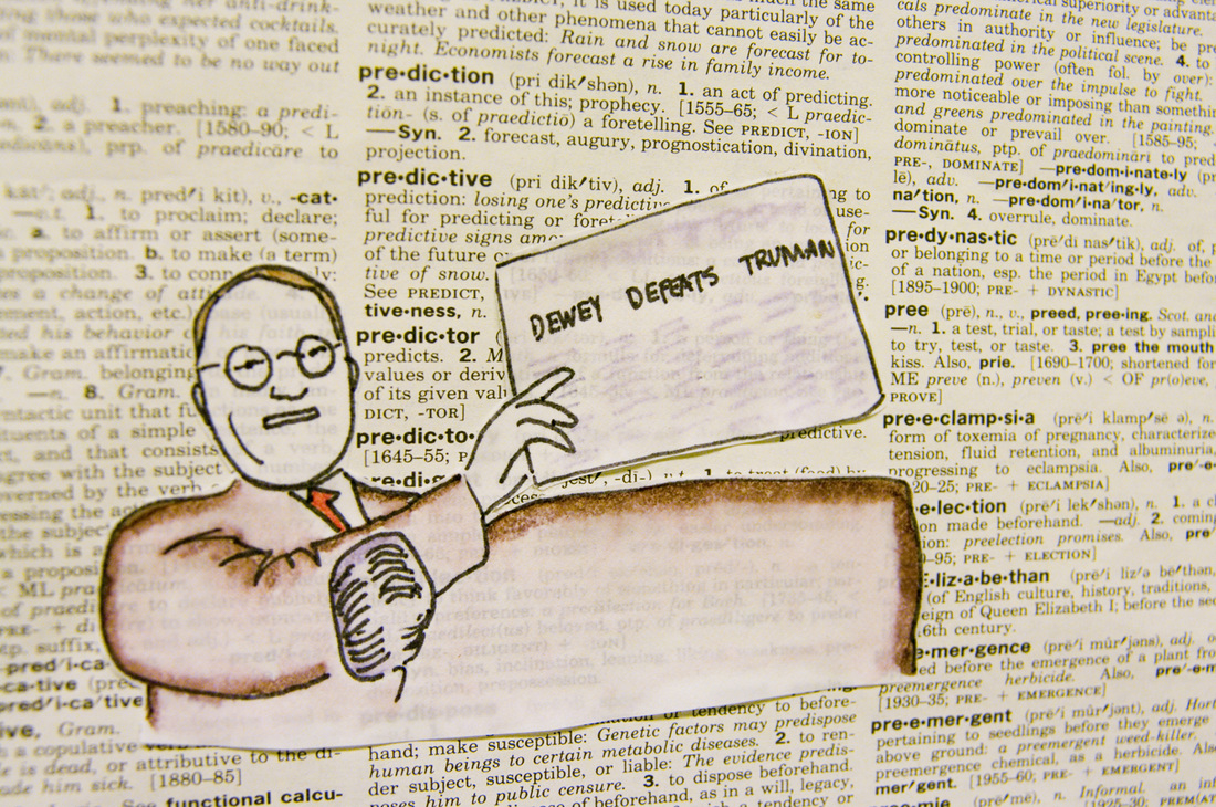
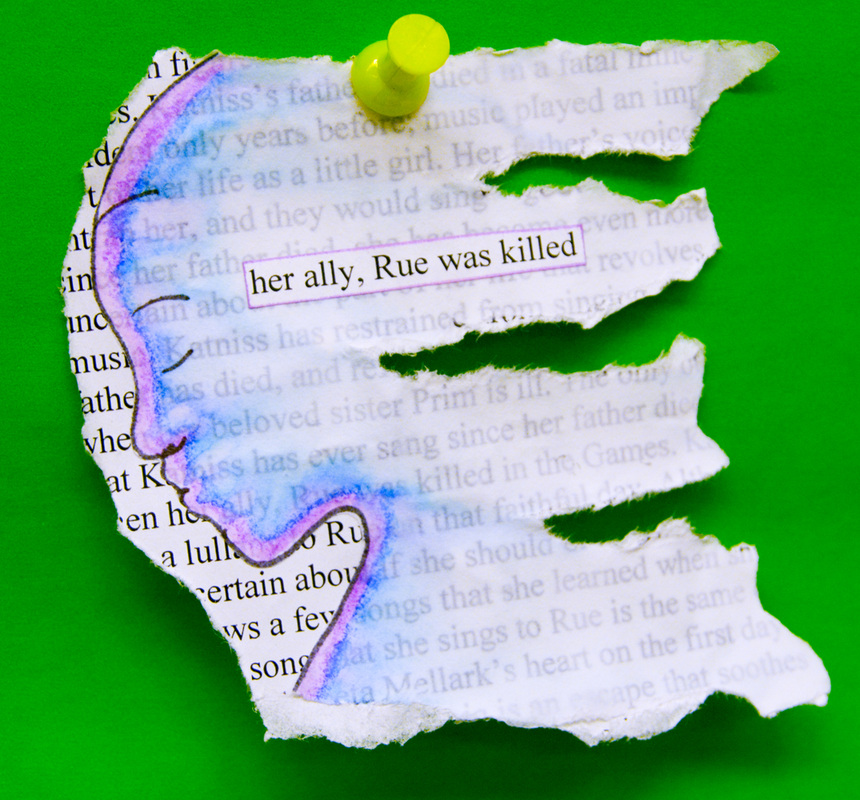
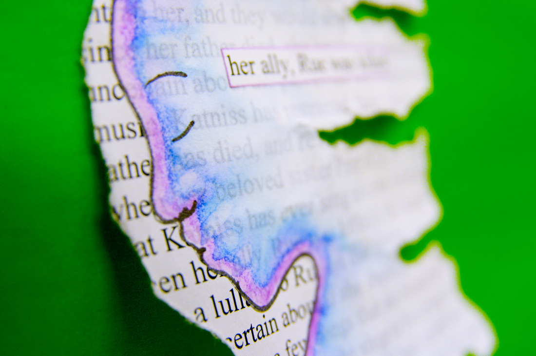
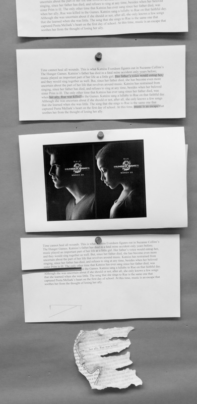
Layering images was an important part of this project. For this technique, we used watercolor markers and sharpies to create a basic image, and then bled the marker lines with wet paintbrushes to create a watercolor effect. These translucent images were then glued to related text from old history books or dictionary pages. This is similar to the conflict project from last year. With each example I demonstrated, I felt like I was on a cooking show: I would mix the ingredients and put it into the oven and then look, it's already done! I needed an example of each stage of the technique ready to show the students so we wouldn't have to spend time watching paint or glue dry. In the end, this proved doubly useful, because I could showcase all steps of the technique on the project wall for students to see.
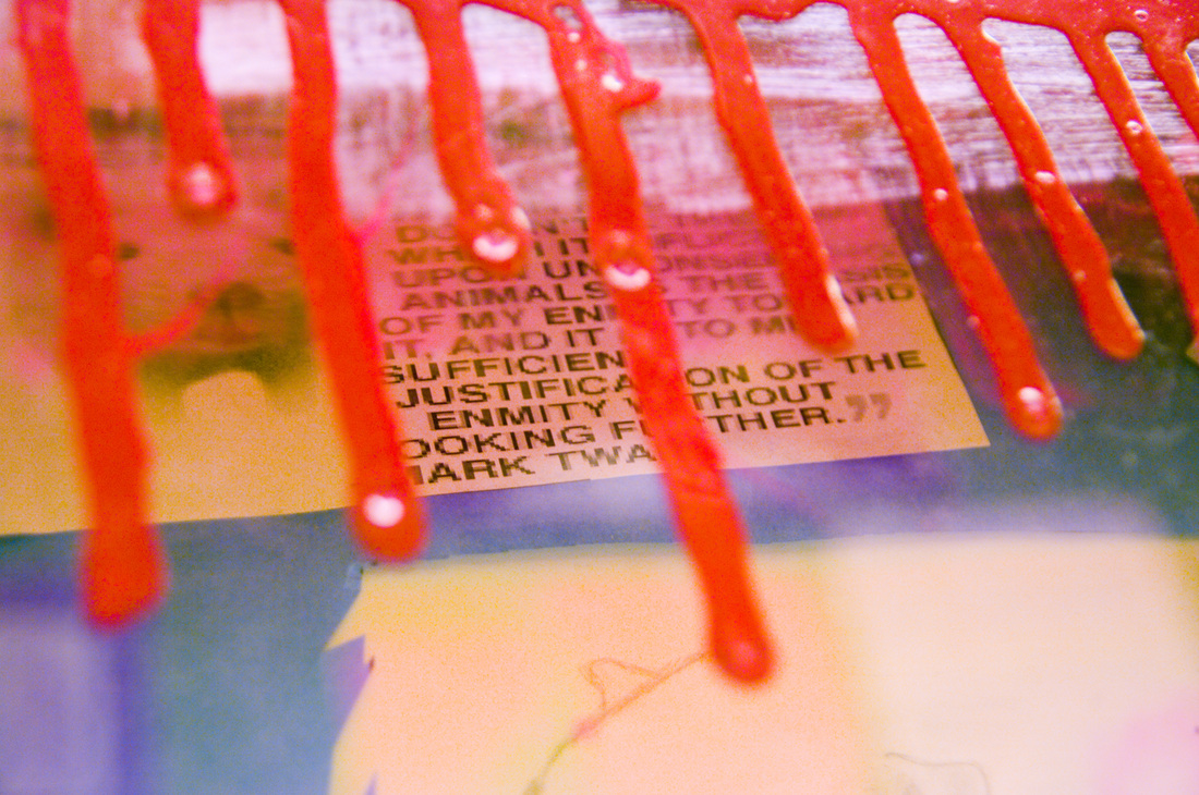
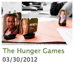
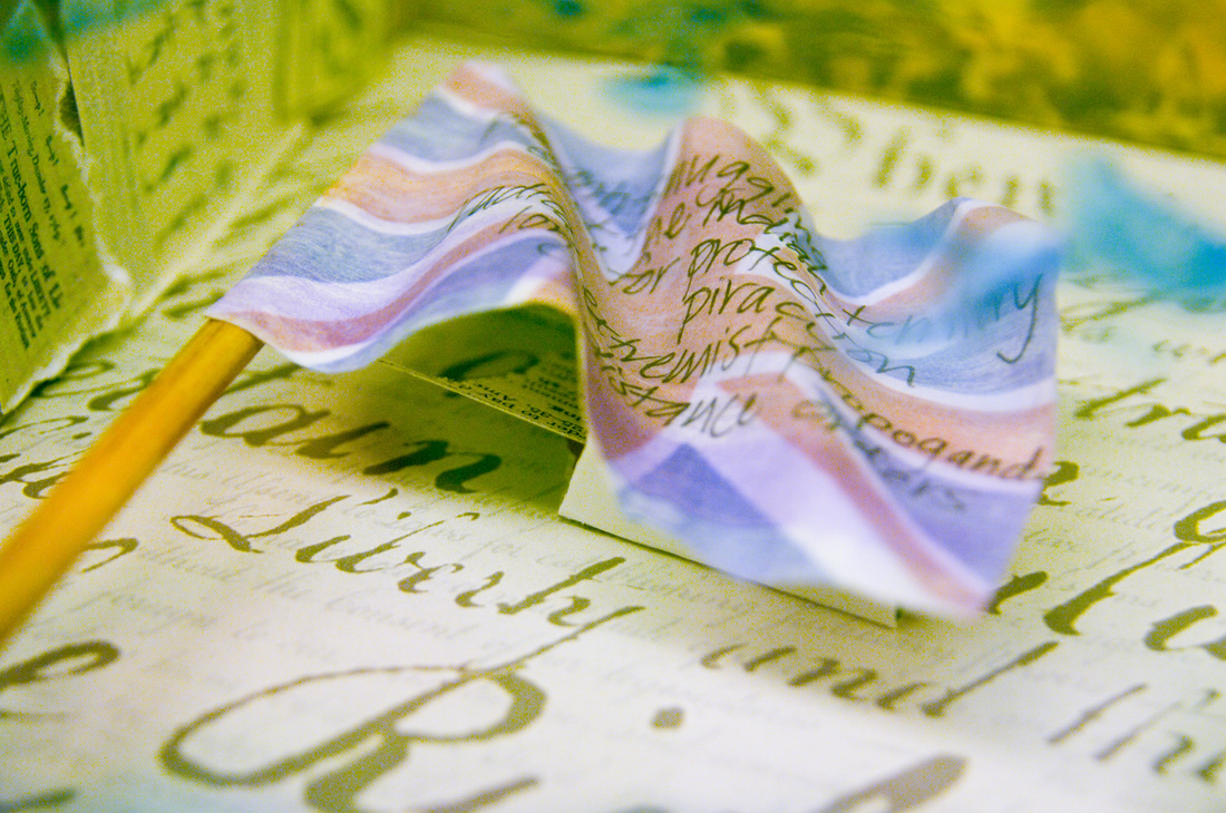
This was my favorite example piece that I did. I wanted to show students that their own words could be used to make powerful art. I took a paragraph that a student had written about their Hunger Games project, and created an element that would be effective in a shadow box.
 |
Topics
All
Archives
May 2021
|


 RSS Feed
HOME |
PHOTOGRAPHY COLLECTIONS
|
© COPYRIGHT 2020. ALL RIGHTS RESERVED.
|