
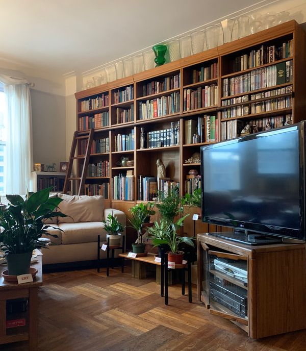
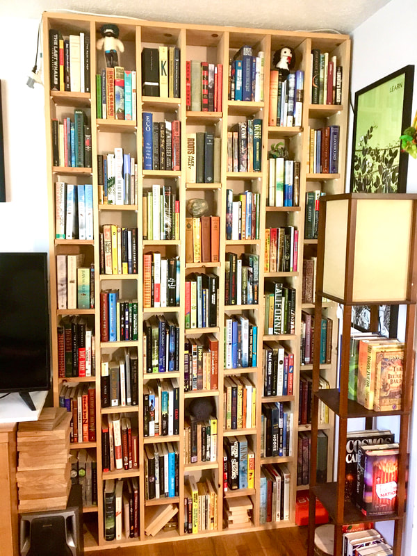
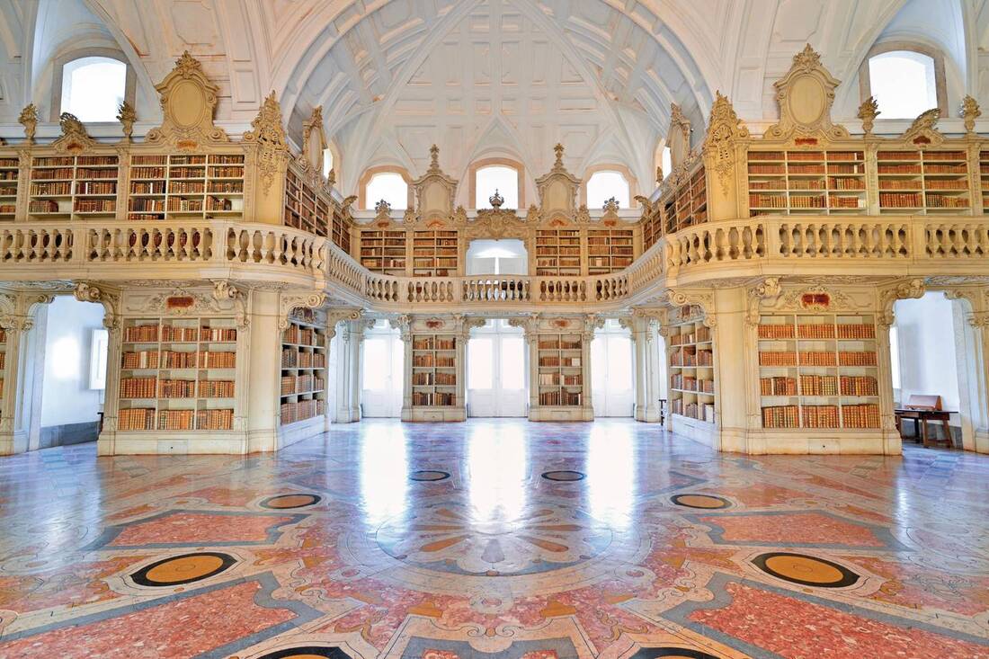
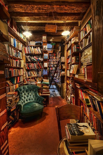
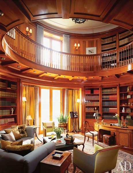
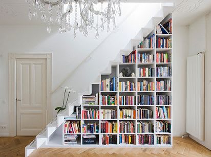
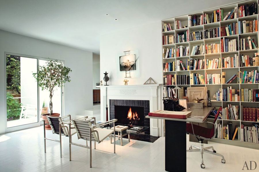
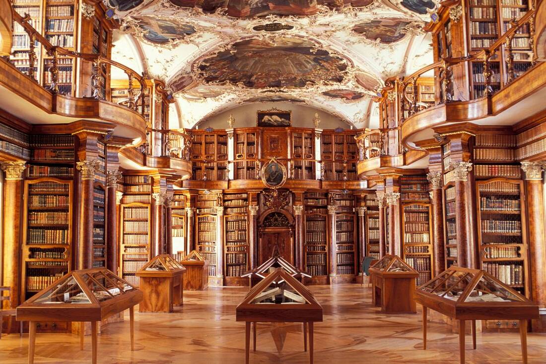
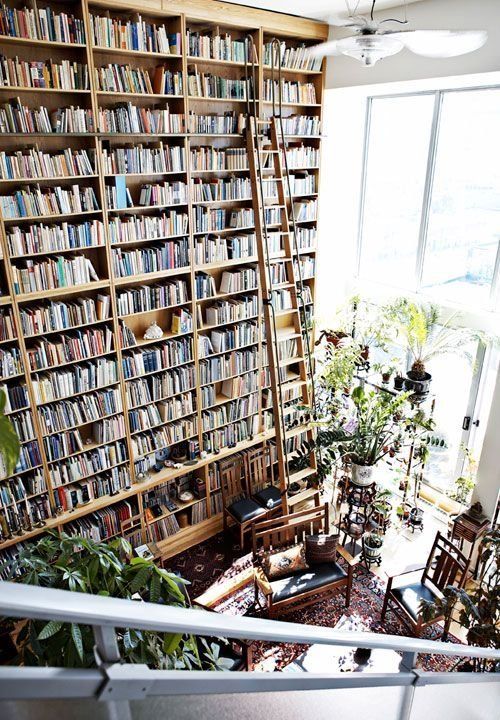
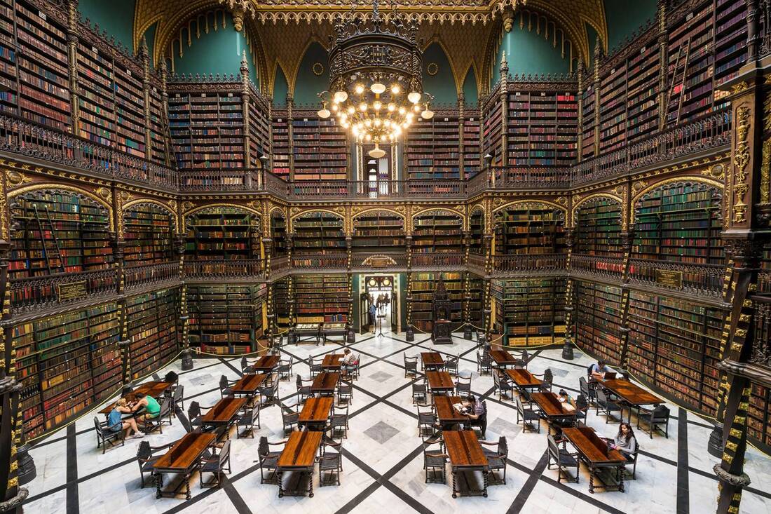
So, what now? Learn from it, I suppose, and continue my never-ending quest to be a better human. This feeling of having hurt someone, even accidentally, is terrible. Zero stars. Do not recommend. But that feeling is important, because it will ultimately cause lasting behavior change. If causing harm to others didn't make us feel bad, where is the incentive to change? Is that all there is to caring about other people? Are there people who never feel this way? Maybe I don't want to know. I do know that there are those who avoid this guilty feeling, not by changing their actions, but by denying that their actions were a problem in the first place, by taking offense to anyone drawing attention to the fact that they might have done something wrong. If you've never done anything wrong, you can't feel bad about it, right? I can relate. My own self-image includes the assertion that I am not, in fact, a jerk. If someone provides evidence that I might be a jerk, my instinct is to resist, deny, rebut. You just don't know me well enough yet! Look at all these ways I'm not a jerk! It takes practice to sit in that discomfort, acknowledge its presence, and see that the way through it is in realizing that we are all works-in-progress. My goal is to not be a jerk, but my actions have shown that I am not there yet. I am occasionally, unintentionally, still a jerk. Maybe I'll never completely get there, but today I have learned how to be one step closer to non-jerkitude. I am grateful for the lesson. I've always been a sucker for beautifully displayed books, and cozy spaces in which to enjoy them. For World Book Day, book enthusiast (among other things), Rachel Miner tweeted: along with photos of her beautiful bookshelves and cozy reading space.
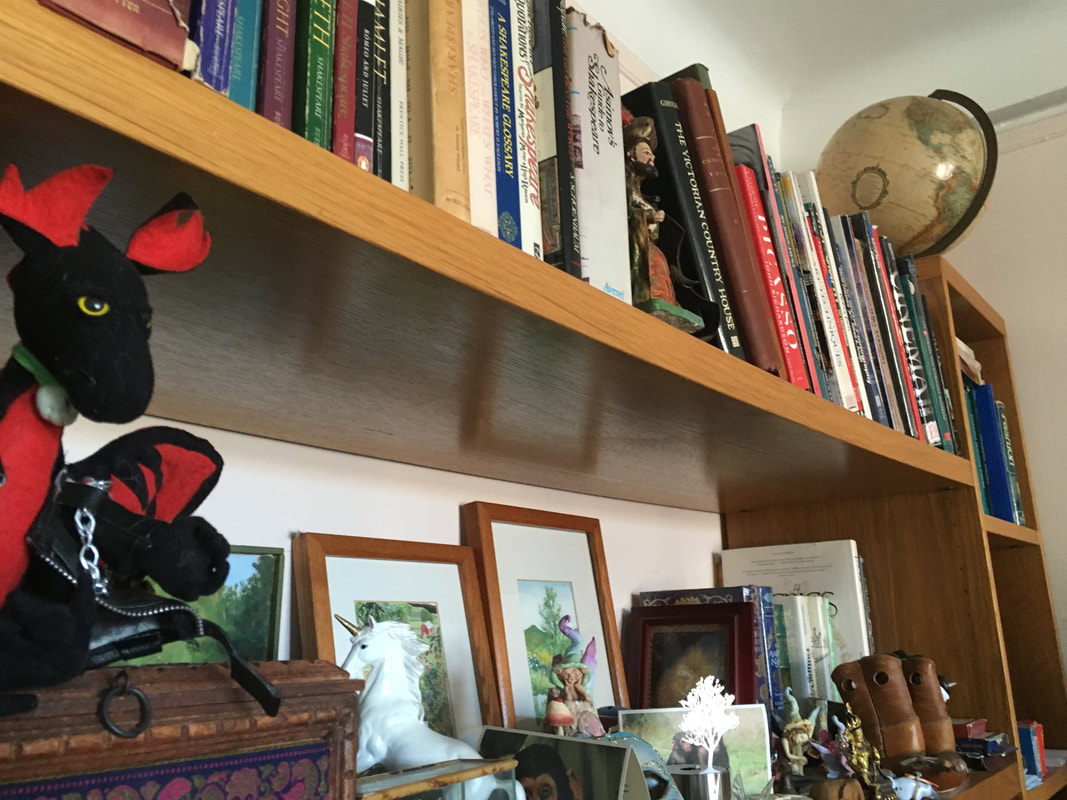
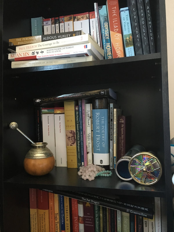
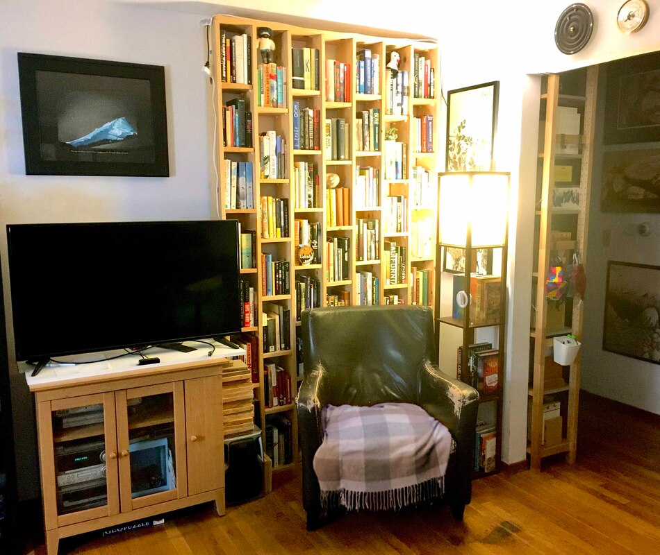
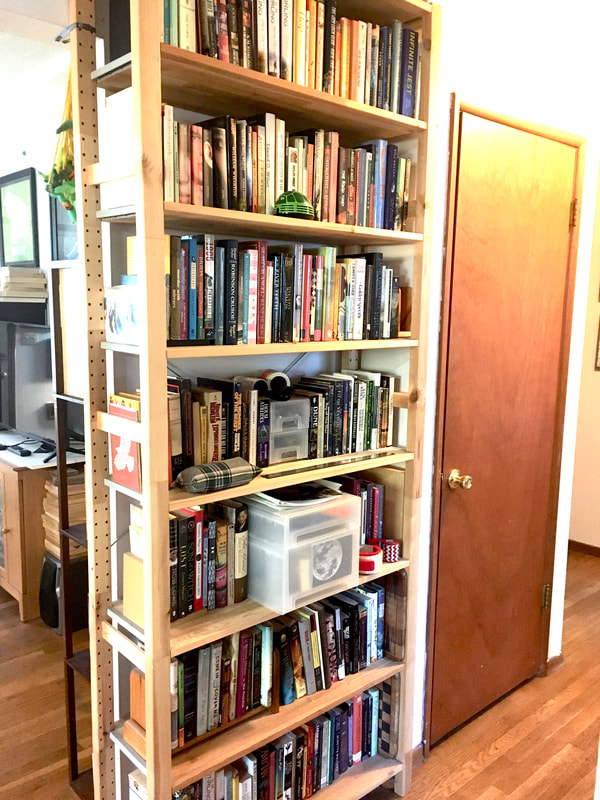
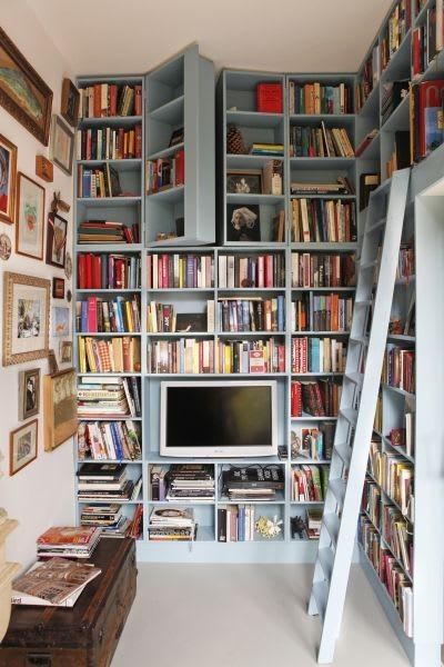
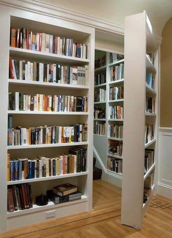
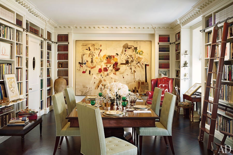
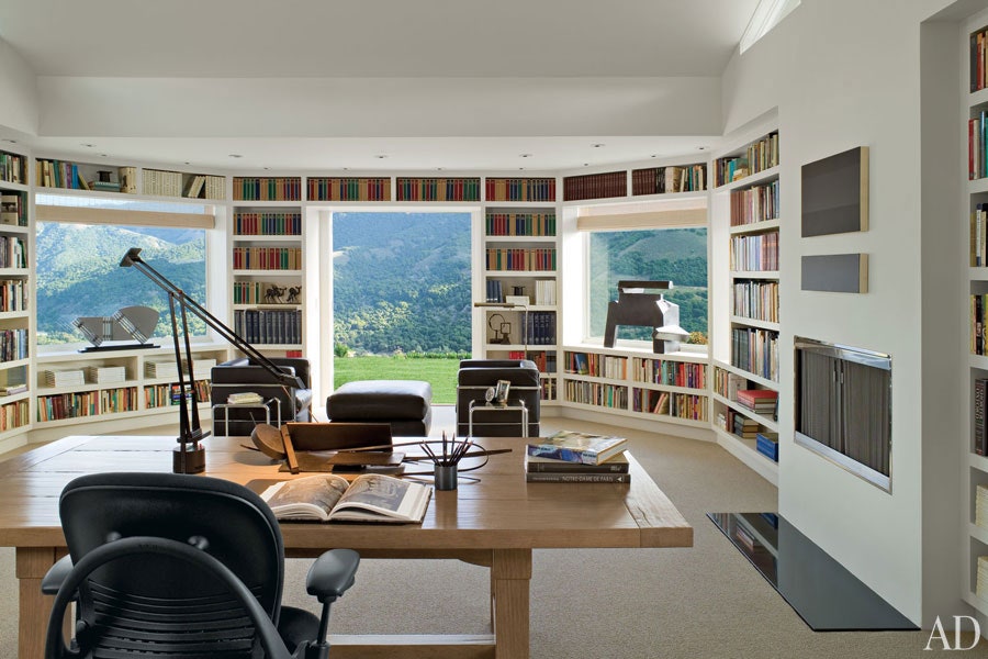
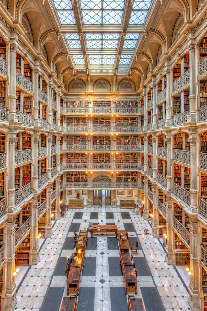
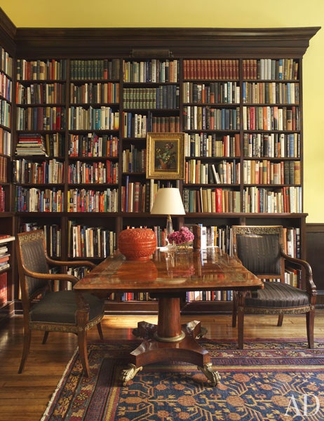
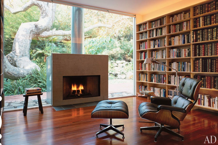
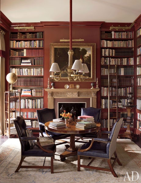
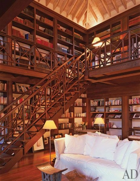
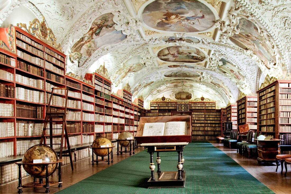
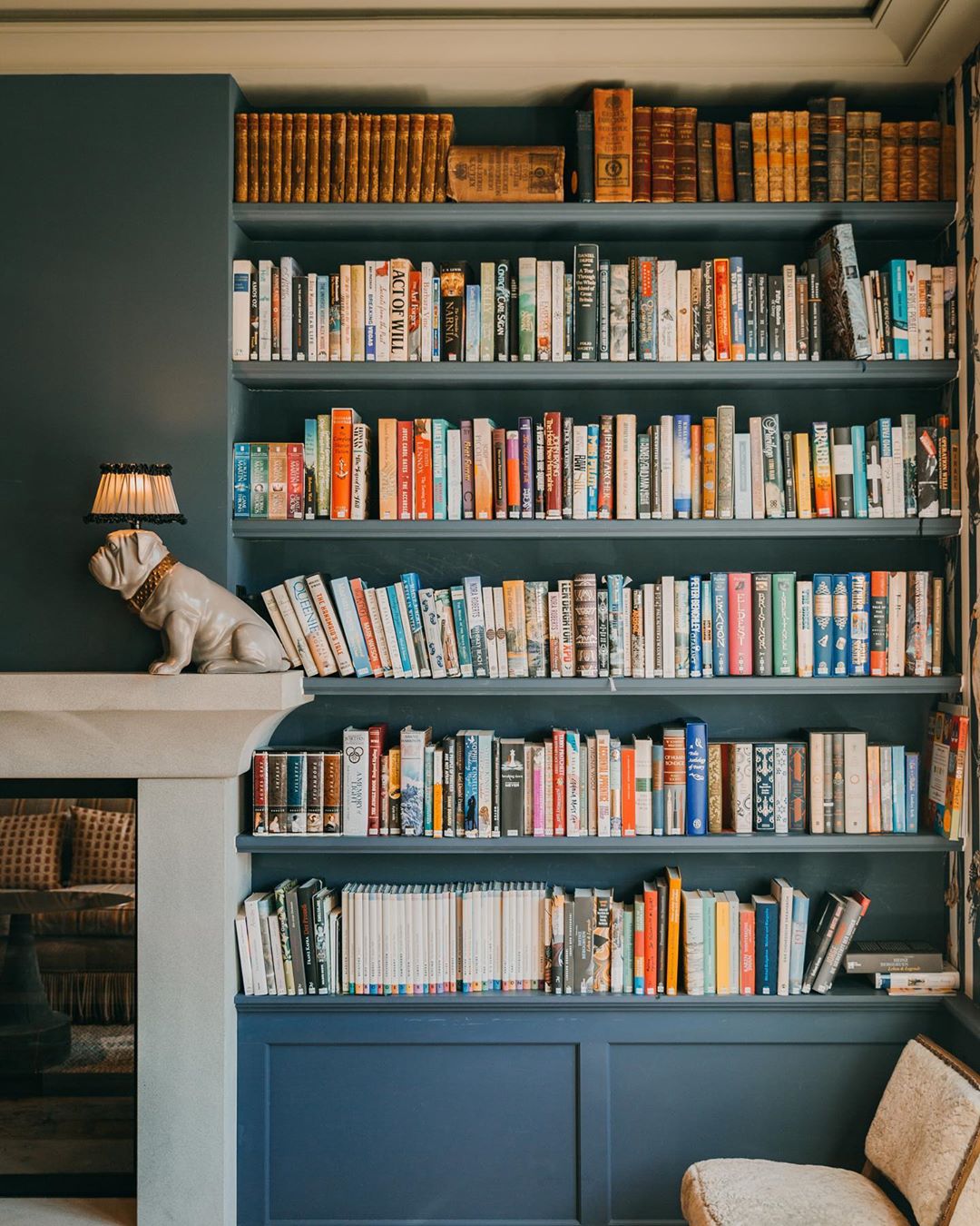
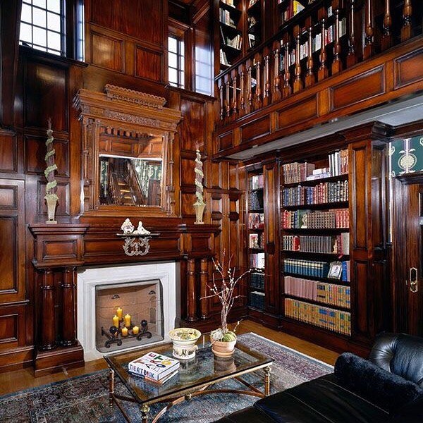
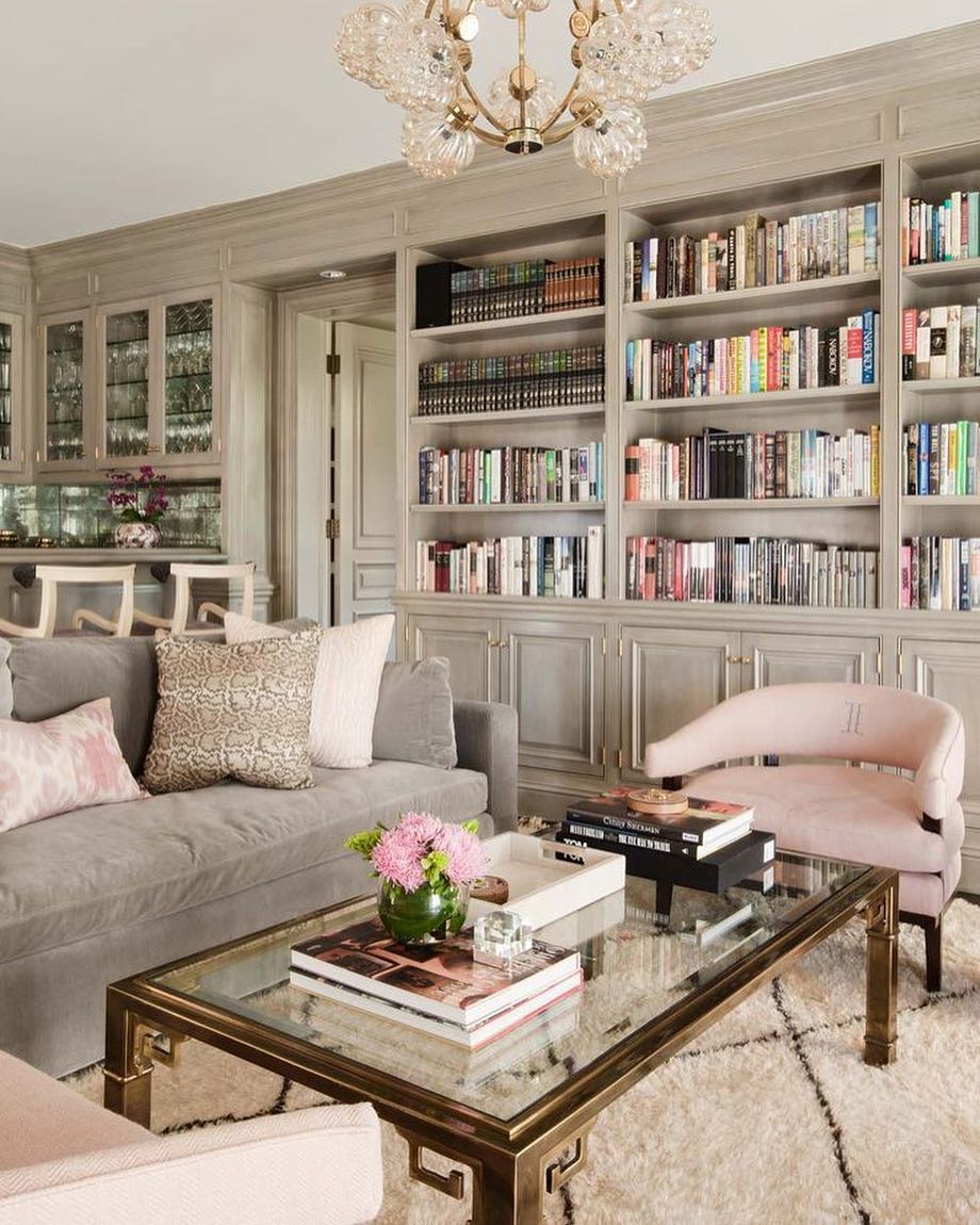
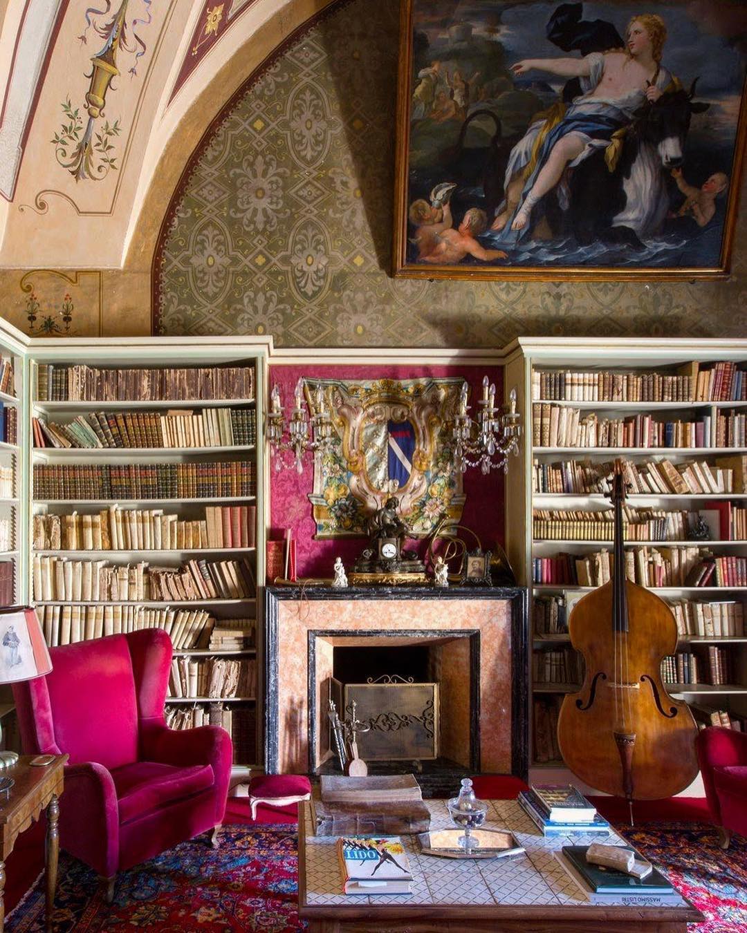
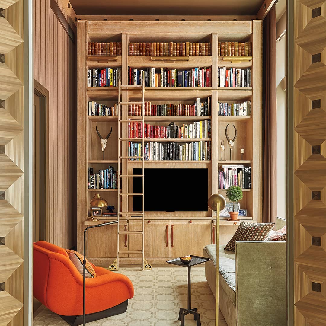
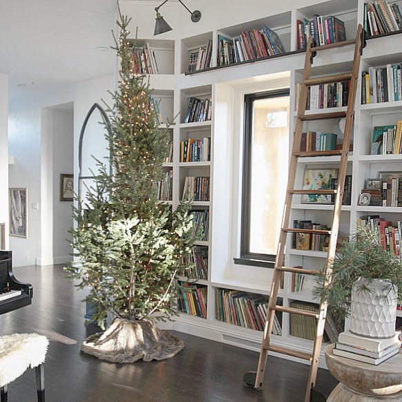
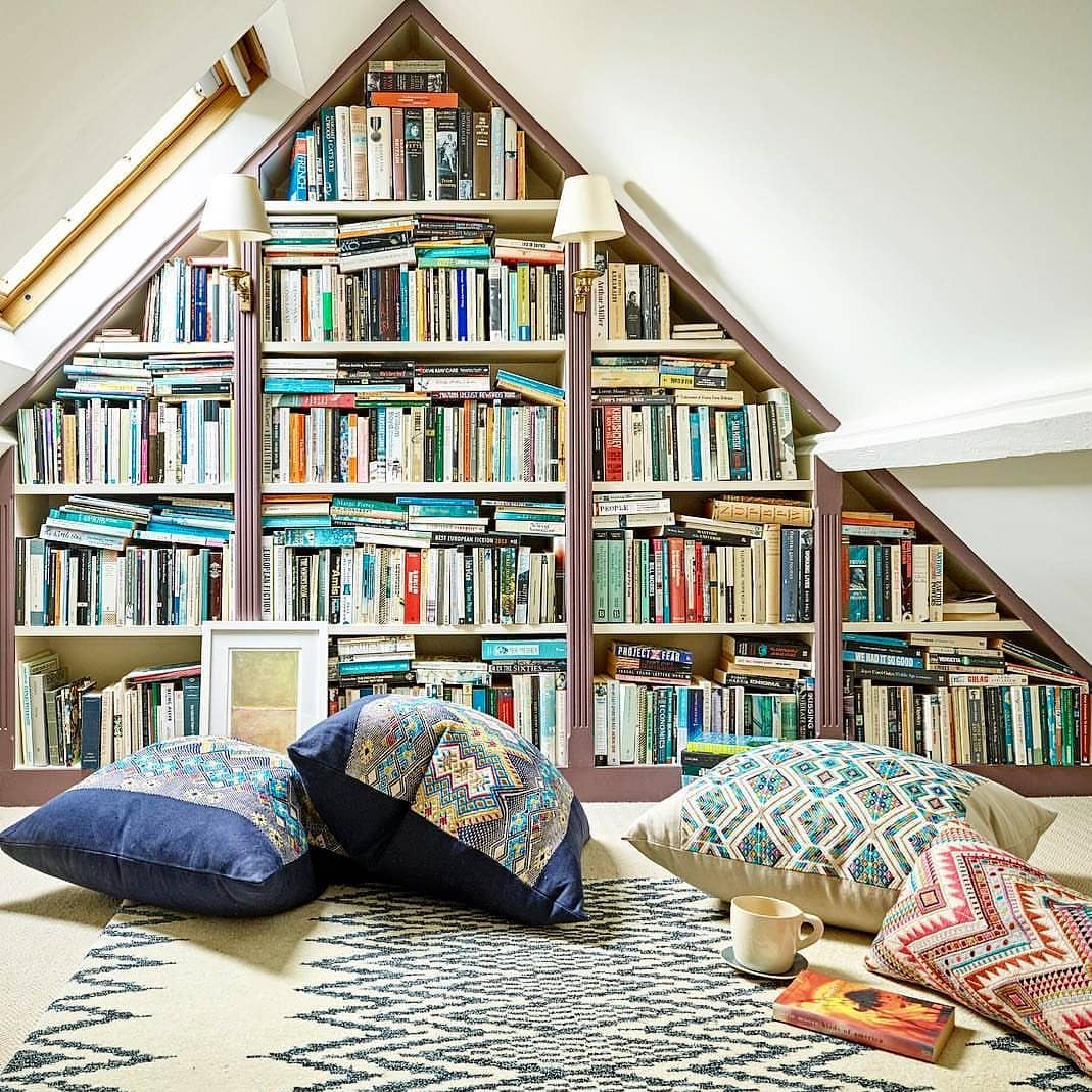
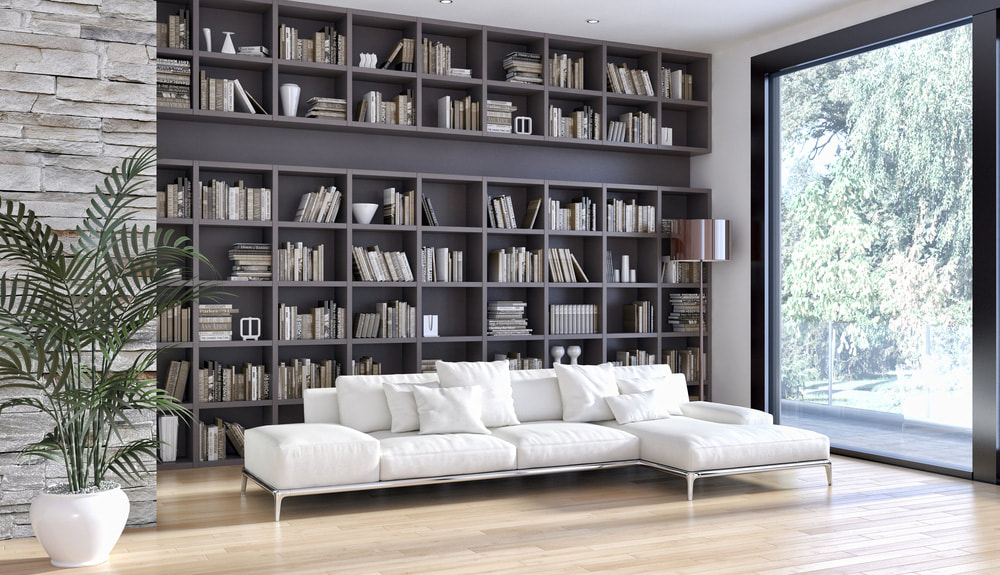
Source: Rachel Miner Ugh. I love it. I have more books in my house than I know what to do with, but this is just *heart-eyes emoji*. I love all of the non-book items that have found their homes amongst the books. I'm a sucker for a good library ladder. And do her plants have... names? Enter my QT: BRB, gonna go live in @RachelMiner1's living room now. #LibraryGoals I have many library goals, as yet unattainable in my current living space, but floor-to-ceiling bookcases wherever I can fit them will have to do for now. I designed and built the bookcase below (left) to house a fraction of my ever-growing book habit, which then expanded into the hallway. I try to keep those two bookcases, containing fiction and literary non-fiction, down to about 500 books. Other bookcases throughout the house store science books, field guides, humor, children's books, reference, travel, how-to, graphic novels, and others.
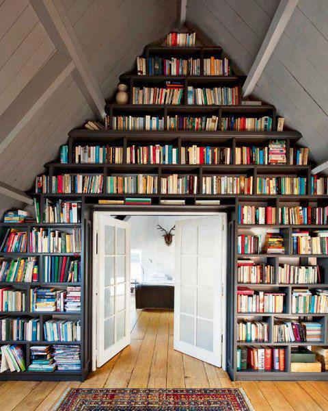
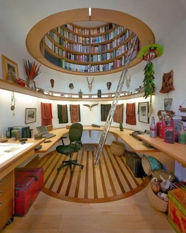
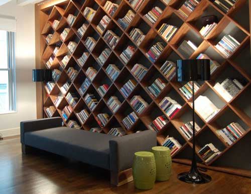
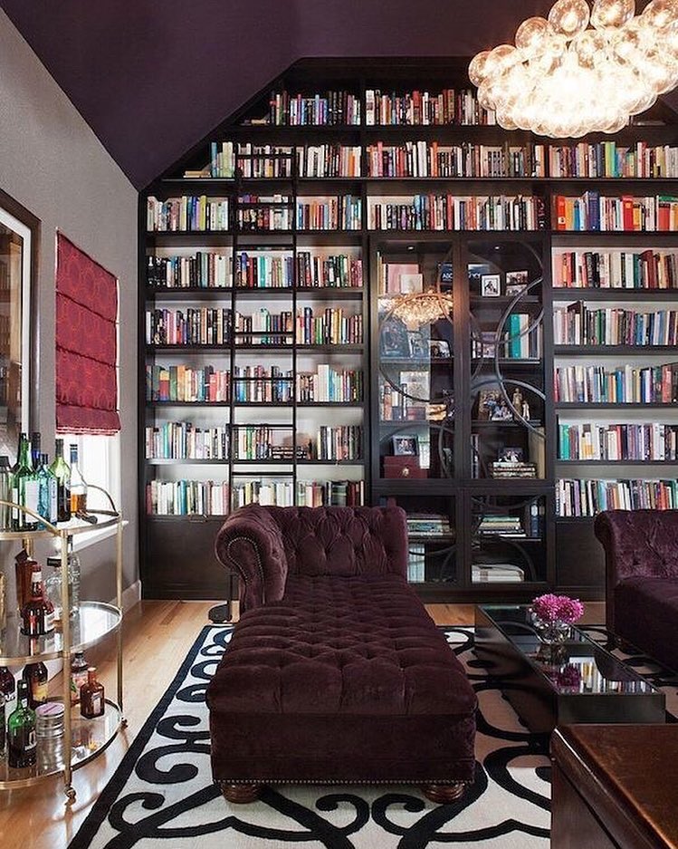
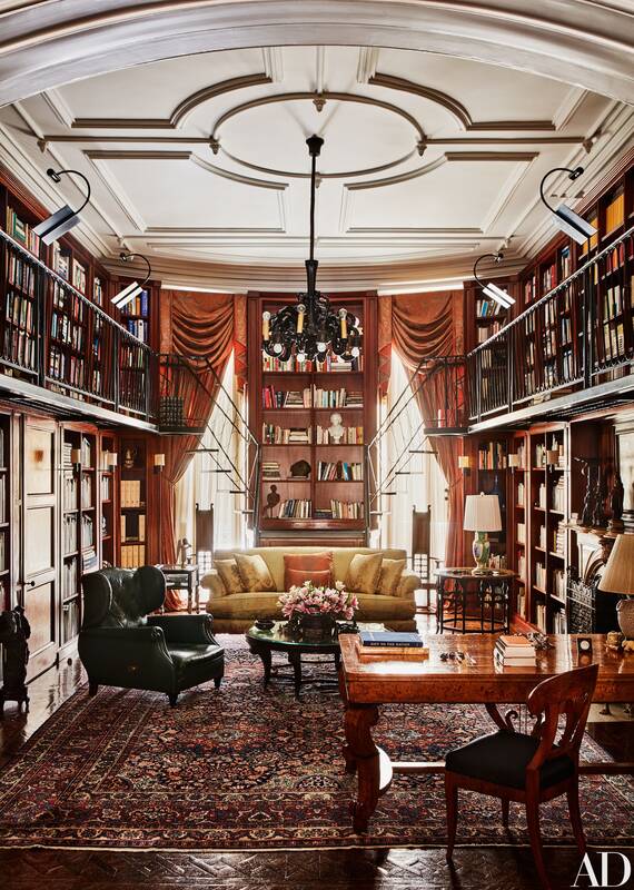
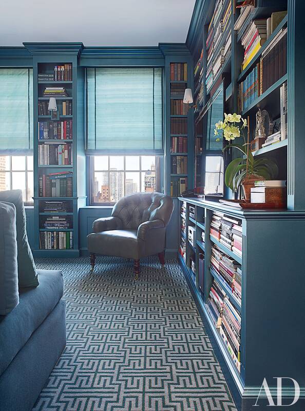
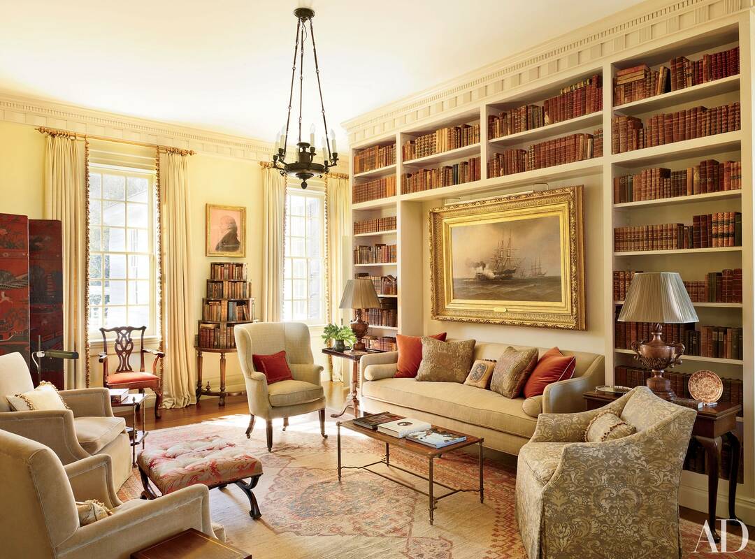
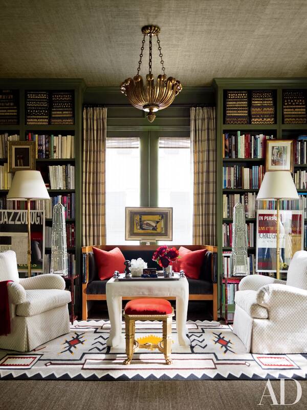
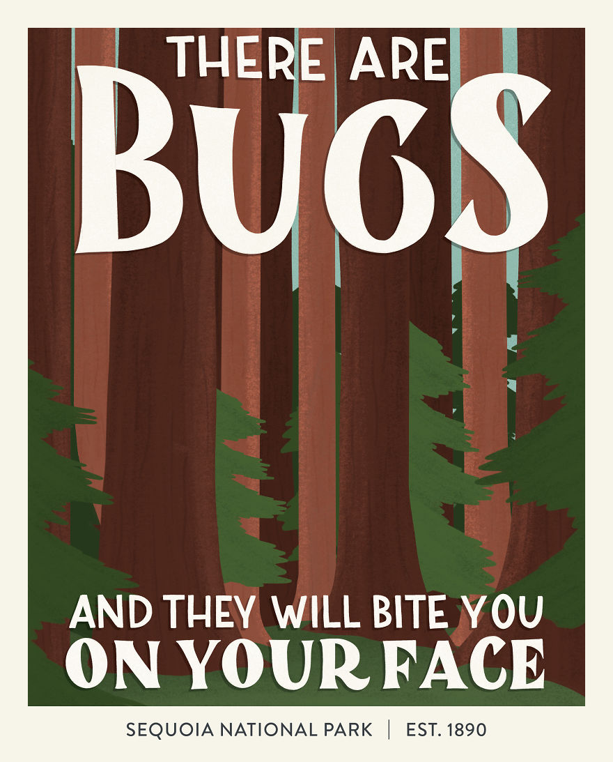
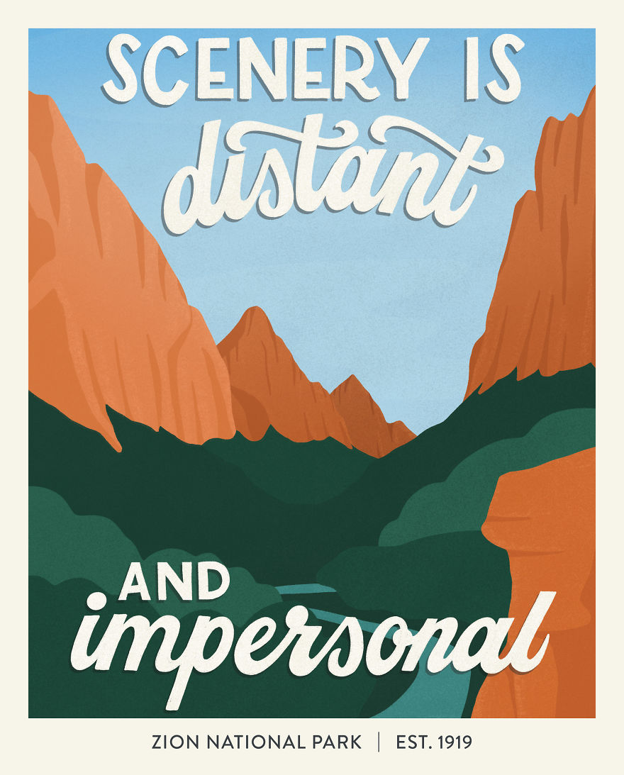
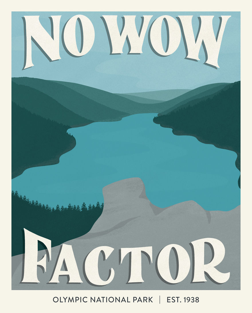
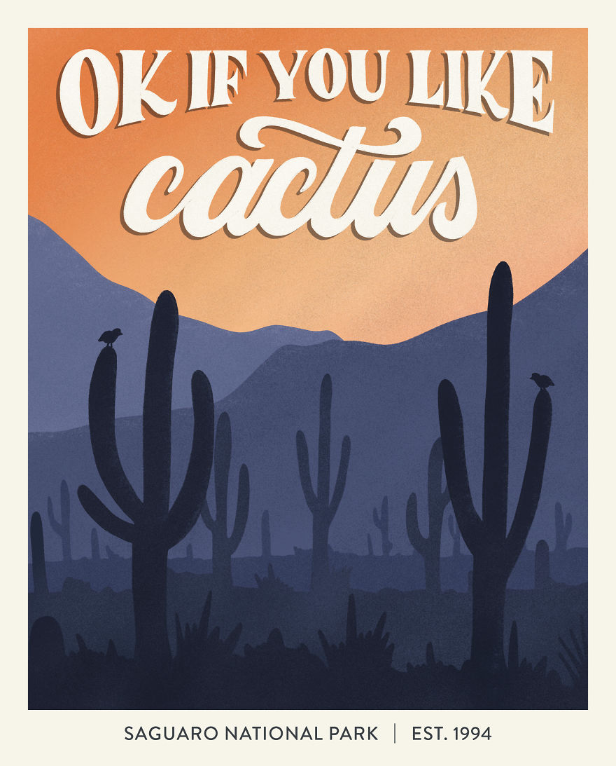
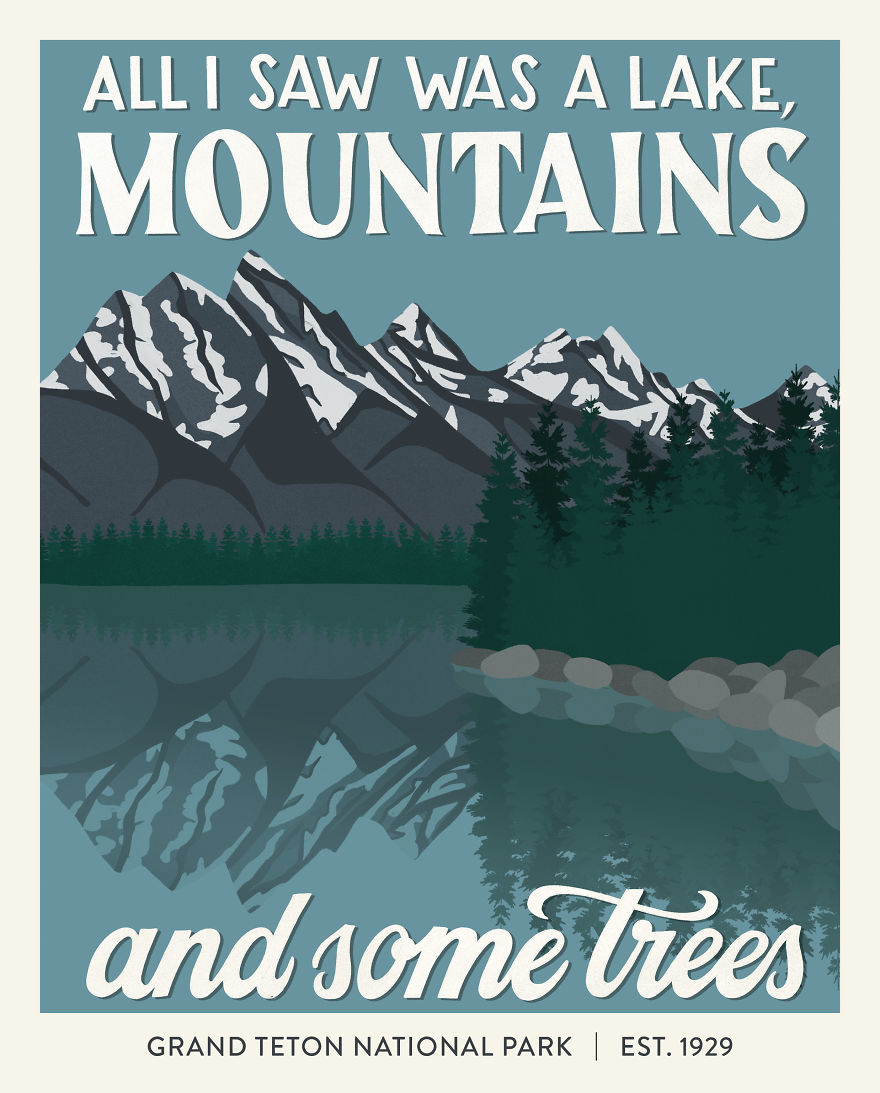
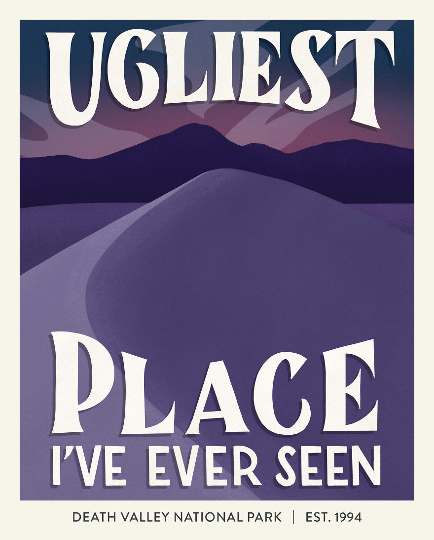
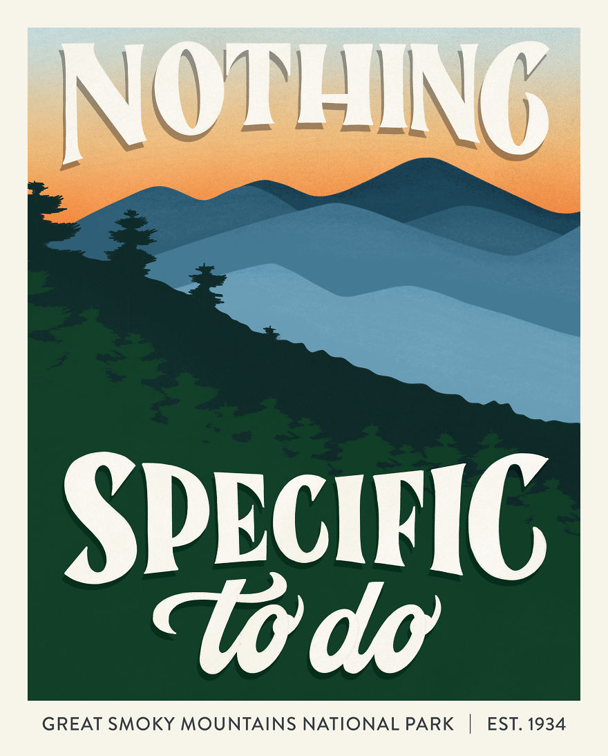
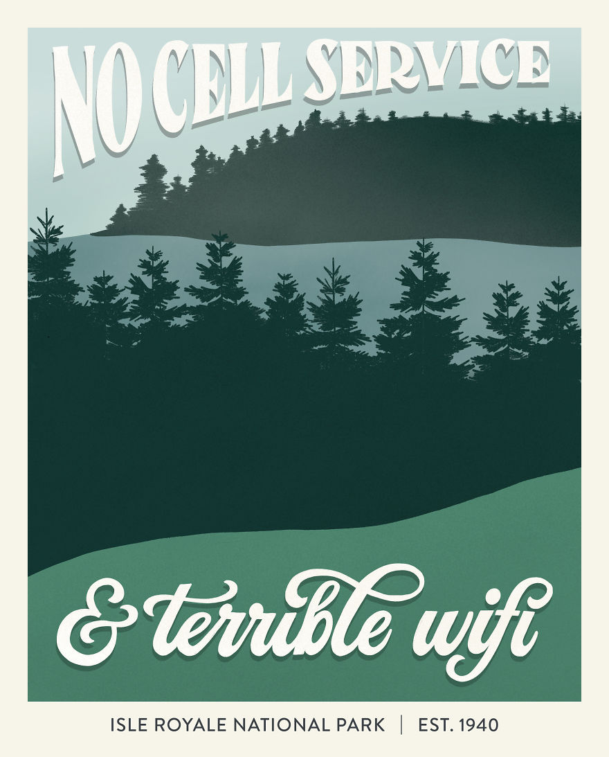
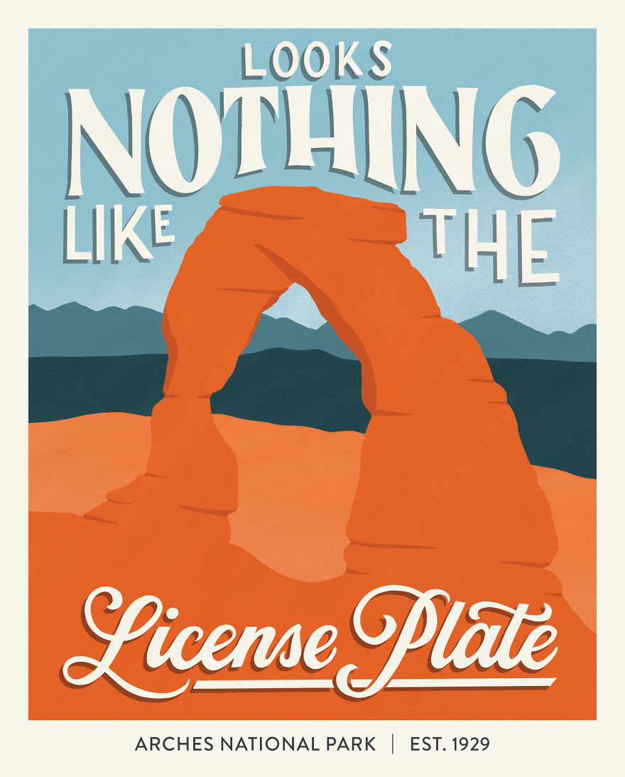
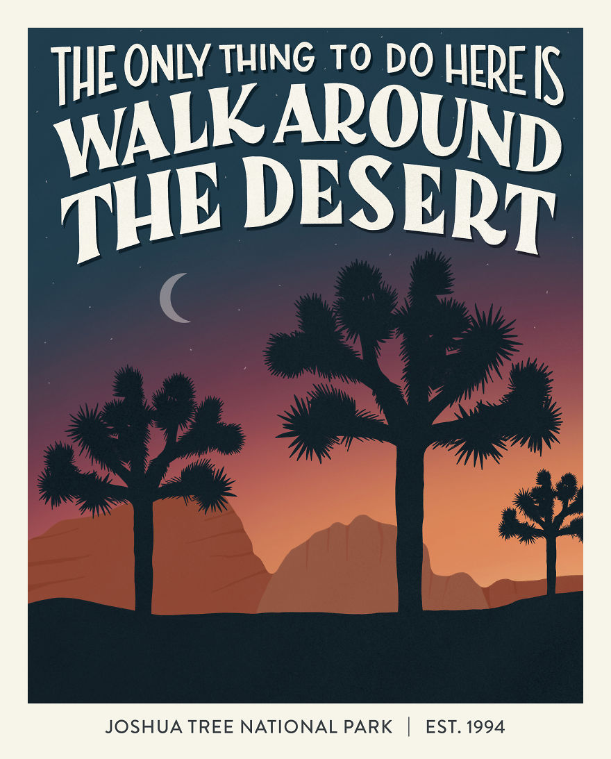
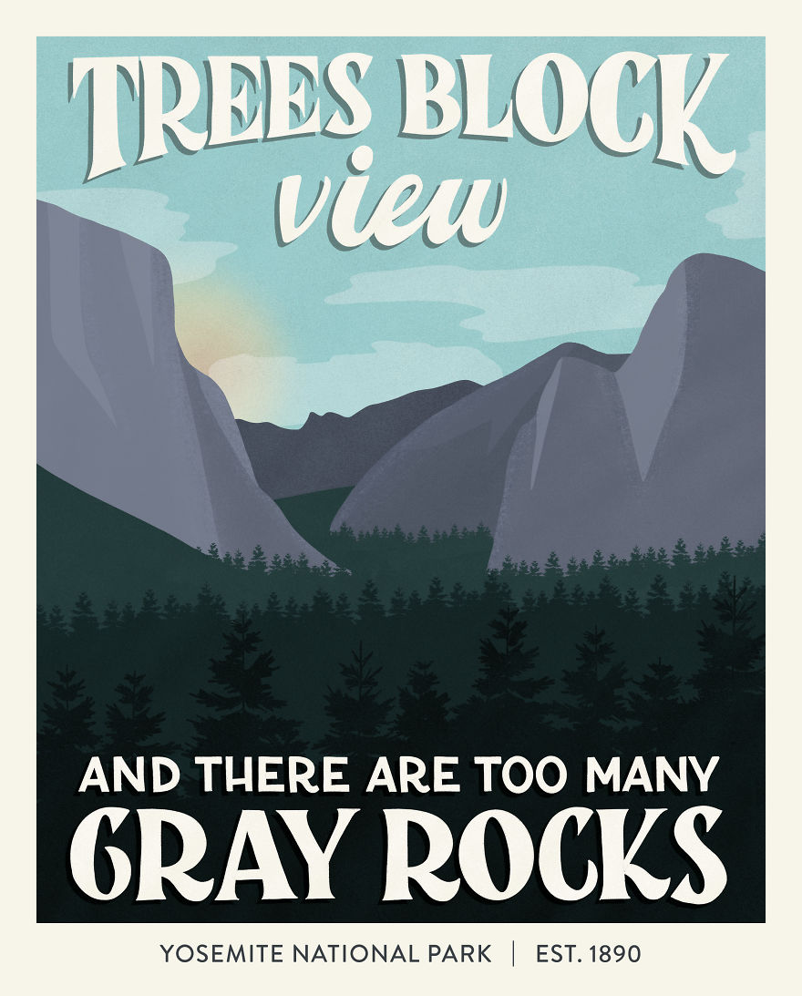
More delicious libraries... (all photos from Architectural Digest, BookBub, BuzzFeed, Condé Nast, and SpaceWise) Even your best will never be good enough for your harshest critics. Apparently, even the majesty of National Parks isn't enough to inspire awe in everyone. Amber Share takes 1-star reviews of National Parks and makes them into art. Your lesson for the day: no matter how incredible you are, someone will find something to criticize. Ignore the critics — you're Yosemite to someone! Find more on Amber's website, Instagram, and Tumblr.
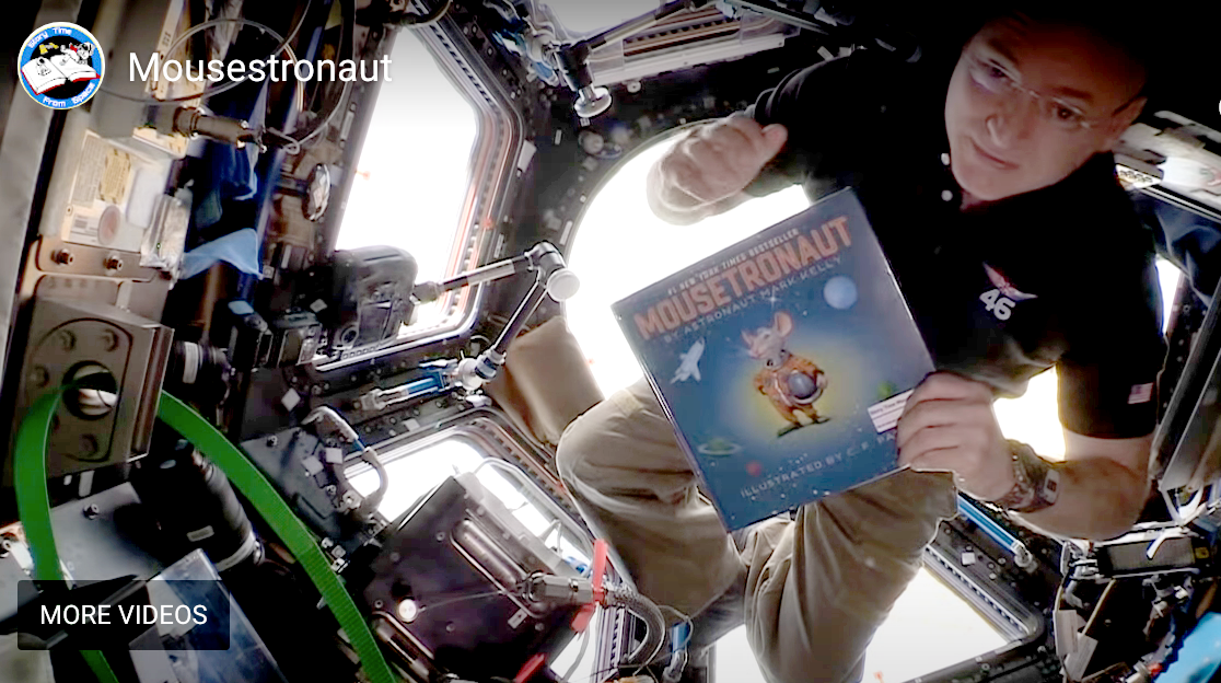 Everything is more fun to watch in zero gravity! The Global Space Education Foundation sends books for astronauts to read from various locations within the International Space Station. Their website includes curriculum for educators to align with and support Next Generation Science Standards.
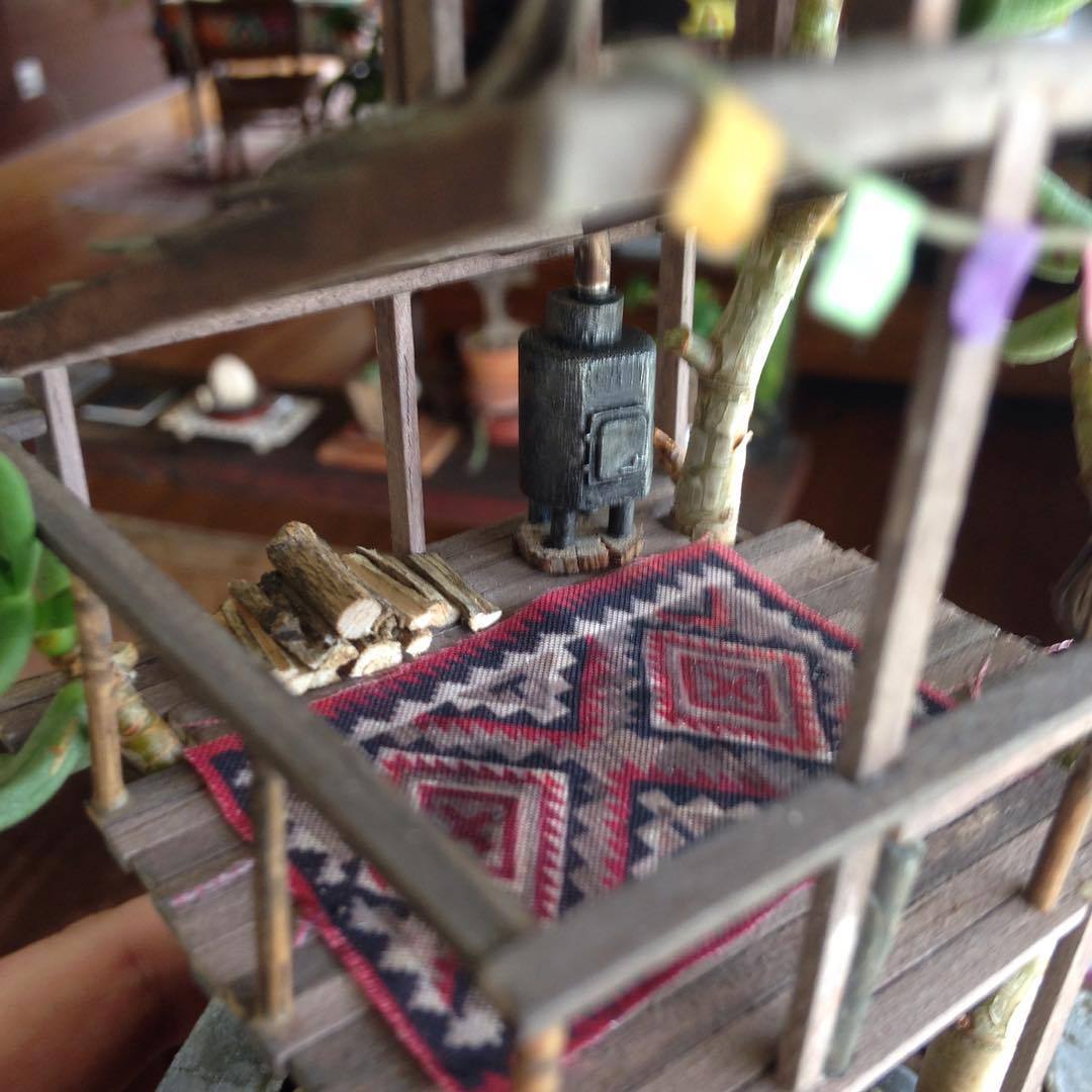
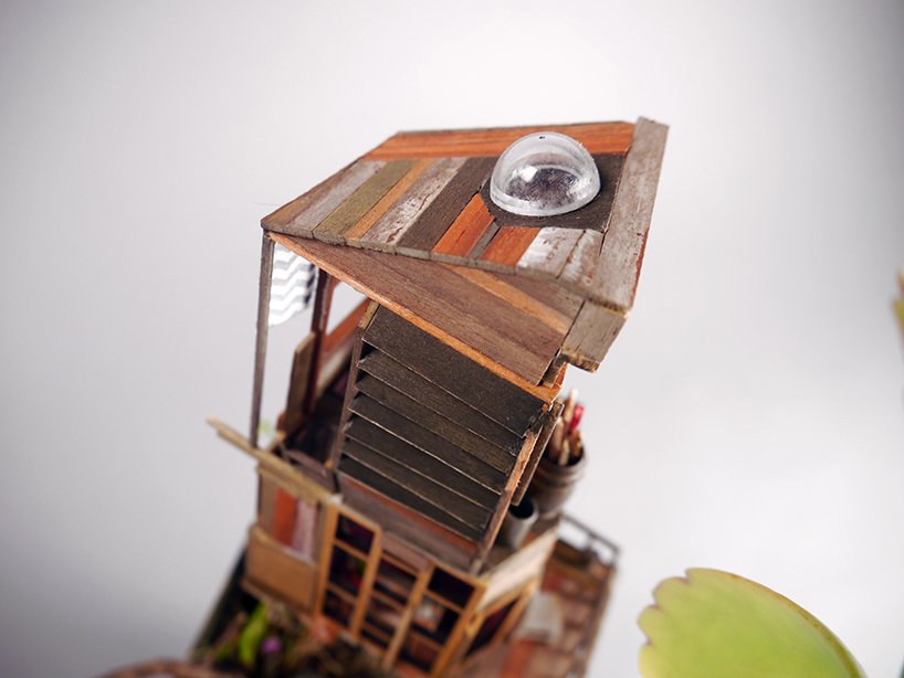
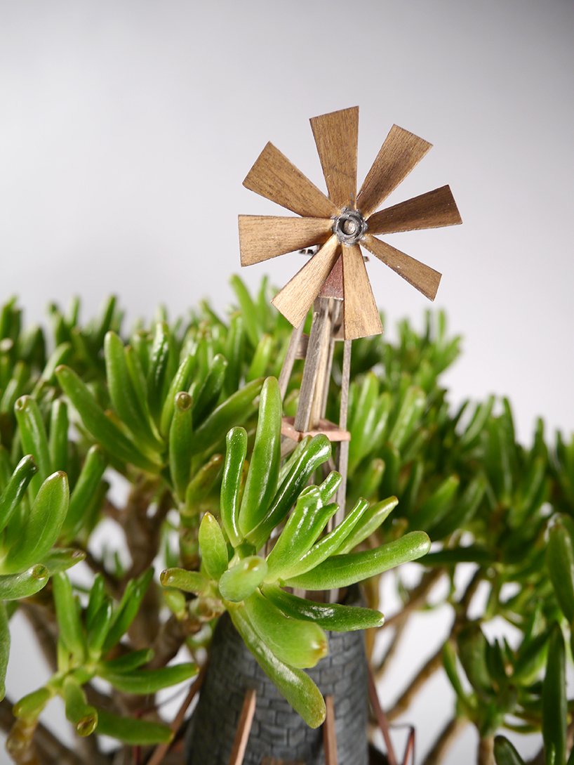
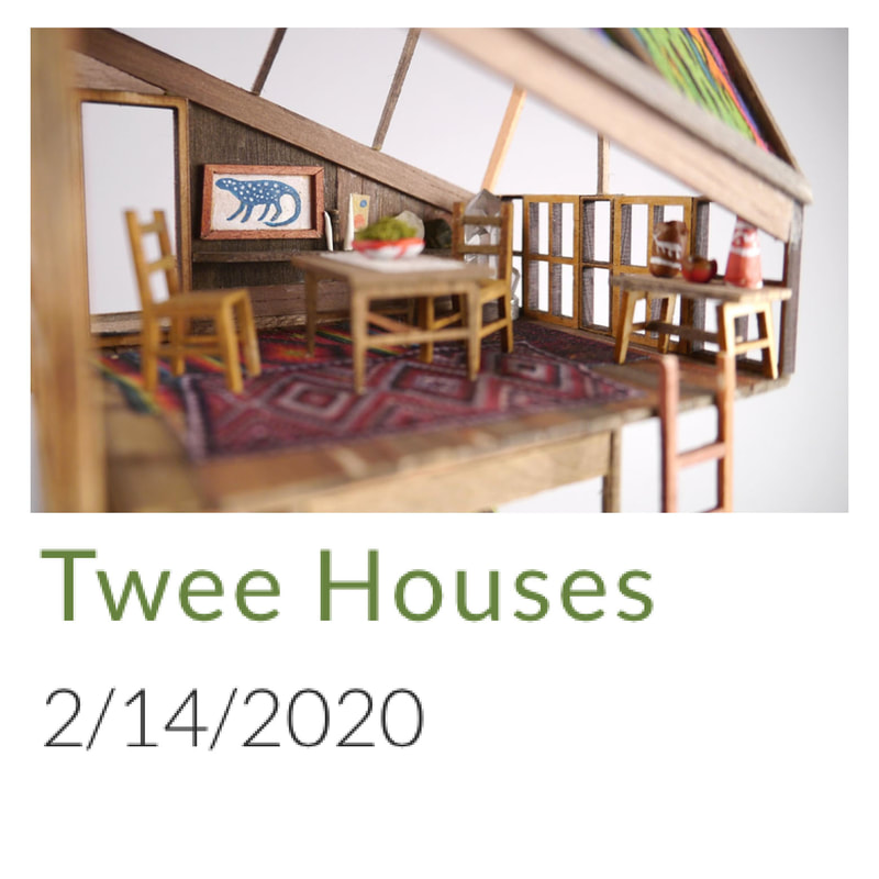
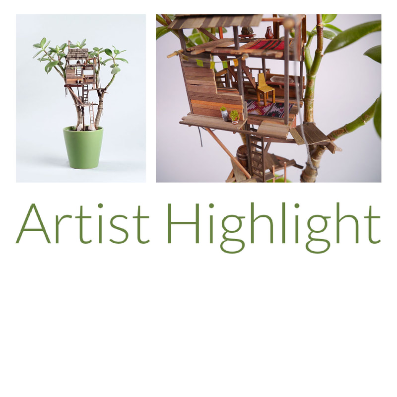
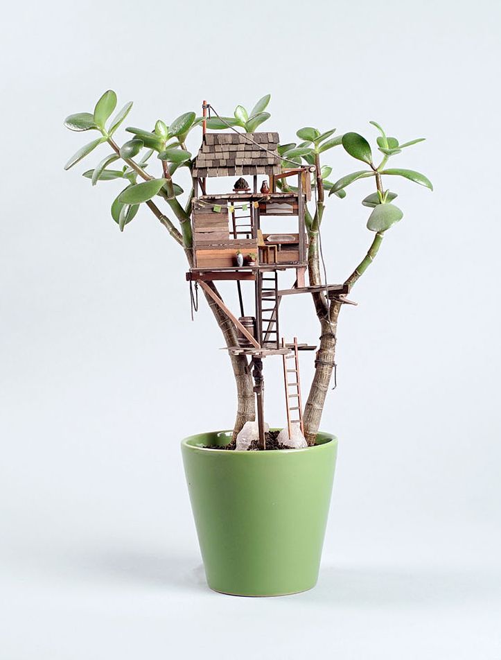
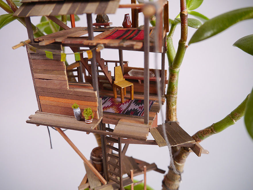
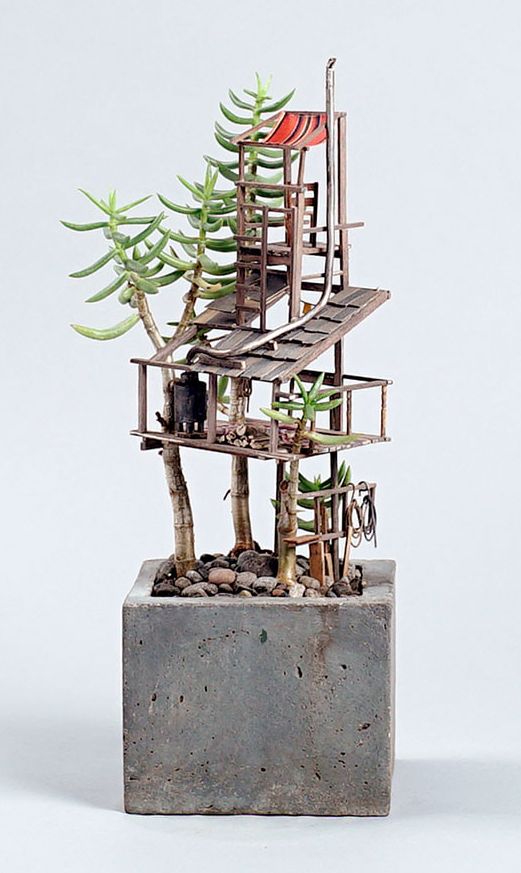
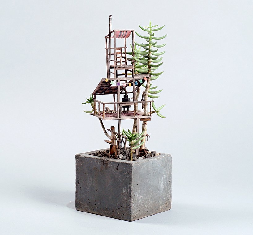
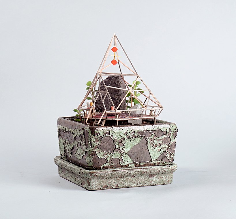
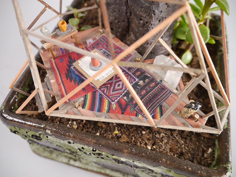
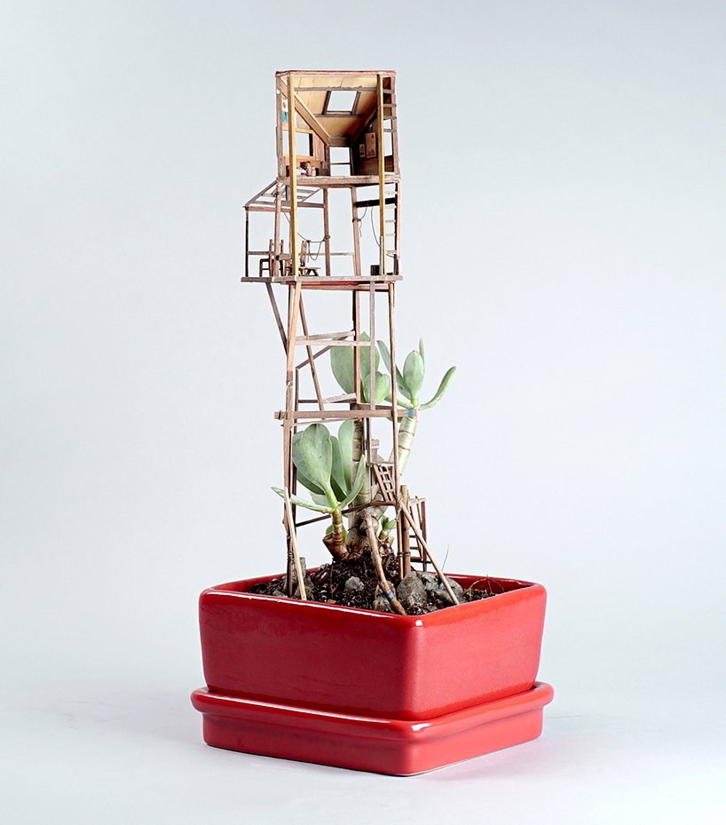
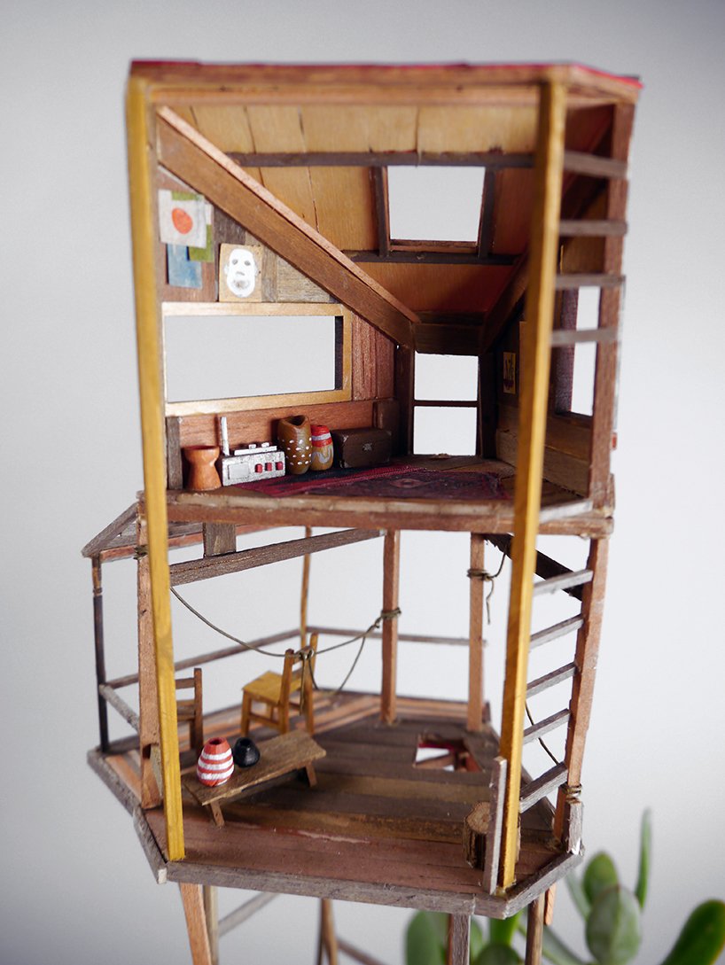
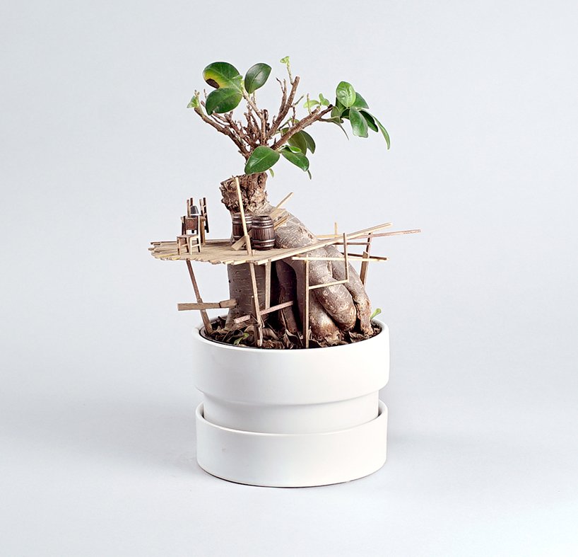
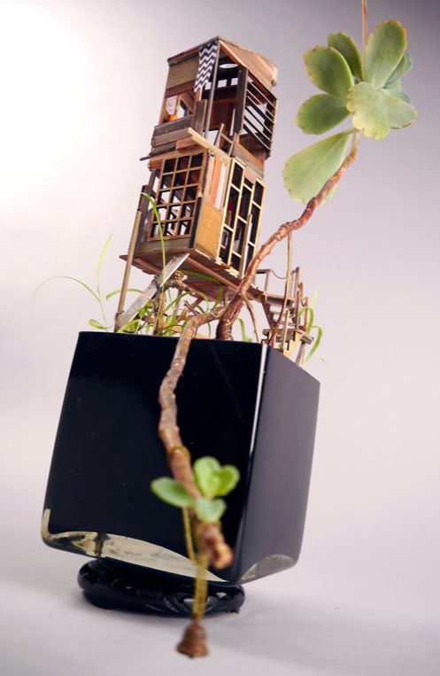
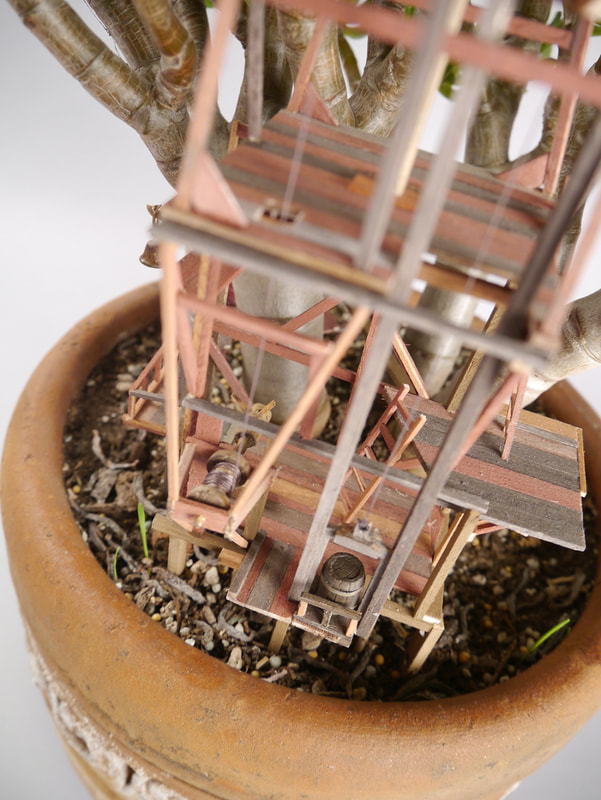
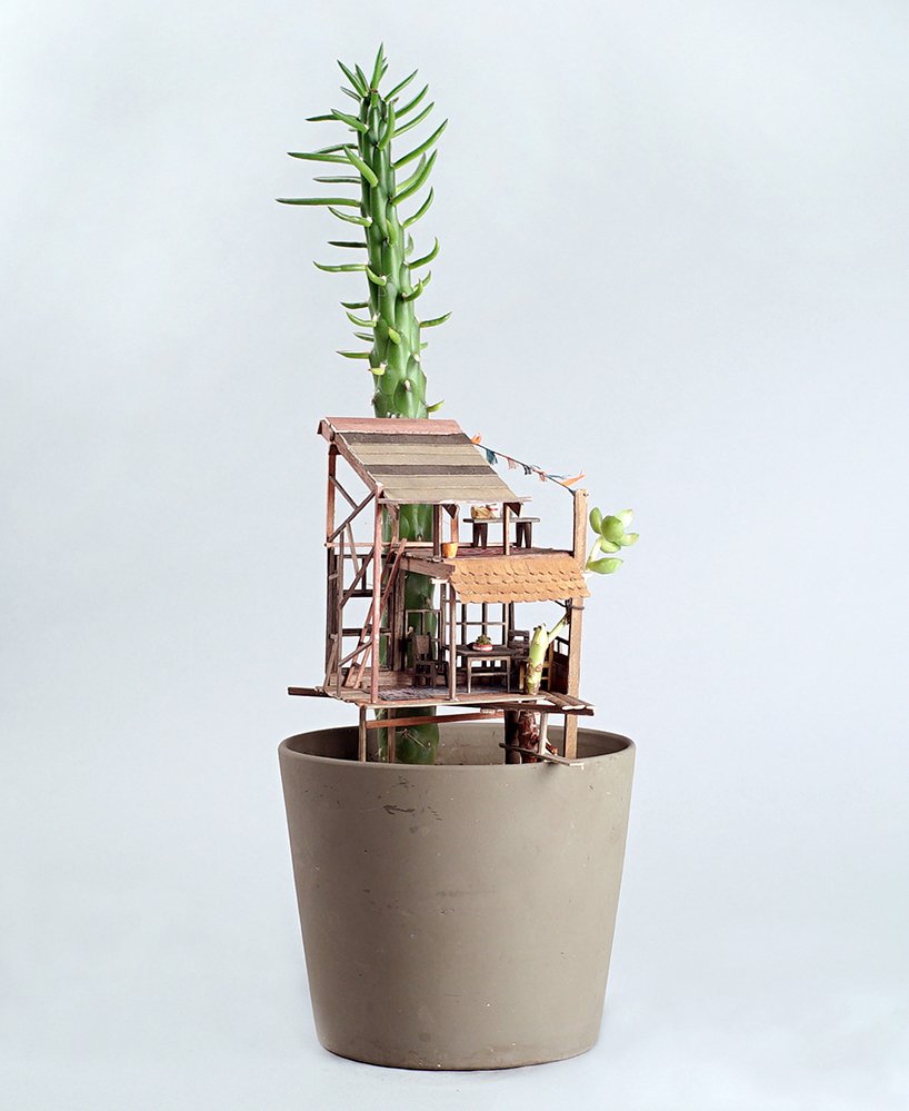
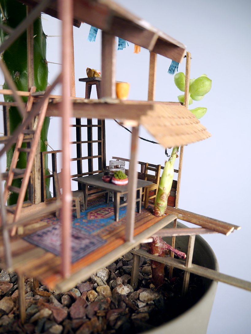
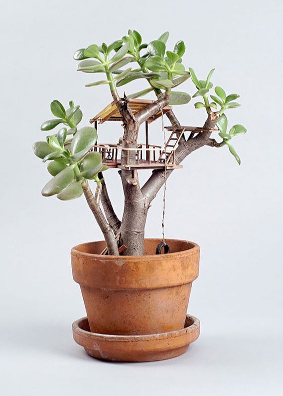
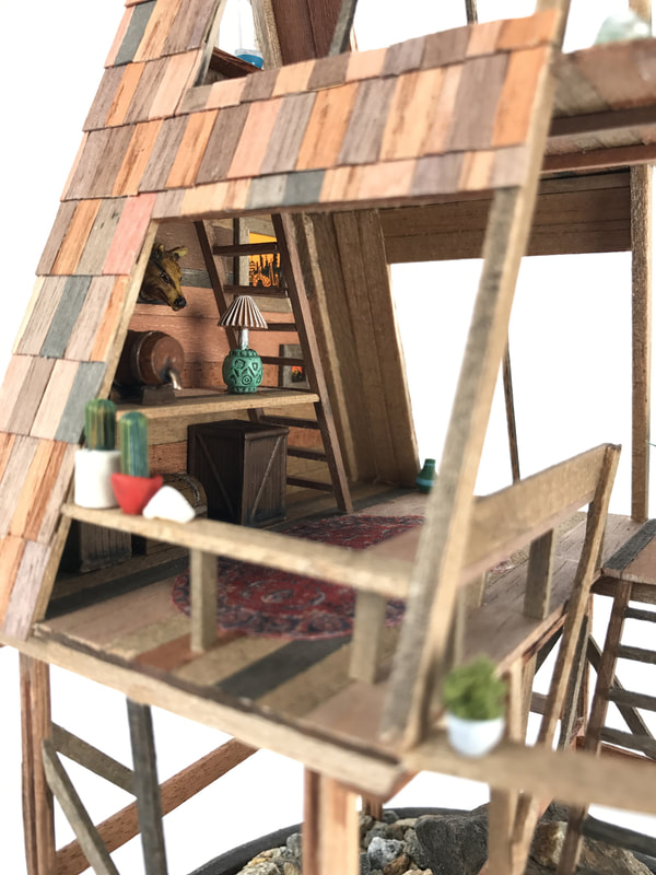
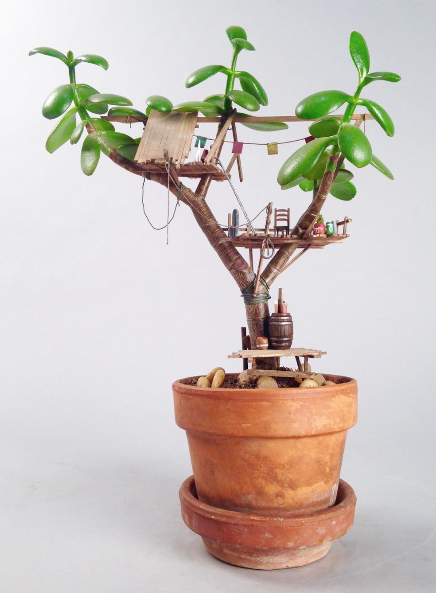
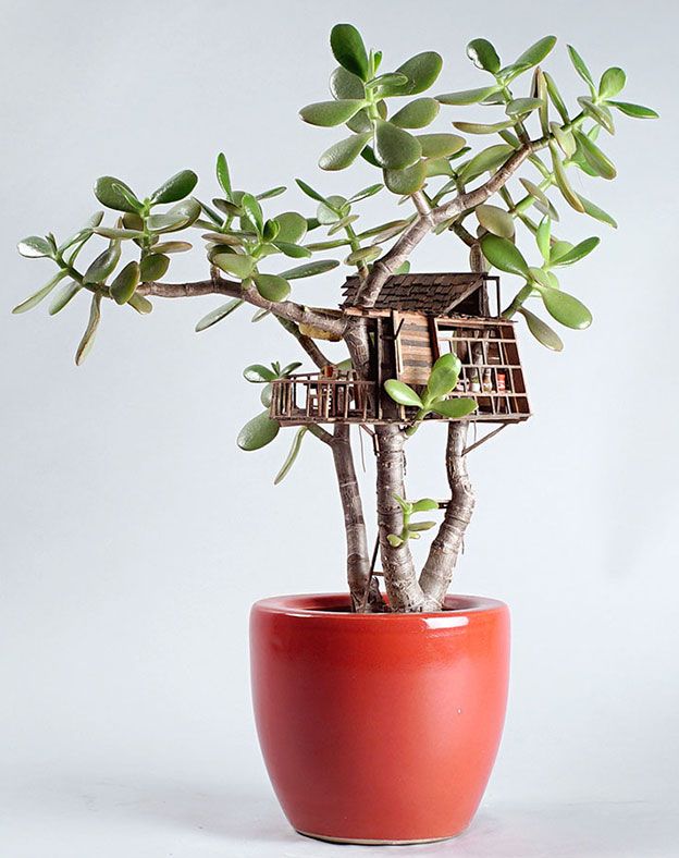
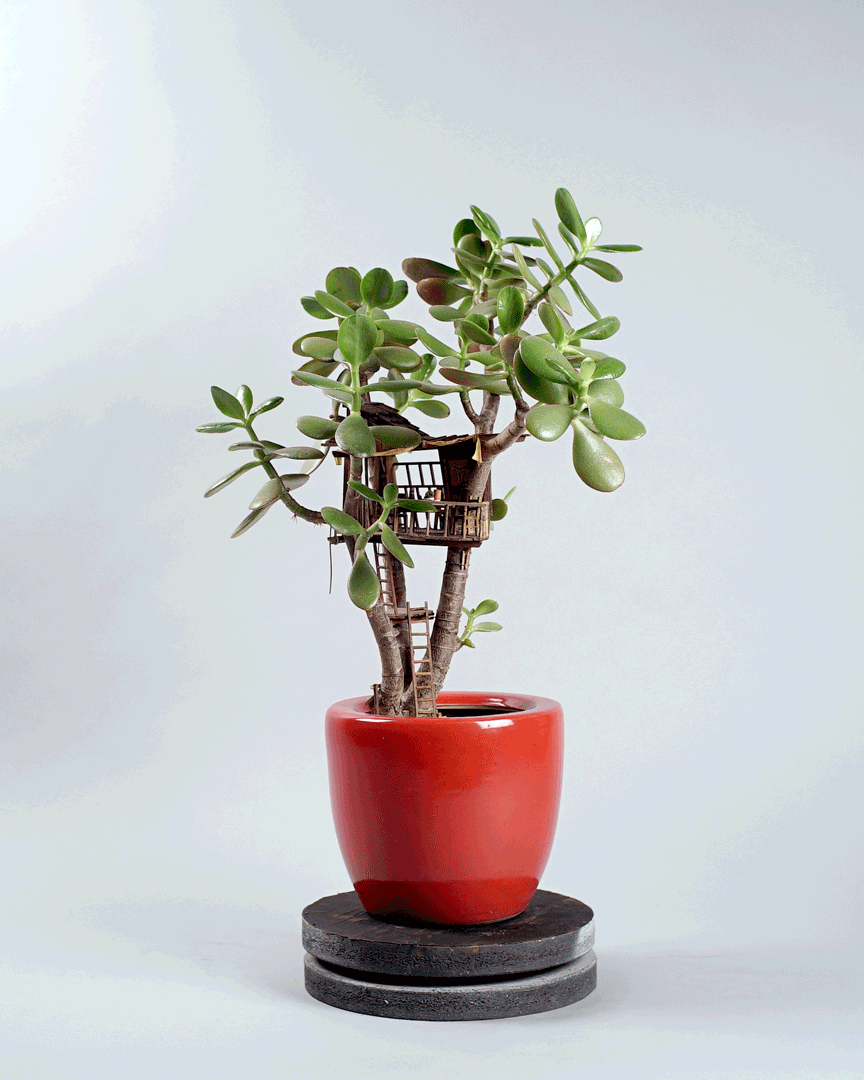
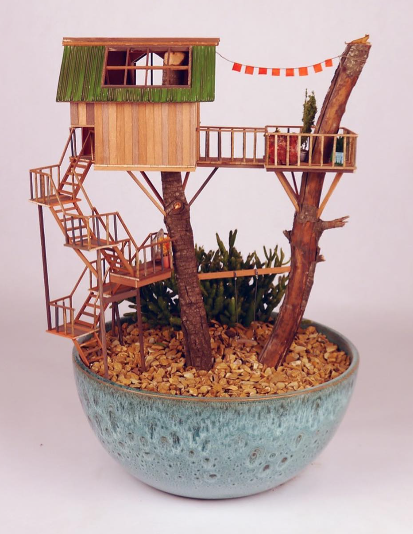
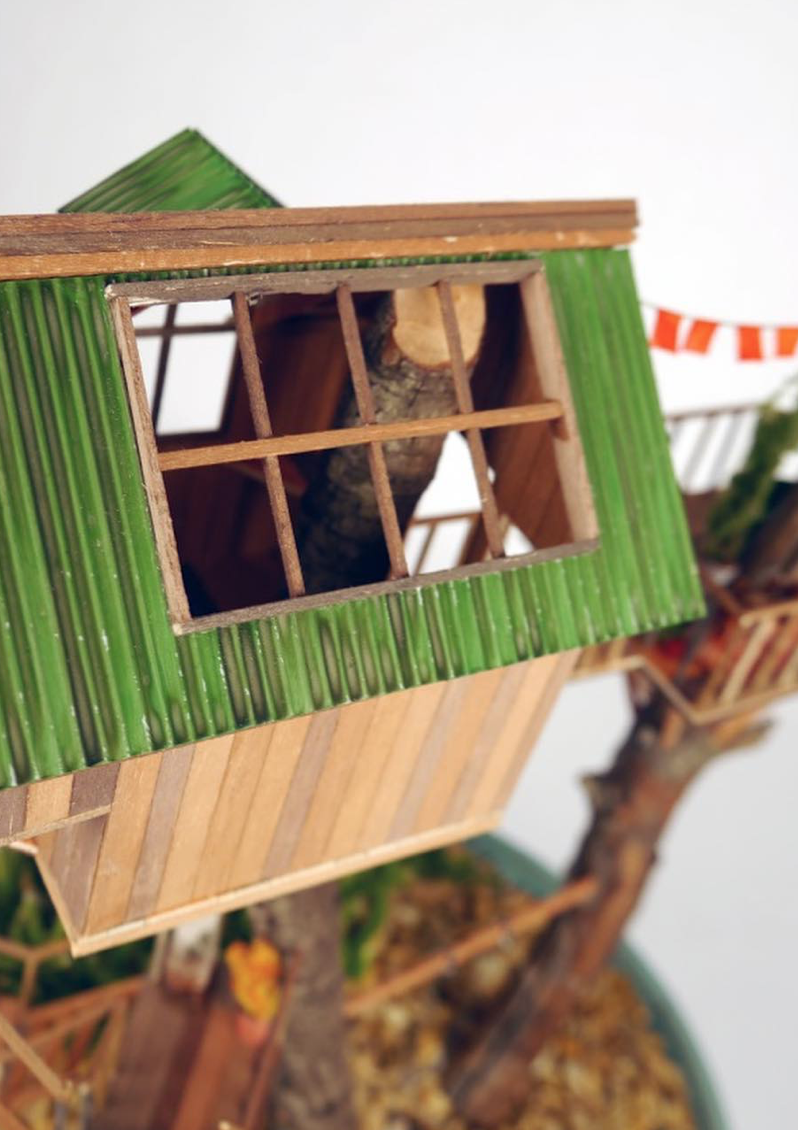
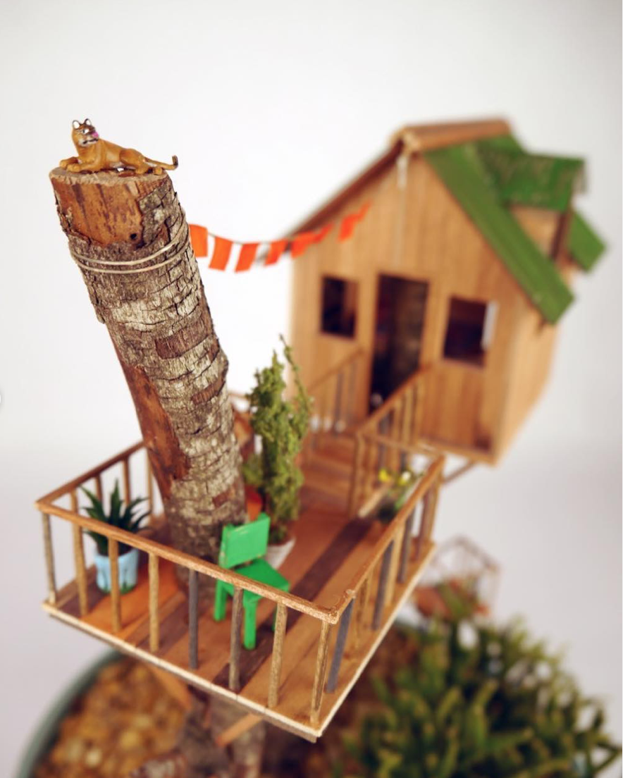
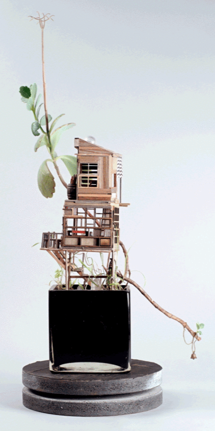
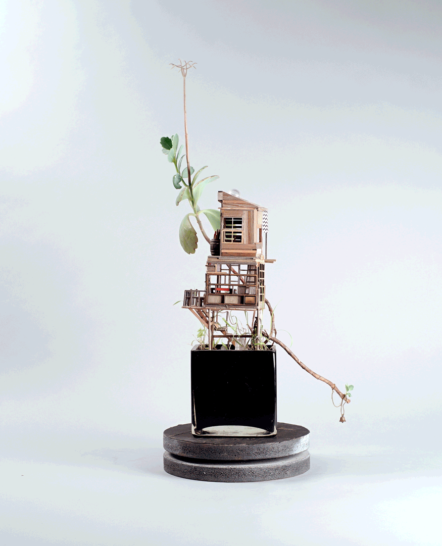
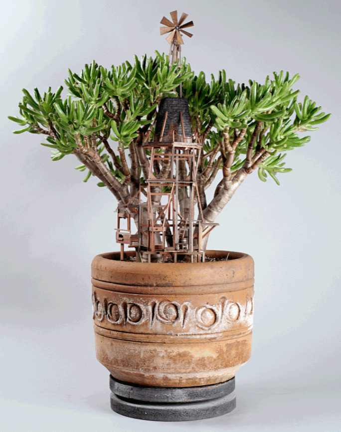
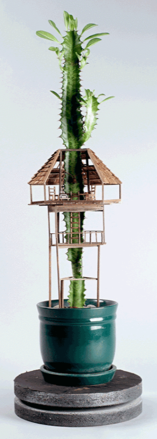
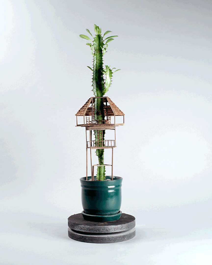
Jedediah Corwyn Voltz is an artist based in Los Angeles who works as a movie prop builder. This project—making miniature tree houses for houseplants—is called Somewhere Small. 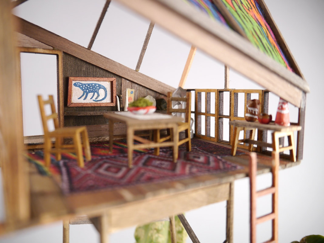 Voltz build tiny tree houses around bonsai trees and other plants. He adds tiny furniture, rugs, and pictures on the walls.
“Building miniatures for stop motion always leaves me with a huge bin of scrap balsa, basswood, various fabrics, etc. and I found myself making little fantasy constructions out of that stuff during my downtime. Those little scrap forts led to me building some more serious ones in little diorama settings, and last year I built my first living treehouse. Since then, I’ve made almost 25 of them, from tiny watchtowers in secluded forests, to quiet treetop meditation platforms, to giant bustling windmills and waterwheels.” 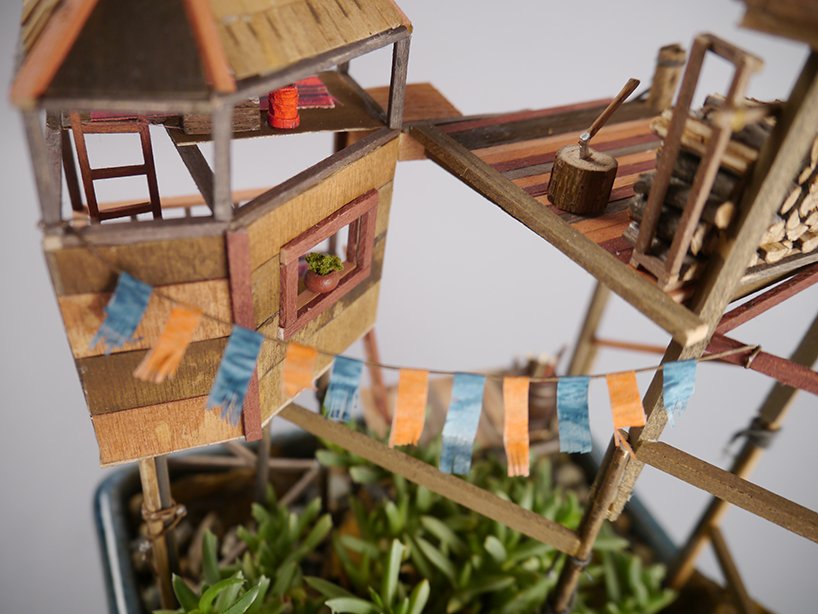 “I started build elaborate forts for my GI Joe toys when I was nine or ten. I’d dig into hillsides, move rocks to make fortifications. When winter came around, I turned to my mothers large selection of indoor house plants. It was pretty common to have 4-5 of these secret bases going simultaneously. Later in life, I began working my way into the stop motion and toy commercial industry. I found myself with big bins of tiny pieces of scrap materials that were left over after jobs. During my down time, I’d start haphazardly glueing some of these together to make crude forts and towers. Nowadays its tough to find a plant in my house or yard that doesn’t have some sort of architectural adornment.”
Follow Jedediah Corwyn Voltz on Instagram: @jed_voltz Shop on Big Cartel: https://jcv.bigcartel.com Portfolio: https://cargocollective.com/jedediahvoltz/ 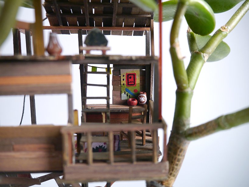
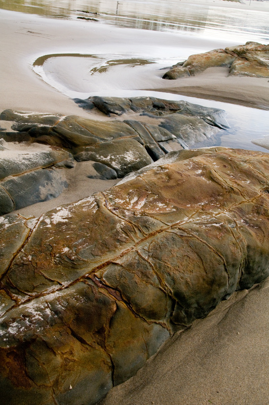
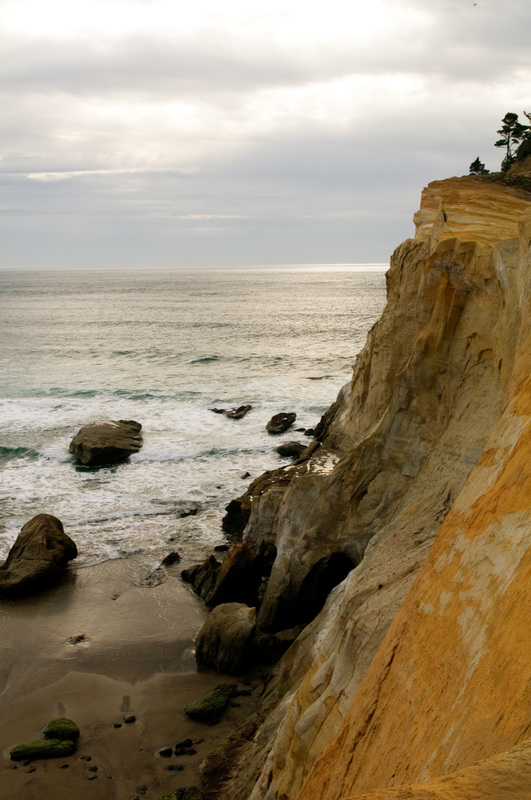
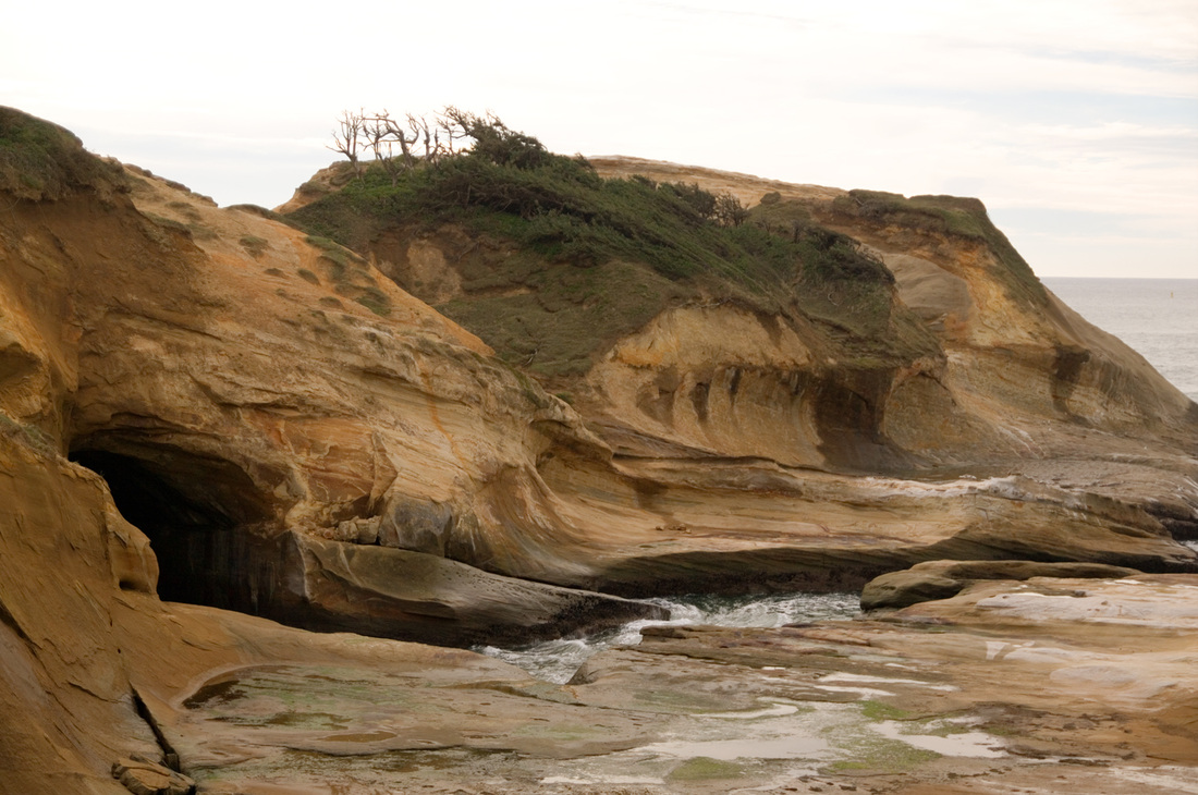
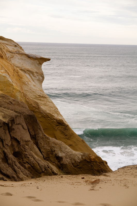
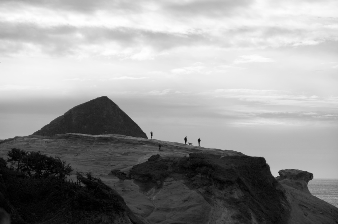
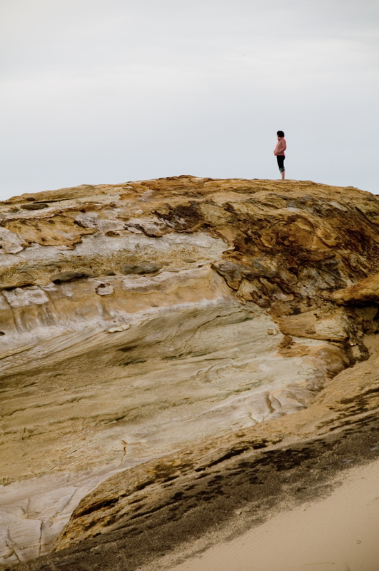
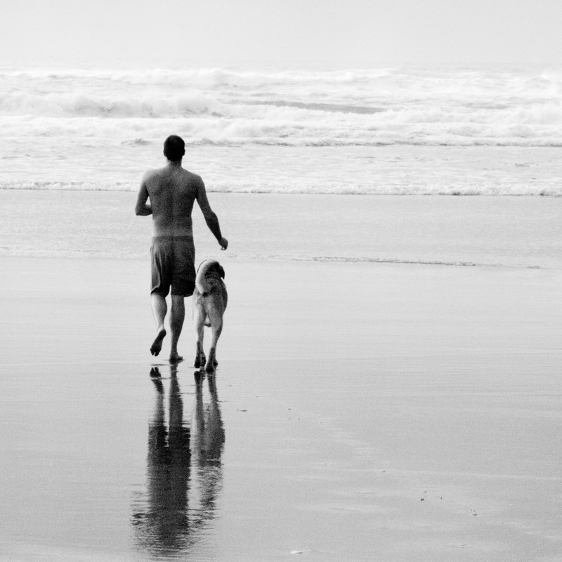
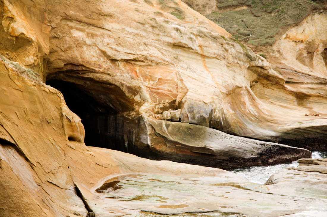
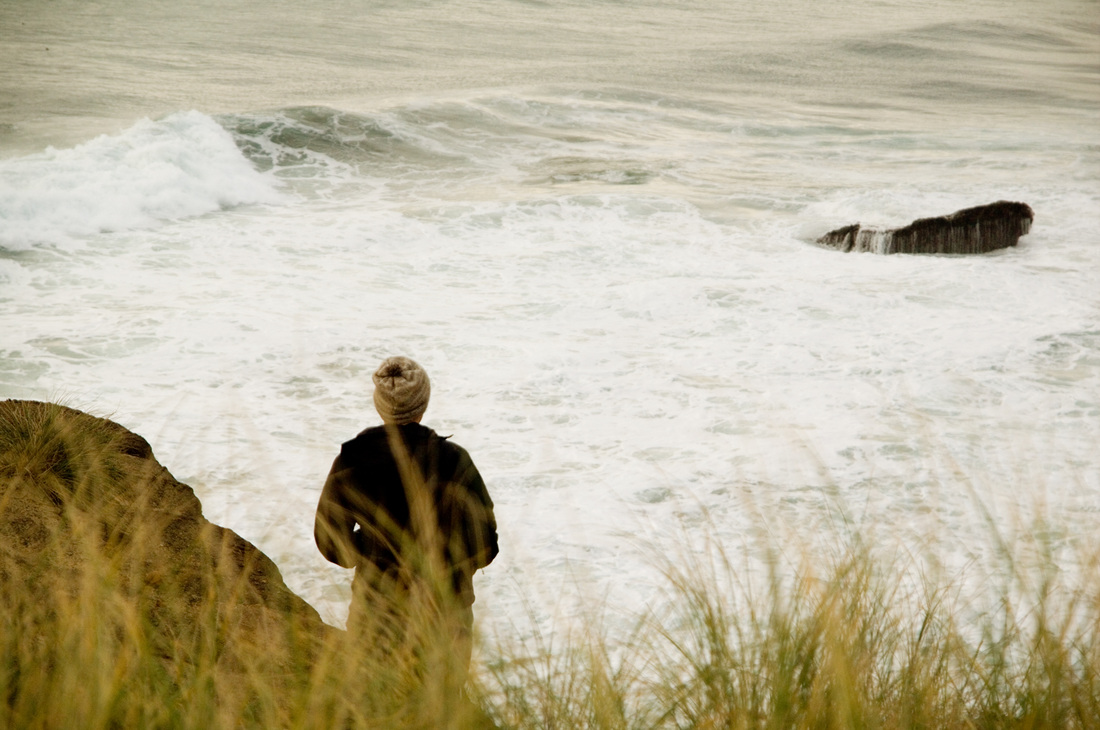
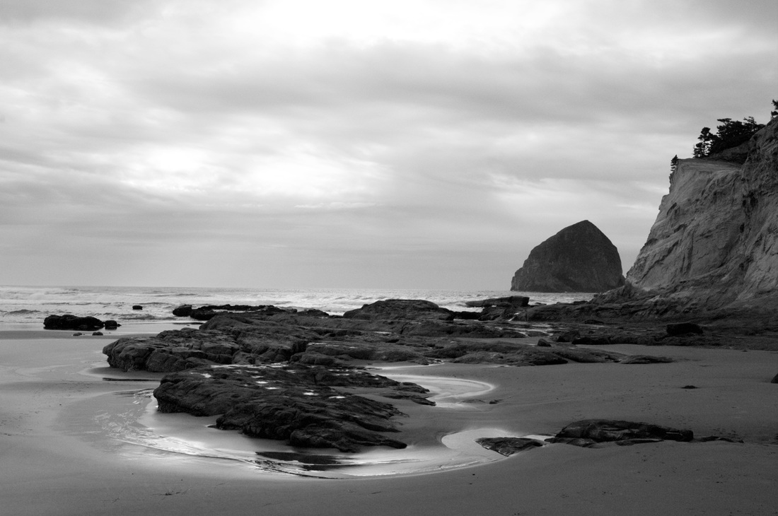
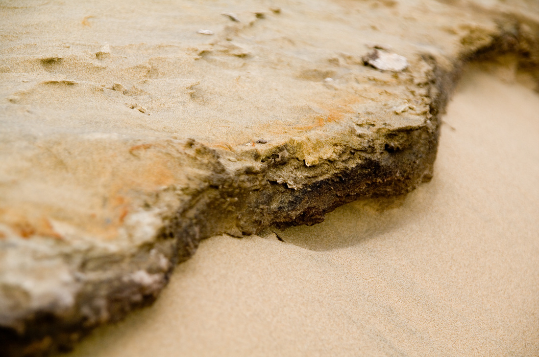
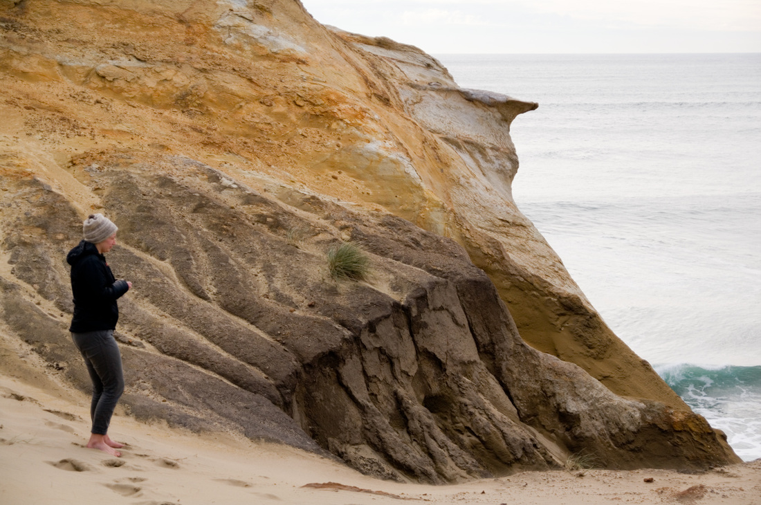
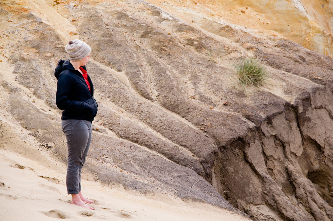
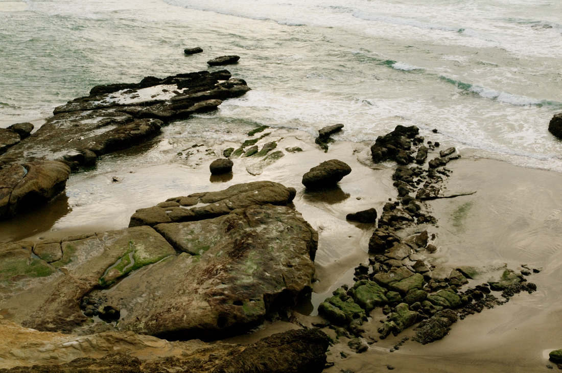
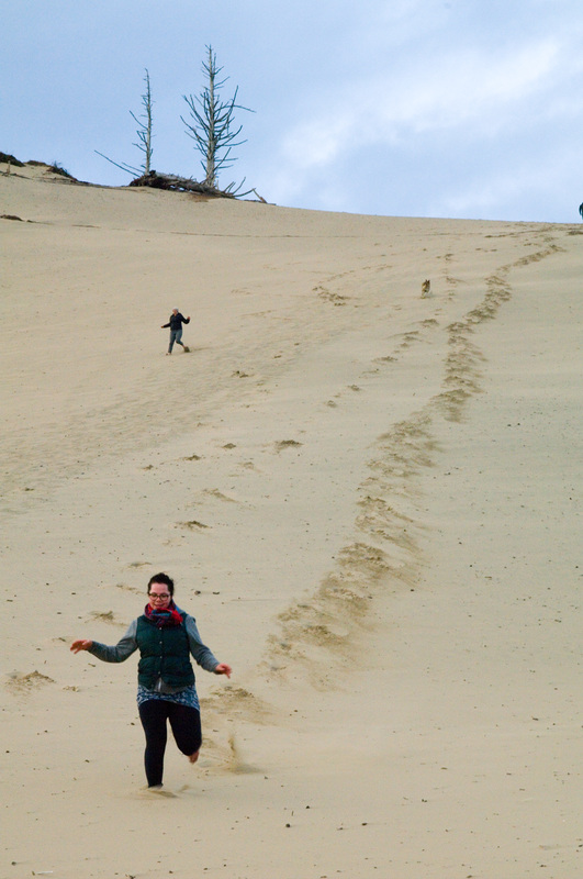
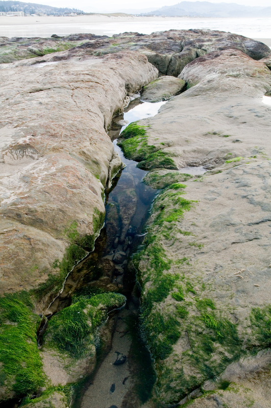
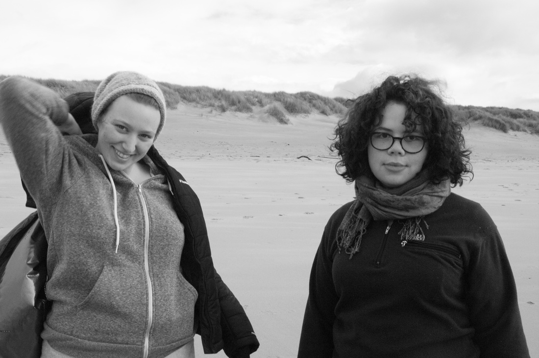
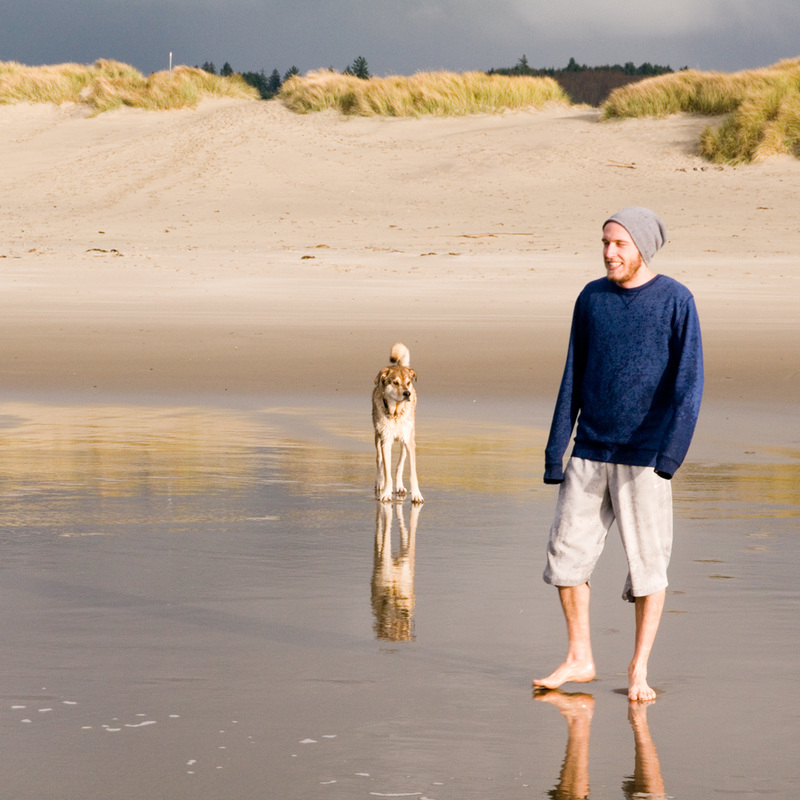
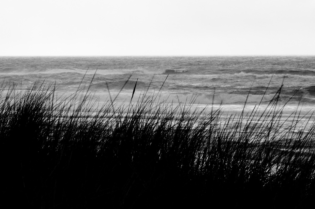
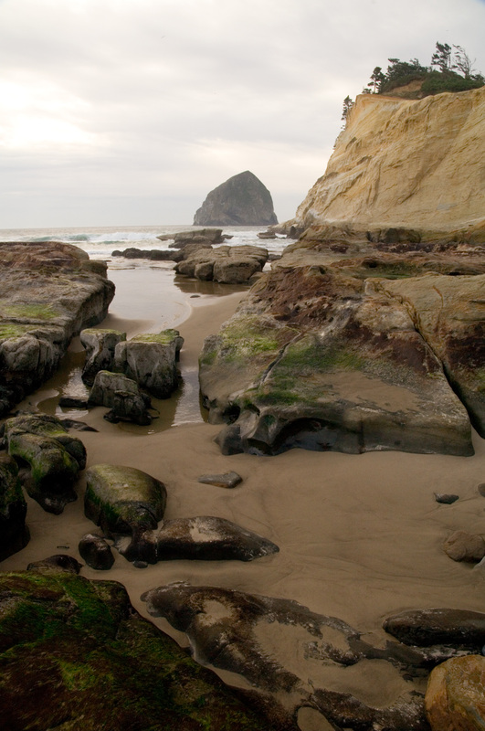
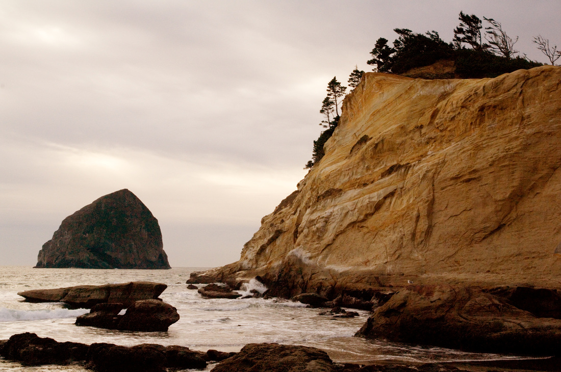
Restarting things can be so invigorating, much like a walk on the Oregon coast in November (or, you know, a swim). As I restart so many things, I am reminded why they petered out or stopped suddenly the first time through.
I discovered a new tool for bulk-deleting tweets from one's twitter account. This was necessary not because I wanted to erase my digital past, but because a glitch in the matrix had caused some egregious over-tweeting. I had several automated postings set up, my favorite of which was the NASA image of the day. I may resume posting that one again, but manually this time. Auto-posts also included a Wikipedia picture of the day, the day's weather forecast, a word of the day, and one or two other things.
The problem began when the Wikipedia picture of the day began posting the same picture over and over again. Most days it would post 15 times. One day it posted 43 times. Another: 78. Twitter suspended my account (as it should). Though it took a bit of finagling to get it back, the process was surprisingly straightforward, and I'm glad Twitter believed my story of an auto-post gone wrong and that I promised never to do it again.
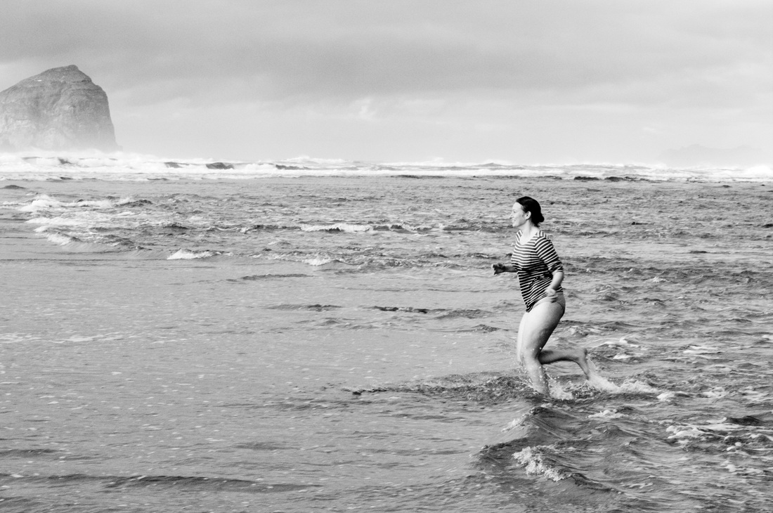
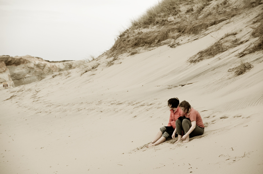
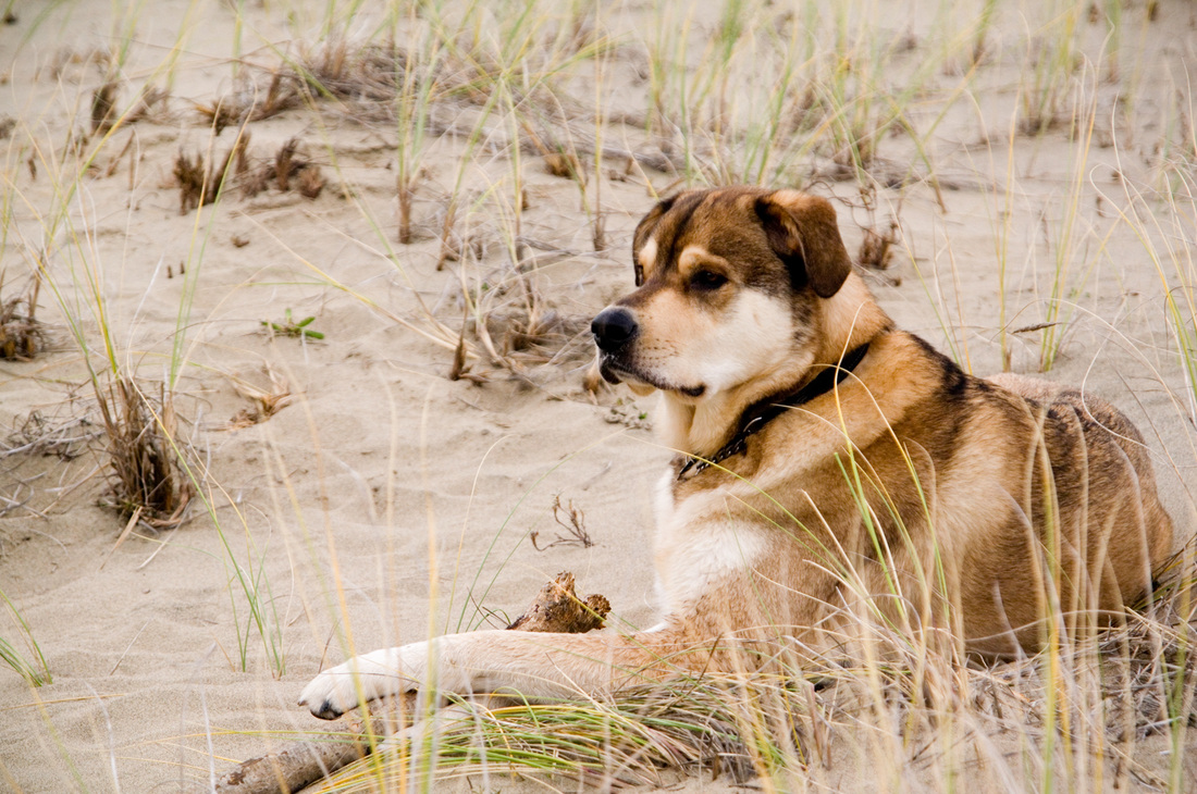
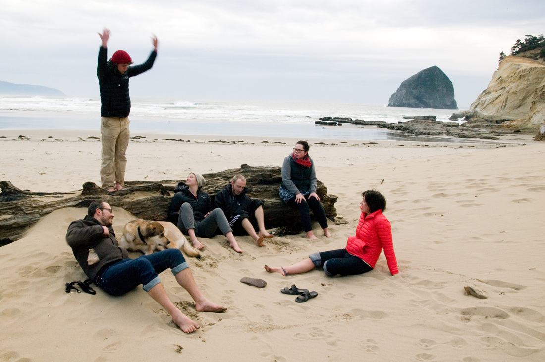
Stepping back from the inundations of rapid information overload (even when you only see each tweet a single time) is refreshing and necessary. This series of photographs comes from a lovely few days on the beach surrounded by friends. This same group of people embarked on this retreat after just having spent almost a week together in the mountains. It clearly wasn't enough.
Sometimes, you just need to get away, twice in a row.
 It's 2020. Time to make some changes. It definitely started last year, or maybe the year before. I was editing my thousands of photos from Iceland, and I realized I had learned some crucial techniques. I decided to go back to the beginning and edit ALL of my past photos. With some of them I achieved dramatic results.
I also found a few treasure-troves of photos I had taken, uploaded to my computer, and then promptly ignored entirely. There were some gems in there that now needed to be added into the timeline into the appropriate place.
Oh, the timeline! This is a spreadsheet, which is easy enough to rearrange, but it's also the Etsy Pattern site I had opened the year before to offer digital downloads that didn't expire. I loved the simplicity of the masonry look of it, but you couldn't rearrange the order easily (or at all? I'm not sure if I ever figured this out). I also had been posting sets of 5 photos from each of my categories on Instagram, chronologically, as each new set of 5 was complete. Was I starting both of these over?  This led to concluding that the Etsy Pattern site had done nothing for me except charge me $15 per month, and I could host my own items on my existing website if I put some money into it. I'd have an extra $15 per month once I shut down the other site. Which in turn led to me taking a look at my existing website. I was pretty proud of it at the time, but I created it in 2009. It LOOKED like it was created in 2009. It was definitely time for an update. As I began to update my new website with a new native shop function, I realized that the way I had been categorizing my photography made a lot of sense in 2009 with the photos that I had at the time, but some of those categories had not grown at all, and some had expanded to ridiculous proportions. It was time for new categories. New categories, like the new timeline, meant starting over on some things (lots of things) AGAIN. Those groups of 5 on Instagram, which I had already completely re-posted the week before, would now have to be re-posted again. I'll do it a little more slowly this time, starting today.  My categories went from 16 to 24—many were more specific, and the total number of photos in each category was closer to equal. I ended up re-naming a few of the categories several times as I went (because, at this point, why not start something over AGAIN again...). These still fit nicely into 4 over-arching categories: Animals, Plants, Objects, and Scenery. ANIMALSOld Category: Charismatic Megafauna Previously contained mammals, usually large, but there were some small ones in there as well. The small ones were breaking the category. They couldn't be mega-anything. There was also a combination of wild animals and pets / livestock. This has now been split into two categories.
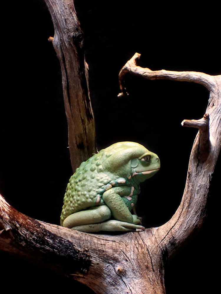
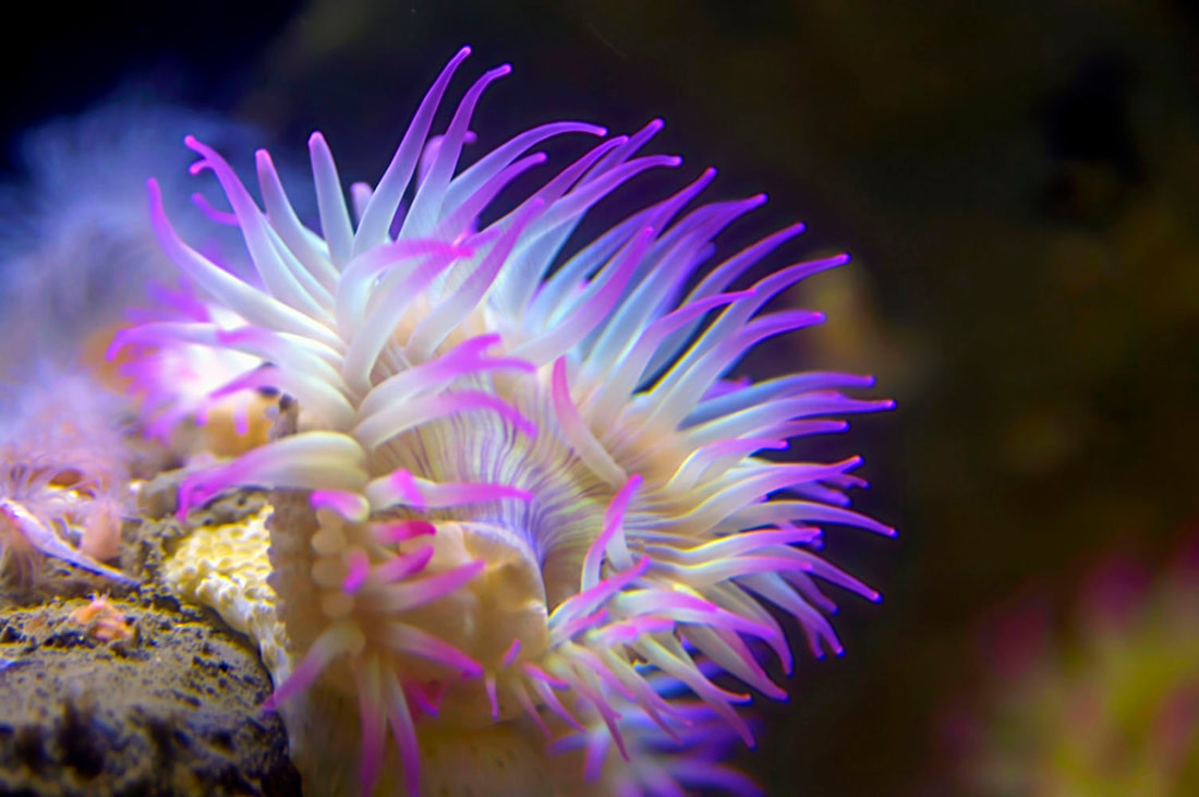
Old Category: Under the Sea This one had become too large, and so it is now split into two categories: "Swim & Float" (animals that generally don't touch the bottom of the ocean) and "Tide Pool & Seashore" (sessile animals or crawling animals you're likely to find in or around tide pools).
PLANTS
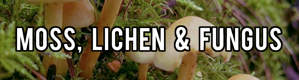
 Old Category: Flowers of the Wild For a long time, this category had only 5 photos. I have now expanded it to include wildflower photos taken in the city (flowers whose garden-version and wild-version would be indistinguishable, even if that particular specimen had been planted by a human). This category also contains wild (or could-be-wild) fruits. Old Category: Forest Flora Now split into two categories—one for general plants and one for moss, lichen, and fungus.
OBJECTSOld Category: Bridges, Buildings & Boats Turns out that's really 3 categories. When I started, it made sense to lump them together, but living in a city with 12 bridges, and visiting many other bridge-heavy cities makes the bridge category pretty big. Buildings are everywhere, too. I don't have that many boat photos, but for some reason I have a handful of truck photos (formerly in the "Everyday Objects" category). Boats + cars = ways to get from point A to point B.
SCENERYOld Category: Creeks, Rivers & Oceans So, like ALL the water ever? Now divided into essentially salt water and fresh water.
Old Category: Into the Sky Now two categories—one to highlight interesting cloud formations and sunsets, and one for the night sky.
Well this is soothing... Take six minutes and let your mind wander a bit.
Update: I'm not in the habit of complaining about my customers. To be clear, this person never actually became my customer because I couldn't give her what she asked for. I also waited more than 5 years before posting this exchange to give her ample time to wander to other parts of the internet. Chances are extremely low she's still haunting my pages. ........ Sometimes, I get requests for my art, but in a slightly different format than I currently offer it. I usually try to find a way to make this happen. I know that personally, I don't physically have space for all of the art that I love, and so flexibility with format can make all the difference.
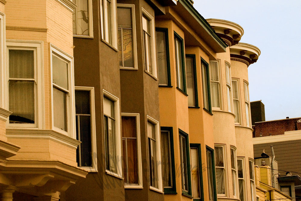
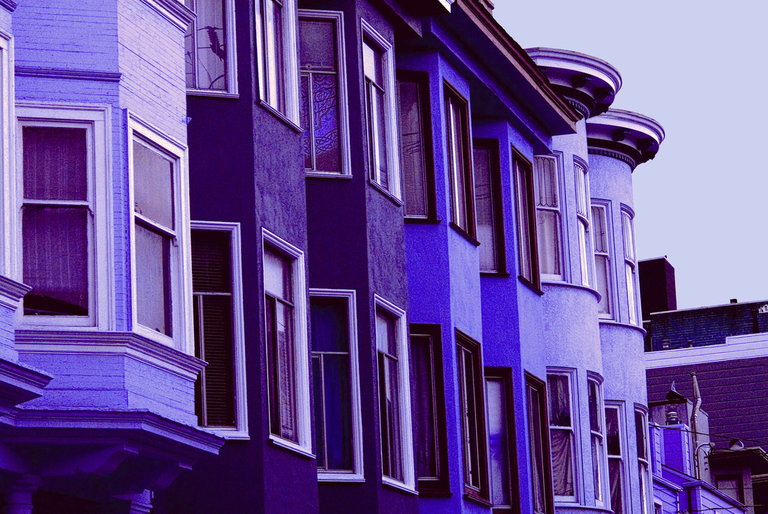
I got the following response: Wow! Now that I know what a great job, you can do. Can you change the colors of the photo so that it will blend in nicely with a grey t-shirt? I love the colors of the photo but it definitely is for warm colors and not for cool colors (going with the color palette for ladies clothing). I still want the photo to stand out like it does, contrast colors are great or vivid colors are great. But I need the color palette changed. Can you do that for me? I also would like that wonderful photo you have on the ladies long sleeve t-shirt at the bottom of the page you provided. I just need that photo tweaked a bit. Normally, taking my original vision for a photograph and wanting the colors altered would rub me the wrong way a bit. I spend time making sure the colors in a photograph are exactly how I want them, while also reflecting the mood if not the reality of the original scene. But, I could see where she was coming from. Warm-colored image on a cool-colored shirt would just clash. It wouldn't take me long to adjust the hue a bit. I added one more shirt to the CafePress site, and sent her a message. Four messages followed (I have added some line breaks for clarity).
This way the print will look like it is blending into the t-shirt. The townhouses color also needs to be vibrant so that they will still stand out. I now look forward to receiving the link for the new printed t-shirt. I was looking at the bottom of the page for the t-shirt change. I finally found the one you changed and I would prefer that the background color be in a grayish color. I would then prefer that the townhouses be in different colors that will make the piece radiate. But please follow the color contrast used by the original piece. What I'll do now is explain the colors combination for you. The sky is in Grey. The background to provide depth is kept in black. The townhouses are in Midnight blue; Nepal; Botticelli and Red Orange. So, please provide this change on the t-shirt you already started developing. I like the 3/4 sleeve XXL t-shirt (dark). Now I saw your talent ability displayed on Etsy so I know you could handle these changes. I now look forward to seeing your new creation. Oh, here is the color sequence for the townhouses from left to right: The first one in Nepal; The next two in Midnight Blue; Then the next two after that in Red Orange and the last two in Botticelli. Again, just a quick reminder that the background for you that the sky is in Grey. Wow, that's going to looking spectacular. Guess I should add this. So, the window trim that is white in the original photo is grey in mine. The trim that is brown on the yellow townhouses in the original photo is now Midnight Blue in mine. The two townhouses that are orange in the original photo that have brown trim now have Midnight Blue trim. Since my townhouses are in Orange Red. Then the last two townhouses in the original picture that are lighter yellow and have whitish trim now have grey trim in my photo. In addition, the eaves trough for the second, third & fourth townhouse is now black in my photo. The last eaves trough that is rounded for the yellowish townhouses in the original is now Midnight Blue. Then, the depth at the bottom of the page and contrast eaves troughs at the right of the page for the background building is now black. That building then has a white trim under the eaves trough and black building. I think it has stairs, which will be black. I also think it has some brick, which will now be Orange/Red caulking, and Nepal brick. I’m now wondering if you have a headache yet. I have no idea what colors "Nepal" and "Botticelli" are, and this customer is awfully specific about what I should do to my art. Except for the parts that are totally confusing: I would prefer that the background color be in a grayish color. The sky is in Grey. The background to provide depth is kept in black. Again, just a quick reminder that the background for you that the sky is in Grey. So, the background and the sky are the same thing, which should be grey. But black. I looked up the colors, and this is what the series of buildings would look like:  With colors specified for the eaves and trim and... stairs? So, basically, "I love your art, but can you change everything about it please?" I responded with this: "I changed the colors of the original to "cool" colors by adjusting the overall hue. I am not willing to change the colors of each house individually, as adjusting the overall hue was already compromising the integrity of my piece of art. If I were willing to do so much to it, the time involved in such a process would make the overall price of the shirt skyrocket beyond what you would want to pay for it." If I were to do all of the things she wanted me to do, and make it look good, and make it a piece of art I was still happy with and willing to put my name on (not actually possible with her color choices), it would take hours of work. And then, this: Would you please change the color of the town houses to greys. I'm just not fond of the purple or the blues that have been picked. I do like the color grey of the sky. Hopefully this will be the last change. I now look forward to receiving this item. Le sigh...  |
Topics
All

Archives
May 2021
|


 RSS Feed
HOME |
PHOTOGRAPHY COLLECTIONS
|

© COPYRIGHT 2020. ALL RIGHTS RESERVED.
|