 It's 2020. Time to make some changes. It definitely started last year, or maybe the year before. I was editing my thousands of photos from Iceland, and I realized I had learned some crucial techniques. I decided to go back to the beginning and edit ALL of my past photos. With some of them I achieved dramatic results.
I also found a few treasure-troves of photos I had taken, uploaded to my computer, and then promptly ignored entirely. There were some gems in there that now needed to be added into the timeline into the appropriate place.
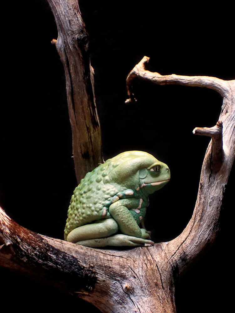
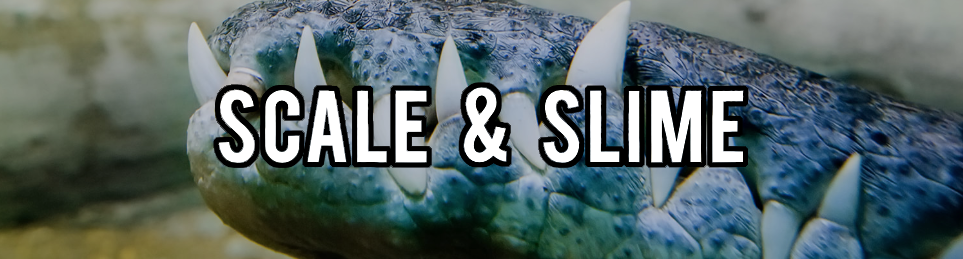
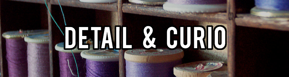
Oh, the timeline! This is a spreadsheet, which is easy enough to rearrange, but it's also the Etsy Pattern site I had opened the year before to offer digital downloads that didn't expire. I loved the simplicity of the masonry look of it, but you couldn't rearrange the order easily (or at all? I'm not sure if I ever figured this out). I also had been posting sets of 5 photos from each of my categories on Instagram, chronologically, as each new set of 5 was complete. Was I starting both of these over?  This led to concluding that the Etsy Pattern site had done nothing for me except charge me $15 per month, and I could host my own items on my existing website if I put some money into it. I'd have an extra $15 per month once I shut down the other site. Which in turn led to me taking a look at my existing website. I was pretty proud of it at the time, but I created it in 2009. It LOOKED like it was created in 2009. It was definitely time for an update. As I began to update my new website with a new native shop function, I realized that the way I had been categorizing my photography made a lot of sense in 2009 with the photos that I had at the time, but some of those categories had not grown at all, and some had expanded to ridiculous proportions. It was time for new categories. New categories, like the new timeline, meant starting over on some things (lots of things) AGAIN. Those groups of 5 on Instagram, which I had already completely re-posted the week before, would now have to be re-posted again. I'll do it a little more slowly this time, starting today.  My categories went from 16 to 24—many were more specific, and the total number of photos in each category was closer to equal. I ended up re-naming a few of the categories several times as I went (because, at this point, why not start something over AGAIN again...). These still fit nicely into 4 over-arching categories: Animals, Plants, Objects, and Scenery. ANIMALSOld Category: Charismatic Megafauna Previously contained mammals, usually large, but there were some small ones in there as well. The small ones were breaking the category. They couldn't be mega-anything. There was also a combination of wild animals and pets / livestock. This has now been split into two categories.
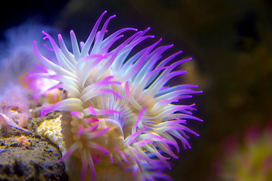
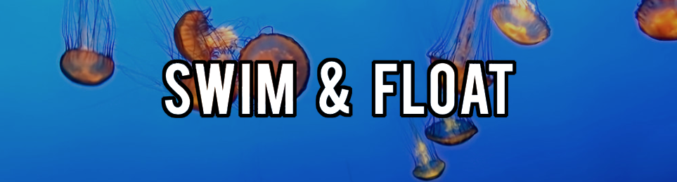
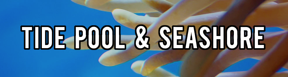
Old Category: Under the Sea This one had become too large, and so it is now split into two categories: "Swim & Float" (animals that generally don't touch the bottom of the ocean) and "Tide Pool & Seashore" (sessile animals or crawling animals you're likely to find in or around tide pools).
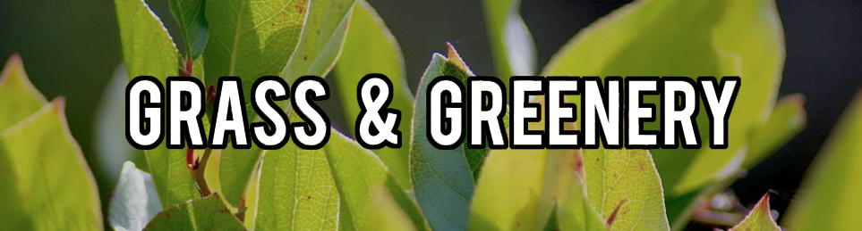
PLANTS
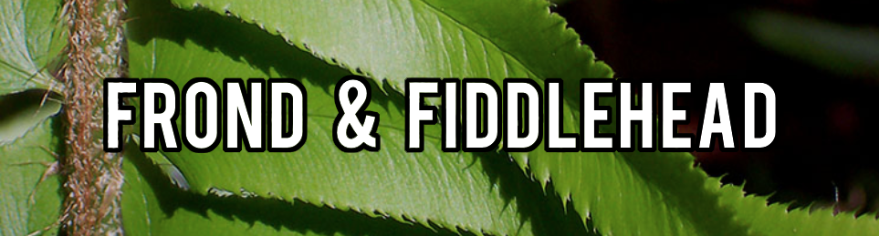
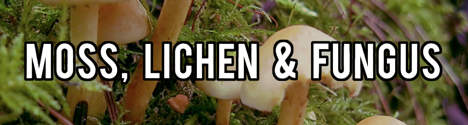
 Old Category: Flowers of the Wild For a long time, this category had only 5 photos. I have now expanded it to include wildflower photos taken in the city (flowers whose garden-version and wild-version would be indistinguishable, even if that particular specimen had been planted by a human). This category also contains wild (or could-be-wild) fruits. Old Category: Forest Flora Now split into two categories—one for general plants and one for moss, lichen, and fungus.
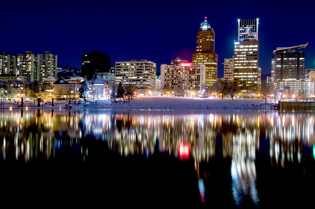
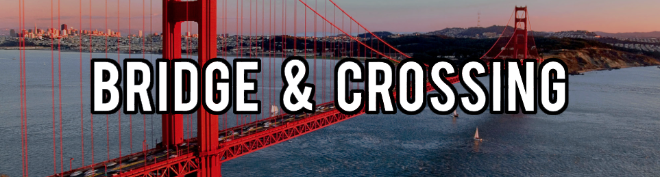
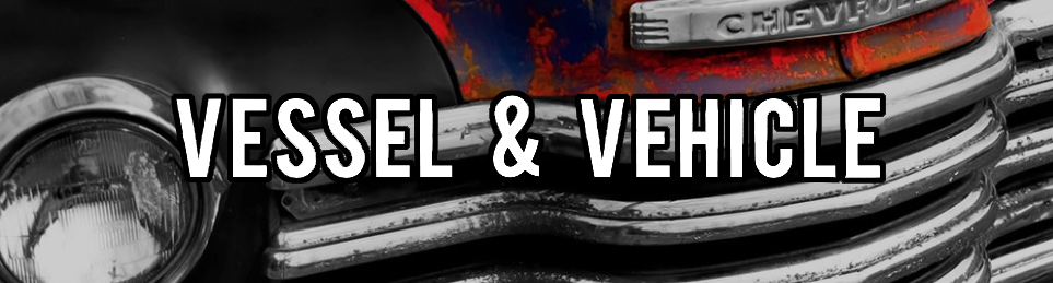
OBJECTSOld Category: Bridges, Buildings & Boats Turns out that's really 3 categories. When I started, it made sense to lump them together, but living in a city with 12 bridges, and visiting many other bridge-heavy cities makes the bridge category pretty big. Buildings are everywhere, too. I don't have that many boat photos, but for some reason I have a handful of truck photos (formerly in the "Everyday Objects" category). Boats + cars = ways to get from point A to point B.
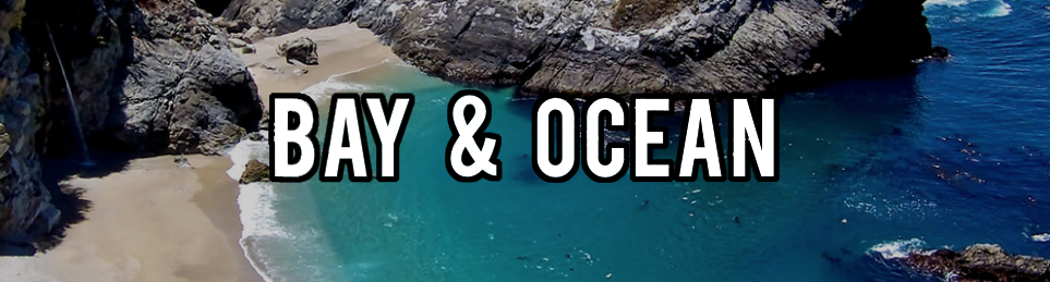
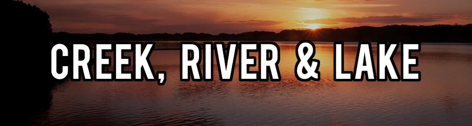
SCENERYOld Category: Creeks, Rivers & Oceans So, like ALL the water ever? Now divided into essentially salt water and fresh water.
Old Category: Into the Sky Now two categories—one to highlight interesting cloud formations and sunsets, and one for the night sky.

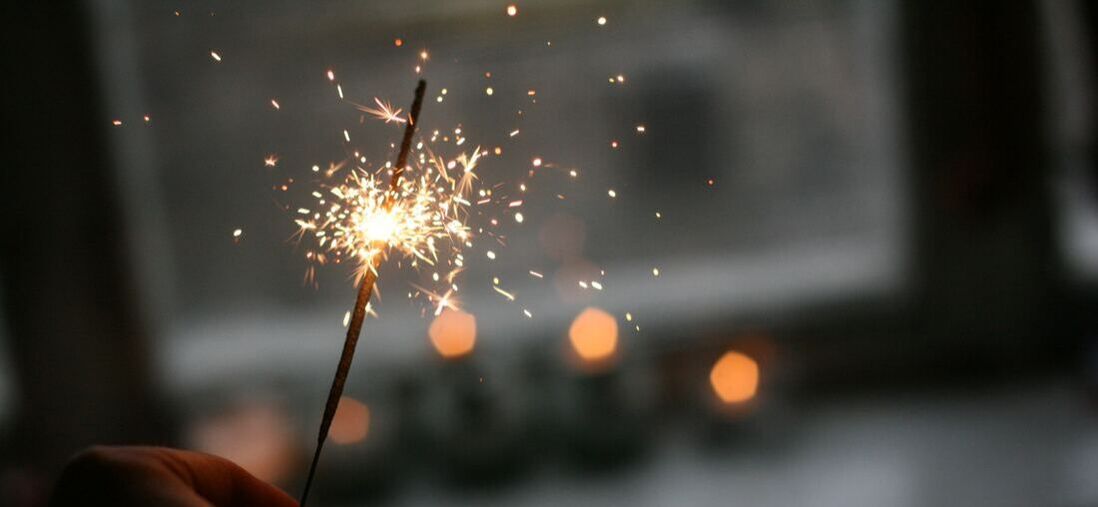
Well this is soothing... Take six minutes and let your mind wander a bit.
Update: I'm not in the habit of complaining about my customers. To be clear, this person never actually became my customer because I couldn't give her what she asked for. I also waited more than 5 years before posting this exchange to give her ample time to wander to other parts of the internet. Chances are extremely low she's still haunting my pages. ........ Sometimes, I get requests for my art, but in a slightly different format than I currently offer it. I usually try to find a way to make this happen. I know that personally, I don't physically have space for all of the art that I love, and so flexibility with format can make all the difference.
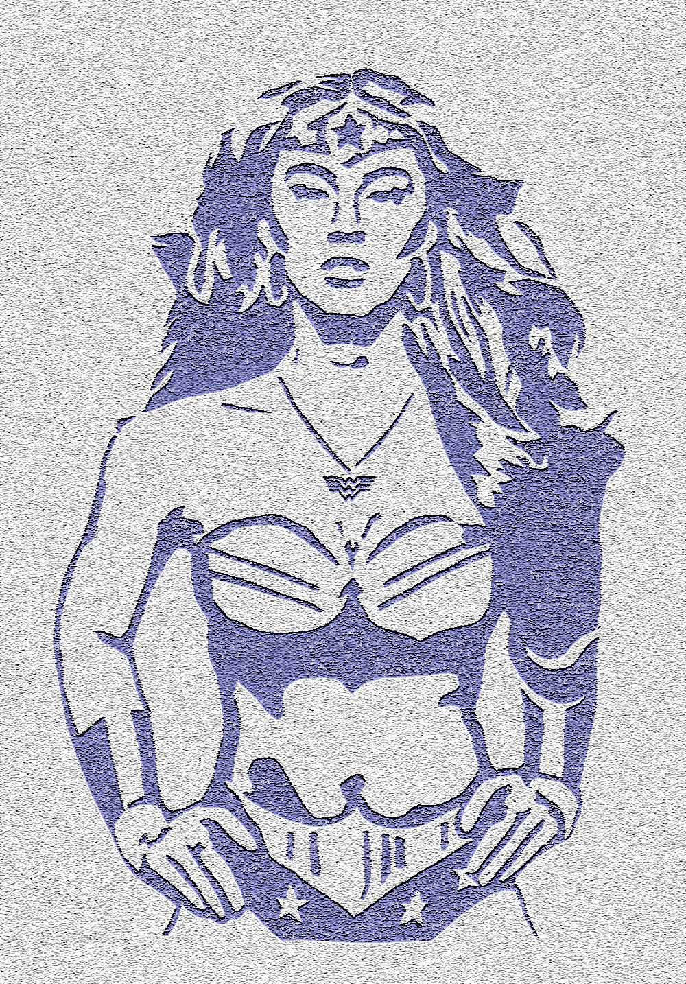
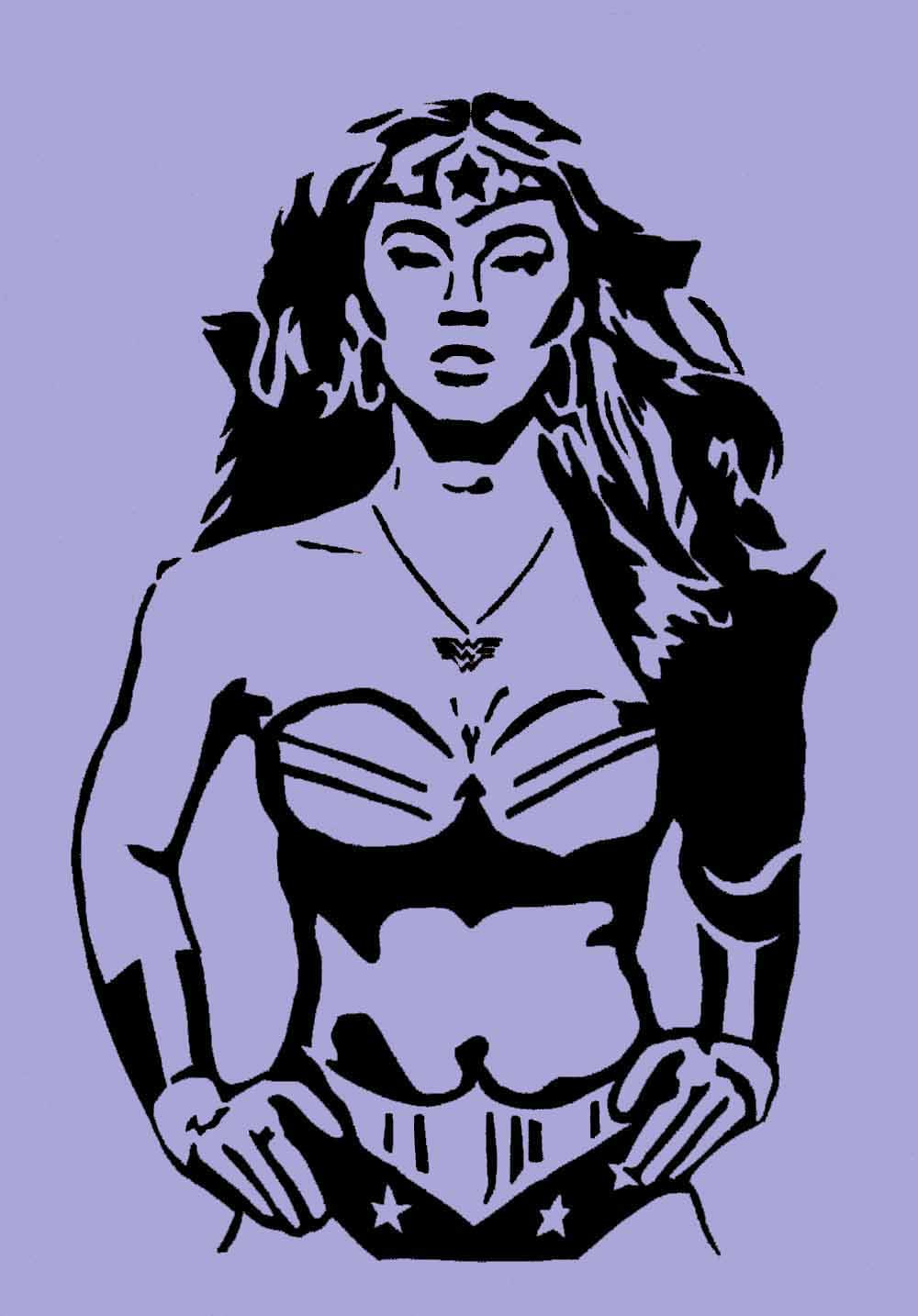
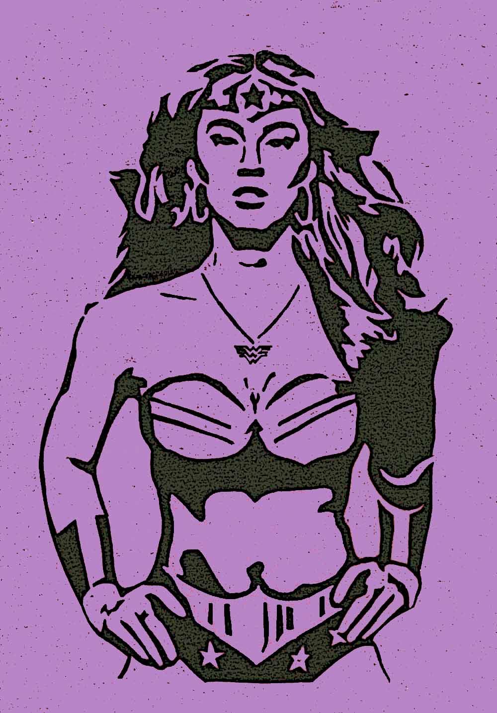
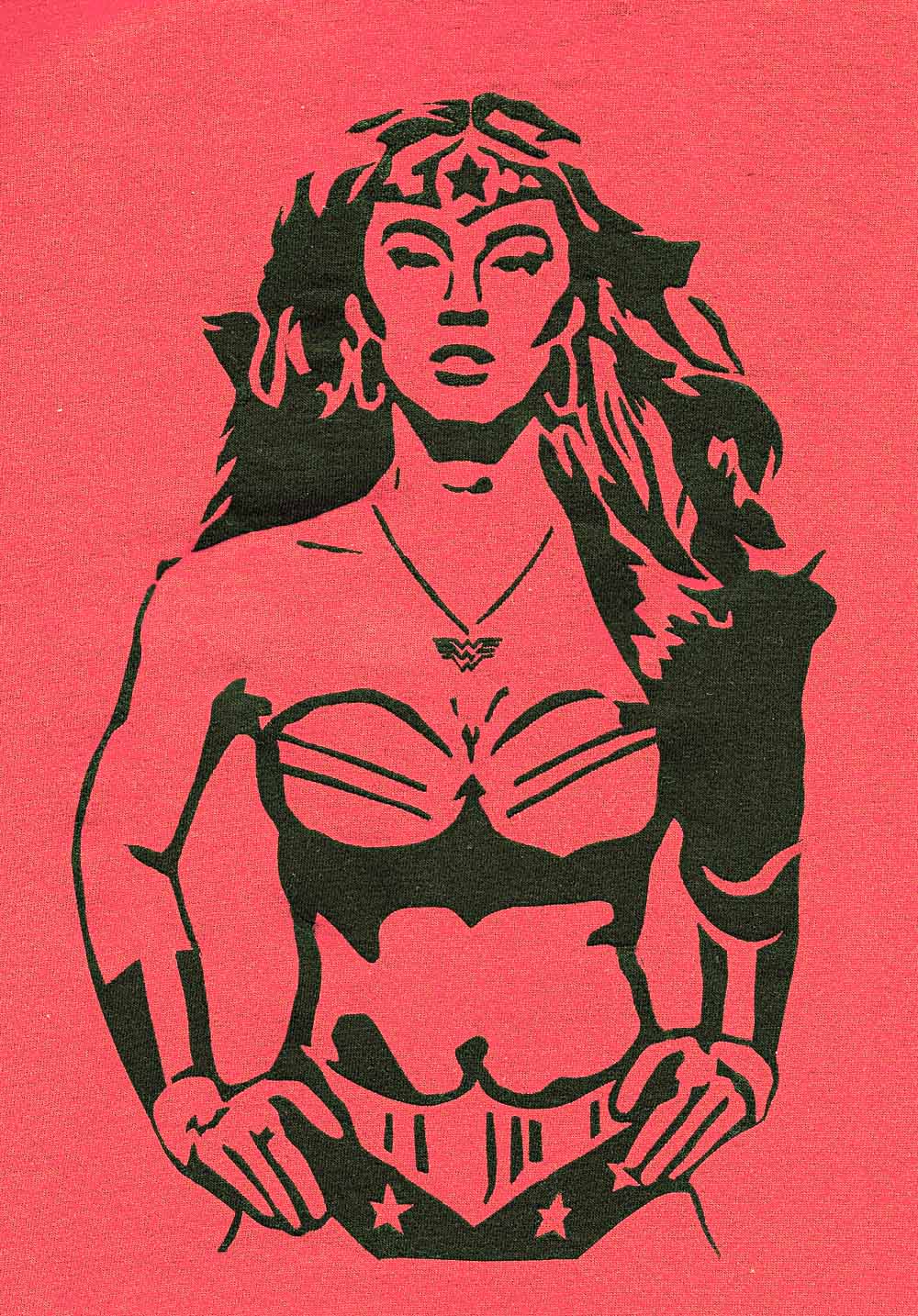
I got the following response: Wow! Now that I know what a great job, you can do. Can you change the colors of the photo so that it will blend in nicely with a grey t-shirt? I love the colors of the photo but it definitely is for warm colors and not for cool colors (going with the color palette for ladies clothing). I still want the photo to stand out like it does, contrast colors are great or vivid colors are great. But I need the color palette changed. Can you do that for me? I also would like that wonderful photo you have on the ladies long sleeve t-shirt at the bottom of the page you provided. I just need that photo tweaked a bit. Normally, taking my original vision for a photograph and wanting the colors altered would rub me the wrong way a bit. I spend time making sure the colors in a photograph are exactly how I want them, while also reflecting the mood if not the reality of the original scene. But, I could see where she was coming from. Warm-colored image on a cool-colored shirt would just clash. It wouldn't take me long to adjust the hue a bit. I added one more shirt to the CafePress site, and sent her a message. Four messages followed (I have added some line breaks for clarity).
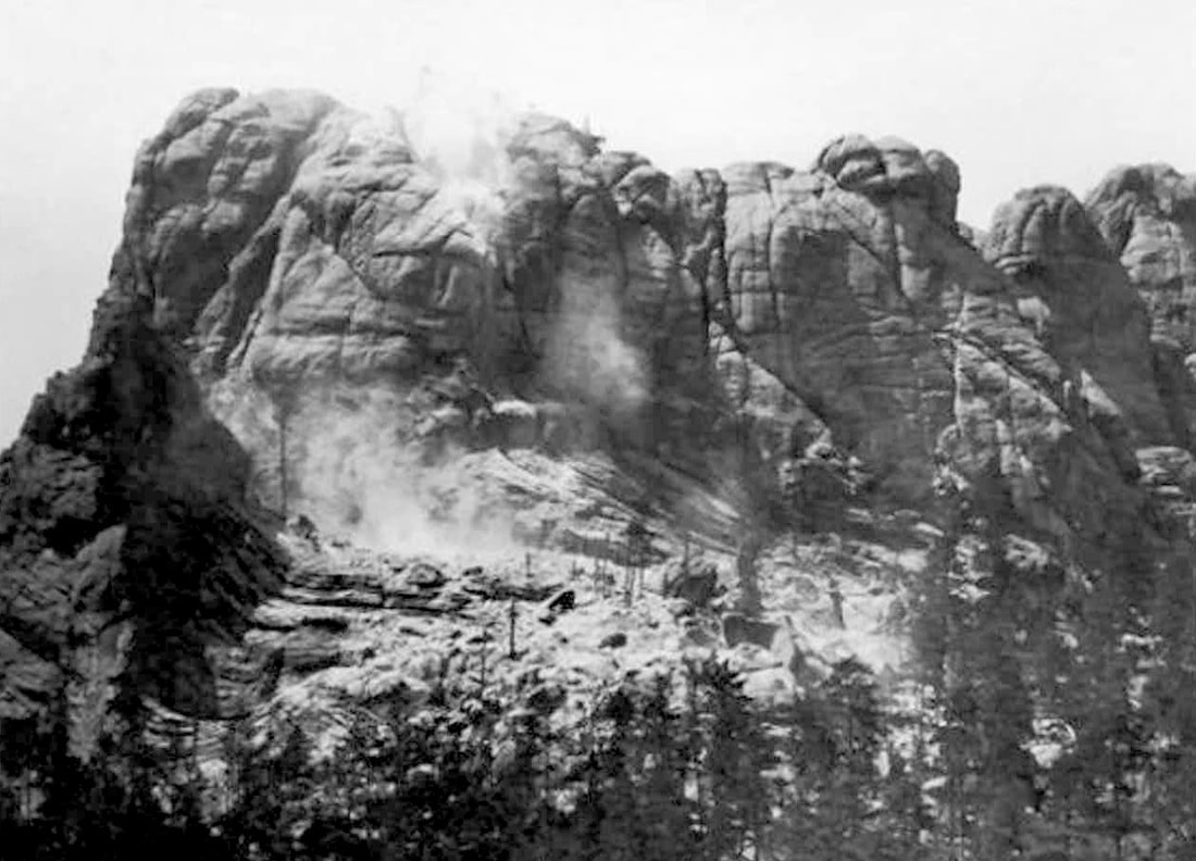
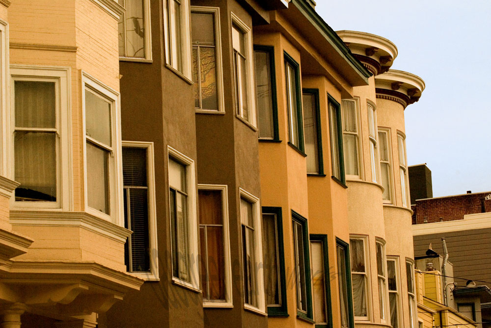
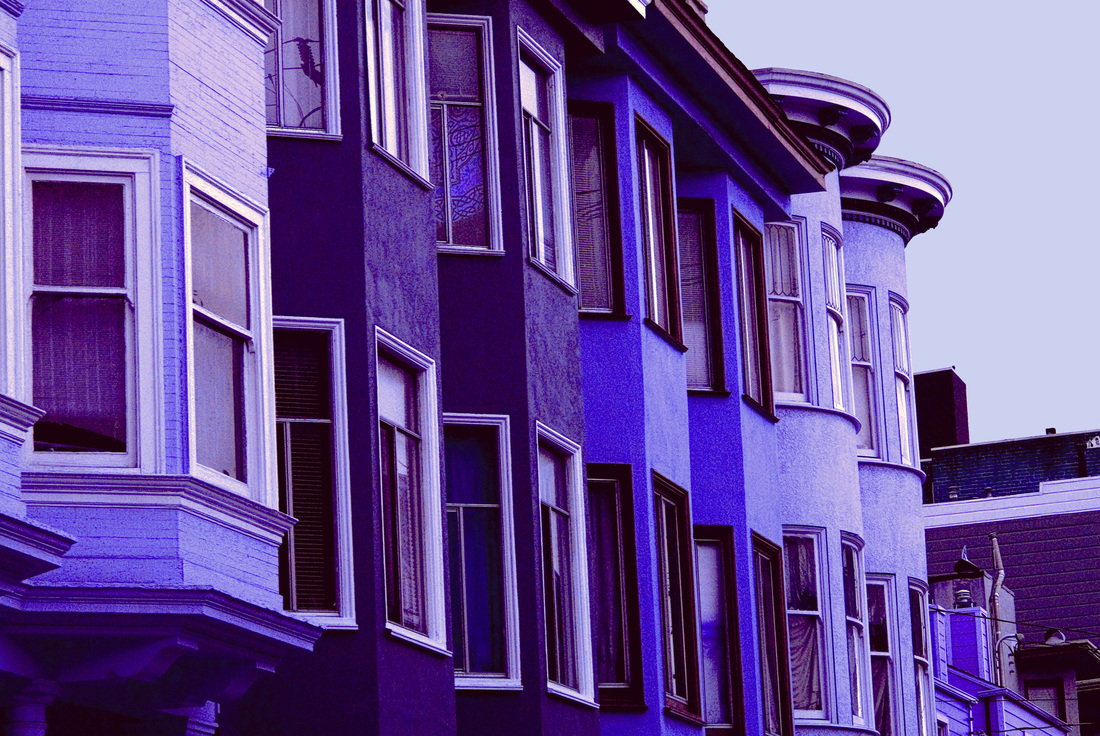
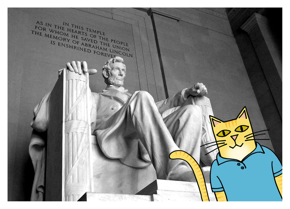
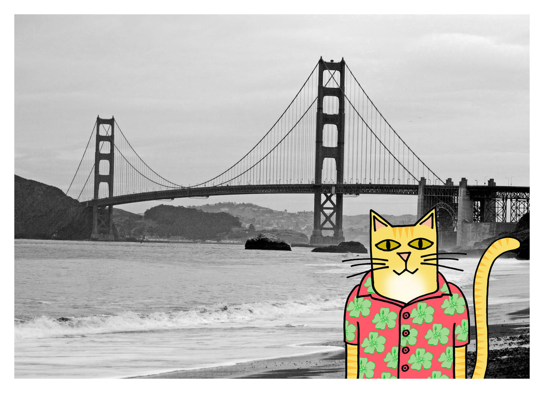
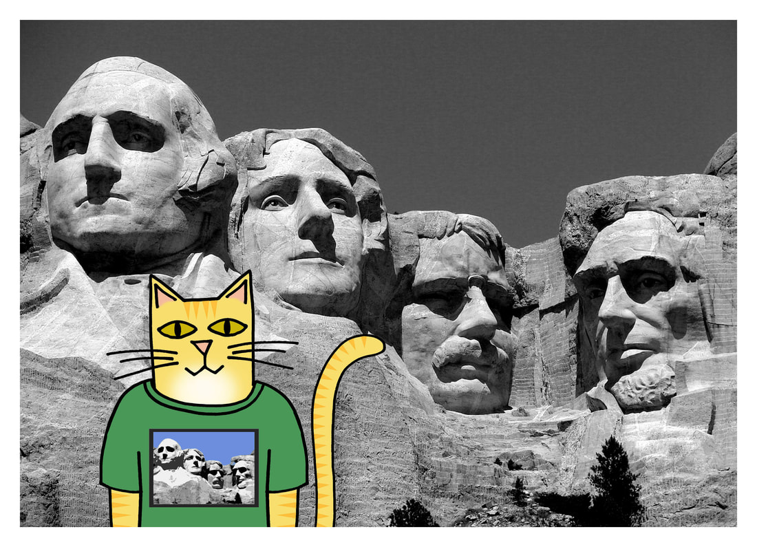
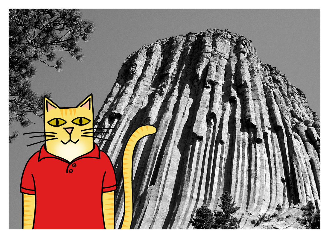
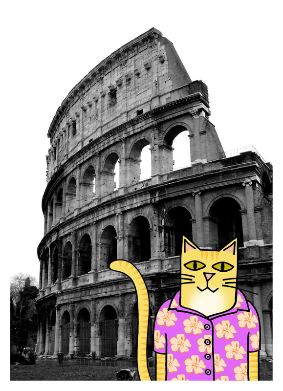
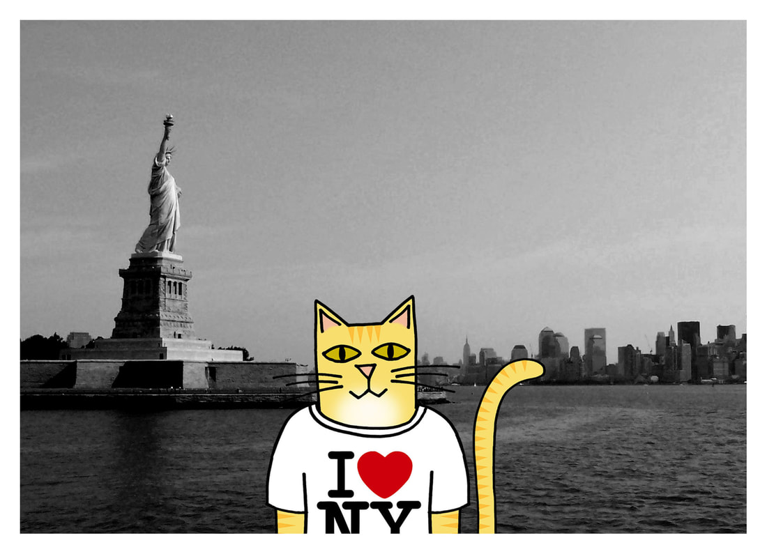
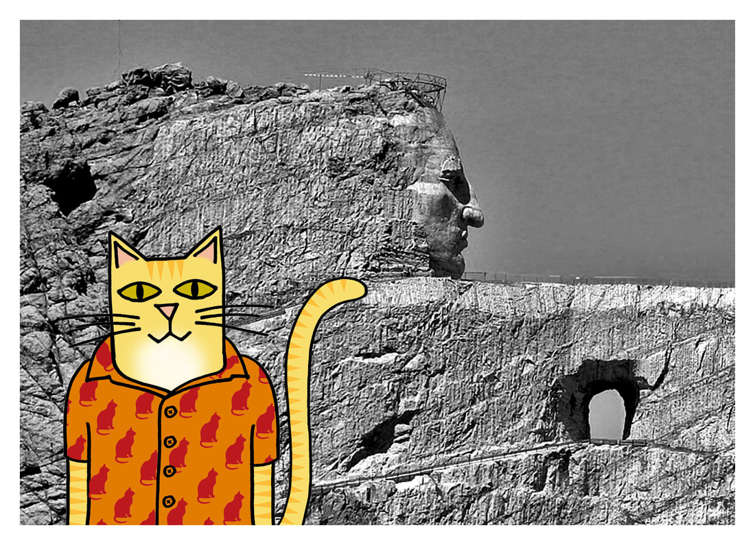
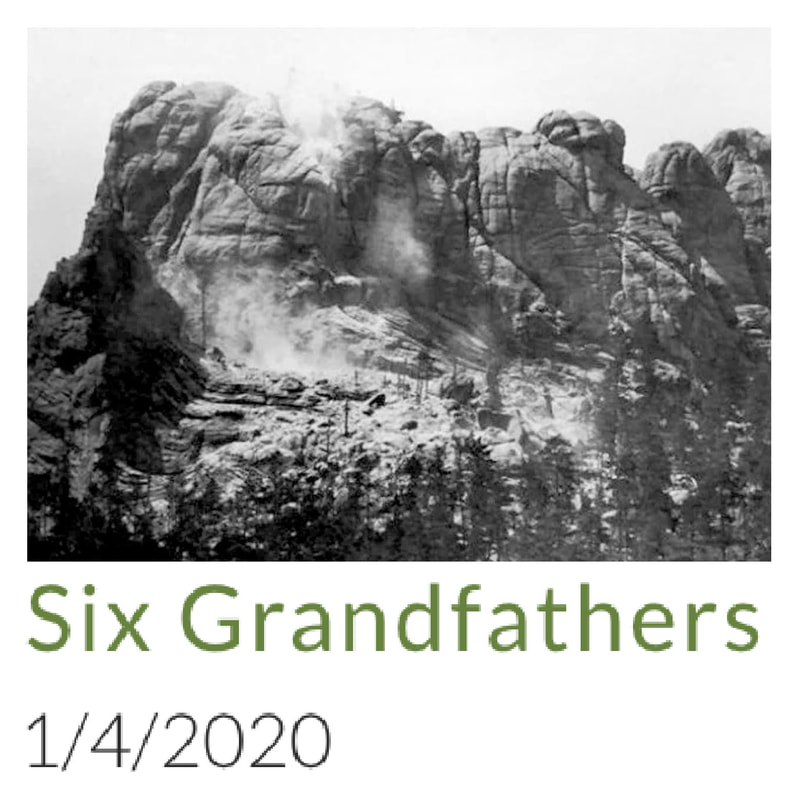
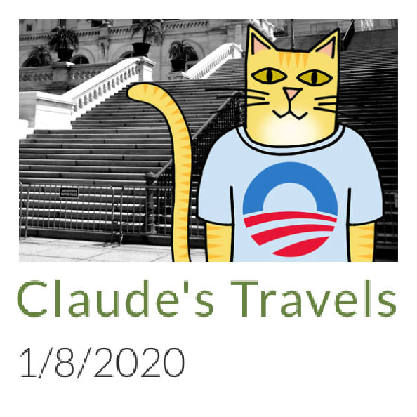
This way the print will look like it is blending into the t-shirt. The townhouses color also needs to be vibrant so that they will still stand out. I now look forward to receiving the link for the new printed t-shirt. I was looking at the bottom of the page for the t-shirt change. I finally found the one you changed and I would prefer that the background color be in a grayish color. I would then prefer that the townhouses be in different colors that will make the piece radiate. But please follow the color contrast used by the original piece. What I'll do now is explain the colors combination for you. The sky is in Grey. The background to provide depth is kept in black. The townhouses are in Midnight blue; Nepal; Botticelli and Red Orange. So, please provide this change on the t-shirt you already started developing. I like the 3/4 sleeve XXL t-shirt (dark). Now I saw your talent ability displayed on Etsy so I know you could handle these changes. I now look forward to seeing your new creation. Oh, here is the color sequence for the townhouses from left to right: The first one in Nepal; The next two in Midnight Blue; Then the next two after that in Red Orange and the last two in Botticelli. Again, just a quick reminder that the background for you that the sky is in Grey. Wow, that's going to looking spectacular. Guess I should add this. So, the window trim that is white in the original photo is grey in mine. The trim that is brown on the yellow townhouses in the original photo is now Midnight Blue in mine. The two townhouses that are orange in the original photo that have brown trim now have Midnight Blue trim. Since my townhouses are in Orange Red. Then the last two townhouses in the original picture that are lighter yellow and have whitish trim now have grey trim in my photo. In addition, the eaves trough for the second, third & fourth townhouse is now black in my photo. The last eaves trough that is rounded for the yellowish townhouses in the original is now Midnight Blue. Then, the depth at the bottom of the page and contrast eaves troughs at the right of the page for the background building is now black. That building then has a white trim under the eaves trough and black building. I think it has stairs, which will be black. I also think it has some brick, which will now be Orange/Red caulking, and Nepal brick. I’m now wondering if you have a headache yet. I have no idea what colors "Nepal" and "Botticelli" are, and this customer is awfully specific about what I should do to my art. Except for the parts that are totally confusing: I would prefer that the background color be in a grayish color. The sky is in Grey. The background to provide depth is kept in black. Again, just a quick reminder that the background for you that the sky is in Grey. So, the background and the sky are the same thing, which should be grey. But black. I looked up the colors, and this is what the series of buildings would look like:  With colors specified for the eaves and trim and... stairs? So, basically, "I love your art, but can you change everything about it please?" I responded with this: "I changed the colors of the original to "cool" colors by adjusting the overall hue. I am not willing to change the colors of each house individually, as adjusting the overall hue was already compromising the integrity of my piece of art. If I were willing to do so much to it, the time involved in such a process would make the overall price of the shirt skyrocket beyond what you would want to pay for it." If I were to do all of the things she wanted me to do, and make it look good, and make it a piece of art I was still happy with and willing to put my name on (not actually possible with her color choices), it would take hours of work. And then, this: Would you please change the color of the town houses to greys. I'm just not fond of the purple or the blues that have been picked. I do like the color grey of the sky. Hopefully this will be the last change. I now look forward to receiving this item. Le sigh...  Some of Claude's travel photos are fine: some are fairly typical tourist shots, and some give us a pang of nostalgia, like Claude wearing his hopeful Obama campaign t-shirt in front of the US Capitol building. Some of Claude's tourist endeavors are downright cringe-worthy. It's not Claude's fault; he picked popular destinations out of guidebooks. Like most tourists, he didn't delve deeply into the historical implications of his vacation destinations. And as amusing as Claude wearing a Mt. Rushmore t-shirt in front of Mt. Rushmore is, Mt. Rushmore itself is not funny at all. And while the Crazy Horse monument does not depict a racist white guy, it still desecrates the very land it was attempting to honor. Whoever's idea that was totally missed the mark. I am retiring the entire collection of Claude's Travels for now. Claude may travel again in the future, but he will pick his destinations more carefully next time. January 2011 Claude likes to travel. Specifically, Claude likes to be a tourist. You may see him in front of a well-known monument, asking if you'll take his picture. Maybe he'll send you a postcard on his next trip. Claude (clawed) was named by Living in the Past, after another traveling cat in her family. Claude is drawn with marker, colored digitally, and poses in front of real (photographs of) popular tourist destinations.
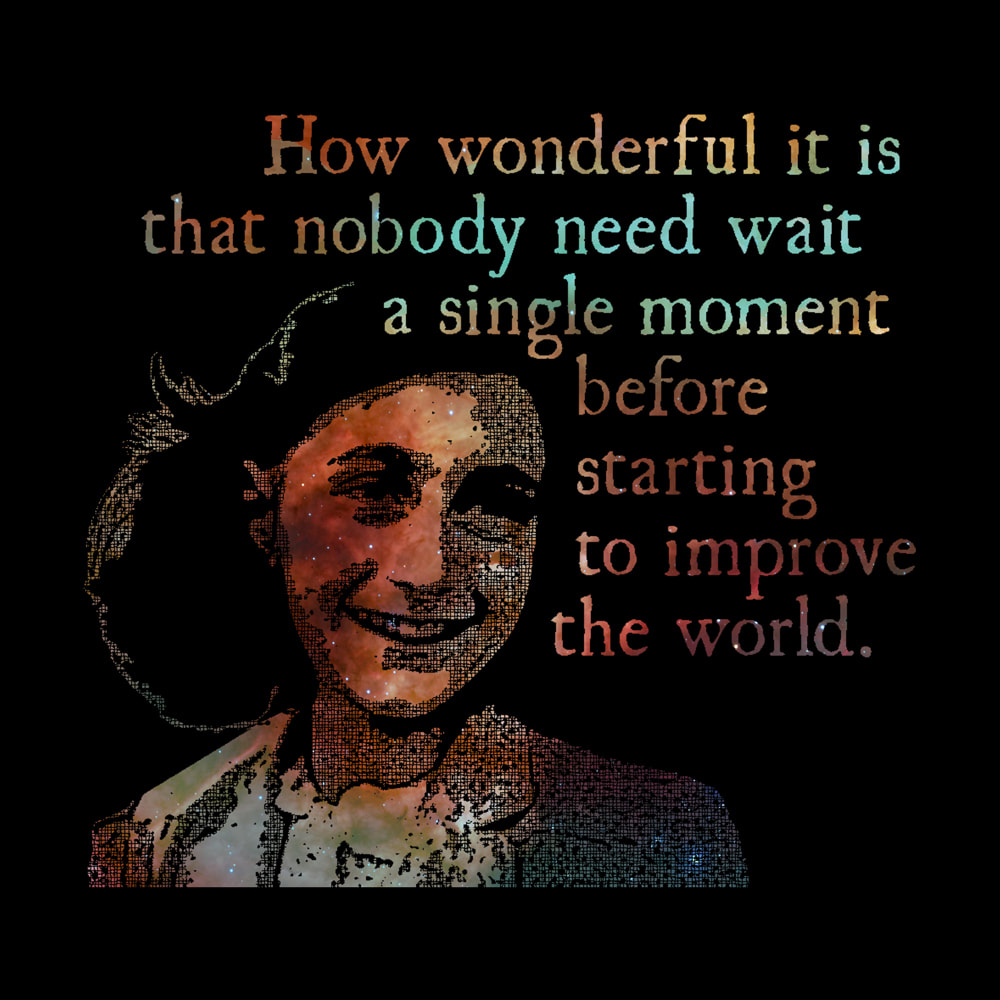
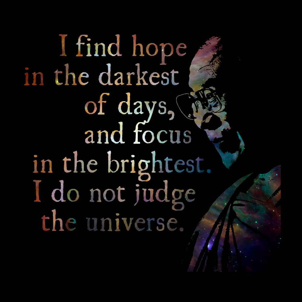
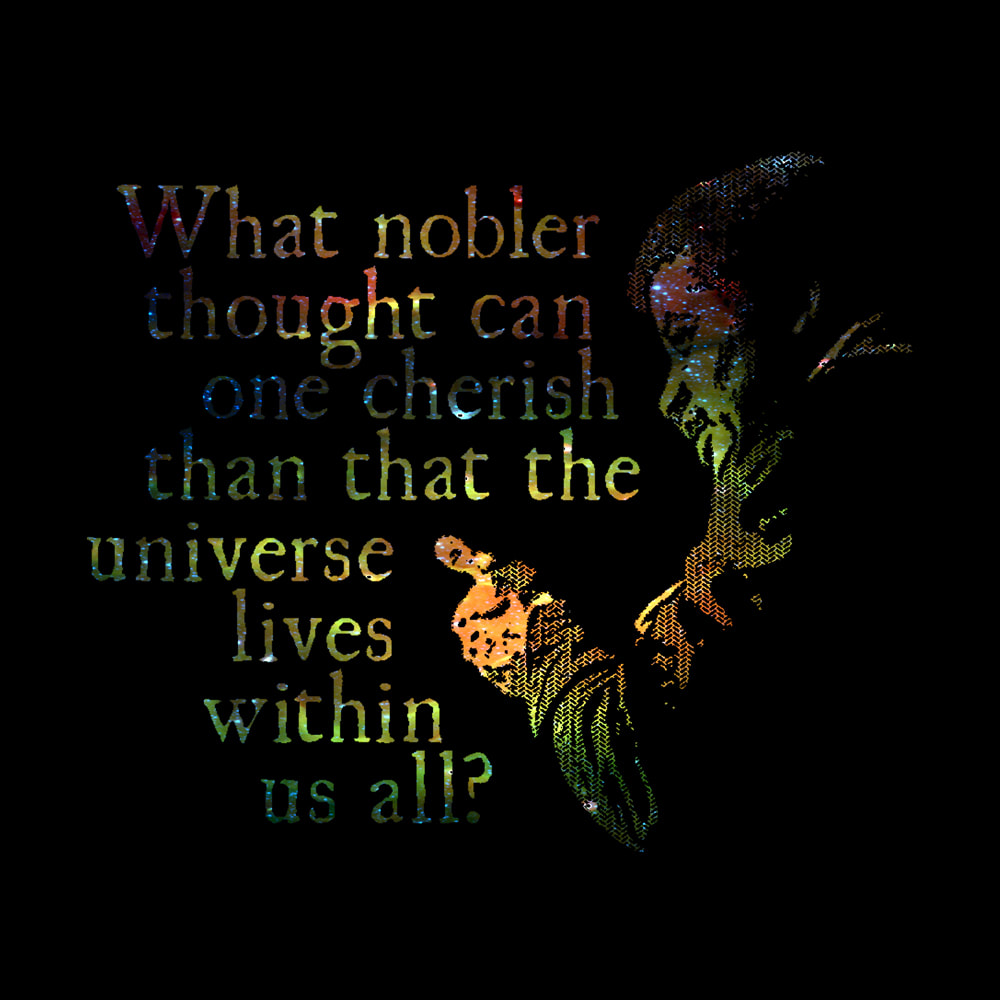
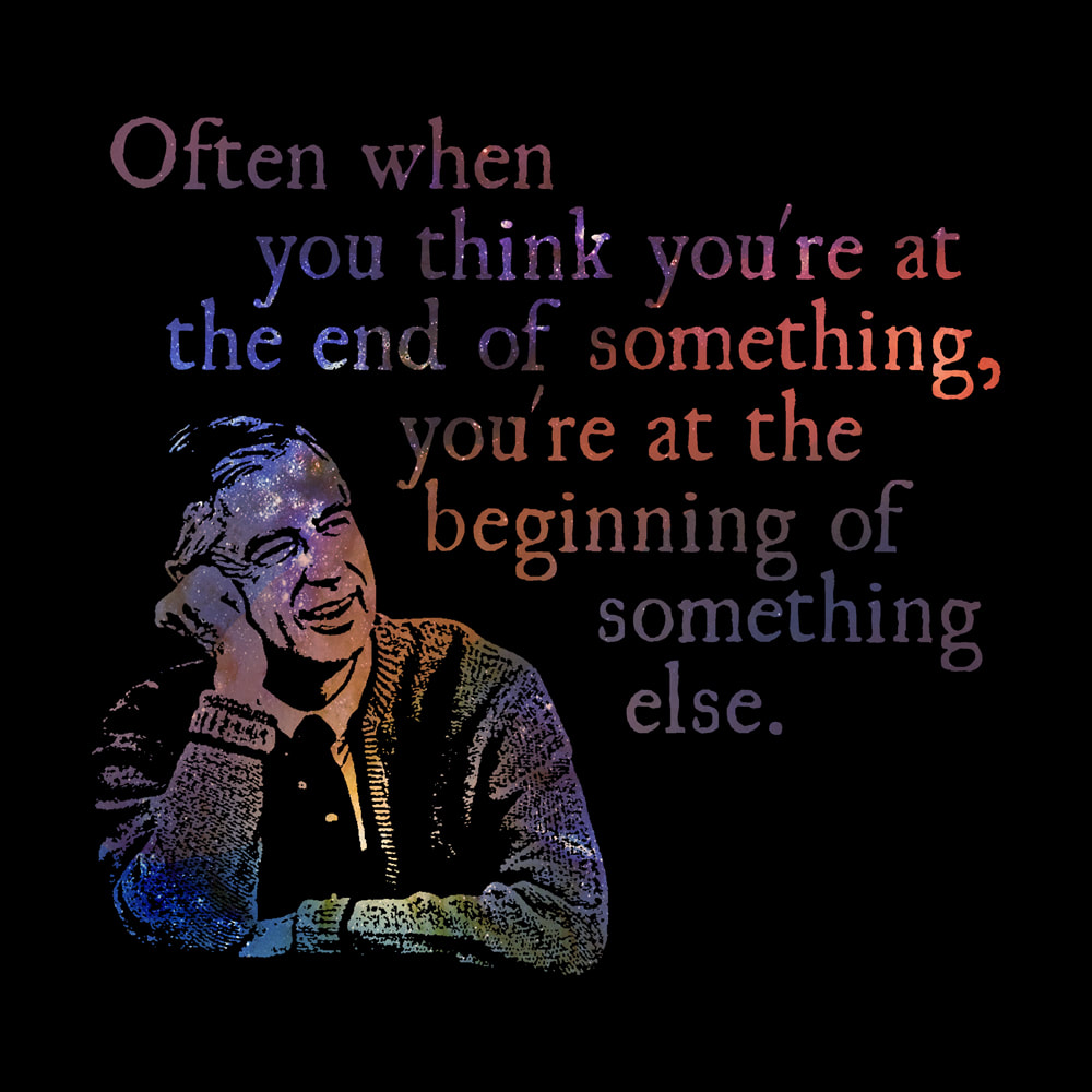
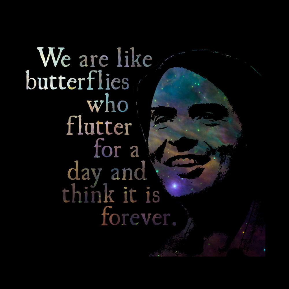
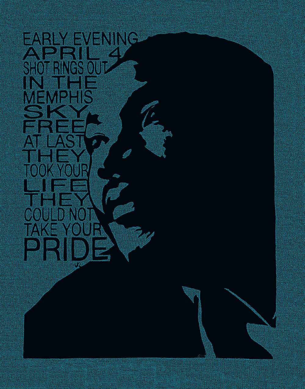
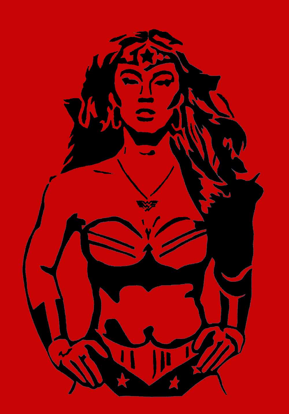
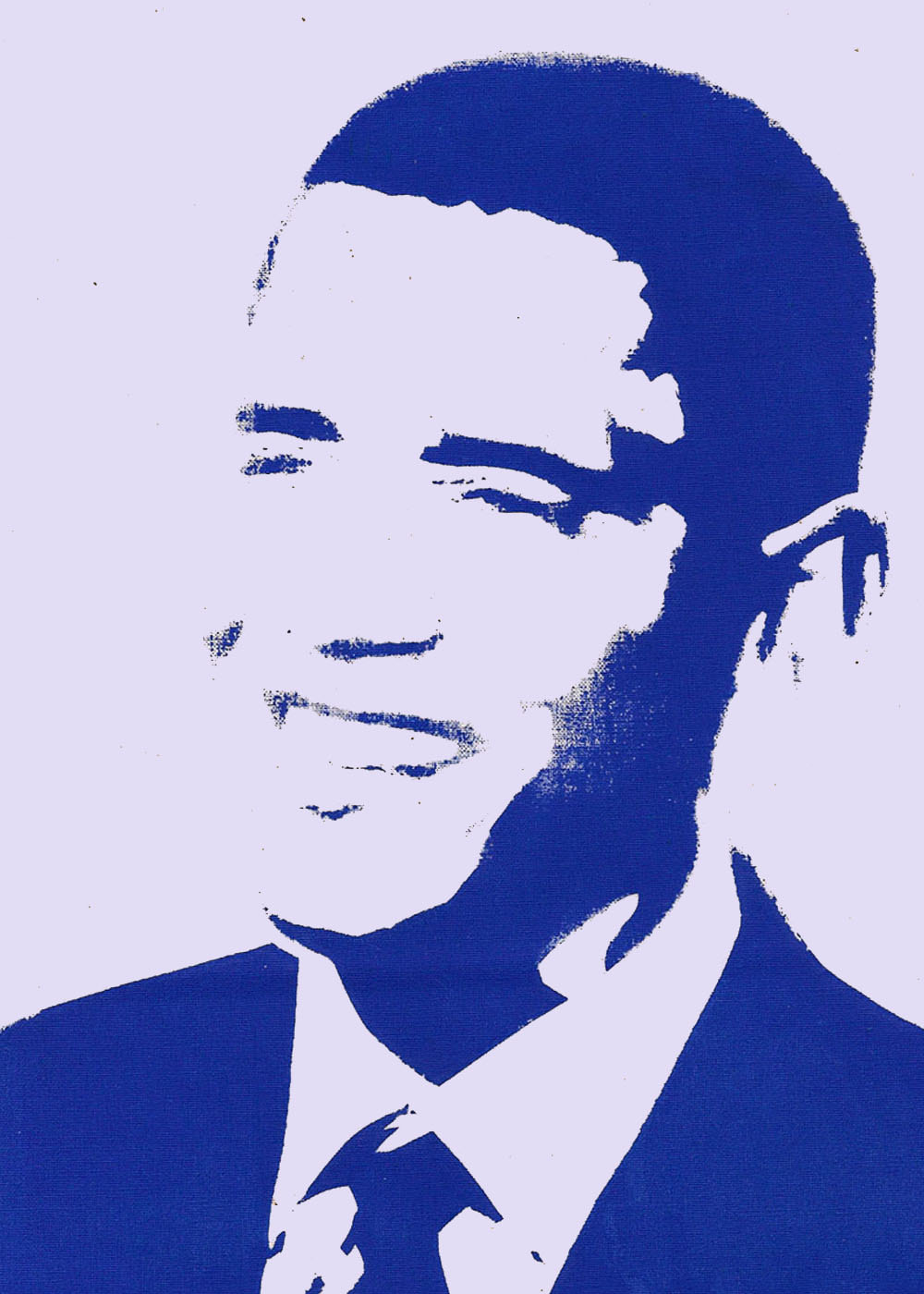
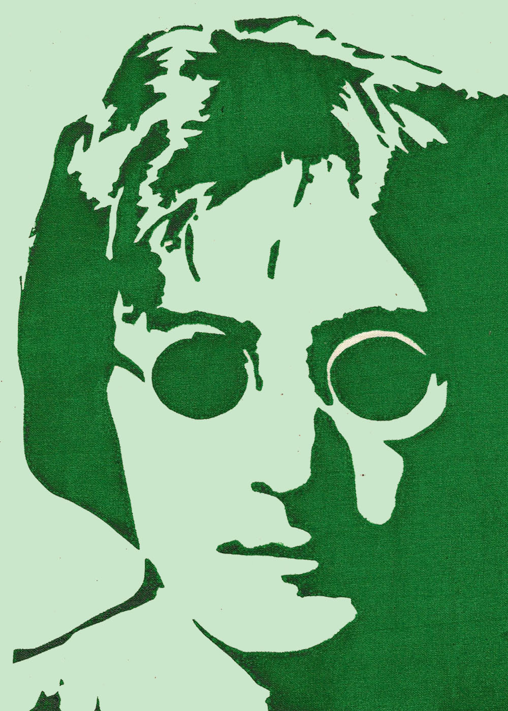
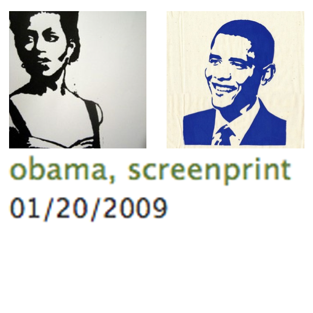
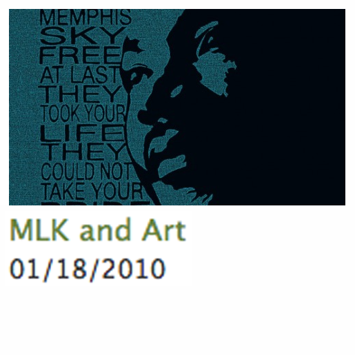
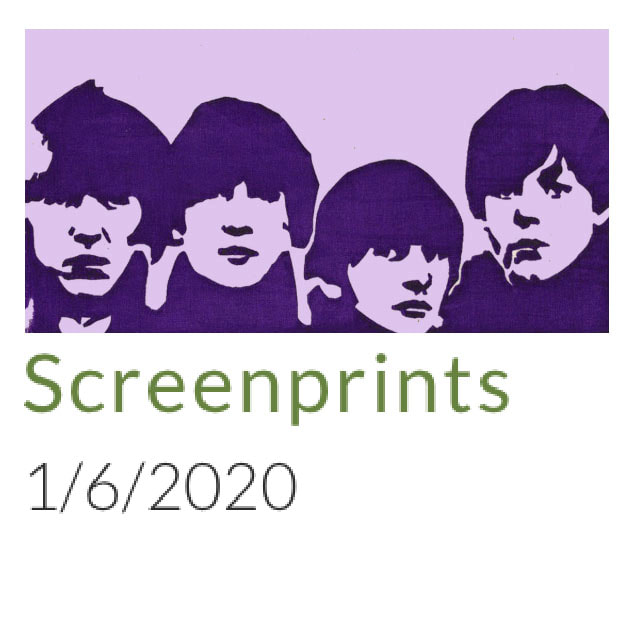
Universal truths by some of the greatest thinkers and souls of our time. I do not own these likenesses. Digitally enhanced silk screen prints: silk screened onto fabric using stencils or traditional screening methods, then scanned and manipulated using a graphics program.
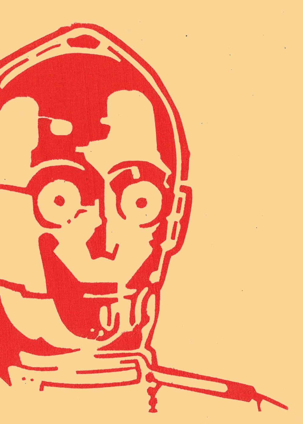
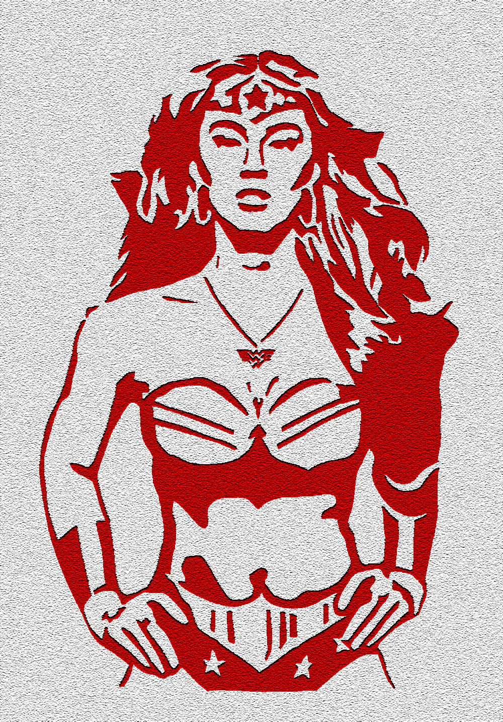
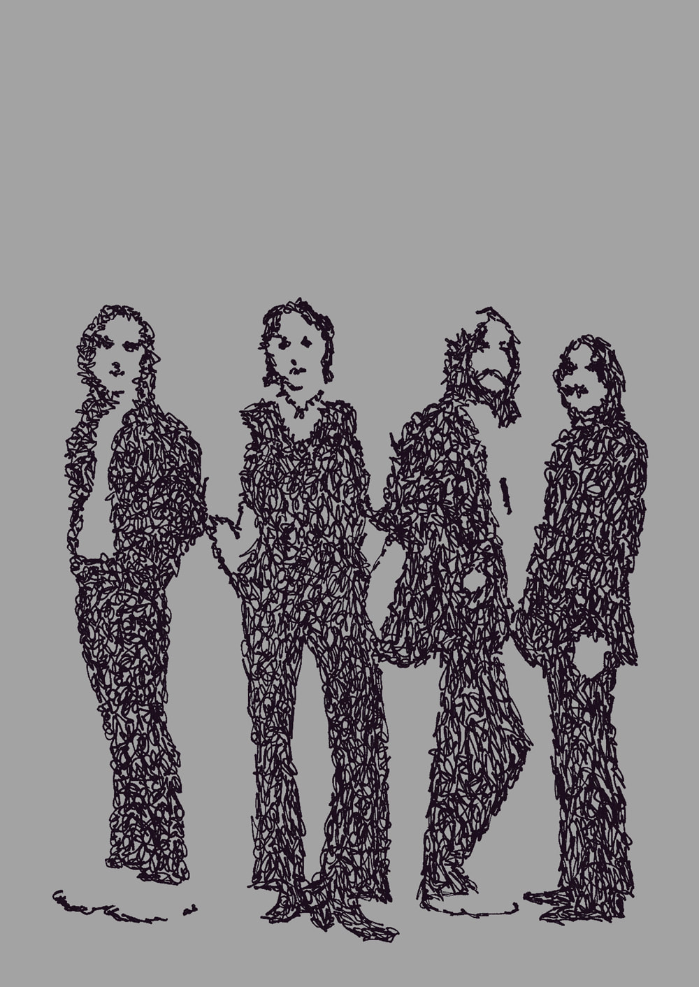
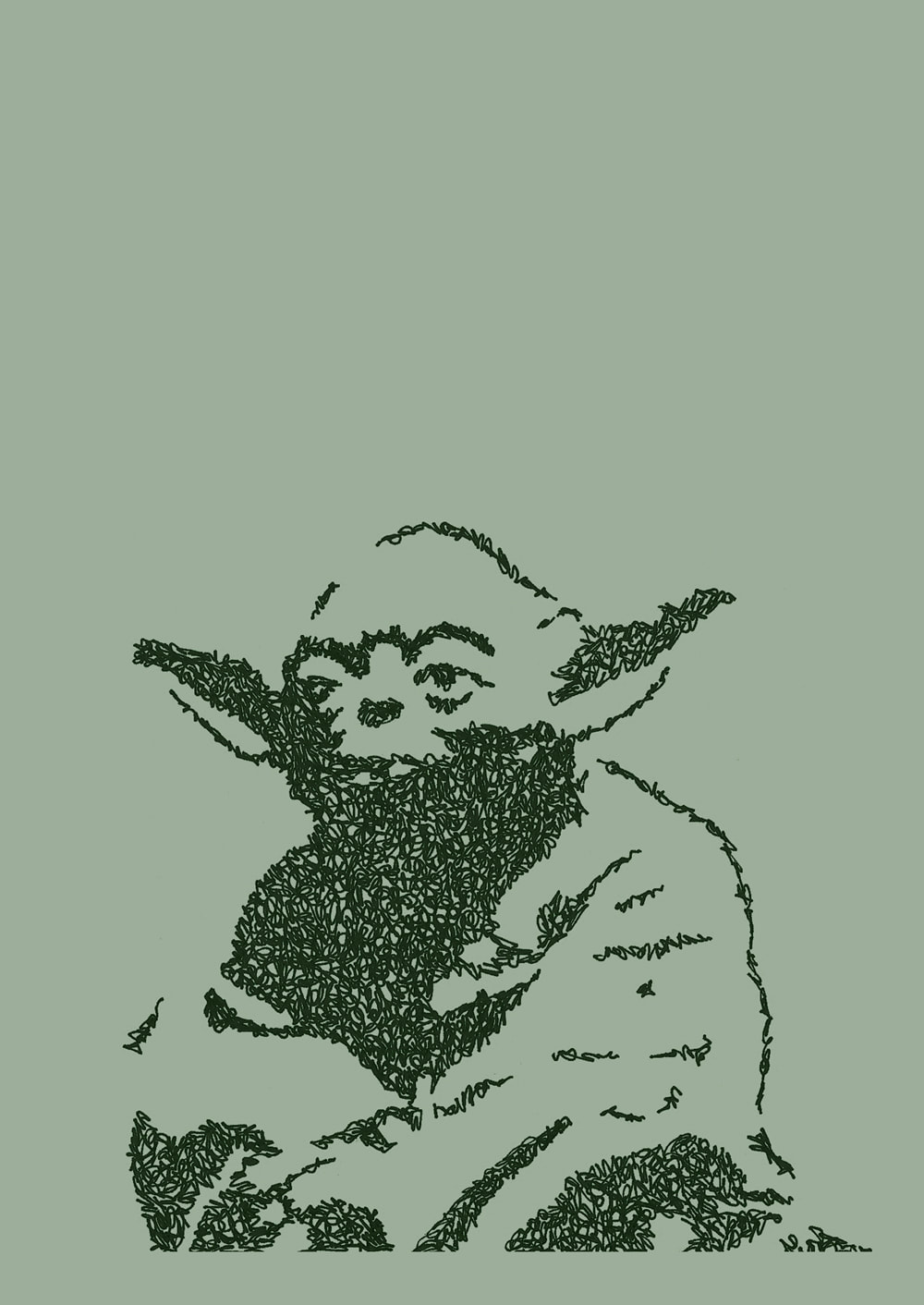
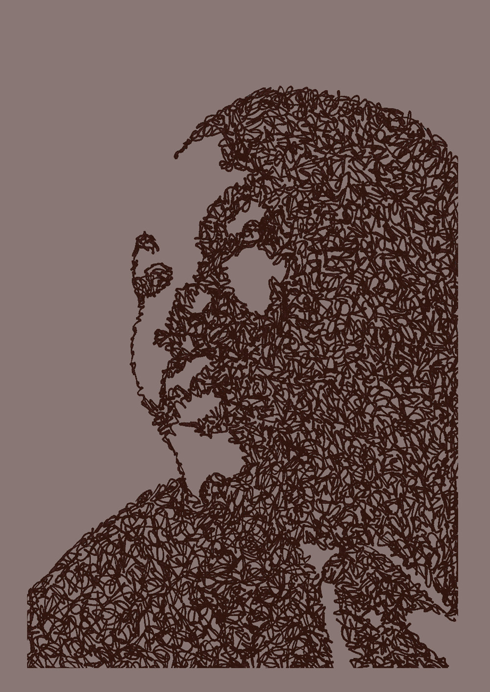
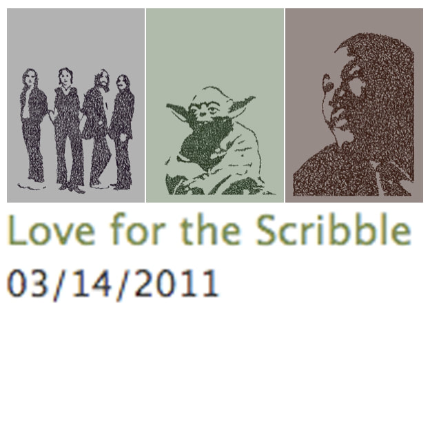
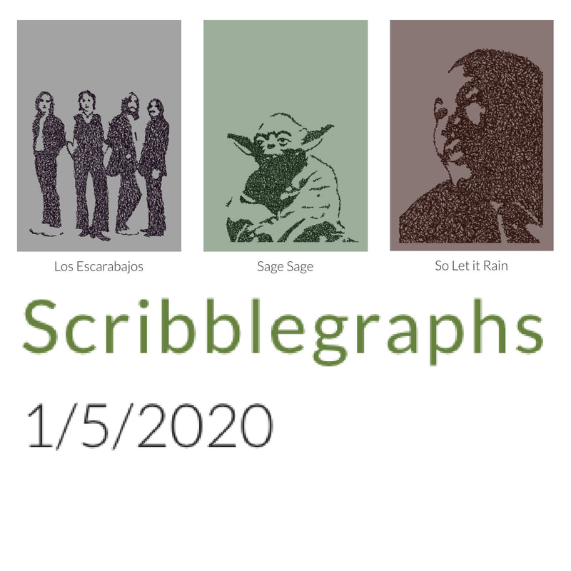
Scribbled lines with black permanent marker on white paper, scanned and colors altered using a graphics program. These were fun to create, and I love the final look of them, but I do not own any of these characters or likenesses.
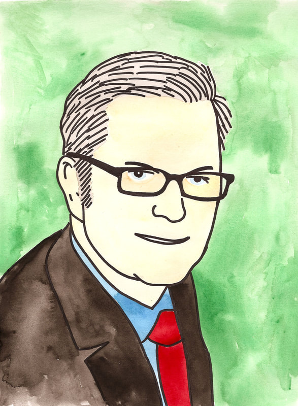
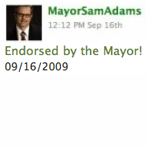
These were originally painted as answers to a visual questionnaire in September 2009. Mayor Sam Adams This one answered the question "What's in your wallet?" In addition to being the actual mayor of Portland, Mayor Sam Adams appeared as "Sam" the aide to the character of the mayor of Portland in the TV series "Portlandia." Sam is no longer Mayor, and his twitter account is defunct.
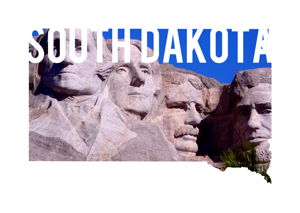
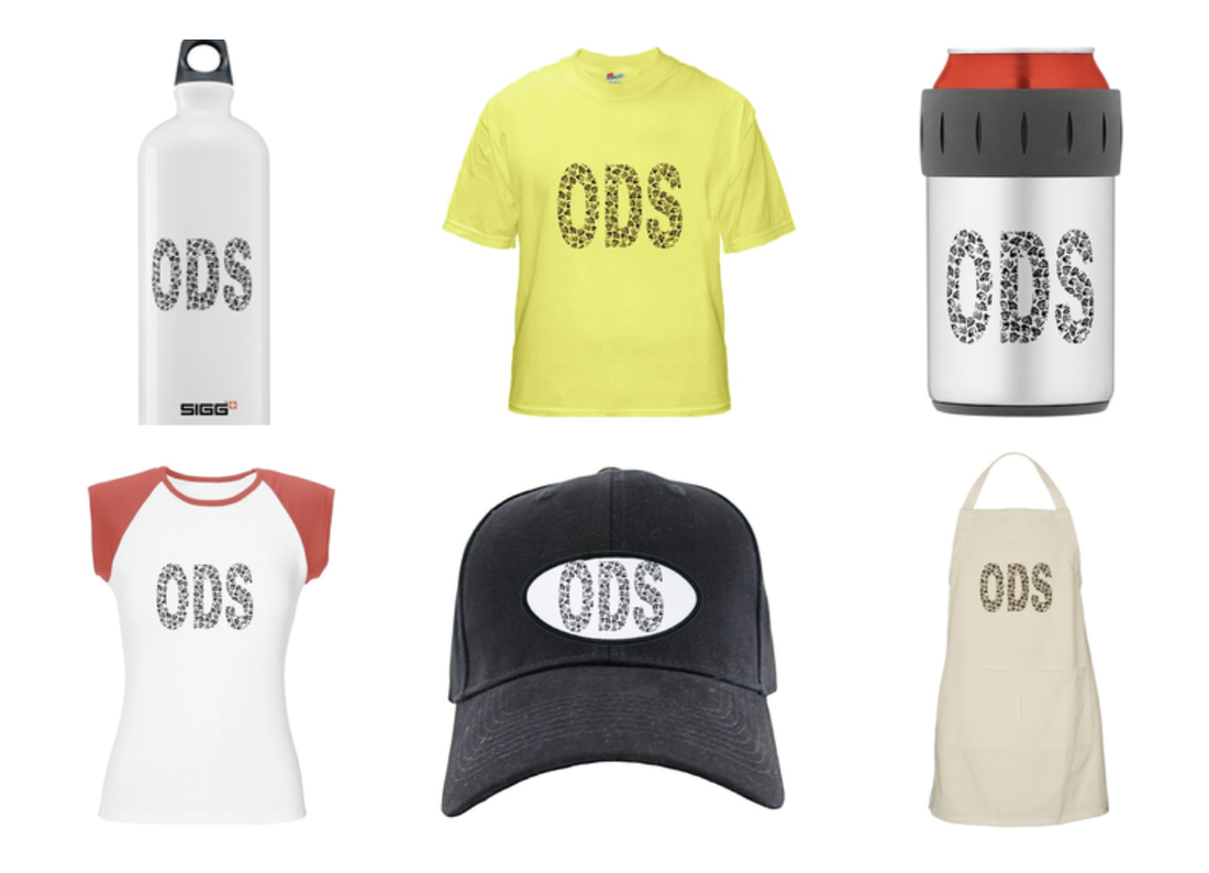
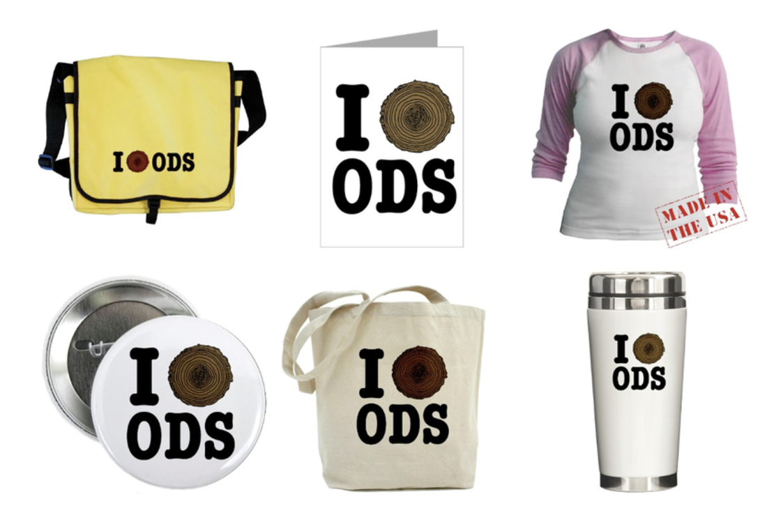
These pieces were tailored specifically to work with on-demand print fulfillment services, such as Café Press and RedBubble. These ones are all Outdoor School-themed.

|
Topics
All
Archives
May 2021
|


 RSS Feed
HOME |
PHOTOGRAPHY COLLECTIONS
|
© COPYRIGHT 2020. ALL RIGHTS RESERVED.
|