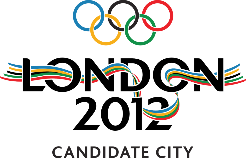
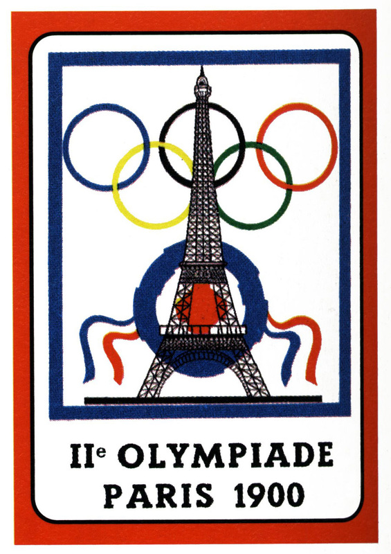
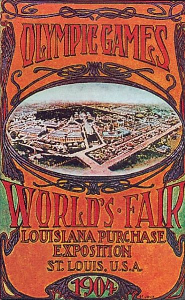
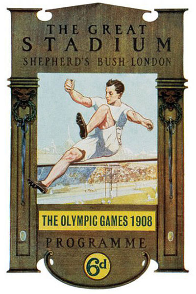
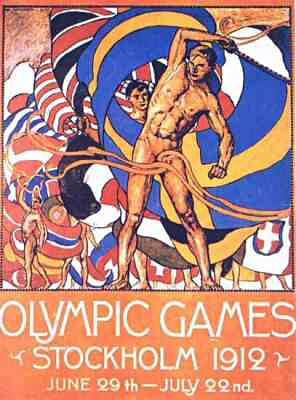
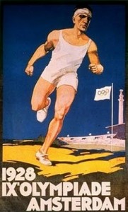
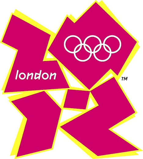
 Dear London 2012 Olympics, Let's talk about your logo. In the bidding process for the 2012 Summer Olympic Games, Kino Design created a lovely image of a ribbon of the Olympic colors weaving through "London 2012" in the shape of your iconic River Thames. It was simple and eye-catching. It clearly stated the city and the year. It had an Olympic feel. It reflected a unique aspect of the host city. It was everything an Olympic logo should be. Your logo for the actual Games, by Wolff Olins, not so much. I understand that your goal was to reach young people. You probably should have asked some young people (or, you know, people) what they thought of the design. Young people aren't just bright colors and hard-to-read, though it may seem like that sometimes. Young people appreciate good design as much as the next person. Maybe more so. Ugly does not equal young. The BBC ran a poll in which more than 80% of those surveyed awarded the design the lowest possible rating. Maybe that should have been a hint. There are many directions you could have taken with this logo business. Early in the modern Olympic era, the logos were similar, and though they started out fairly plain, they soon transformed into more poster-like advertisements for the Games. Although not all of them succeed on all counts, most of them are simple, eye-catching, have an Olympic feel, and reflect the host city.
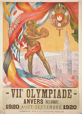
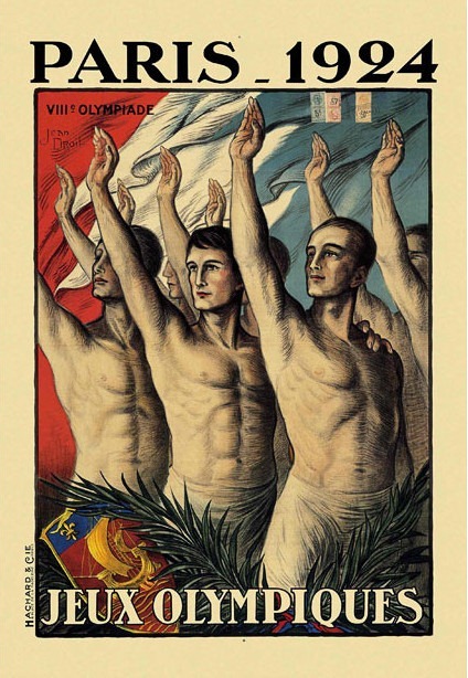
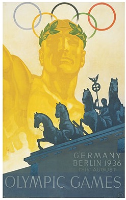
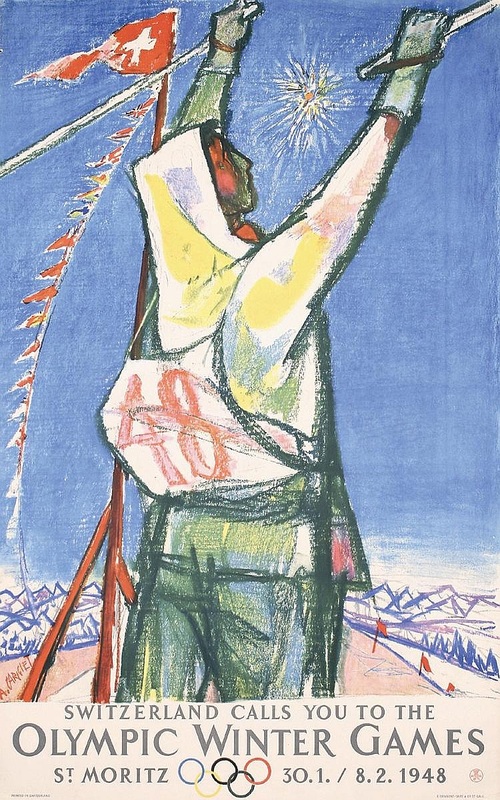
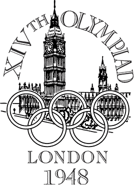
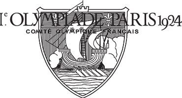
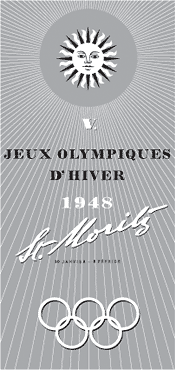
Posters eventually gave way to more logo-like representations of a particular Olympic Games, but for many years, each Games had both a logo and a poster (or several). Often, the posters and logos complemented each other, like your own 1948 Games.
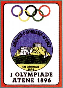
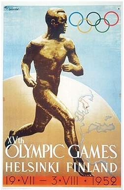
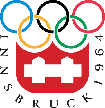
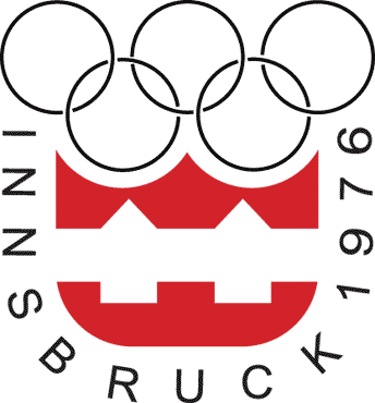
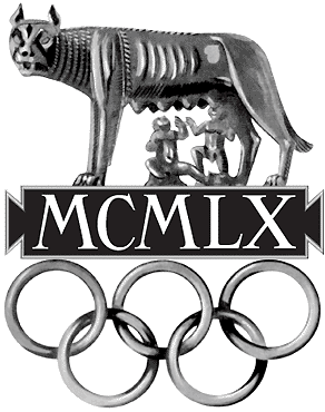
Early logos were official-looking affairs, all monotone and seal-like. This is certainly the type of thing to be avoided if you're looking to appeal to a younger crowd, and yet the Olympic Games represent more than 100 years of international competition in the modern era. There's nothing wrong with honoring a little bit of history (like you did so well in your opening ceremony).
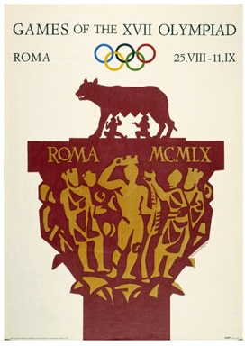
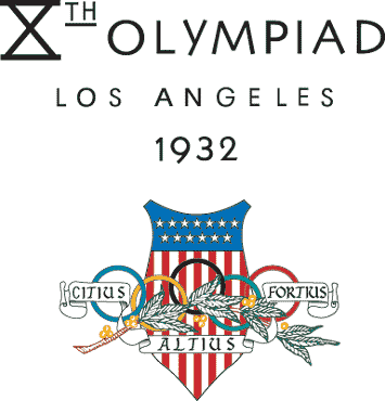
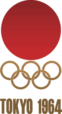
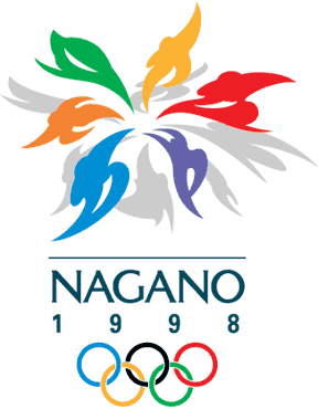
Another option would have been to make it painfully obvious that you're the host country. Make the Union Jack the focal point, so nobody can forget the London 2012 happened in the UK. This was the strategy taken by both Los Angeles Games, and two of the three games held in Japan.
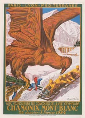
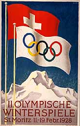
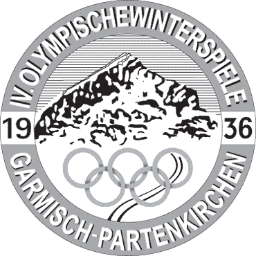
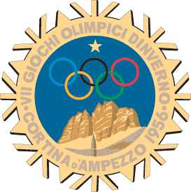
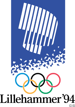
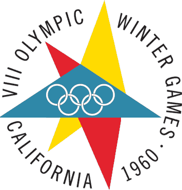
Although it seems easiest to accomplish this with a Winter Games, you could have gone with a motif that represents the season, or a particular sport. Snowflakes, like Sapporo above, seem to be a popular choice. Lillehammer used a representation of the aurora, and though St. Mortiz was a Winter Games, the sunshine seems to work.
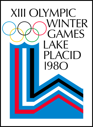
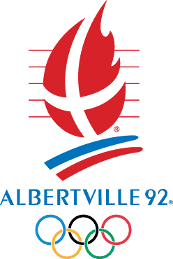
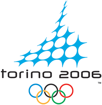
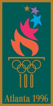
A sport, a torch, or simply an abstraction (of strength, grace, movement, power, or an element of the host city). Simple and eye-catching. Easy to read. Olympic spirit. Reflection of the host city. More than one of the above are required for a good Olympic logo.
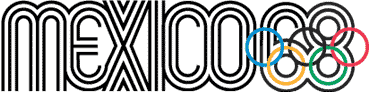
But I see what you were trying to do. You wanted the text itself to be the design. Well-designed text can make for an elegant, stunning, simple, powerful logo. But it's not easy to do.
And yet, with over a century of examples, ranging from excellent to mediocre, you came up with this monstrosity. It hurts my eyes. Animated footage of it triggered seizures in viewers with photosensitive epilepsy. How many people approved the design before it became official?
It's not pleasing to look at. From a distance, it doesn't look like anything at all. Now, London, I understand that it was a design firm and not you responsible for this particular design, but it's possible to make your design firm start over. It's even possible to fire your design firm and hire another one. Like maybe the one that did your candidate city logo. That one was nice. I realize it's too late now, so just know that you've won the gold—for worst Olympic logo ever. 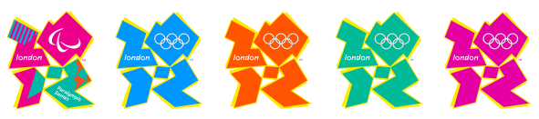  8/3/2012 11:18:22 am
Test yourself:
Infomom
8/7/2012 02:44:08 am
The BBC talk show host Graham Norton characterized the logo as "a dinosaur taking a crap." Comments are closed.
|
Topics
All
Archives
May 2021
|


 RSS Feed
HOME |
PHOTOGRAPHY COLLECTIONS
|

© COPYRIGHT 2020. ALL RIGHTS RESERVED.
|