|
Update: I'm not in the habit of complaining about my customers. To be clear, this person never actually became my customer because I couldn't give her what she asked for. I also waited more than 5 years before posting this exchange to give her ample time to wander to other parts of the internet. Chances are extremely low she's still haunting my pages. ........ Sometimes, I get requests for my art, but in a slightly different format than I currently offer it. I usually try to find a way to make this happen. I know that personally, I don't physically have space for all of the art that I love, and so flexibility with format can make all the difference.
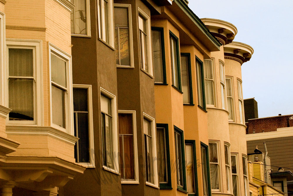
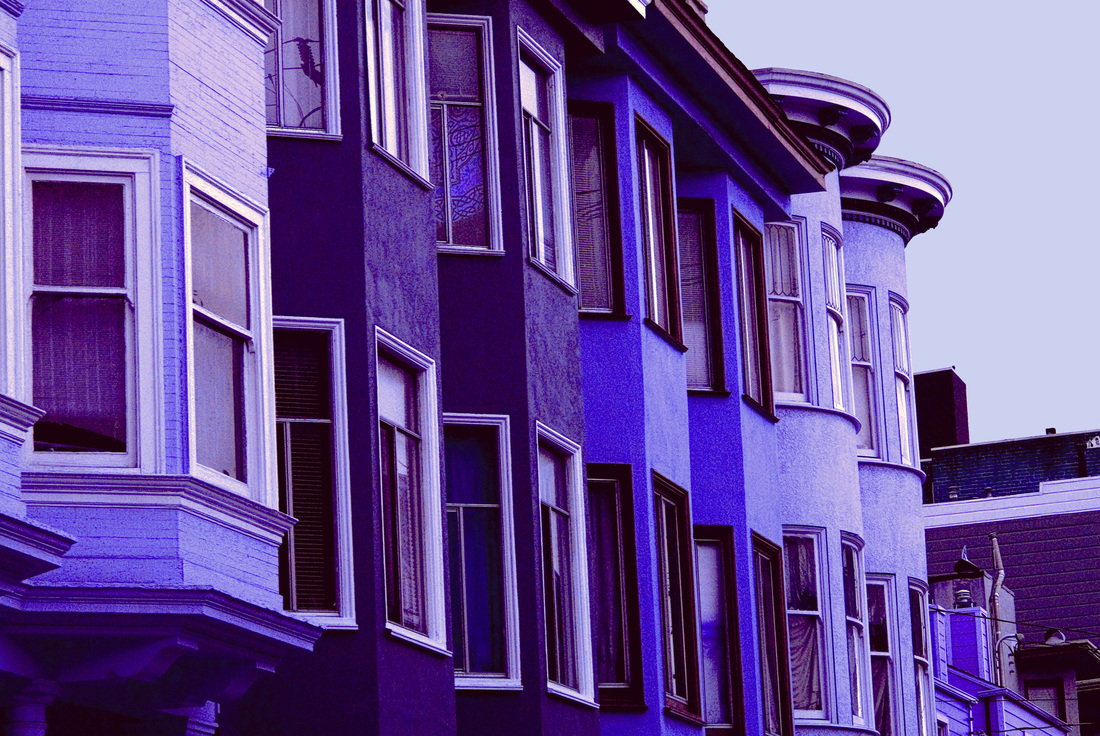
I got the following response: Wow! Now that I know what a great job, you can do. Can you change the colors of the photo so that it will blend in nicely with a grey t-shirt? I love the colors of the photo but it definitely is for warm colors and not for cool colors (going with the color palette for ladies clothing). I still want the photo to stand out like it does, contrast colors are great or vivid colors are great. But I need the color palette changed. Can you do that for me? I also would like that wonderful photo you have on the ladies long sleeve t-shirt at the bottom of the page you provided. I just need that photo tweaked a bit. Normally, taking my original vision for a photograph and wanting the colors altered would rub me the wrong way a bit. I spend time making sure the colors in a photograph are exactly how I want them, while also reflecting the mood if not the reality of the original scene. But, I could see where she was coming from. Warm-colored image on a cool-colored shirt would just clash. It wouldn't take me long to adjust the hue a bit. I added one more shirt to the CafePress site, and sent her a message. Four messages followed (I have added some line breaks for clarity).
This way the print will look like it is blending into the t-shirt. The townhouses color also needs to be vibrant so that they will still stand out. I now look forward to receiving the link for the new printed t-shirt. I was looking at the bottom of the page for the t-shirt change. I finally found the one you changed and I would prefer that the background color be in a grayish color. I would then prefer that the townhouses be in different colors that will make the piece radiate. But please follow the color contrast used by the original piece. What I'll do now is explain the colors combination for you. The sky is in Grey. The background to provide depth is kept in black. The townhouses are in Midnight blue; Nepal; Botticelli and Red Orange. So, please provide this change on the t-shirt you already started developing. I like the 3/4 sleeve XXL t-shirt (dark). Now I saw your talent ability displayed on Etsy so I know you could handle these changes. I now look forward to seeing your new creation. Oh, here is the color sequence for the townhouses from left to right: The first one in Nepal; The next two in Midnight Blue; Then the next two after that in Red Orange and the last two in Botticelli. Again, just a quick reminder that the background for you that the sky is in Grey. Wow, that's going to looking spectacular. Guess I should add this. So, the window trim that is white in the original photo is grey in mine. The trim that is brown on the yellow townhouses in the original photo is now Midnight Blue in mine. The two townhouses that are orange in the original photo that have brown trim now have Midnight Blue trim. Since my townhouses are in Orange Red. Then the last two townhouses in the original picture that are lighter yellow and have whitish trim now have grey trim in my photo. In addition, the eaves trough for the second, third & fourth townhouse is now black in my photo. The last eaves trough that is rounded for the yellowish townhouses in the original is now Midnight Blue. Then, the depth at the bottom of the page and contrast eaves troughs at the right of the page for the background building is now black. That building then has a white trim under the eaves trough and black building. I think it has stairs, which will be black. I also think it has some brick, which will now be Orange/Red caulking, and Nepal brick. I’m now wondering if you have a headache yet. I have no idea what colors "Nepal" and "Botticelli" are, and this customer is awfully specific about what I should do to my art. Except for the parts that are totally confusing: I would prefer that the background color be in a grayish color. The sky is in Grey. The background to provide depth is kept in black. Again, just a quick reminder that the background for you that the sky is in Grey. So, the background and the sky are the same thing, which should be grey. But black. I looked up the colors, and this is what the series of buildings would look like: With colors specified for the eaves and trim and... stairs? So, basically, "I love your art, but can you change everything about it please?" I responded with this: "I changed the colors of the original to "cool" colors by adjusting the overall hue. I am not willing to change the colors of each house individually, as adjusting the overall hue was already compromising the integrity of my piece of art. If I were willing to do so much to it, the time involved in such a process would make the overall price of the shirt skyrocket beyond what you would want to pay for it." If I were to do all of the things she wanted me to do, and make it look good, and make it a piece of art I was still happy with and willing to put my name on (not actually possible with her color choices), it would take hours of work. And then, this: Would you please change the color of the town houses to greys. I'm just not fond of the purple or the blues that have been picked. I do like the color grey of the sky. Hopefully this will be the last change. I now look forward to receiving this item. Le sigh... Playing once again with Google's reverse image search and the visually similar image results. My photographs are on the left, images by others on the right. Click any image for its source. I think the most interesting result this time around was the steering wheel shot for "Deep Tall." Almost all of the visually similar images presented by Google were virtually the same image, but interiors of slightly different cars. Strange... Google has a reverse image search, where you can drag a photo from your computer into the search box, and it will find that image on the web. This is great if you're wondering if anyone has stolen your images, or used them in a way you don't agree with on the internet. This would be uncredited instances of you art—impossible to find by simply searching for your own name. I found a few myself. But the really fun part about searching this way is Google's collection of "visually similar images" that appears near the bottom of the page. You can find images of vastly different subject matter that look pretty similar. Here are a few of mine (on the left) and visually similar images by other people (on the right) that make for interesting complementary pairs. Click any image to be taken to the source.
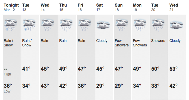
This winter has been absolutely beautiful. According to the Fox 12 Weather Blog from late January, the long-range weather forecast for Portland is decidedly un-Portland-like:
So, hurray for spring, right? Flowers are blooming...
...but just in time for me to spend every waking hour outside, the Portland weather comes back:
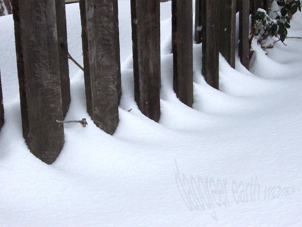
Yes, that's right, that's snow you're seeing there. ...Sigh...
Early Monday morning, two strong earthquakes awakened the Bay Area. At 5:33 am, a magnitude 3.5 quake, followed immediately by a magnitude 4.0 quake shook approximately 5.5 miles below the surface in El Cerrito, CA. Another mild aftershock was felt a half hour later.
Though the quakes served as a rude awakening and were felt as far away as Santa Cruz, they were relatively minor. Police dispatchers in the surrounding cities received no reports of injuries or major damage. Nearby transit systems and bridges were inspected and given the all-clear. My friend, Mac (below) was less than 2.5 miles from the epicenter that morning, and his important job of keeping my mother's feet warm while she sleeps was interrupted by the jolt.
Earthquakes are a constant threat in the vicinity of the seismically active San Andreas Fault, but individual minor quakes are only as significant as something like a nearby tornado: sure you pay attention to it, but if it doesn't destroy your house or community, you can forget about it pretty quickly. Here it is just a few days later and I bet most people have forgotten it already.
Every once in a while, though, an earthquake is a big deal. Longtime residents of the Bay Area will certainly remember the Loma Prieta earthquake (a.k.a. the Quake of '89 or the World Series Earthquake) as vividly as others remember 9/11 or the assassination of JFK. The Loma Prieta Quake measured 6.9 on the Richter Magnitude Scale. The Richter Scale is logarithmic in nature, so each whole number is 10 times as powerful as the preceding number. That makes the '89 quake roughly 1000 times as powerful as Monday's quake. Because of the timing of the event, the earthquake happened during the warm-up of a World Series game, making it the first major quake to have live, national coverage on television. It was also the event that triggered more long-distance phone calls than any other date in history up to that point. Everyone wanted to know if their Bay Area loved ones were OK. As, of course, did I. My mother (the one whose feet are warmed by Mac) was unable to cross the San Francisco-Oakland Bay Bridge because of the collapsed section, and took a circuitous route around the bay on public transportation to get home from work that night, along with everyone else in the same boat. A commute that normally took about an hour on the bus ended up taking her closer to seven hours. Before cell phones, there was really no way for me to know if she was going to be able to come home at all that night. As a ten-year-old who had just experienced a major earthquake, it was pretty scary. I stayed at a friend's house that night, as did my brother. We didn't leave a note for Mom, mostly because we didn't want to remain in the high-rise apartment building longer than necessary, but she knew exactly where to find us anyway. She called our respective friends' houses around midnight when she finally got home. Twenty-two years later, I can still remember exactly what I was eating just a moment before the shaking started. I can remember the underside of the heavy wooden table under which we took cover. I can remember exactly what the shaking felt like. I can remember the color of my friend's socks as we ran down eleven flights of stairs without stopping to put on our shoes. I can remember debating whether to continue walking to my friend's (one story) house in just our socks, or to risk going back inside for shoes (ultimately, we decided to go back inside for shoes and to rescue the cat). I can remember the exact clothing items I had to borrow from my friend to wear to school the next morning. I can remember looking around at the empty desks of my classmates the next day, and hoping that nothing terrible had happened to them. And I can remember swapping where-where-you-when? stories for years afterward.
...twice as big as it needs to be.
I spent a bit of time this week sitting in on a few middle school classes with which I soon will be working. As I listened to them discuss complex topics of monumental importance, impressed all the while by their eloquence and compassion, I was reminded of a moment in that very classroom two years ago that blew me away (names have been changed). Each morning that year, the students spent a period of time writing. Students took turns bringing in a topic or a bit of inspiration (frequently a song or poem that they found particularly meaningful), and the class would set to work writing silently in the mood-lit classroom. After a time (there was no signal, just a feeling that enough time had lapsed), the student who had brought the inspiration for the day would begin reading their piece of writing aloud. Others subsequently took turns, in no particular order and without raising their hands or waiting to be recognized in any way, reading their piece of writing whenever they were ready. Not every student shared their writing every day. Some wrote a lot, some very little, some only shared a sentence or two of their larger whole. Some students, too shy to share their piece, would pass their notebook to a neighbor to read aloud in their stead. Frequently, students were moved to tears by their own writing, or by listening to the words of their classmates. On one particular day the inspiration piece included a reference to a glass half-full, or half-empty, I can't remember which. Many of the students' compositions followed that theme of optimism versus pessimism. One particular student, Carissa, began to share her piece.
Carissa was confident in her writing, and unafraid to share. Her thoughts were organized well enough for a twelve-year-old, but right in the middle of her soliloquy came this:
_
"The glass is not half-empty or half-full; it is exactly enough water for one life, and I'm going to drink it slowly."
_Her teacher and I exchanged glances across the room. He mouthed "Oh my god!" We both knew immediately that such a powerful statement—such a powerful idea—was one not easily understood by very many adults, let alone humans as young as Carissa.
Her teacher informed me later that part of Carissa's academic history included an IEP, or "Individualized Education Program," specifically for writing. Such programs are tailored to meet the academic needs of a student who struggles in a particular area for a variety of reasons. It's hard to say when Carissa went from struggling with writing to eloquently expressing such powerful ideas, but a safe, respectful environment in which to share her writing aloud was probably a large part of it. If you ask Carissa, she'd say she wants to be a writer when she grows up. Never underestimate the capacity of a child to think and express in profound ways. Never underestimate the power of a respectful and encouraging community to let individuals shine. ...makes me want to sit down with a nice cool glass of water. Or maybe half a glass...
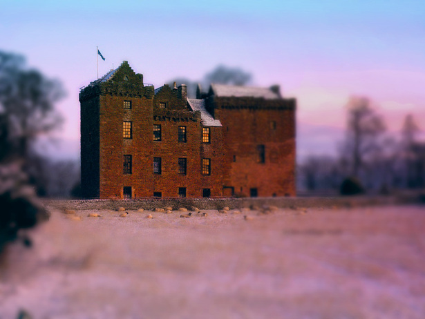
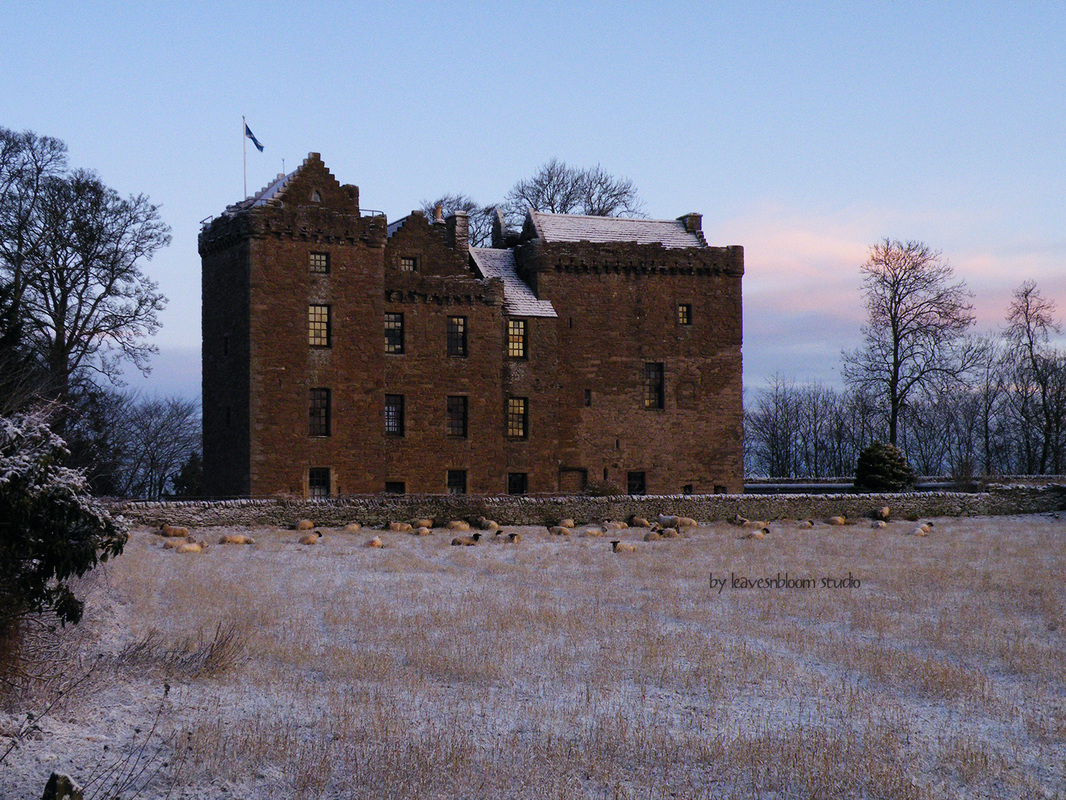
_This week's Edit Me challenge photo comes from Rosie of Leavesnbloom Studio. I took advantage of this sleepy-sheepy castle scene to try out a new technique: imitating the effect of a tilt-shift lens.
_I adjusted the blurry and non-blurry portions with a low-opacity black brush and a low-opacity eraser. The rest was just tweaking colors. I'll probably get better at making it look more realistic with practice (and by more realistic, I mean of course more fake-miniature).
I'm participating in the first week of Photo Feedback on Mom Tried It. The purpose of this particular blog hop is to give and receive feedback about photography. This chicken photograph is my entry. This is a friend's chicken. I had a hard time getting one of them to stay still long enough (there were three of them), and it wasn't just a fast shutter speed issue; they were in and out of the frame before I could compose the shot most of the time. So, this was my best attempt.
Please critique my photograph! Tell me what you think I did well, and what you think I could have done better with this shot. Even if you don't know anything technical about photography, you can still give me some feedback. I look forward to reading it!
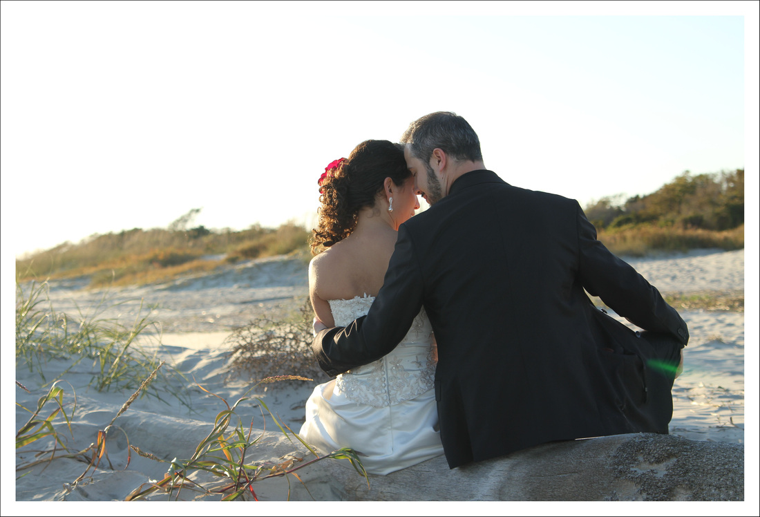
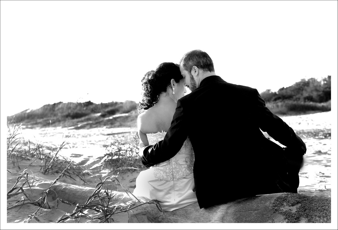
This week's Edit Me Challenge comes from Selena of Stoneyville. The original image (below) had some challenging elements, most notably the sky with complete lack of color or interest.
_With my first edit, I did so many things to it, I don't even remember them all. It ended up looking a little over-colorized, but I think I like the effect anyway. I definitely added some sky color, and warmed it up overall. I changed the contrast and saturation on the couple's clothing as well. This one is my official entry for the Edit Me Challenge.
_On this second edit, I simply altered the levels, brightness, and contrast, and then burned in some details. After editing both ways, I'm still not sure which I like better - more color or less color (I did try knocking down the saturation of the vibrant edit, but it left something to be desired).
|
Topics
All
Archives
May 2021
|
HOME |
PHOTOGRAPHY COLLECTIONS
|
© COPYRIGHT 2020. ALL RIGHTS RESERVED.
|











































 RSS Feed

