|
Update: I'm not in the habit of complaining about my customers. To be clear, this person never actually became my customer because I couldn't give her what she asked for. I also waited more than 5 years before posting this exchange to give her ample time to wander to other parts of the internet. Chances are extremely low she's still haunting my pages. ........ Sometimes, I get requests for my art, but in a slightly different format than I currently offer it. I usually try to find a way to make this happen. I know that personally, I don't physically have space for all of the art that I love, and so flexibility with format can make all the difference.
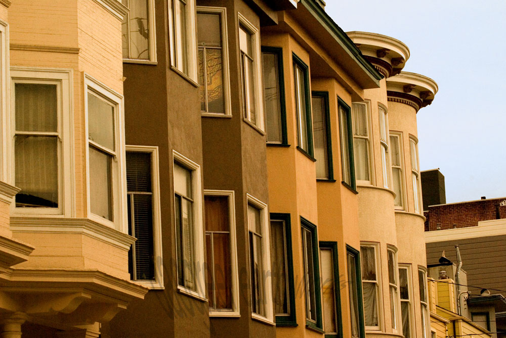
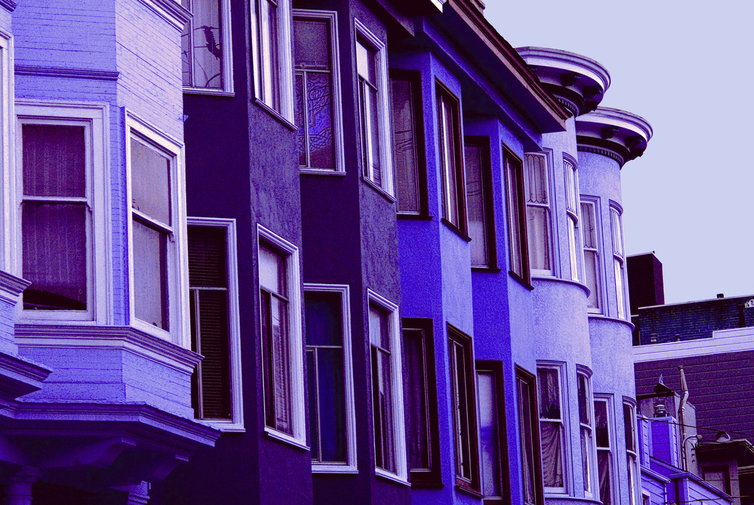
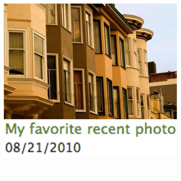
I got the following response: Wow! Now that I know what a great job, you can do. Can you change the colors of the photo so that it will blend in nicely with a grey t-shirt? I love the colors of the photo but it definitely is for warm colors and not for cool colors (going with the color palette for ladies clothing). I still want the photo to stand out like it does, contrast colors are great or vivid colors are great. But I need the color palette changed. Can you do that for me? I also would like that wonderful photo you have on the ladies long sleeve t-shirt at the bottom of the page you provided. I just need that photo tweaked a bit. Normally, taking my original vision for a photograph and wanting the colors altered would rub me the wrong way a bit. I spend time making sure the colors in a photograph are exactly how I want them, while also reflecting the mood if not the reality of the original scene. But, I could see where she was coming from. Warm-colored image on a cool-colored shirt would just clash. It wouldn't take me long to adjust the hue a bit. I added one more shirt to the CafePress site, and sent her a message. Four messages followed (I have added some line breaks for clarity).
This way the print will look like it is blending into the t-shirt. The townhouses color also needs to be vibrant so that they will still stand out. I now look forward to receiving the link for the new printed t-shirt. I was looking at the bottom of the page for the t-shirt change. I finally found the one you changed and I would prefer that the background color be in a grayish color. I would then prefer that the townhouses be in different colors that will make the piece radiate. But please follow the color contrast used by the original piece. What I'll do now is explain the colors combination for you. The sky is in Grey. The background to provide depth is kept in black. The townhouses are in Midnight blue; Nepal; Botticelli and Red Orange. So, please provide this change on the t-shirt you already started developing. I like the 3/4 sleeve XXL t-shirt (dark). Now I saw your talent ability displayed on Etsy so I know you could handle these changes. I now look forward to seeing your new creation. Oh, here is the color sequence for the townhouses from left to right: The first one in Nepal; The next two in Midnight Blue; Then the next two after that in Red Orange and the last two in Botticelli. Again, just a quick reminder that the background for you that the sky is in Grey. Wow, that's going to looking spectacular. Guess I should add this. So, the window trim that is white in the original photo is grey in mine. The trim that is brown on the yellow townhouses in the original photo is now Midnight Blue in mine. The two townhouses that are orange in the original photo that have brown trim now have Midnight Blue trim. Since my townhouses are in Orange Red. Then the last two townhouses in the original picture that are lighter yellow and have whitish trim now have grey trim in my photo. In addition, the eaves trough for the second, third & fourth townhouse is now black in my photo. The last eaves trough that is rounded for the yellowish townhouses in the original is now Midnight Blue. Then, the depth at the bottom of the page and contrast eaves troughs at the right of the page for the background building is now black. That building then has a white trim under the eaves trough and black building. I think it has stairs, which will be black. I also think it has some brick, which will now be Orange/Red caulking, and Nepal brick. I’m now wondering if you have a headache yet. I have no idea what colors "Nepal" and "Botticelli" are, and this customer is awfully specific about what I should do to my art. Except for the parts that are totally confusing: I would prefer that the background color be in a grayish color. The sky is in Grey. The background to provide depth is kept in black. Again, just a quick reminder that the background for you that the sky is in Grey. So, the background and the sky are the same thing, which should be grey. But black. I looked up the colors, and this is what the series of buildings would look like: With colors specified for the eaves and trim and... stairs? So, basically, "I love your art, but can you change everything about it please?" I responded with this: "I changed the colors of the original to "cool" colors by adjusting the overall hue. I am not willing to change the colors of each house individually, as adjusting the overall hue was already compromising the integrity of my piece of art. If I were willing to do so much to it, the time involved in such a process would make the overall price of the shirt skyrocket beyond what you would want to pay for it." If I were to do all of the things she wanted me to do, and make it look good, and make it a piece of art I was still happy with and willing to put my name on (not actually possible with her color choices), it would take hours of work. And then, this: Would you please change the color of the town houses to greys. I'm just not fond of the purple or the blues that have been picked. I do like the color grey of the sky. Hopefully this will be the last change. I now look forward to receiving this item. Le sigh... Comments are closed.
|
Topics
All
Archives
May 2021
|
HOME |
PHOTOGRAPHY COLLECTIONS
|
© COPYRIGHT 2020. ALL RIGHTS RESERVED.
|


 RSS Feed

