|
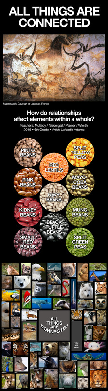
After our lengthy discussions of fractals and chaos theory, it was time to focus on fractals in nature. The students each chose a biome to research, and their report must include information on animals, plants, natural cycles, and abiotic factors. Fractals can be found in all of those things. For this art piece, each student chose a natural fractal specific to their biome.
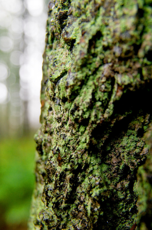
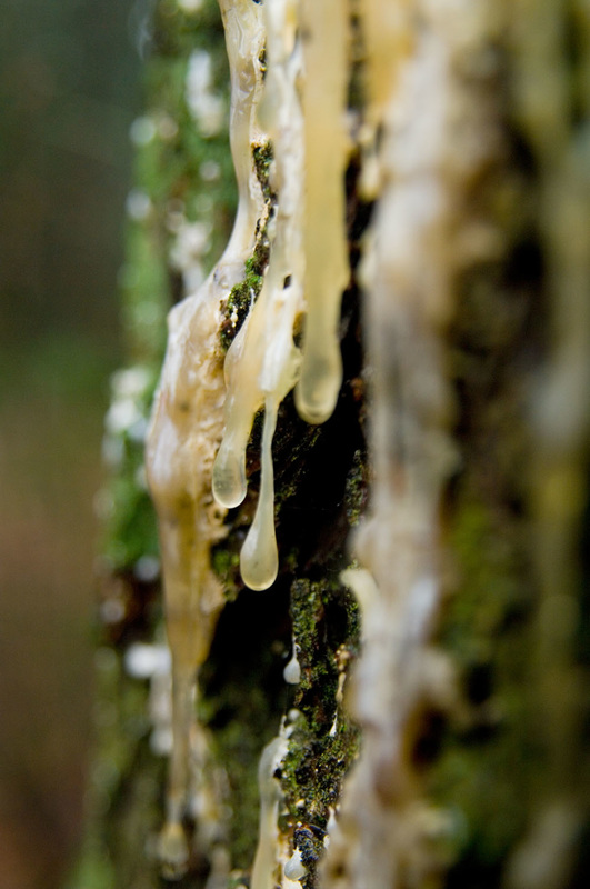
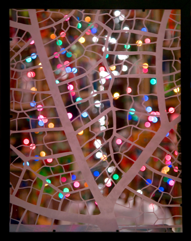
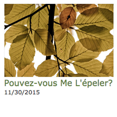
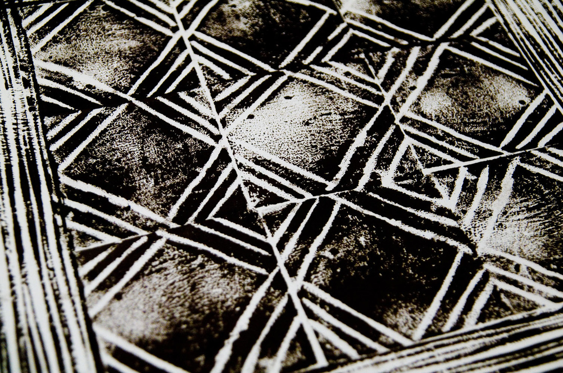
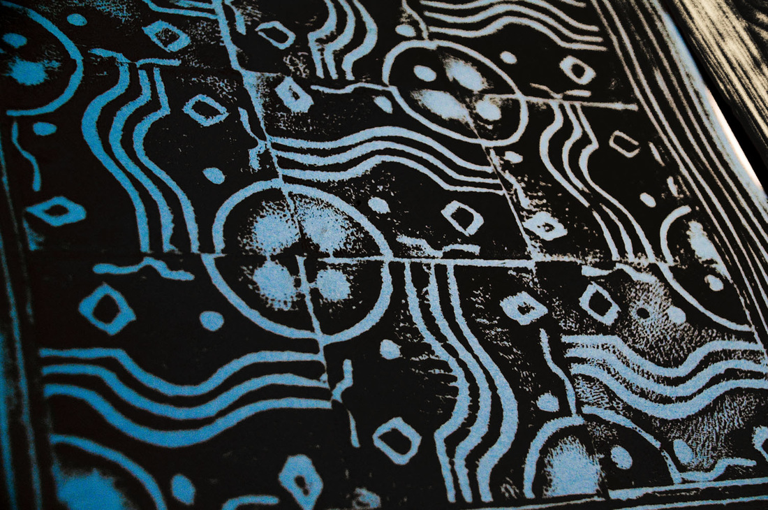
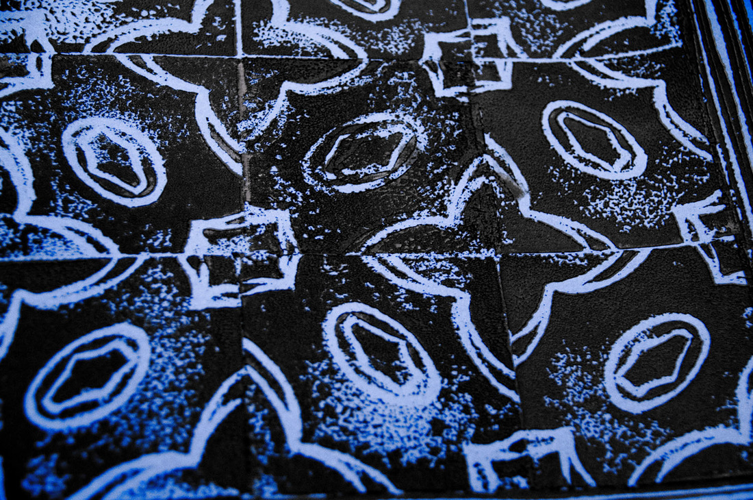
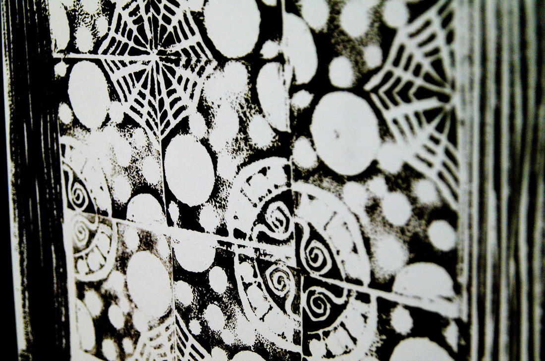
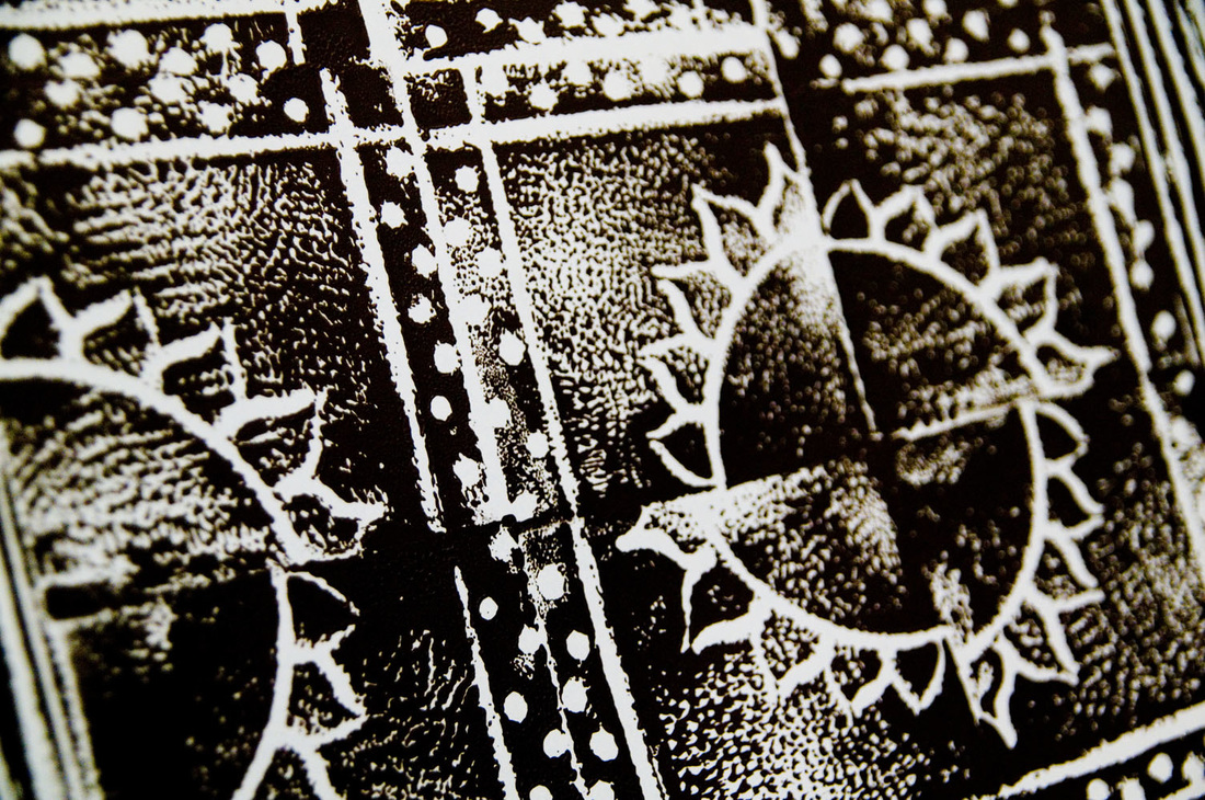
Temperate rainforests are always good for ferns, moss, and intricate tree bark—all of which are excellent sources of fractals. The final art piece for this project is framed etched glass. An eclectic selection of frames was acquired from various thrift stores around Portland, and each student spray-painted their frame the same shade of flat black. I created the example piece below using an image of leaf veins (while my Christmas tree was still decorated).
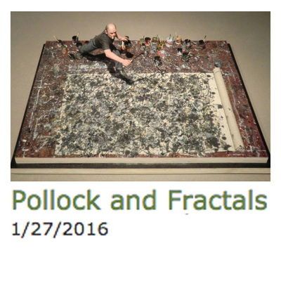
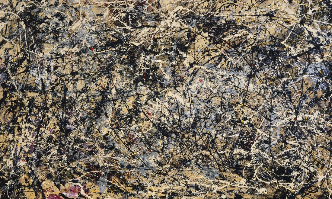
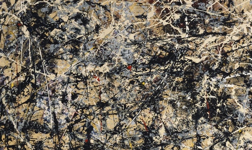
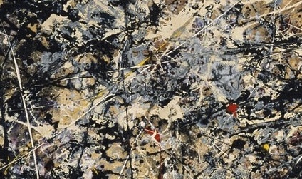
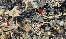
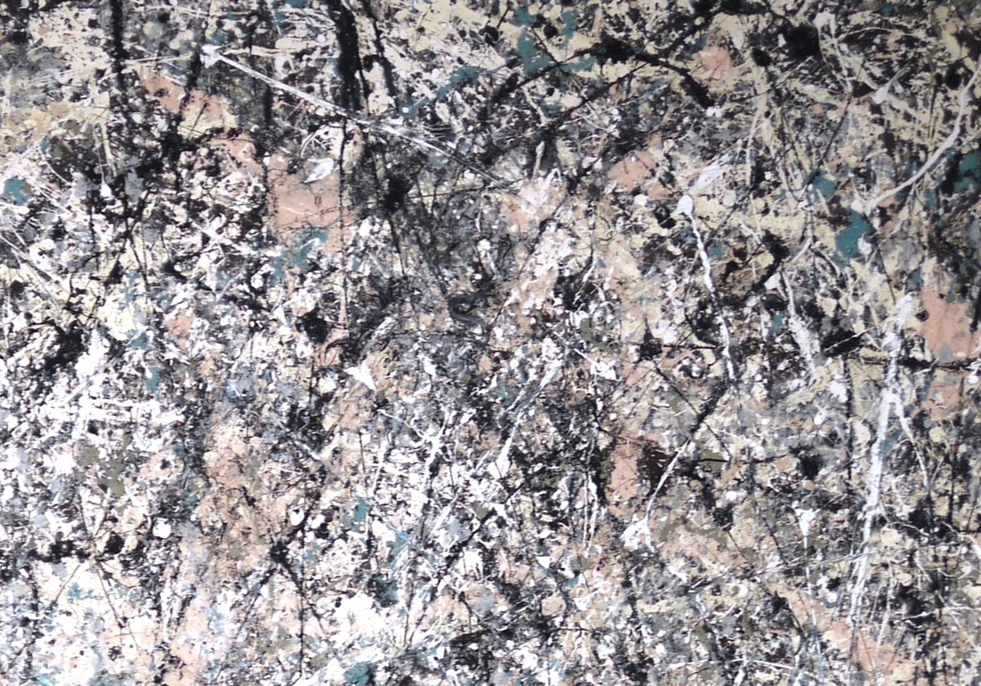
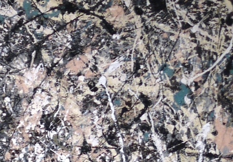
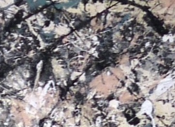
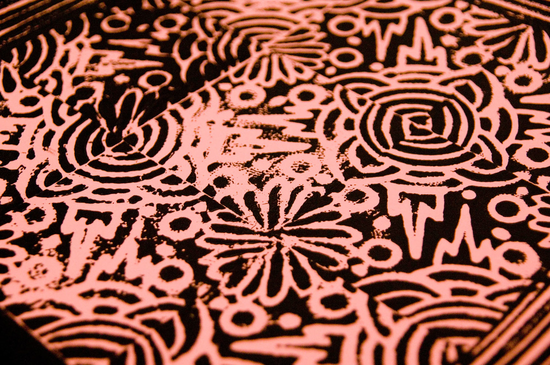
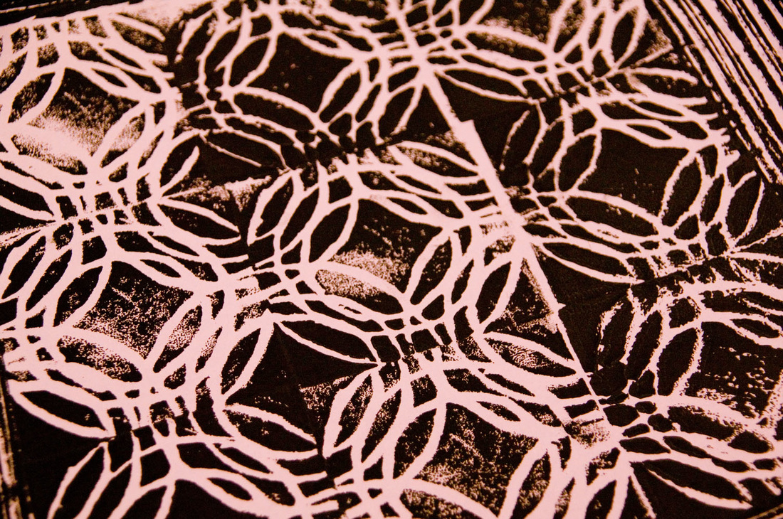
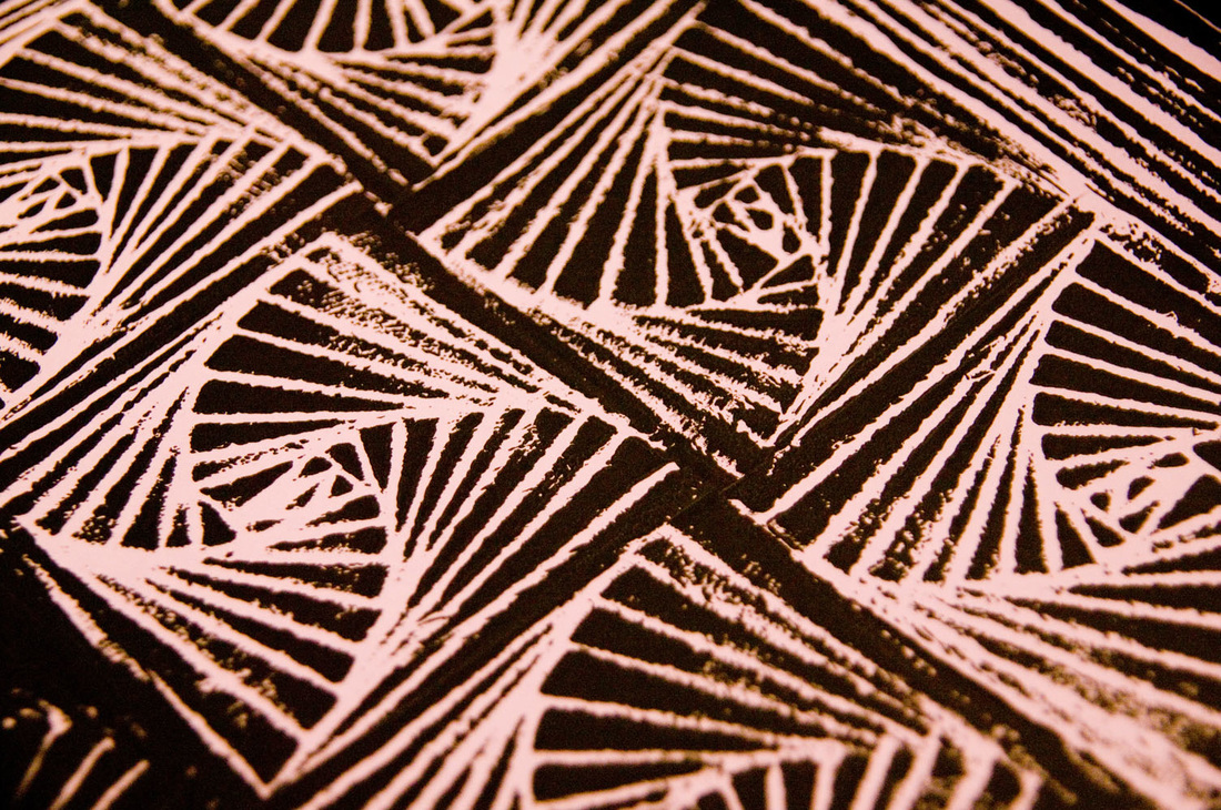
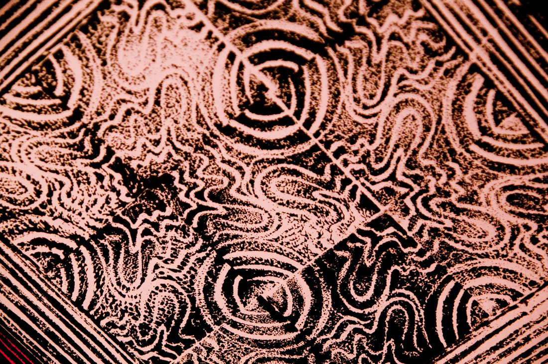
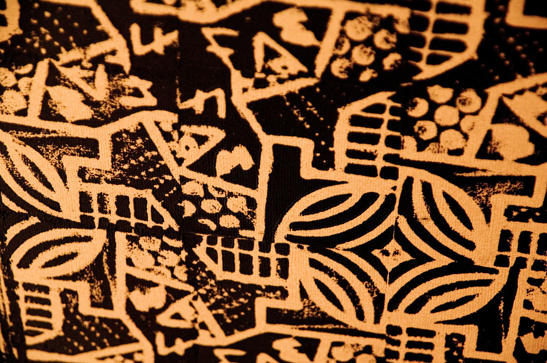
 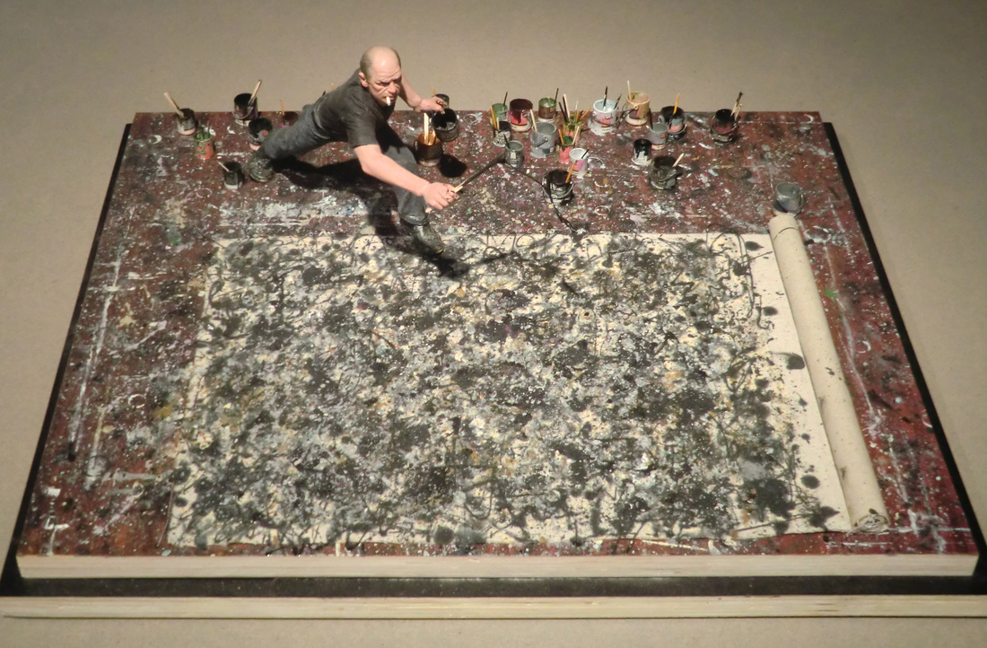 This time around, we tackled high-level mathematics and abstract art. Not easy for sixth graders. Our masterworks were Number 1A and Lavender Mist by Jackson Pollock, and we studied fractals and chaos theory to understand the natural world and Pollock's brilliance alike. What exactly is chaos theory, and how does it relate to fractals? This brief documentary created by a kid explains it quite well. The music becomes tedious, so try to ignore those parts, but all of the conceptual stuff is quite well explained. Also, when he starts talking about actual equations, and your eyes start to glaze over, hang in there—the results of the equations are pretty interesting. So, what does all that have to do with Jackson Pollock? It turns out that the motions that Pollock used when creating his famous splattered paintings are similar to a kicked pendulum. The irregularity introduced by adjusting the length of a pendulum at random (or even regular) intervals results in a fractalized splatter. "Fractals" weren't a thing anyone knew about when Pollock was painting, so he wasn't doing this intentionally. Art critics also had never heard of fractals at the time, so those who liked Pollock's work couldn't effectively describe why it was so brilliant. Now look closely. Below is Number 1A (don't be fooled by the title; it wasn't his first). 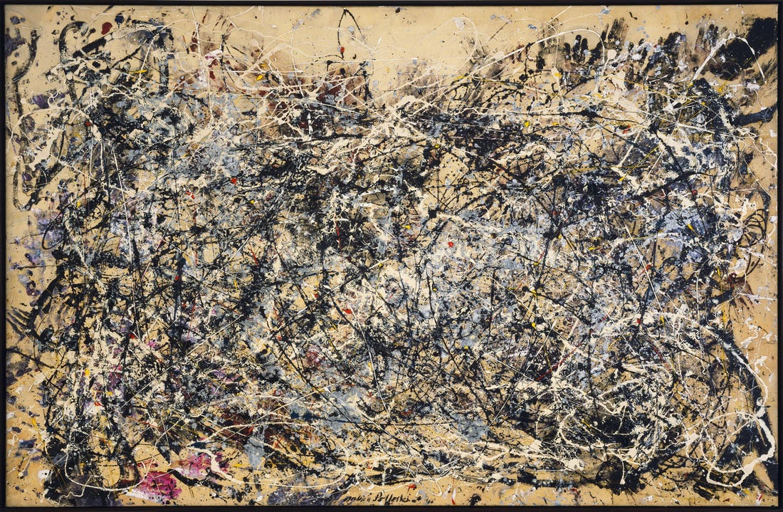 There are so many interesting parts of this painting; I would love to see it in person someday. The section below is from the center top. It almost looks like a turbulent ocean (which, incidentally, is a natural feature that can be explained by chaos theory and fractals). 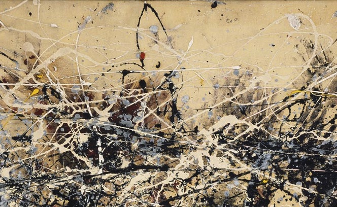 Zooming in again and again on the painting reveals that the level of complexity is consistent regardless of how close your viewpoint is to the painting.
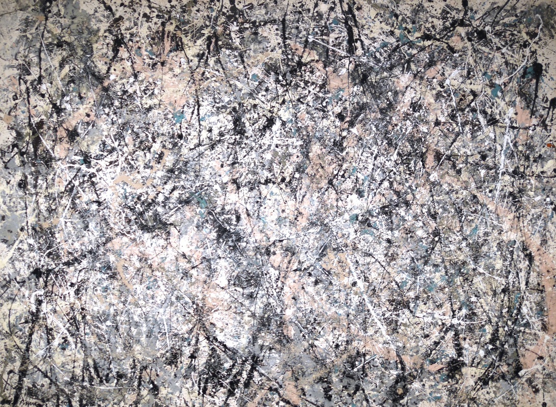
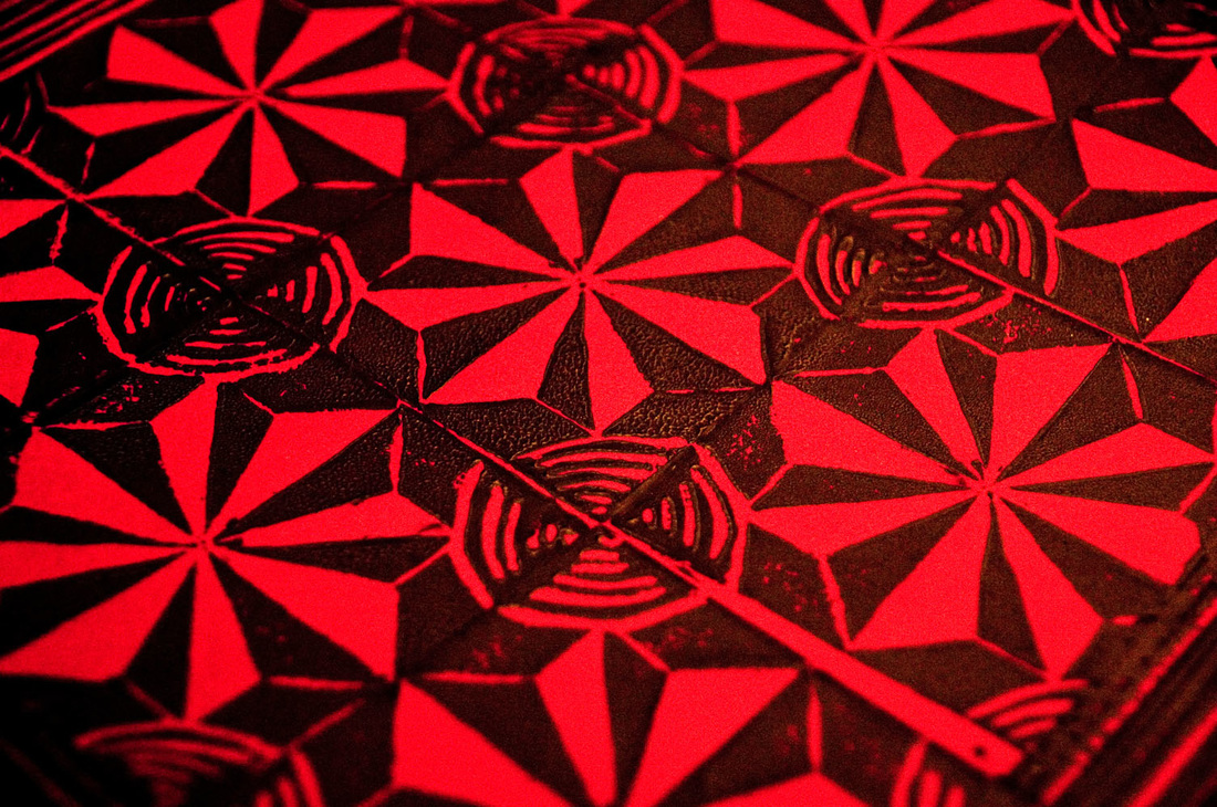
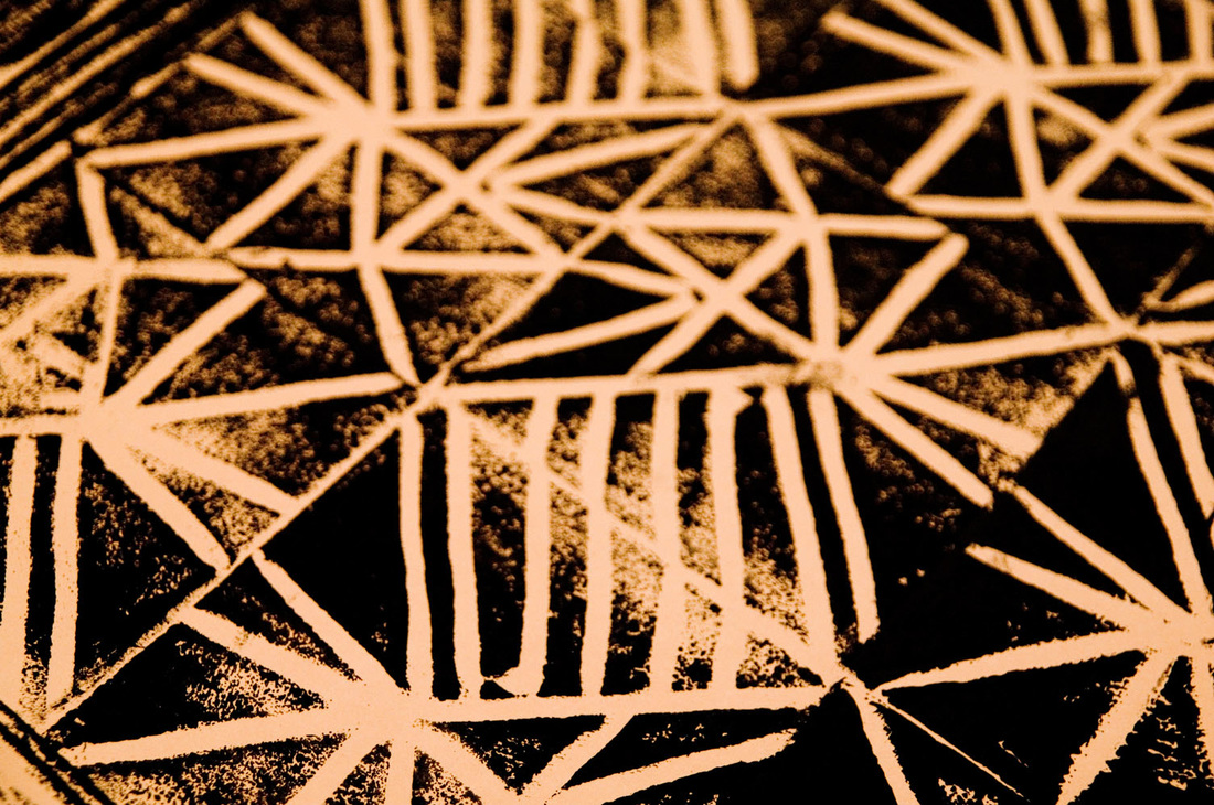
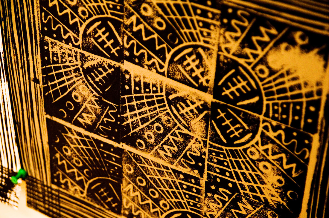
Below is Lavender Mist. I love this title. There is nary a drop of lavender paint in this piece, and yet, the overall impression is distinctly lavender. This painting is featured in the movie Mona Lisa Smile. 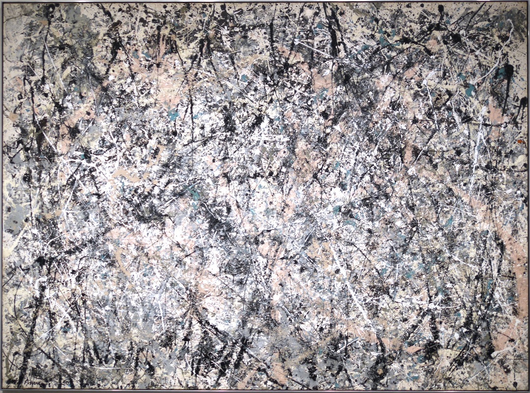 Again, zooming in reveals continued complexity.
The video below features a pendulum with an "elbow" in it. Though the pendulum is released relatively straight, tiny changes in position become compounded and result in chaotic motion. As the light traces the path, the result starts to look similar to a Pollock piece. Pollock has an elbow. Also a wrist. Consider the above video with two joints instead of one. Pollock effectively used his arm as a pendulum, but added the "kicked pendulum" motion by utilizing his elbow and wrist joints to create chaotic movement of the brush. This is not easy to do. Your average person with a brush would not be able to make their arm move in this way. As humans, we try too hard to control motion, even when trying not to. This is not to say that Pollock lacked control—quite the contrary. Pollock knew exactly where the paint would fall, and he was able to utilize his own joints to make it happen in a way that hasn't been replicated since. Not a lot of footage of Pollock in action exists, but this little video shows a little bit of what he does with his shoulder, elbow, and wrist to get the paint to fall where he wants in a fractalized way. Also, I love that he has special painting shoes, as you would have to with this style. Next step for the students: finding fractals in nature.  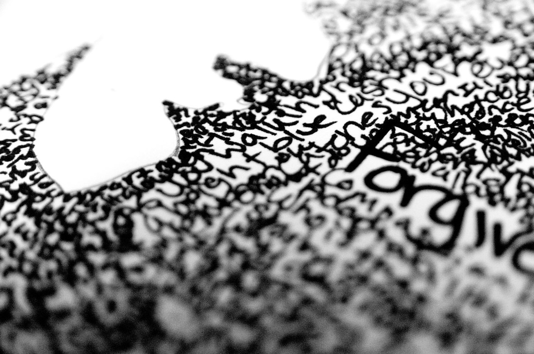
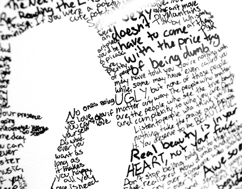
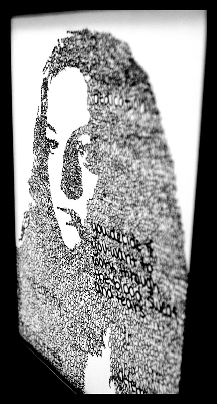
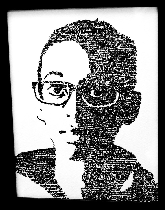
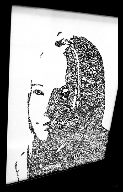
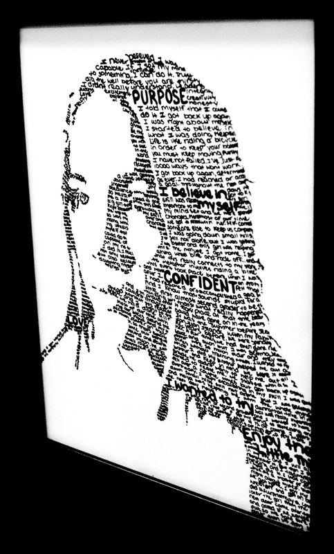
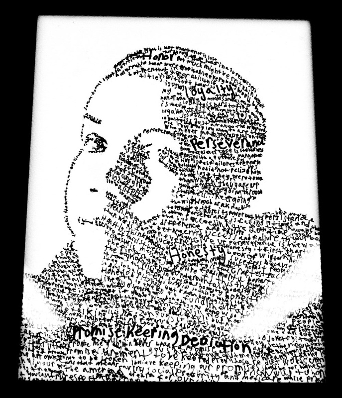
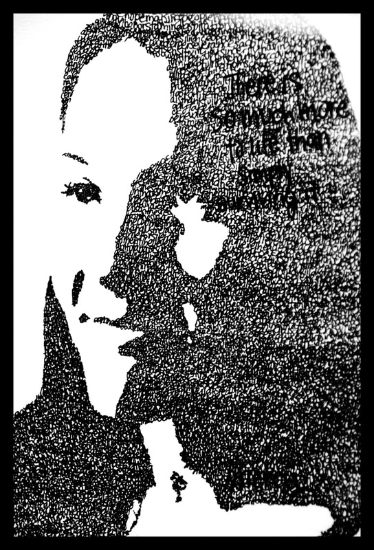
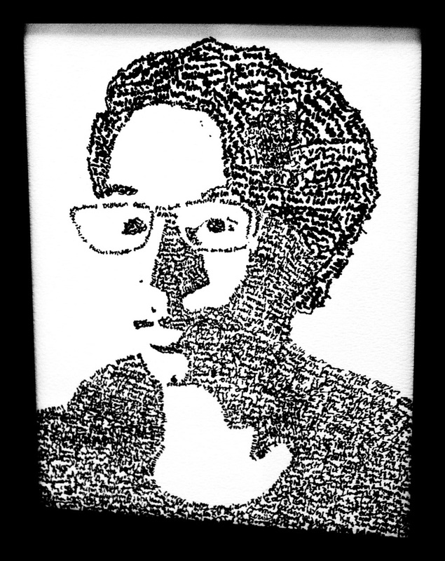
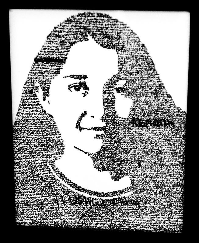
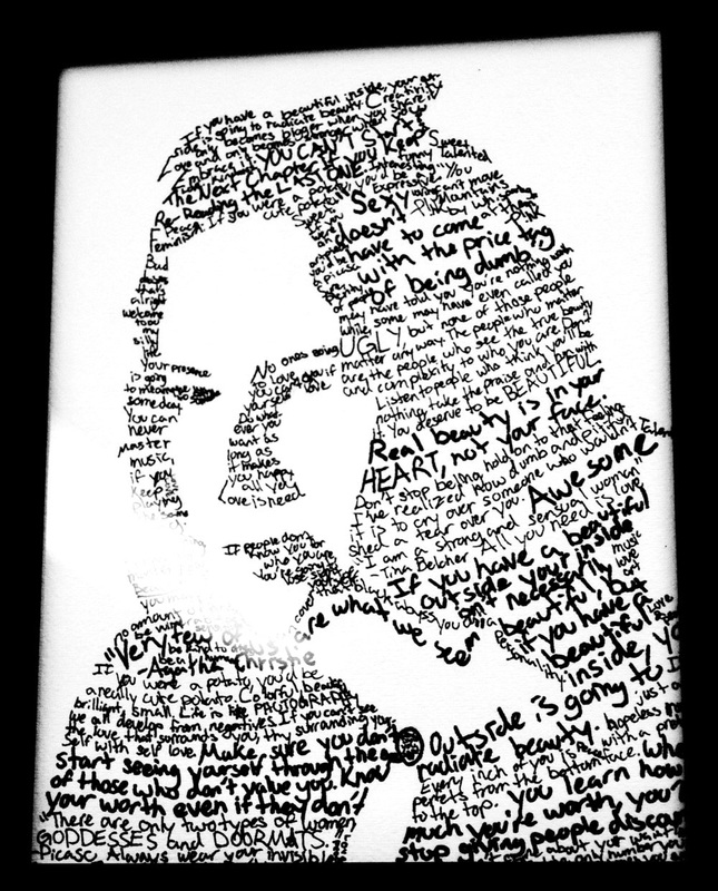
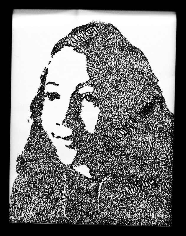
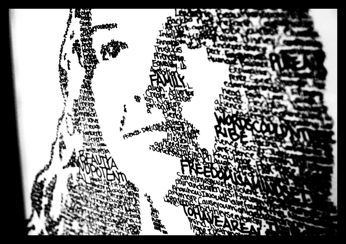
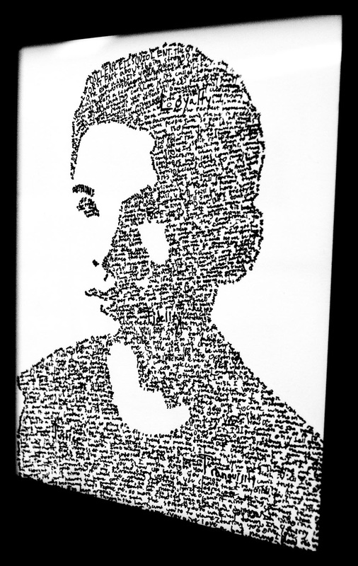
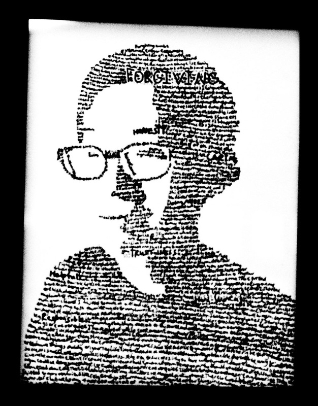
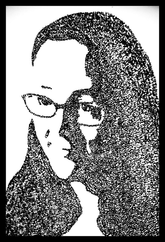
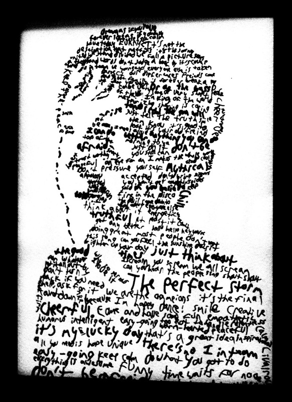
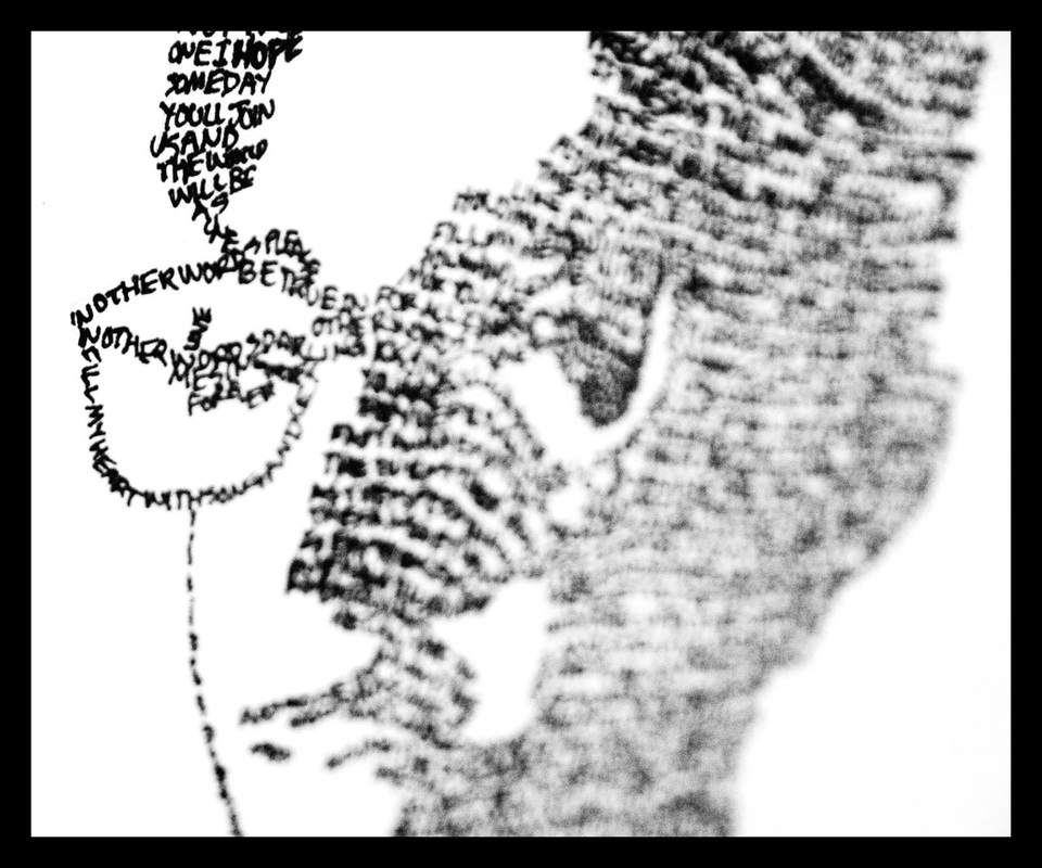
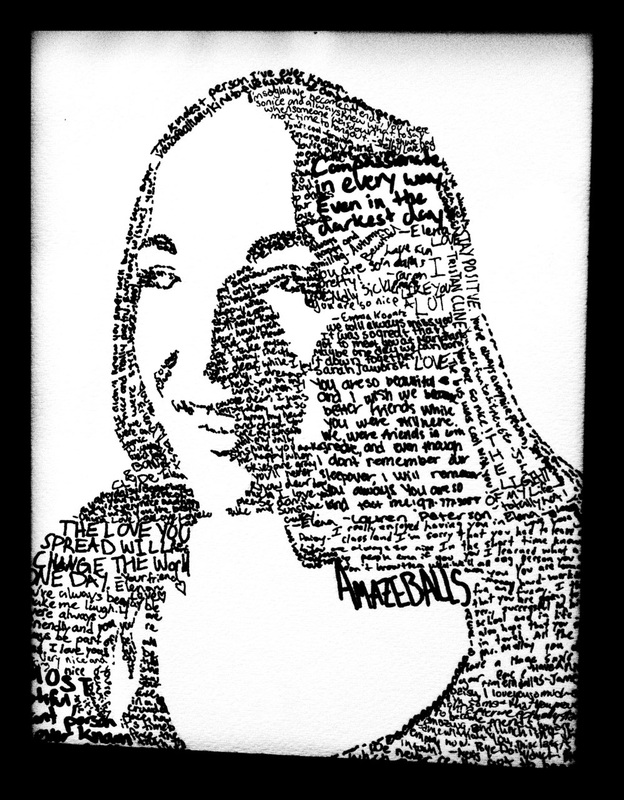
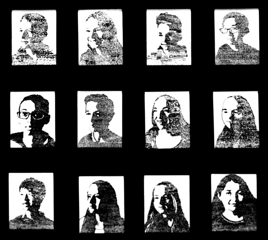
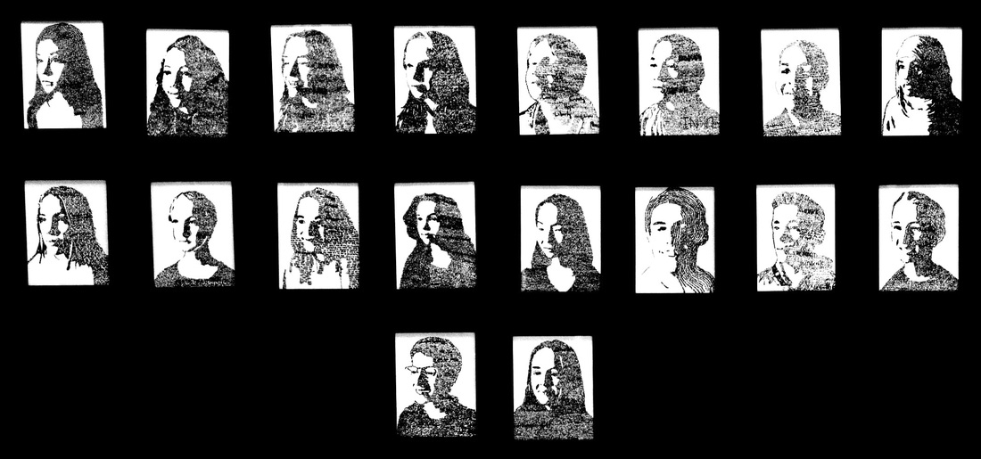
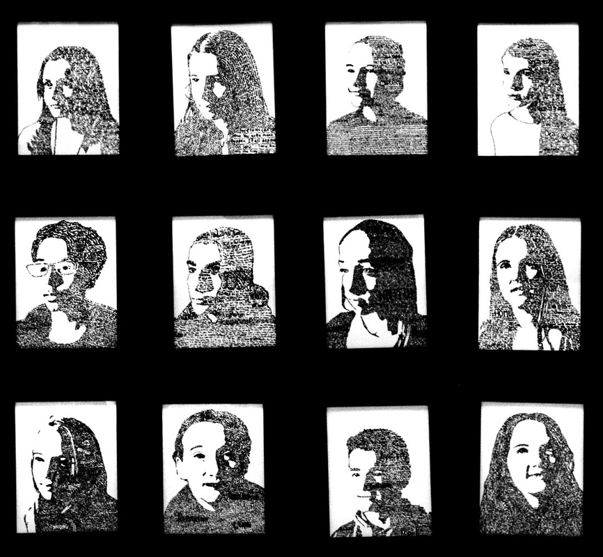
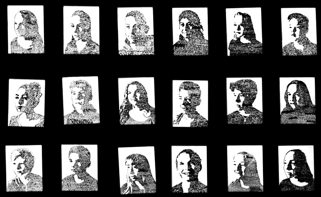
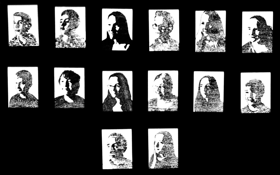
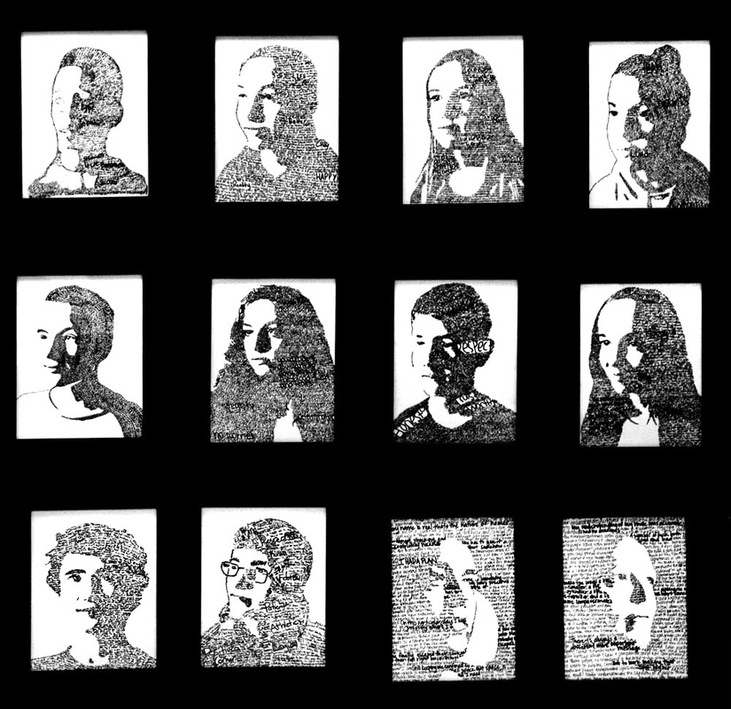
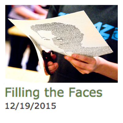
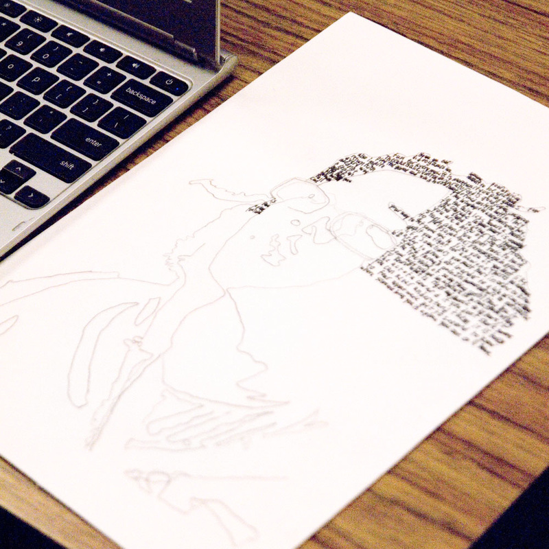
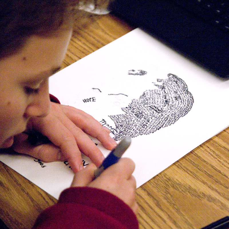
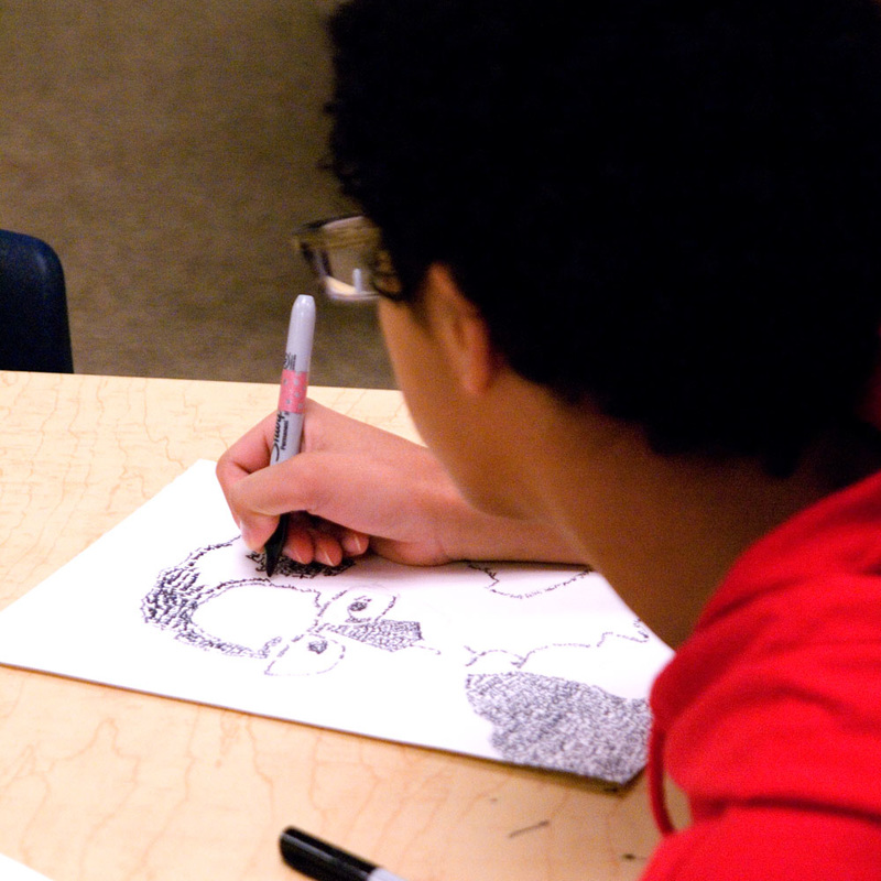
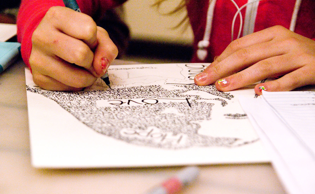
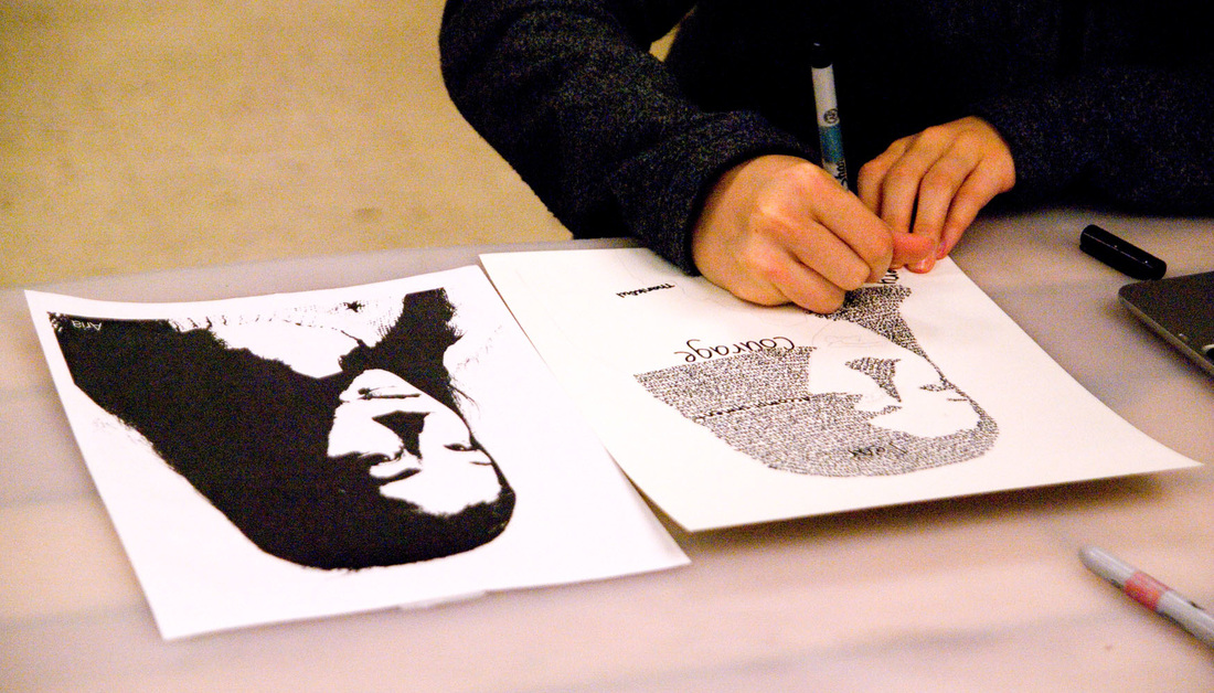
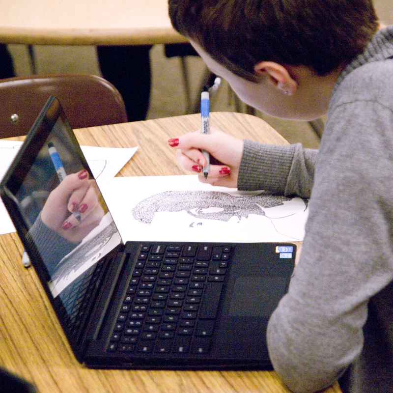
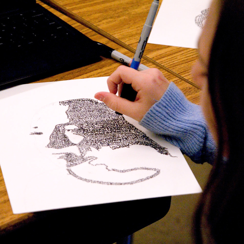
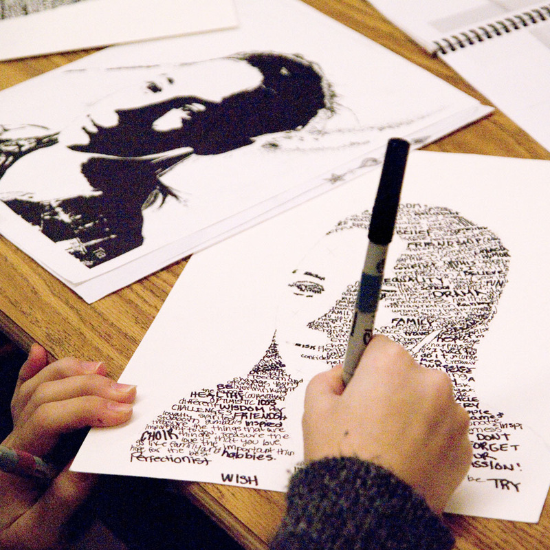
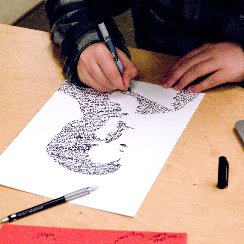
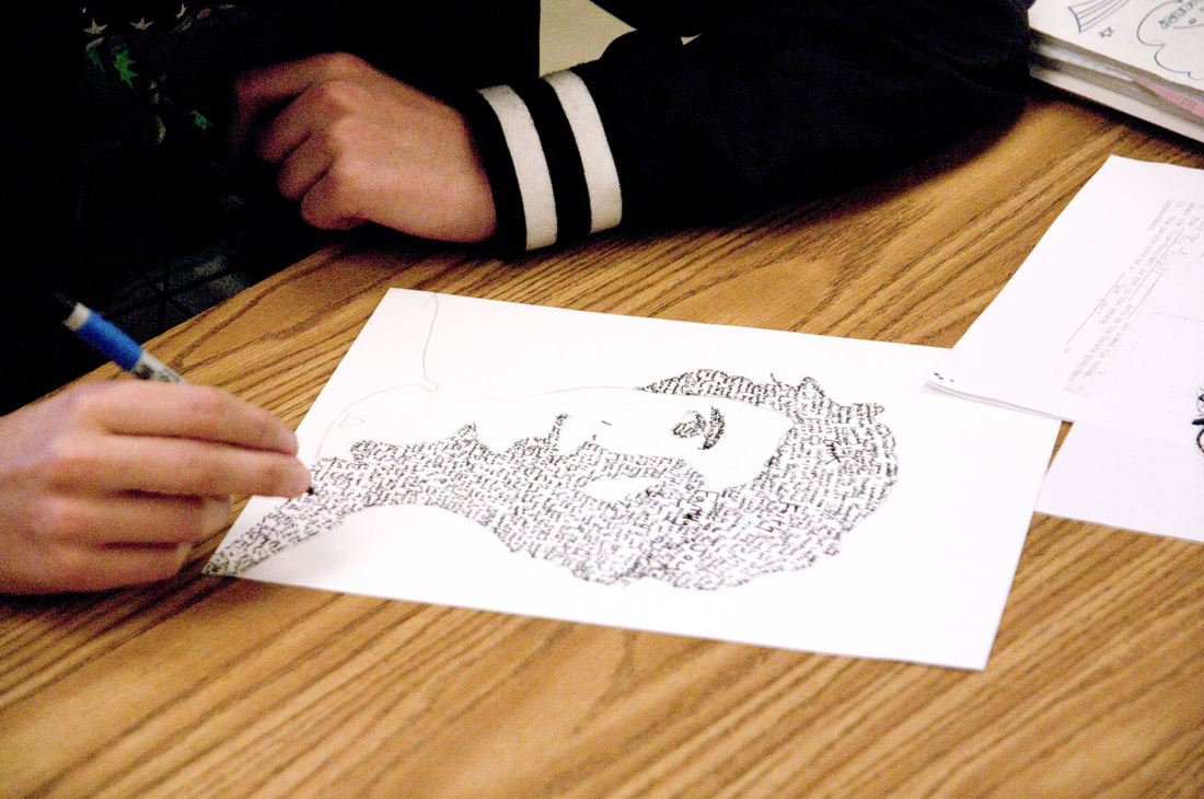
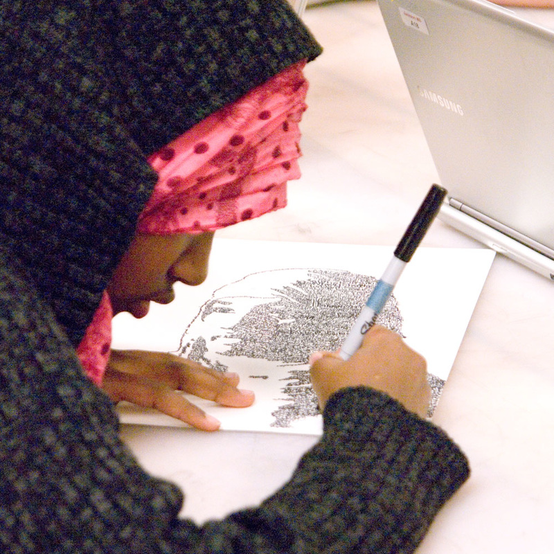
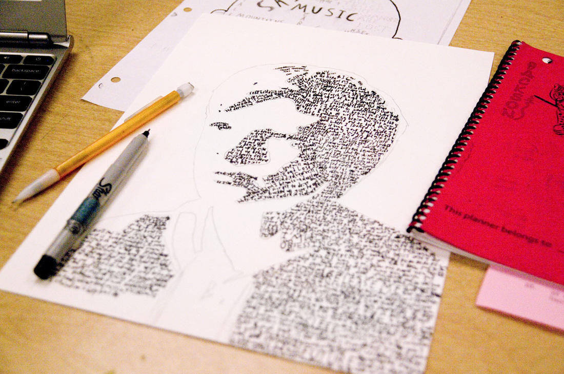
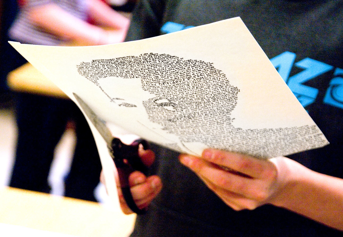
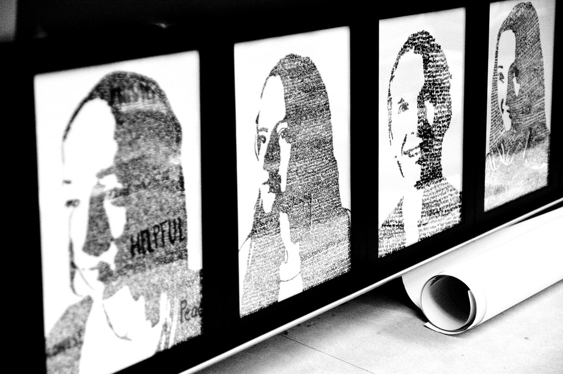
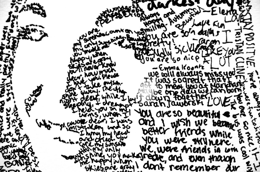 This project was very personal to each student. In addition to being a portrait of their face, and using words they wrote about their own core values, each project also features the student's own handwriting. The density and disorder of the handwriting varies greatly from project to project, but ultimately all are effective in creating a meaningful and recognizable portrait. Not every student was completely finished with their projects by the time I started taking photographs in the gallery, but most were. I think only 3-5 were not yet displayed. 
 I worked with 8th graders for the first time with this art project (many of whom I had worked with as 6th or 7th graders), and it was wonderful to see how they had grown in their art and in their focus. This project involved students identifying an aspect of their own core values, and writing an essay about it. These essays were to follow the "This I Believe" model. From the This I Believe website: "This I Believe is based on a 1950s radio program of the same name, hosted by acclaimed journalist Edward R. Murrow. Each day, Americans gathered by their radios to hear compelling essays from the likes of Eleanor Roosevelt, Jackie Robinson, Helen Keller, and Harry Truman as well as corporate leaders, cab drivers, scientists, and secretaries—anyone able to distill into a few minutes the guiding principles by which they lived. These essayists’ words brought comfort and inspiration to a country worried about the Cold War, McCarthyism, and racial division." Modern interpretations of this theme can be found on the This I Believe podcast and are occasionally featured on NPR. Many are tear-inducing, heart-warming, and inspiring—definitely worth a listen.
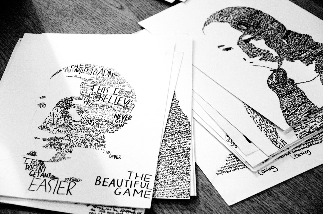 Upon completion, the pencil lines were erased, portraits carefully trimmed, and then framed.

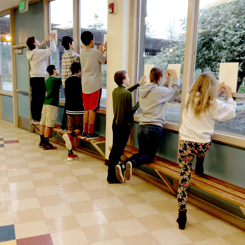
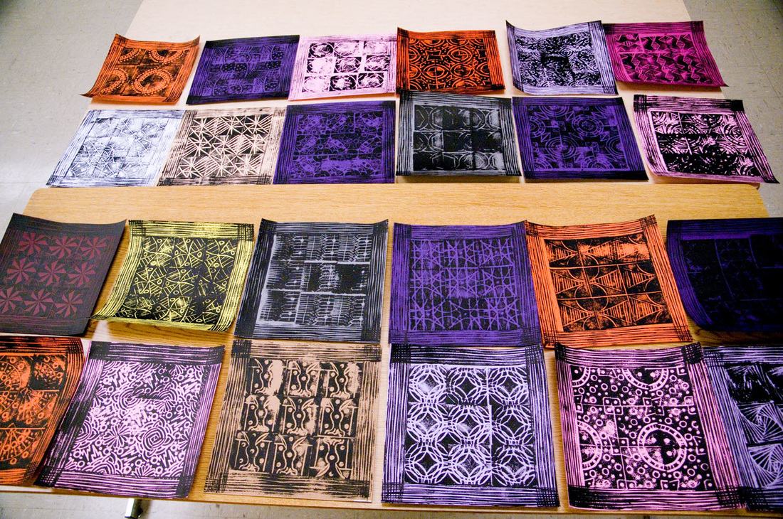
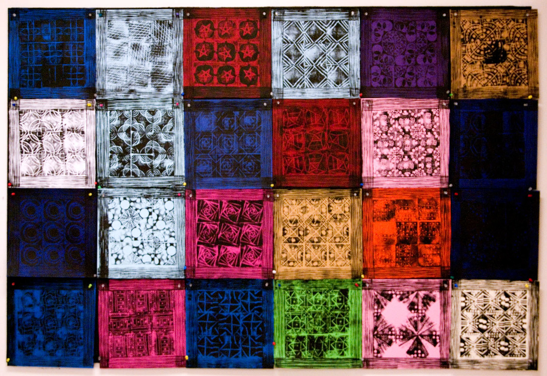
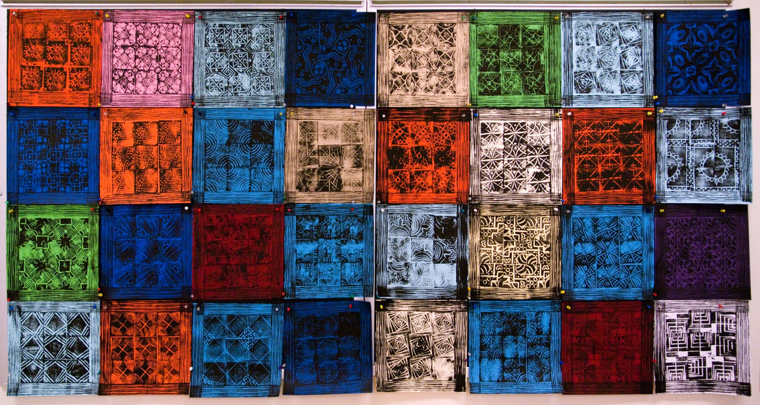
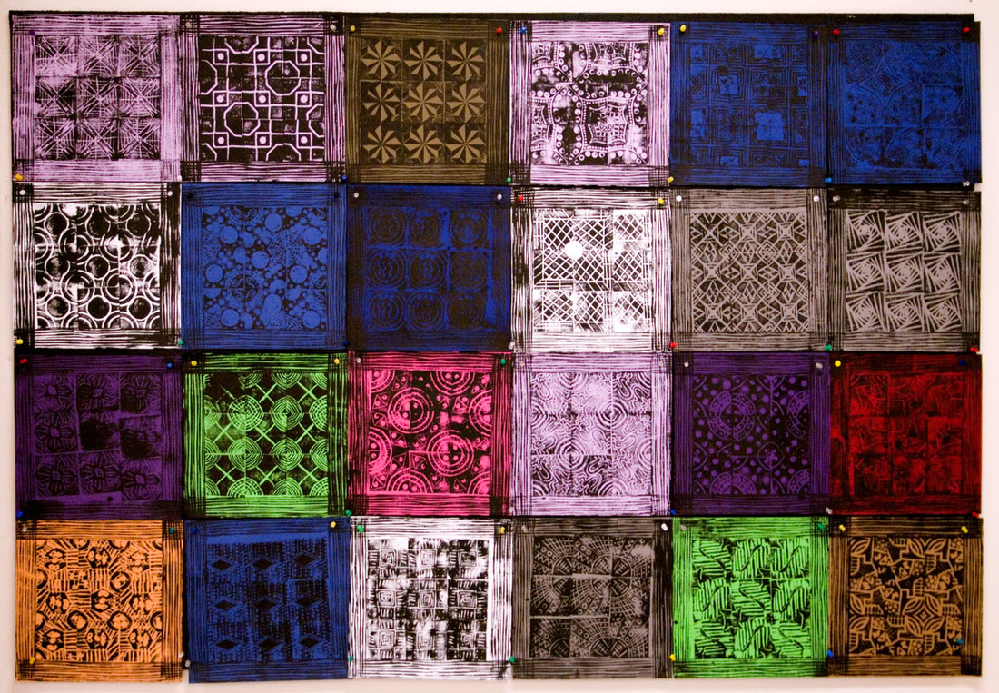
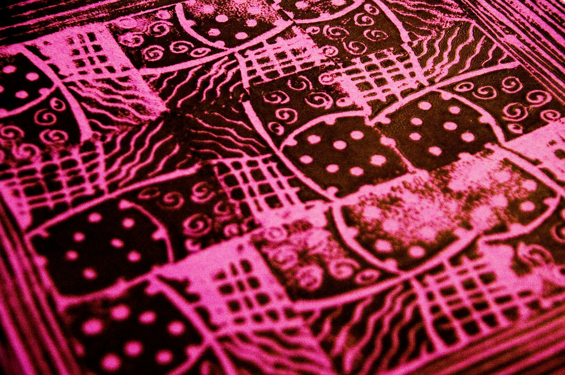
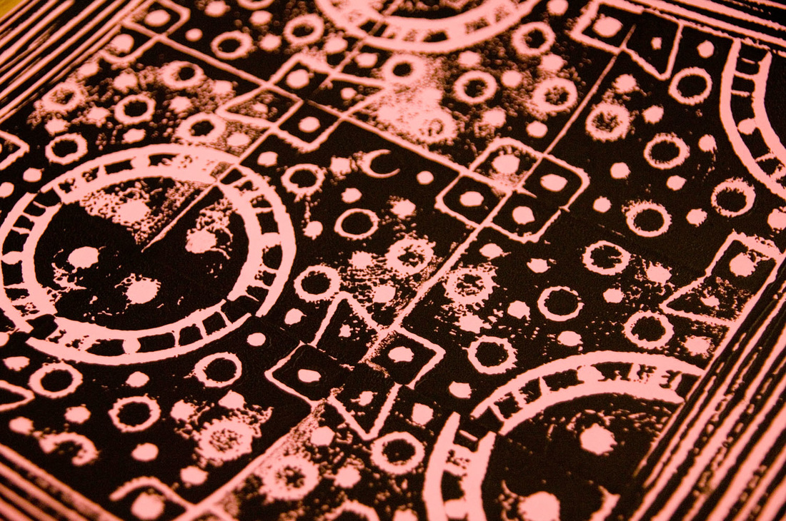
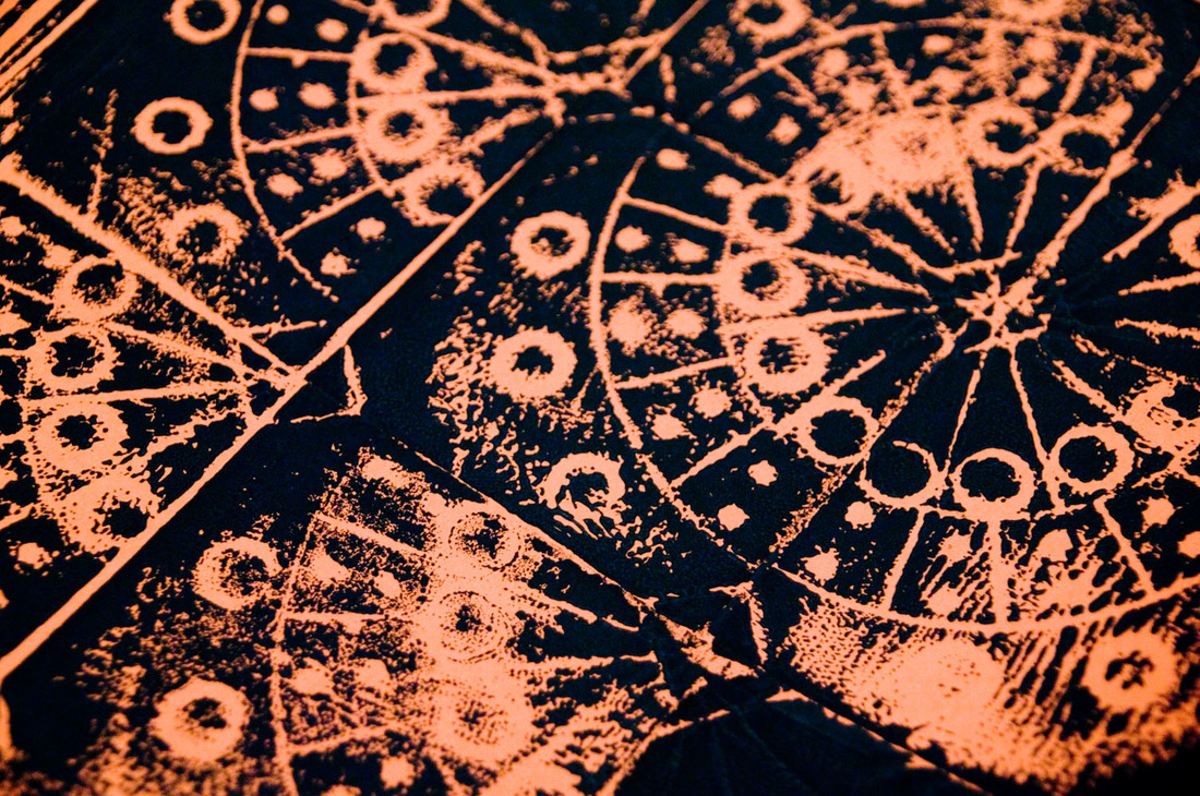
It's always interesting to watch the students create, and then improve their design. Each student's personality shines through in the paper they choose and style with which they methodically print each of their nine squares.

As far as permanent installations go, this one's a winner.

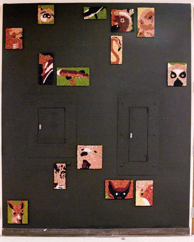
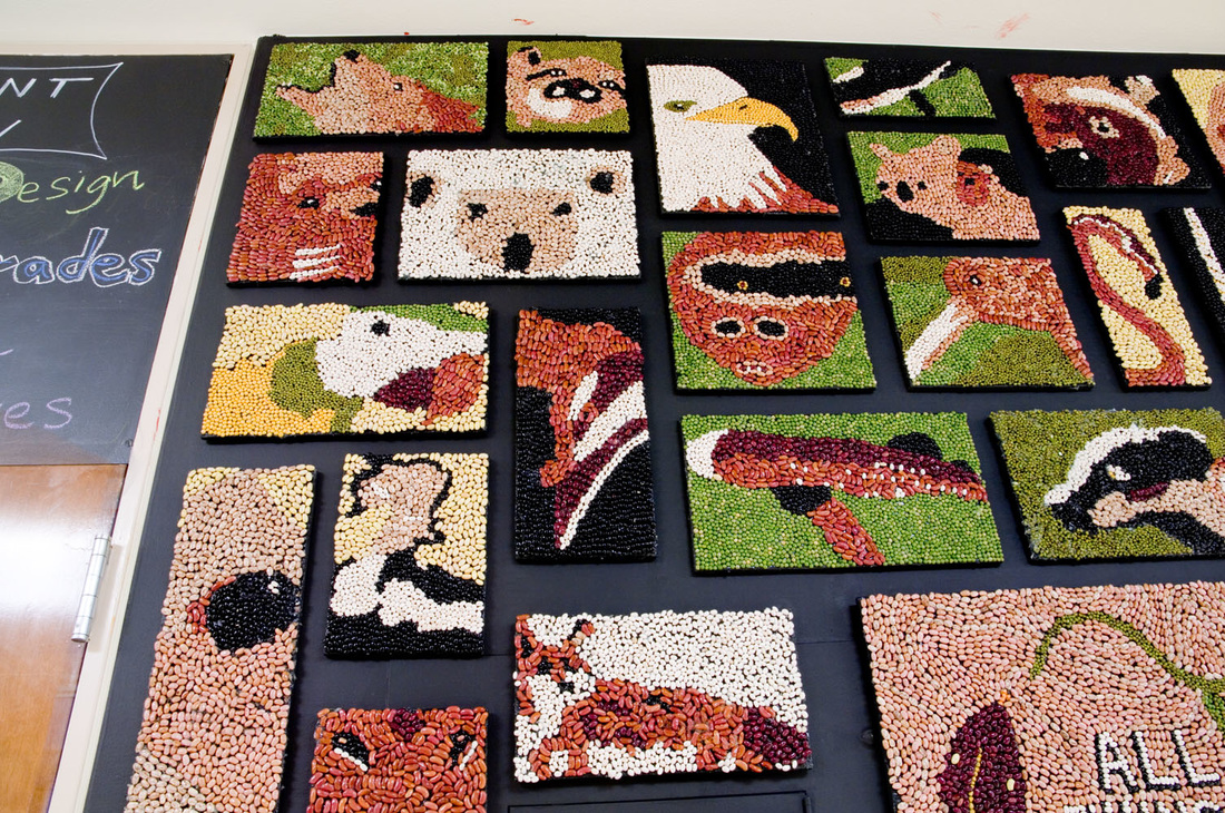
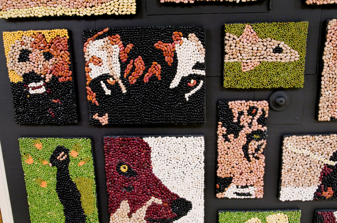
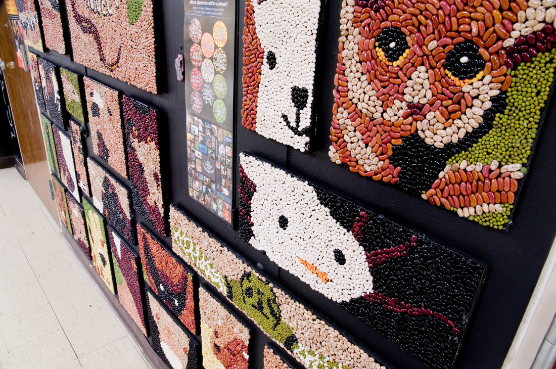
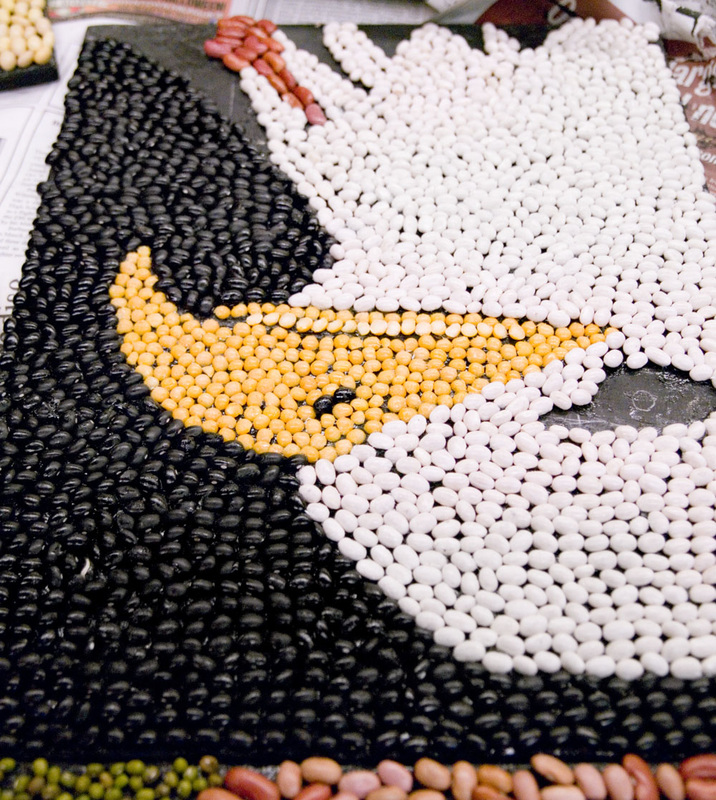
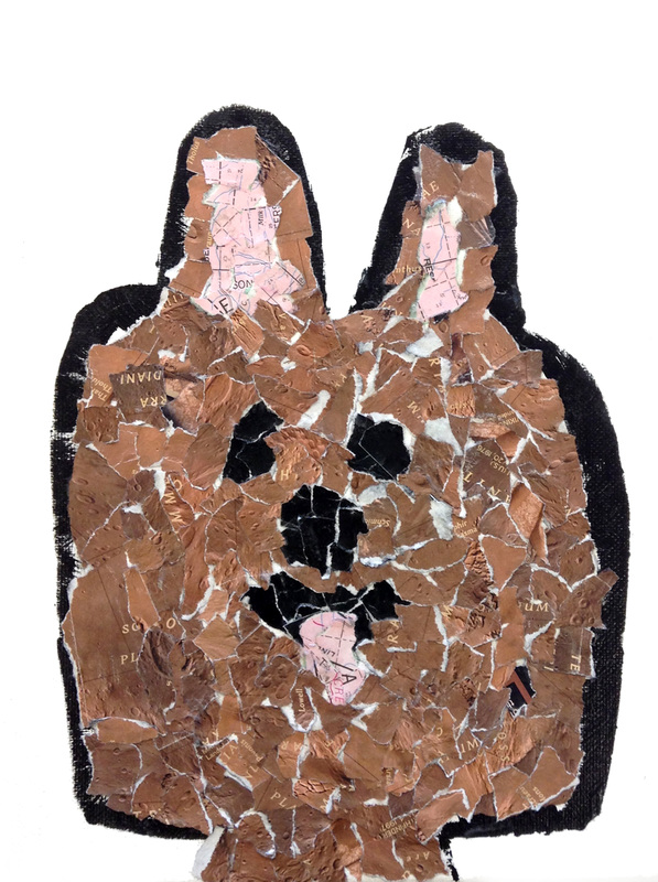
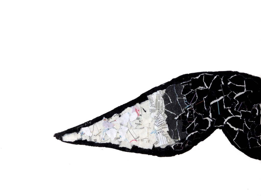
Center above: prairie dog; below left: pileated woodpecker; below right: three-toed sloth.
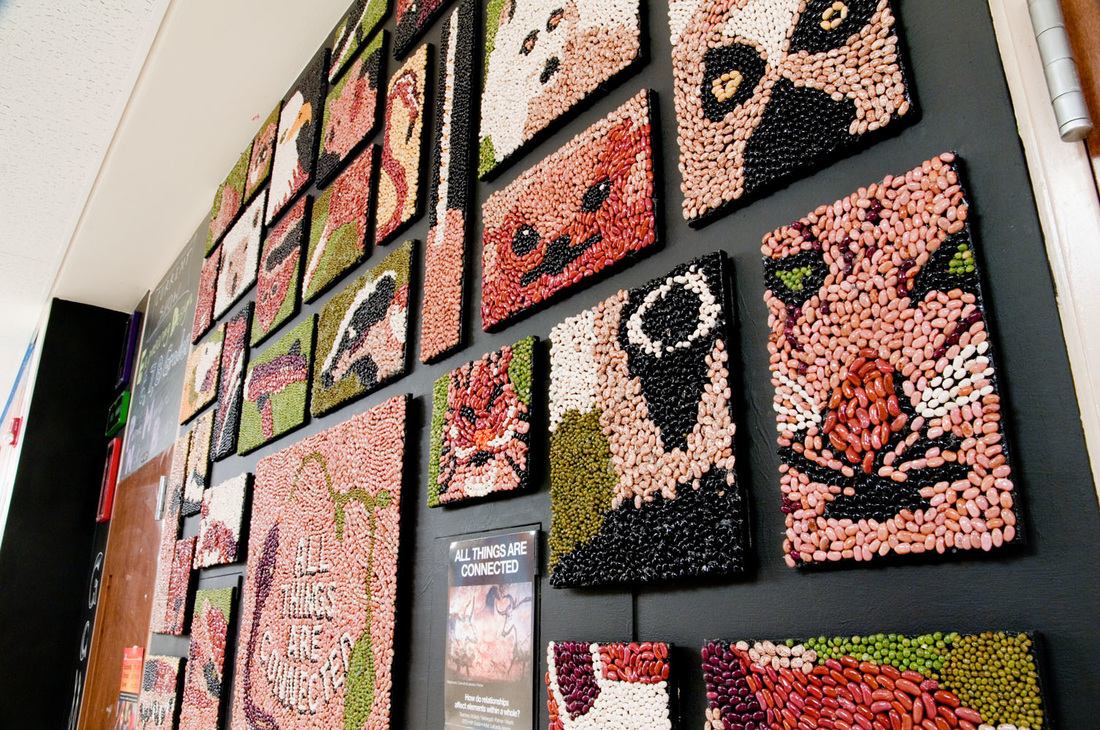
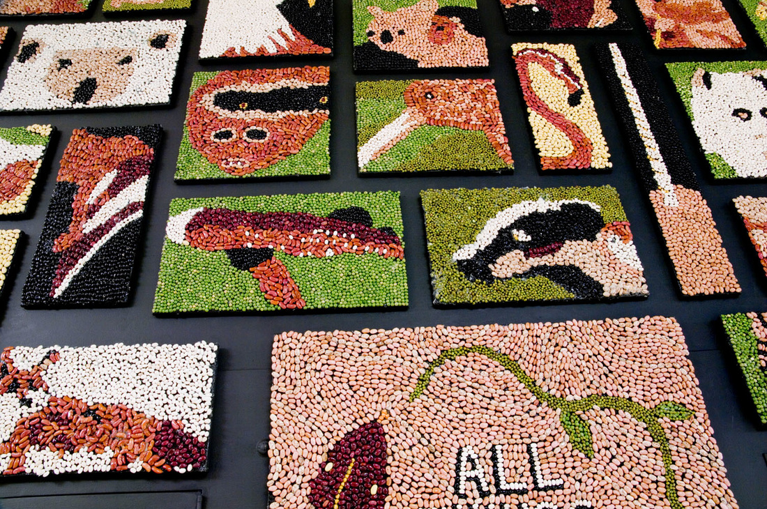
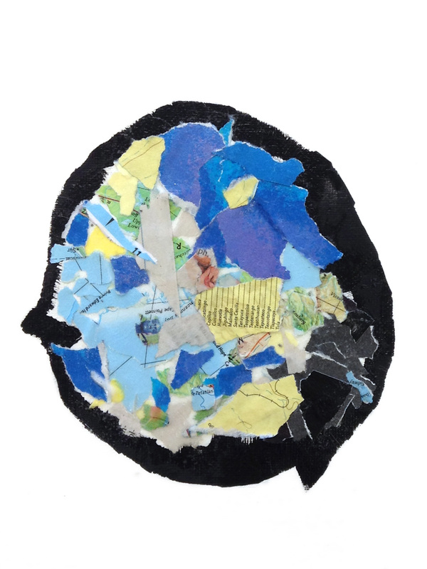
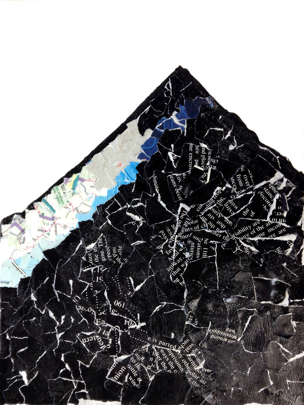
The center panel on the wall (center photo below) says "All things are connected" and depicts a snake and a plant in the shape of a "cycle" and the background, though subtler than intended, shows a topographic map. The four elements the students were required to include in their biome reports were animals, plants, natural cycles, and abiotic factors. Below left: koala and baby; below right: grizzly bear yawning.

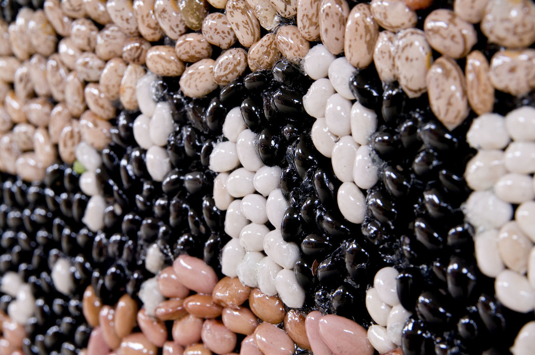
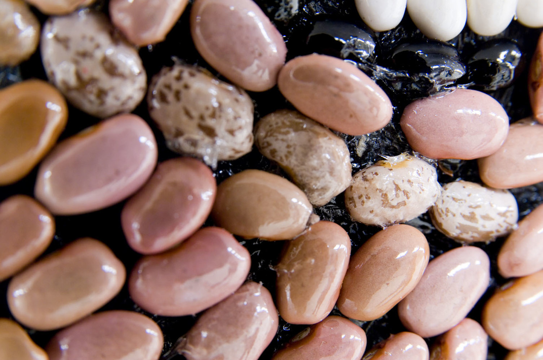
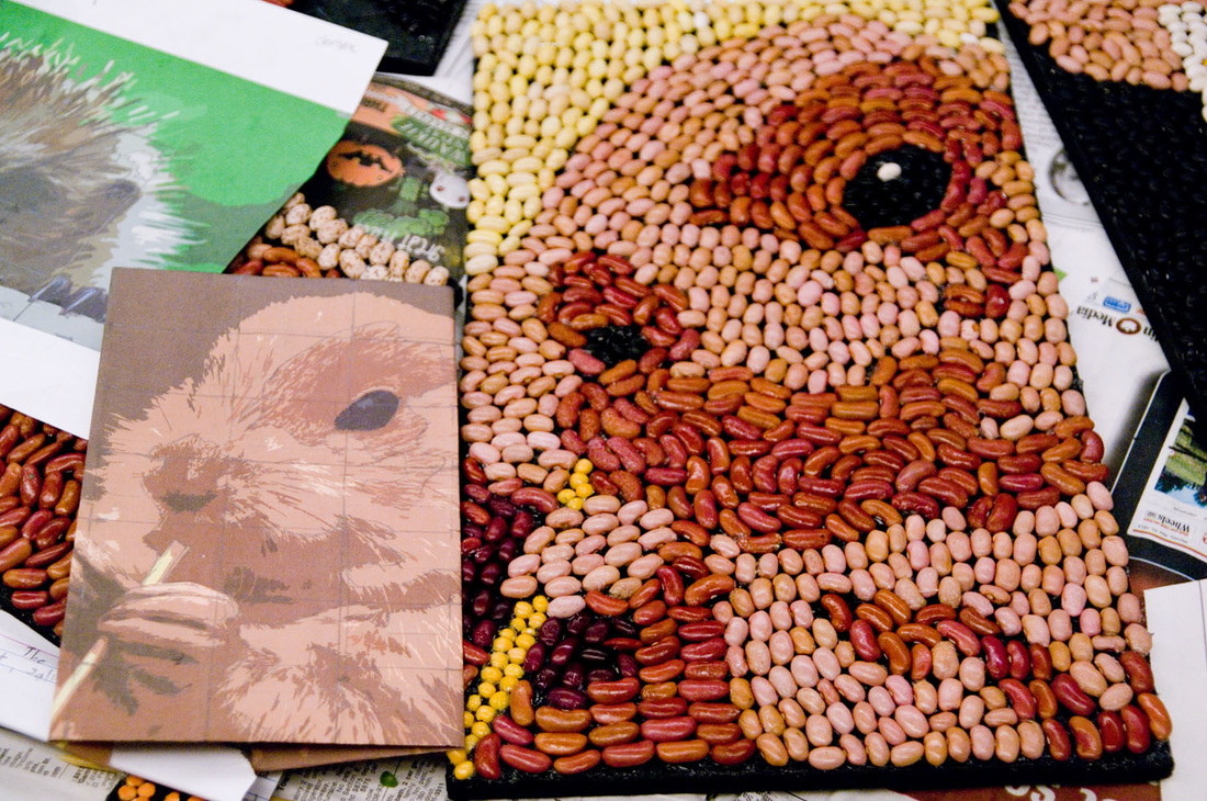
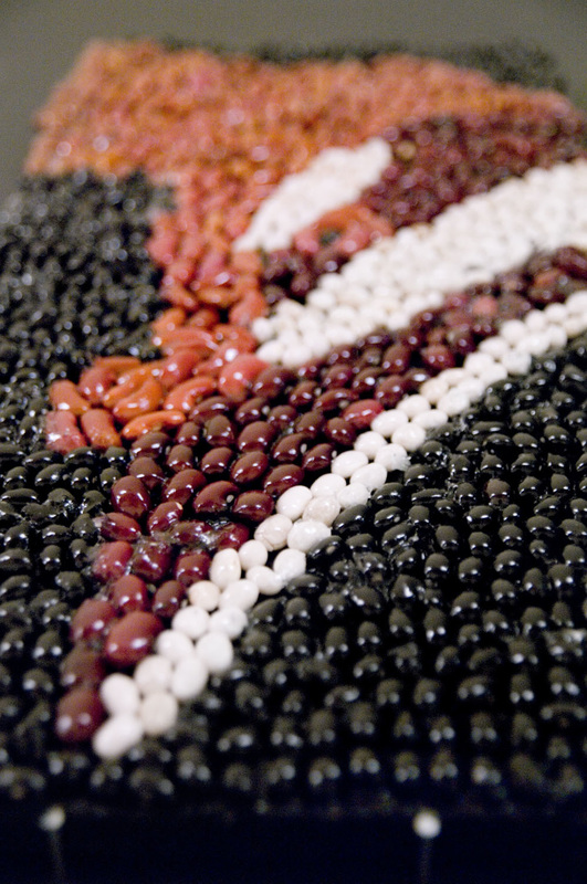
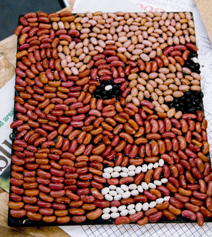
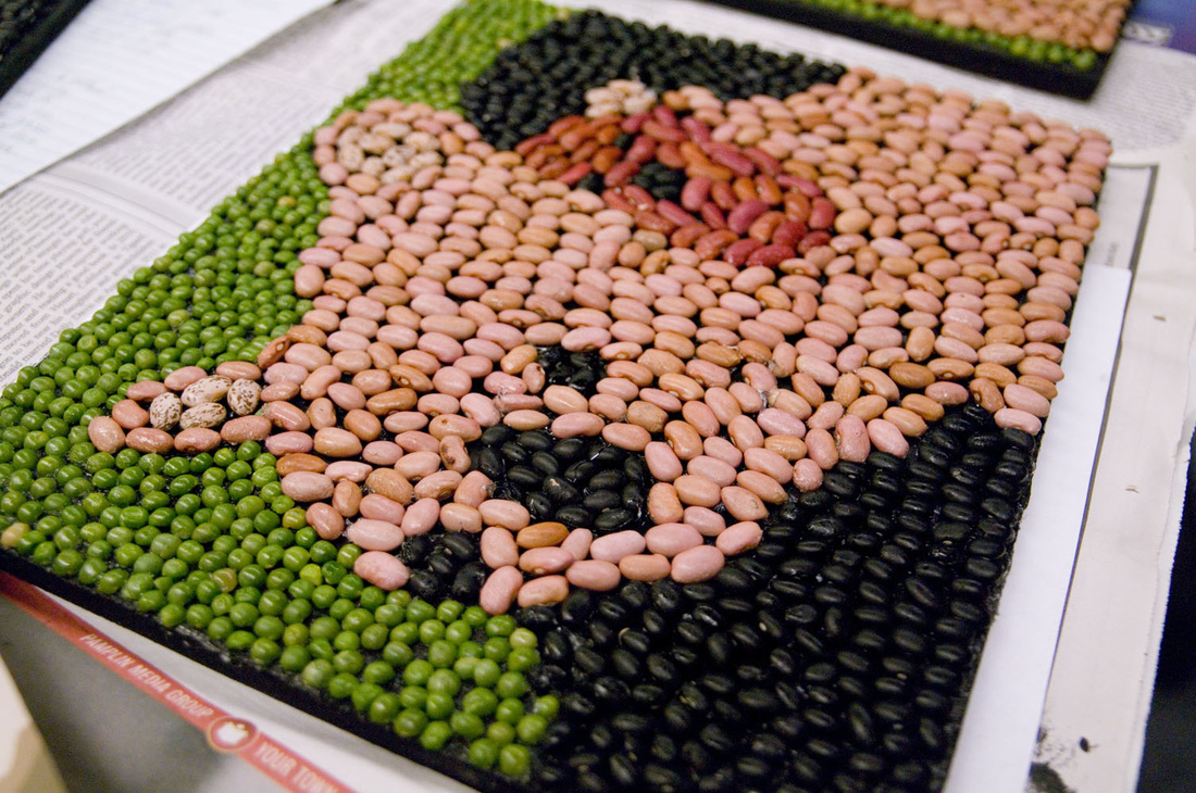
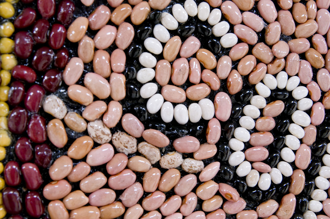
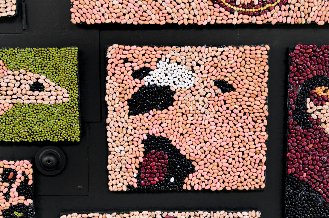
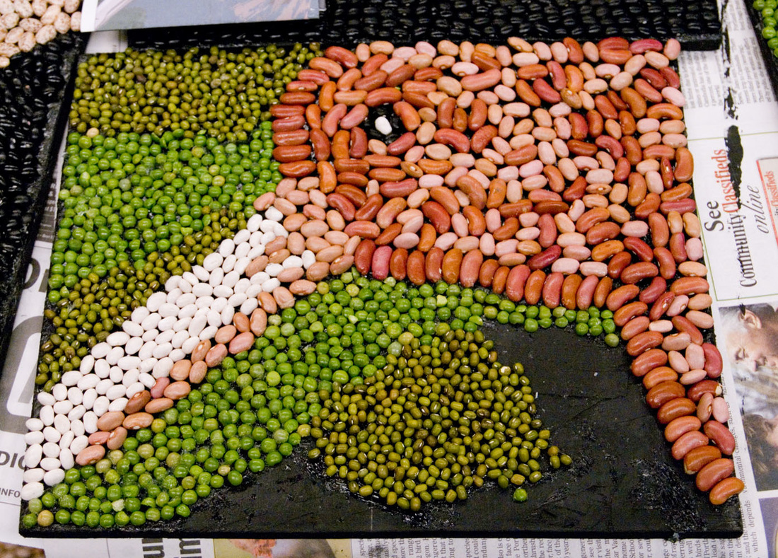
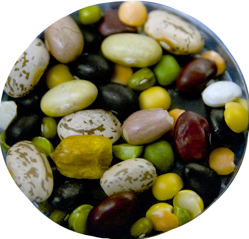
Most students placed all of the beans of a particular color before moving on to another color.
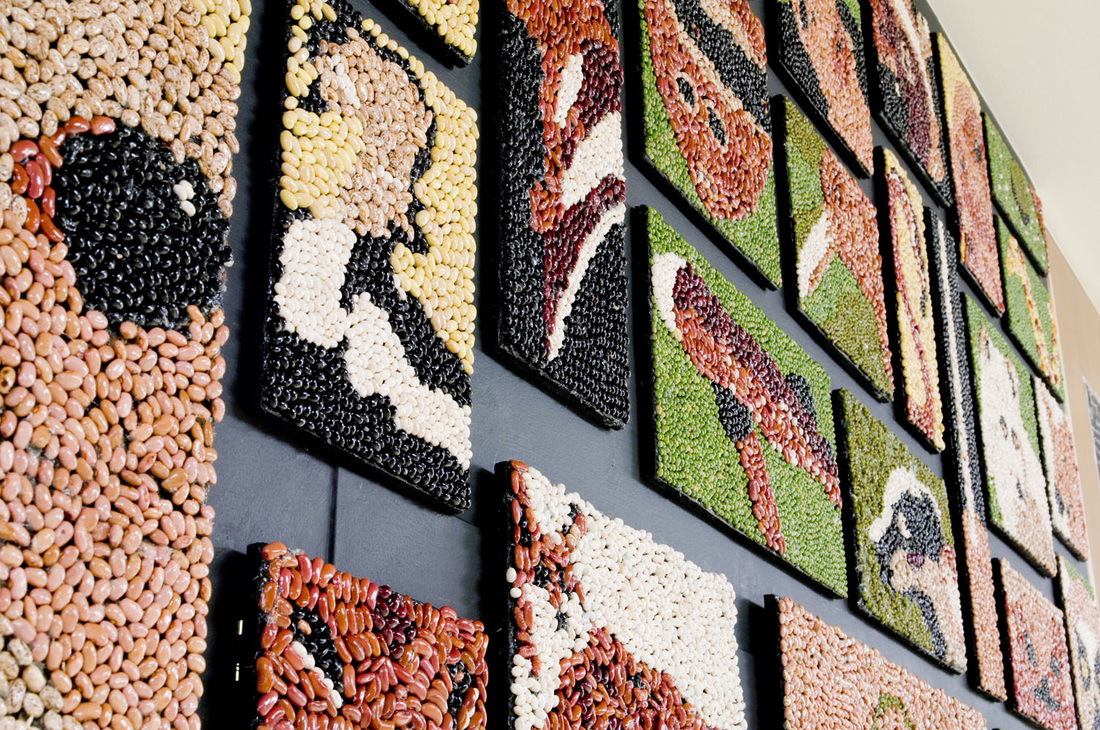
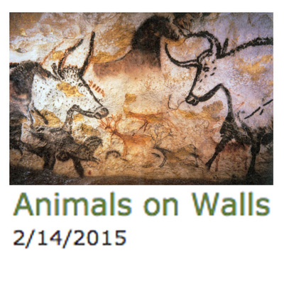
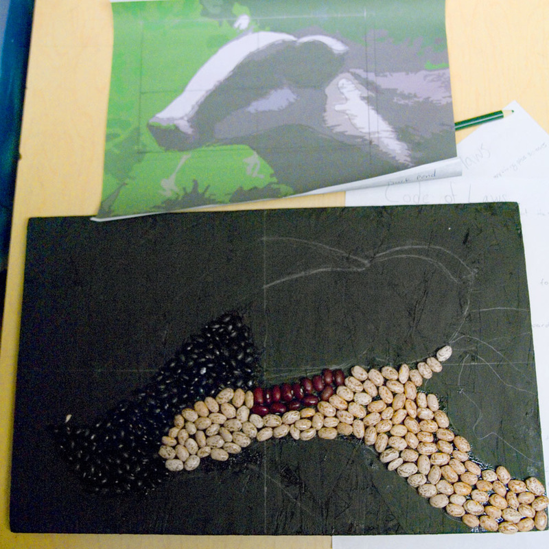
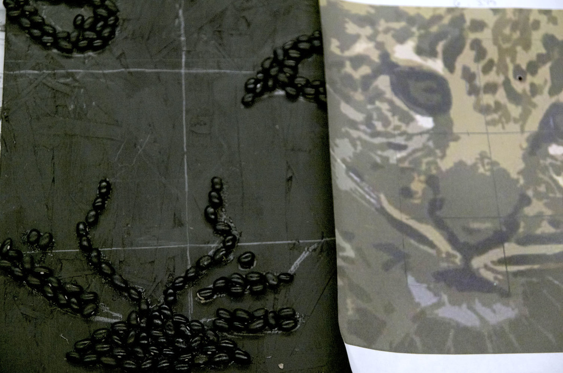
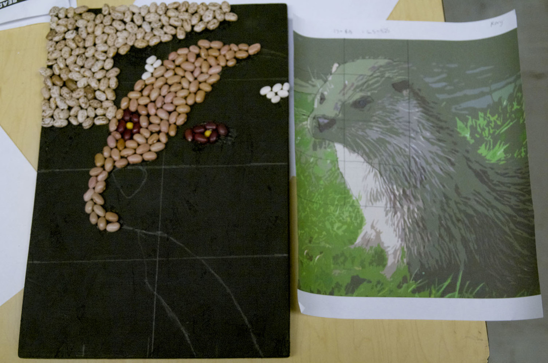
 Humans have been putting animals on walls, using natural pigments, for a very long time. 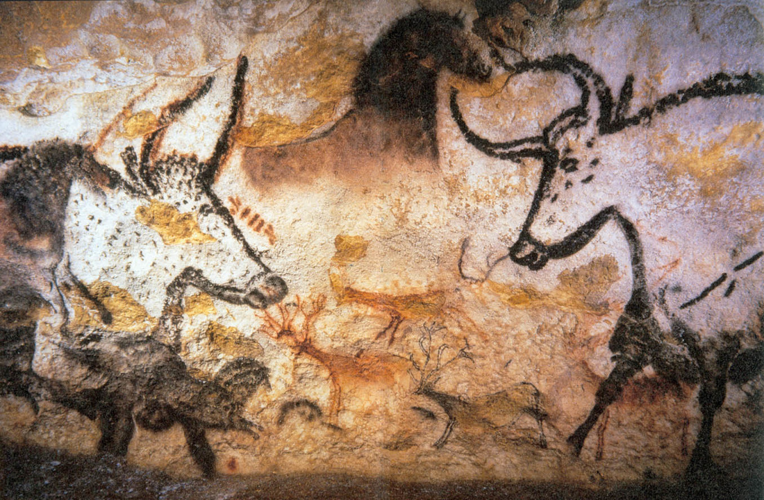 The students studied the cave art of Lascaux, France as their masterwork for this project. The experience included entering a nearly-dark classroom lit only by a few candles, with ambient water dropping and other recorded cave sounds playing. The students lay down beneath their desks and drew animals with chalk on the undersides by candlelight. 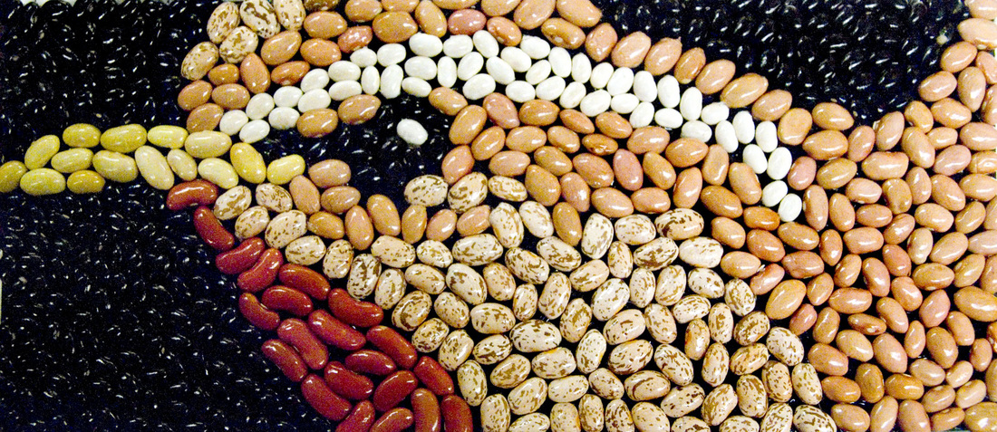 The project is beans. When describing it to people, most of them seem to picture some sort of kindergarten-level macaroni art. They scoff and roll their eyes. How cute that the kiddies get to do a little art project. This is so much more than that.
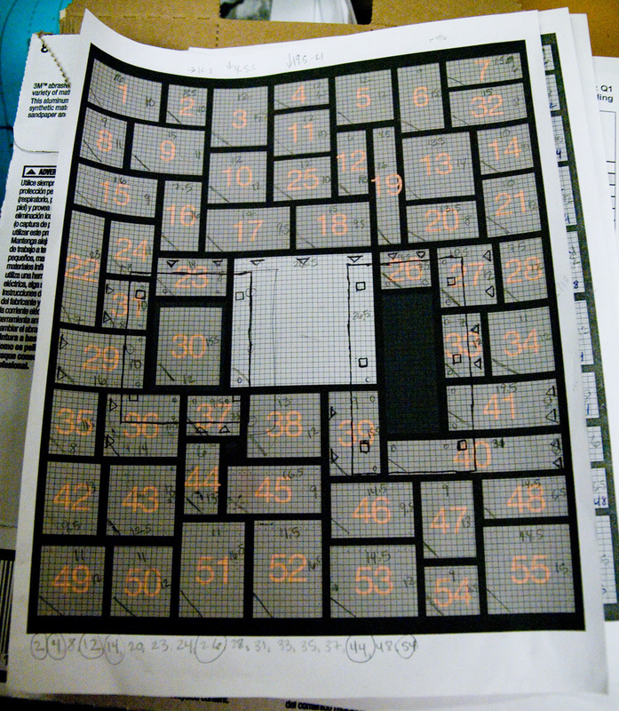
Good thing the panels are metal. Art pieces that partially covered a panel edge were screwed to the wall on one side with hinges, and strong magnets affixed the panel to the metal. In the picture above, #30 is glued to the door of one of the panels. The larger box around it represents the edge of the panel housing, with large bolts holding it in place. Pieces #23, #31, #29, #36, and #37 all have hinges shown with triangles.
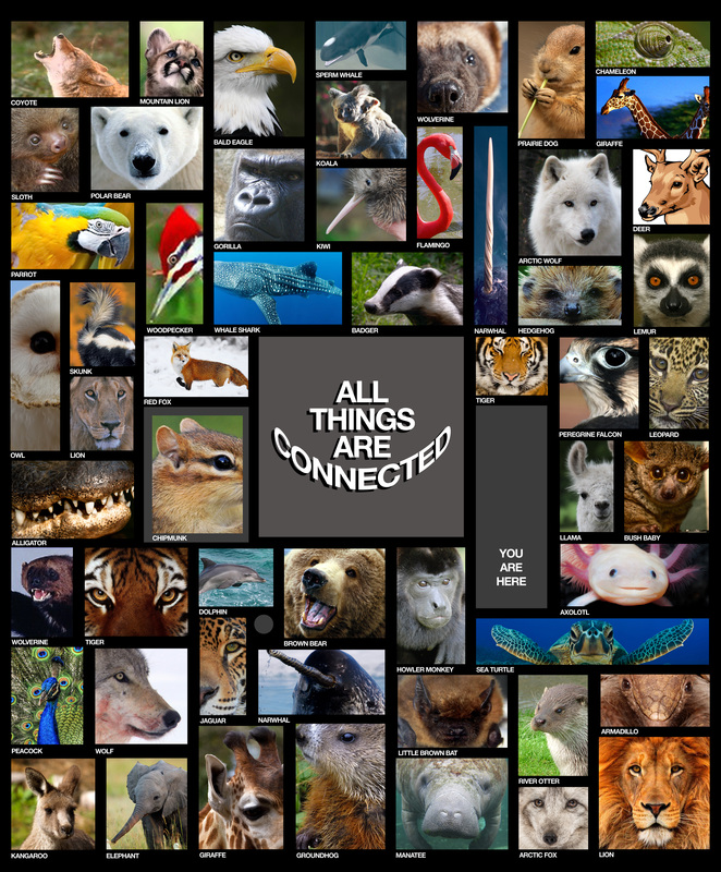
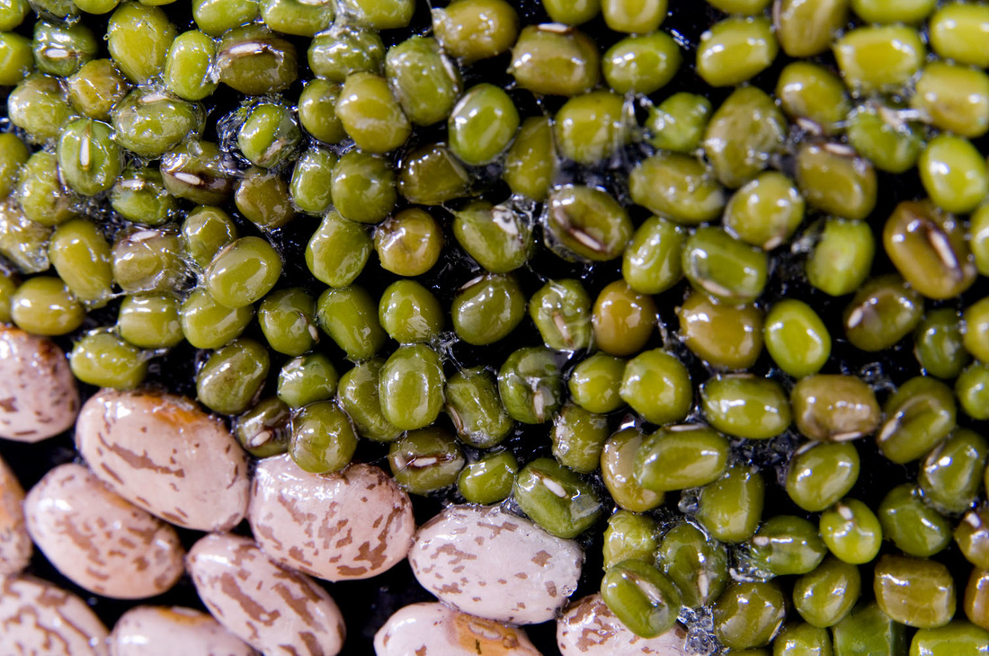
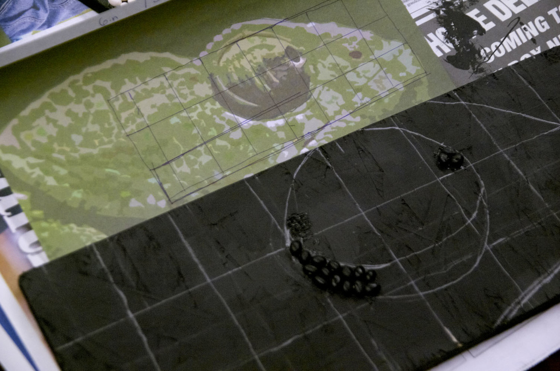
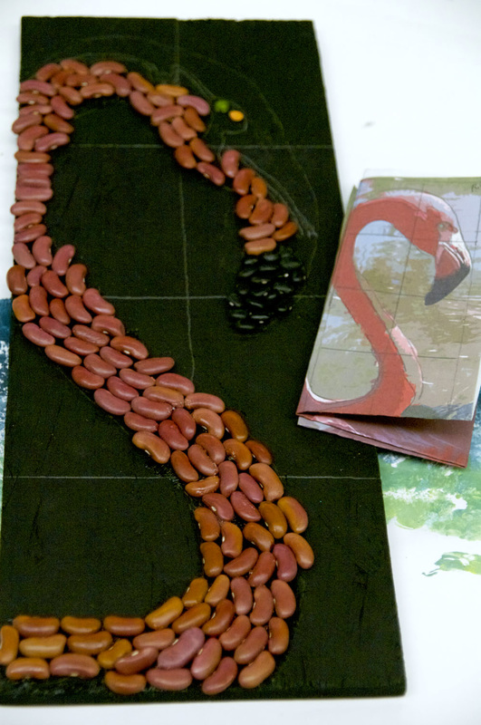
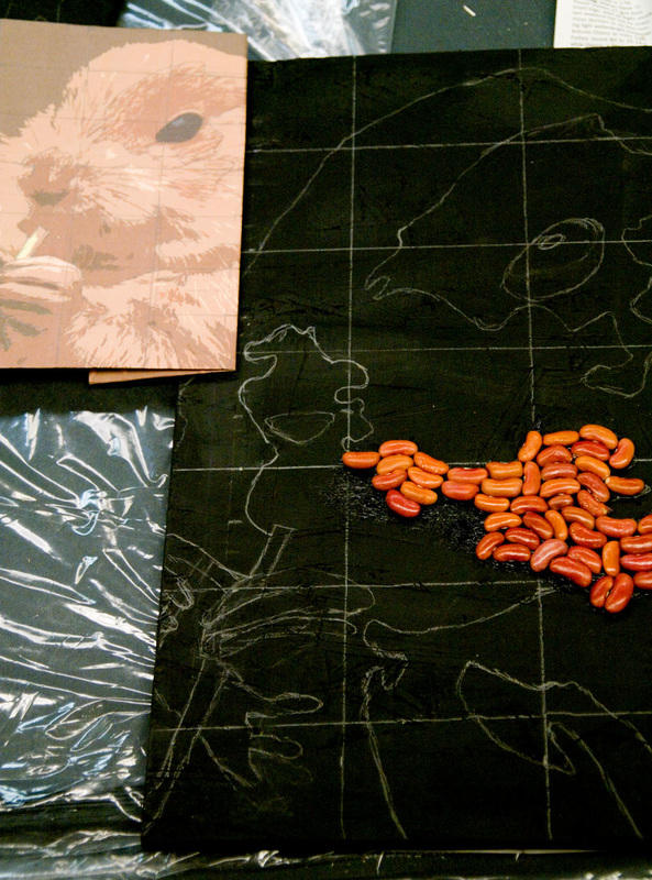
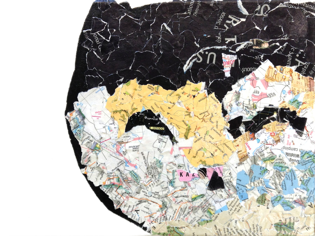
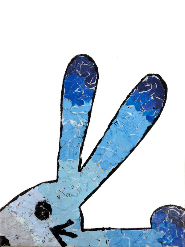
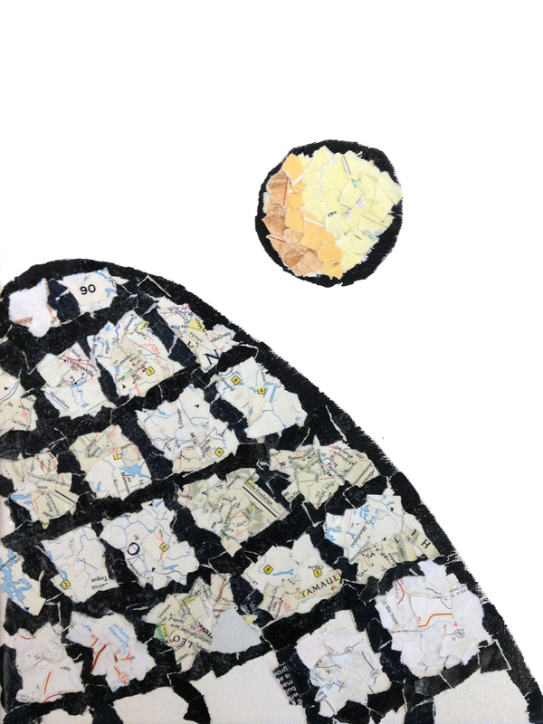
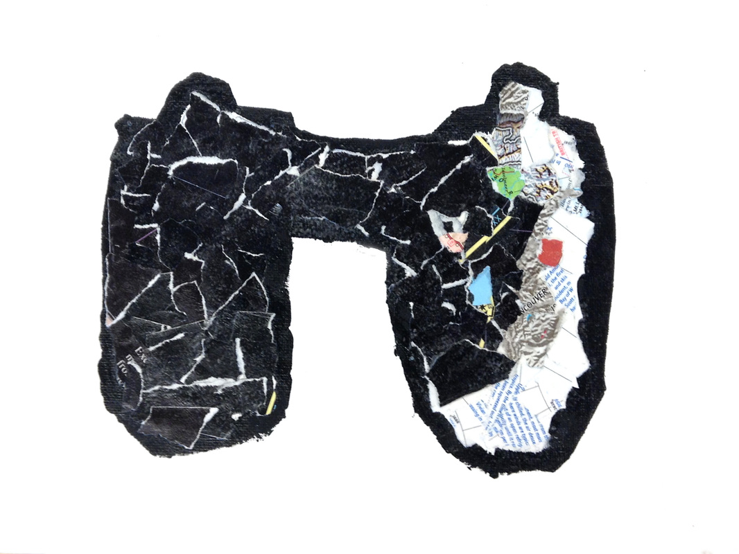
Keeping their dimensions in mind, the students each selected an image of their biome project's focus animal and I simplified each image to a few key colors for them. Using the limited range of colors available in beans, students planned which beans would represent which colors on their design with varying degrees of difficulty depending on the animal—there are no blue beans. 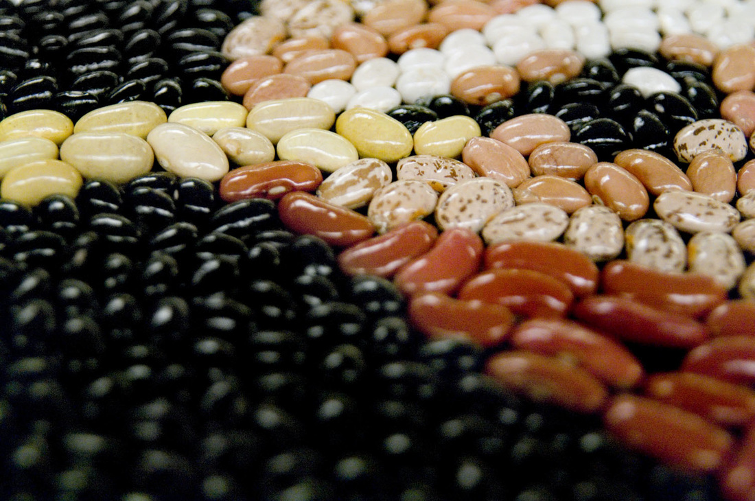  By the end of the day today, just a few projects remained to be completed. A couple of students had been absent during the bulk of the creation process, and a few were just meticulous workers. Though the five below are not quite finished, the essence is apparent. They will be finished next week.
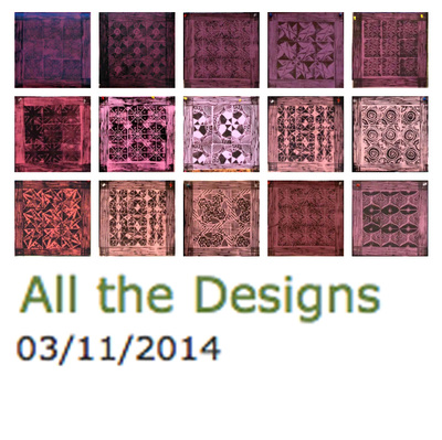
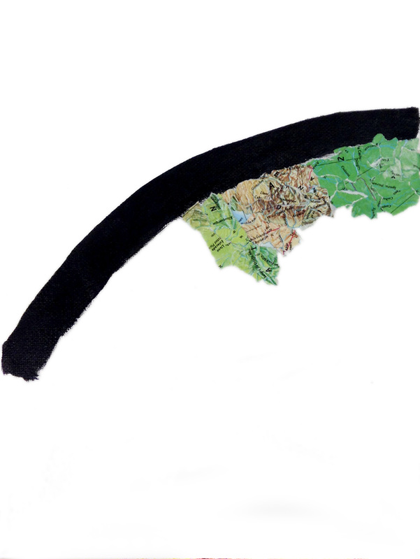
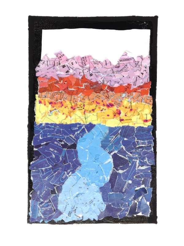
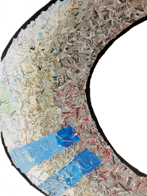
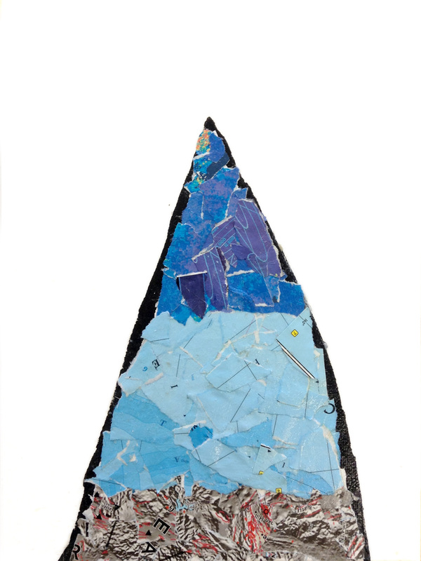
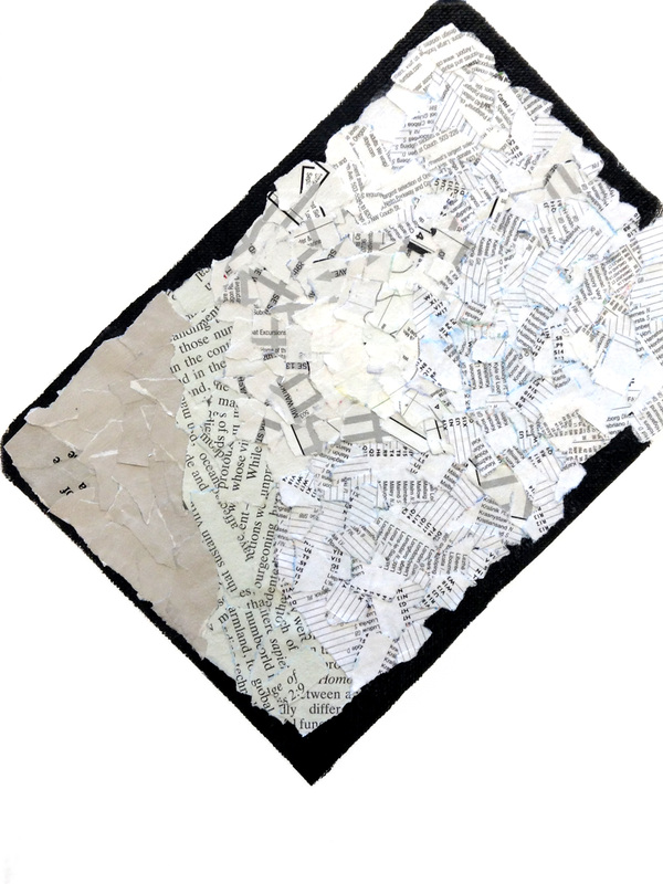
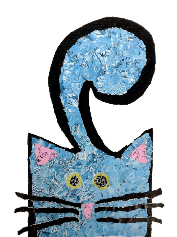
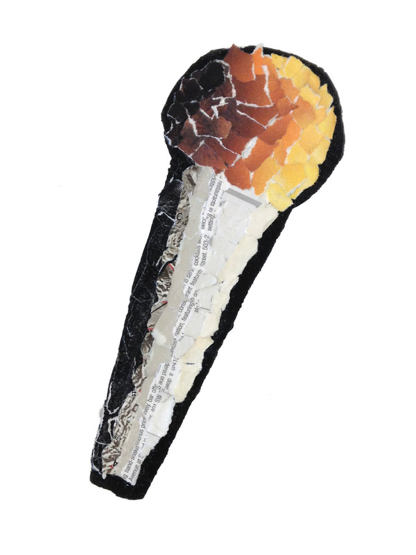
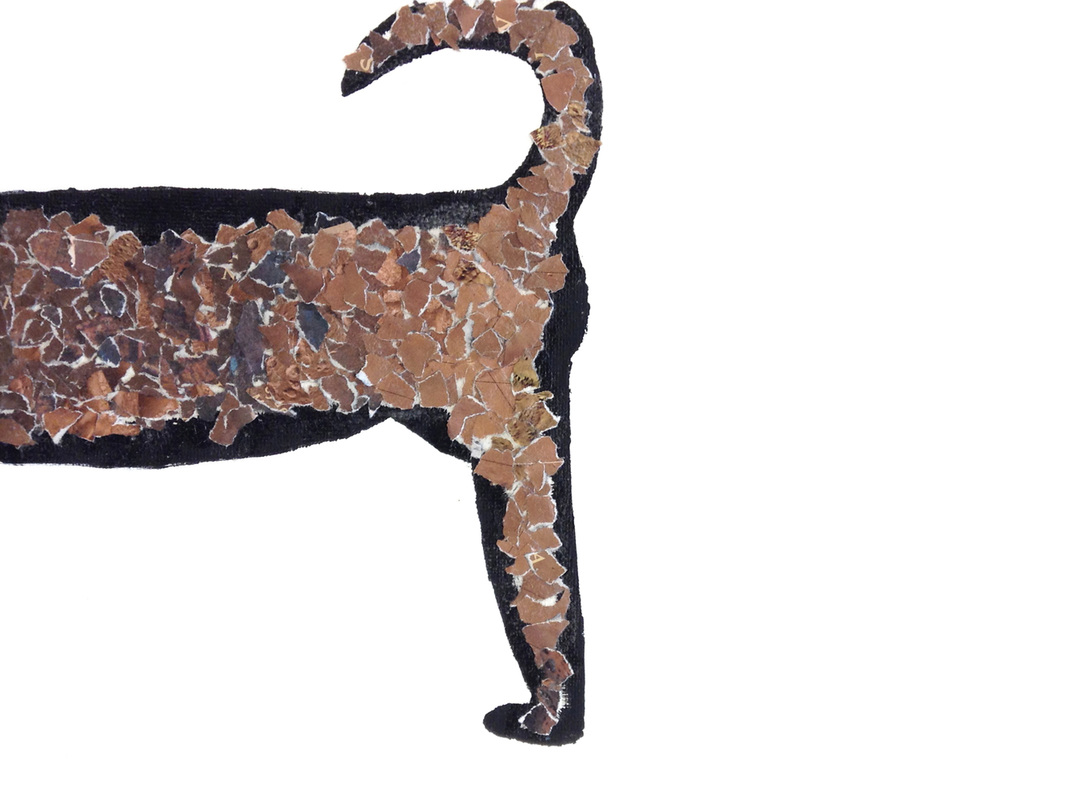
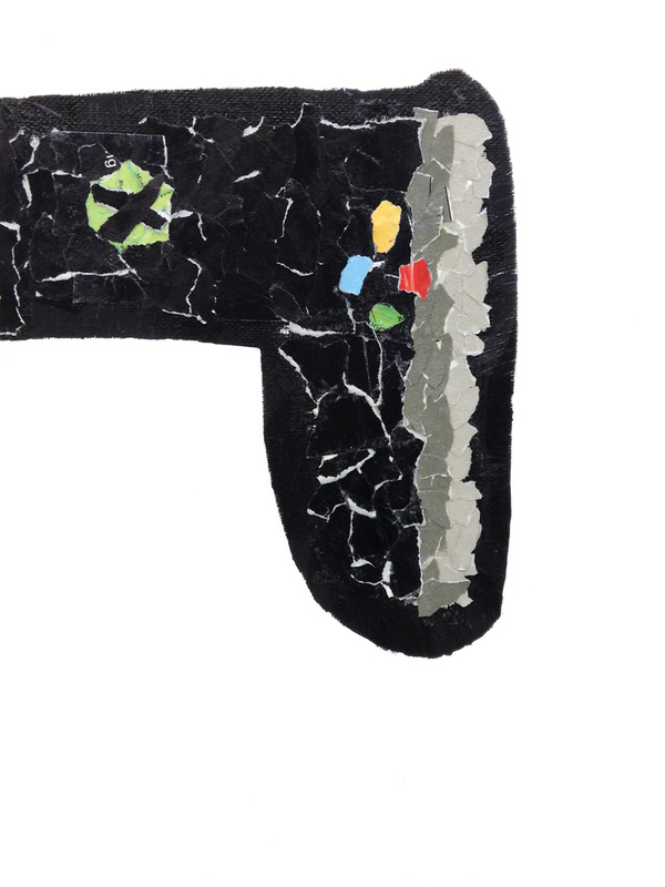
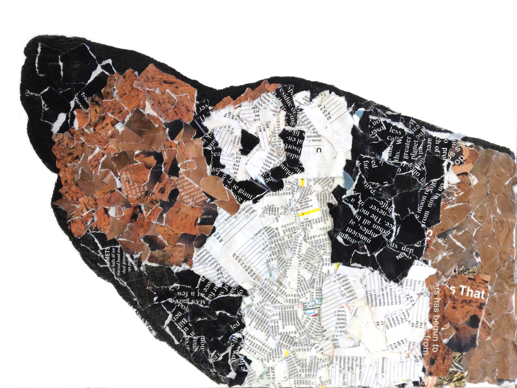
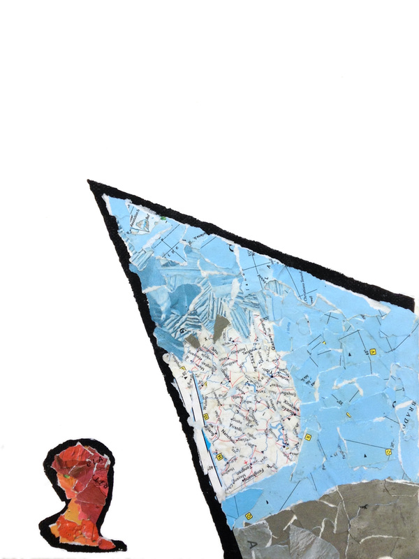
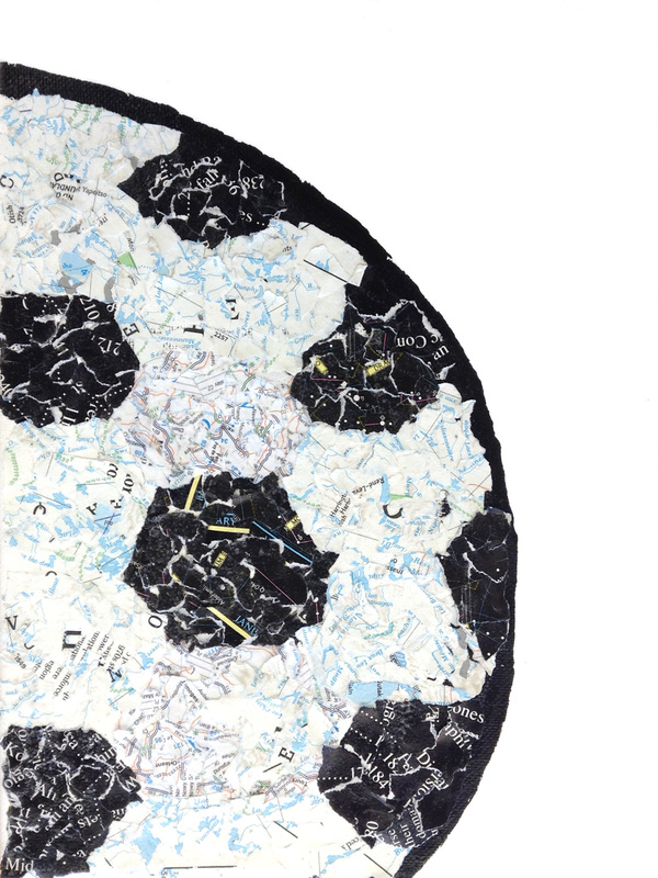
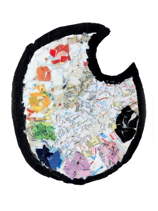
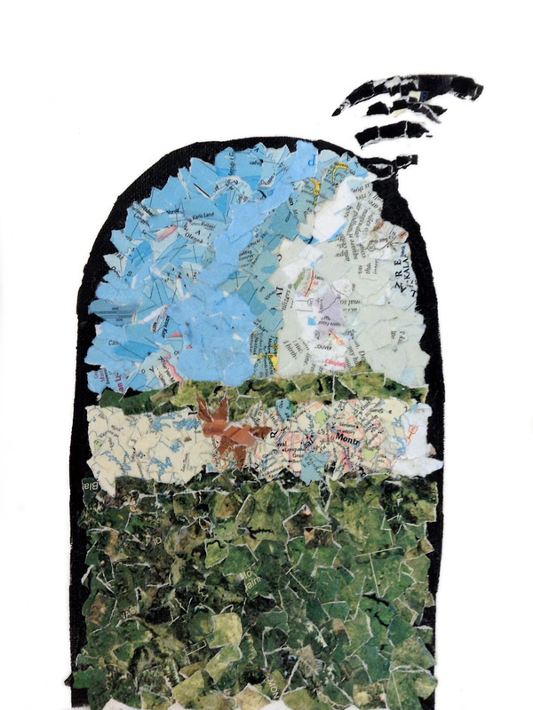
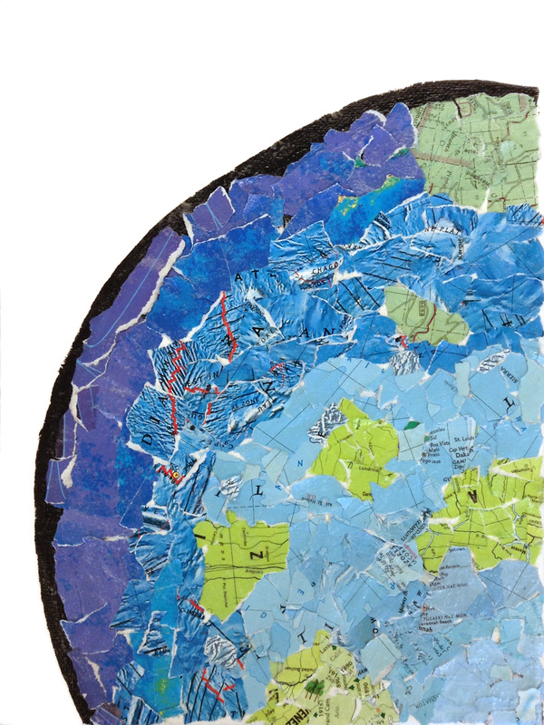
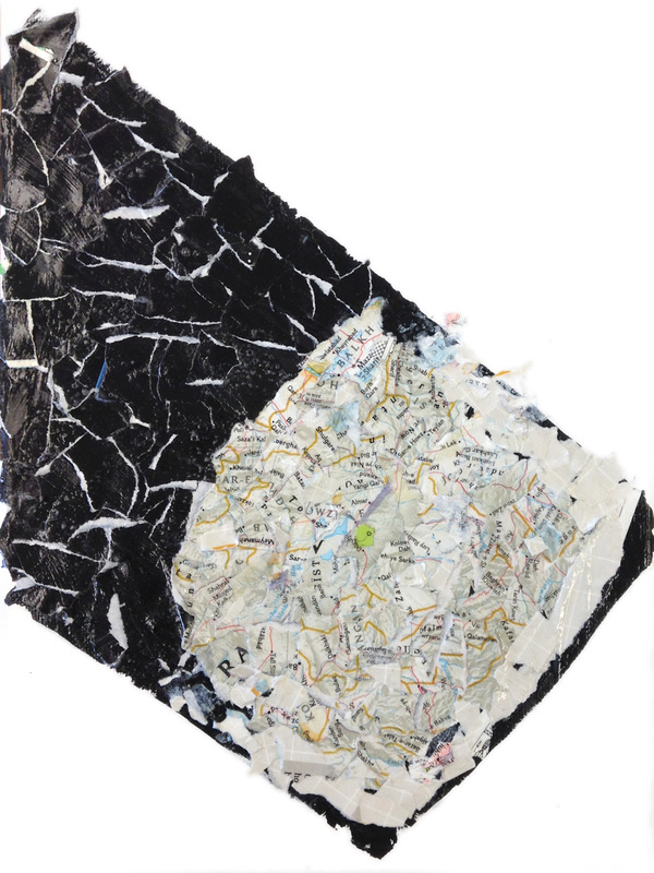
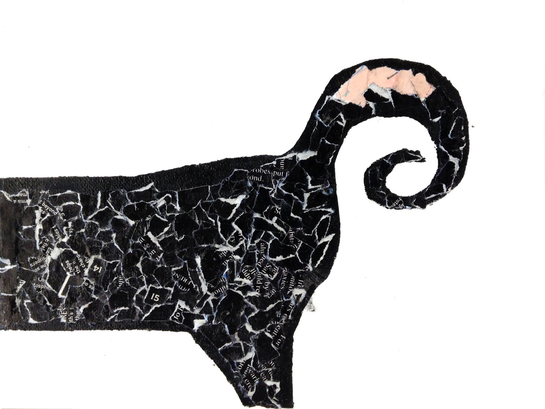
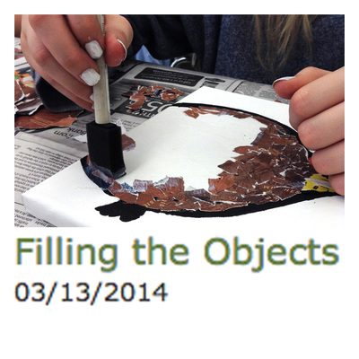
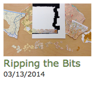
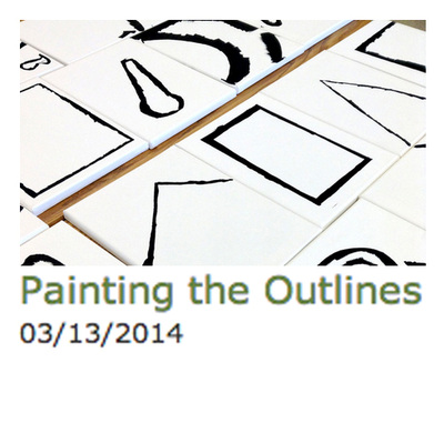
The students did an excellent job abstracting their objects, making use of gradients, and collaging it all with bits of maps. The overall effect is brilliant, and I know that visitors to the school's gallery will be impressed with the quality of the work achieved by these students. Click any image below to launch a slide show of the finished projects.  |
Topics
All

Archives
May 2021
|


 RSS Feed
HOME |
PHOTOGRAPHY COLLECTIONS
|
© COPYRIGHT 2020. ALL RIGHTS RESERVED.
|